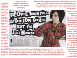
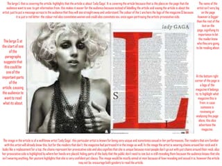
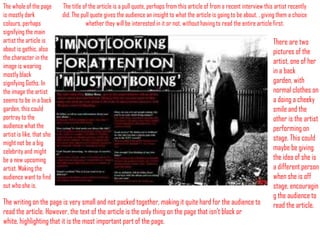
Double Page Spread Analysis
Nicole Keating
A large ‘I’ is used at the
beginning of the article to
show the audience where the
article begins.

The way the character is dressed is quite minimalistic, highlighting that the artist doesn’t
care what she looks like. The posture of the character in the image displays that the
artist is confident, he leaning forward towards the camera with her hands on her hips.
This signifies that she is not shy and hiding away, she is confident and quirky, like the
clothes she wears.

The colour scheme
of the page is used
to display what is
important on the
page and what isn’t.
For example, the
title covers most
for the page but is
black and
white, along with
the rest of most of
the page. However
certain parts of the
page are red, to
catch the audiences
attention like the
main character in
the image, the
artists name ‘Lily
Allen’ and the
writers name. This
is to give important
information across
without the reader
having to spend
time looking at it if
they don’t want to.
As the colour of the
text is red and the
rest in the article is
black, the reader The title of the article covers most of the page and is black and white, the writing and size of the text is extremely
dysfunctional, perhaps portraying the characters look, weird and loud. The title is also a pull quote, perhaps from this
can just glance
over these words article or from interview that the main character recently did. This gives the audience and insight to what the article is
and realise what about, giving them a choice whether they will be interested in it or not, without having to read the entire article first.
they are.

The layout of the page
is different to most
double page
spreads, most double
page spreads have a
medium sized image
of an artist and a title
in the corner, the rest
of the page is usually
an article.
However, in this
double page spread it
seems to be quite the
opposite, the image
and the quote/title
covers more than half
of the page and the
article is only 4
columns long, this is
because it could only
be a short article so
the magazine is using
the large title and
large image to
encourage the
audience the read the
The large L that is covering the article, highlights that the article is about ‘Lady Gaga’. It is covering the article because that is the place on the page that the
audience want to see, to get information from, this makes it easier for the audience because instead of labelling the article and saying the article is about the
artist, just to put a message across to the audience that they will see straight away and understand. The colour of the L anchors the logo of the magazine Q because
it is just a red letter, the colour red also connotates women and could also connotate sex, once again portraying the artists provocative side.

The large S at
the start of one
of the
paragraphs
suggests that
this could be
one of the
important parts
of the
article, causing
the audience to
want to read
what its about.

The name of the
artist isn’t very big
on the page
however is bigger
than the rest of the
text on the
page, signifying its
importance to let
the reader know
who they are going
to be reading about.

At the bottom right
corner of the page is
a logo of the
magazine it belongs
to, to highlight what
magazine this is
from, in case
someone is
reviewing or
analysing this page
alone, this also
advertises the
magazine.

The image in the article is of a well know artist ‘Lady Gaga’, this particular artist is known for being very unique and sometimes sexual in her performances. The readers that are familiar
with this artist will already know this, but for the readers that don’t, the magazine had portrayed it in the image as well. In the image the artist is wearing chains around her neck and it
looks like a replacement for a top, the chains represent her provocative side and also signifies that she is unique because most people don’t go out with just chains around their neck, also
her provocative side is highlighted by where her hands are placed, hiding parts of the body that the public don’t need to see but is still revealing them because the audience knows that she
isn’t wearing anything. Her posture highlights that she is very confident yet classy. This image would be mostly aimed at men because of how revealing and sexual it is, however the article
may not be, encourage both genders to read the article.
The whole of the page
is mostly dark
colours, perhaps
signifying the main
artist the article is
about is gothic, also
the character in the
image is wearing
mostly black
signifying Goths. In
the image the artist
seems to be in a back
garden, this could
portray to the
audience what the
artist is like, that she
might not be a big
celebrity and might
be a new upcoming
artist. Making the
audience want to find
out who she is.

The title of the article is a pull quote, perhaps from this article of from a recent interview this artist recently
did. The pull quote gives the audience an insight to what the article is going to be about, , giving them a choice
whether they will be interested in it or not, without having to read the entire article first.

The writing on the page is very small and not packed together, making it quite hard for the audience to
read the article. However, the text of the article is the only thing on the page that isn’t black or
white, highlighting that it is the most important part of the page.

There are two
pictures of the
artist, one of her
in a back
garden, with
normal clothes on
a doing a cheeky
smile and the
other is the artist
performing on
stage. This could
maybe be giving
the idea of she is
a different person
when she is off
stage, encouragin
g the audience to
read the article.

Double page spread analysis

  • 1.
    Double Page SpreadAnalysis Nicole Keating
  • 2.
    A large ‘I’is used at the beginning of the article to show the audience where the article begins. The way the character is dressed is quite minimalistic, highlighting that the artist doesn’t care what she looks like. The posture of the character in the image displays that the artist is confident, he leaning forward towards the camera with her hands on her hips. This signifies that she is not shy and hiding away, she is confident and quirky, like the clothes she wears. The colour scheme of the page is used to display what is important on the page and what isn’t. For example, the title covers most for the page but is black and white, along with the rest of most of the page. However certain parts of the page are red, to catch the audiences attention like the main character in the image, the artists name ‘Lily Allen’ and the writers name. This is to give important information across without the reader having to spend time looking at it if they don’t want to. As the colour of the text is red and the rest in the article is black, the reader The title of the article covers most of the page and is black and white, the writing and size of the text is extremely dysfunctional, perhaps portraying the characters look, weird and loud. The title is also a pull quote, perhaps from this can just glance over these words article or from interview that the main character recently did. This gives the audience and insight to what the article is and realise what about, giving them a choice whether they will be interested in it or not, without having to read the entire article first. they are. The layout of the page is different to most double page spreads, most double page spreads have a medium sized image of an artist and a title in the corner, the rest of the page is usually an article. However, in this double page spread it seems to be quite the opposite, the image and the quote/title covers more than half of the page and the article is only 4 columns long, this is because it could only be a short article so the magazine is using the large title and large image to encourage the audience the read the
  • 3.
    The large Lthat is covering the article, highlights that the article is about ‘Lady Gaga’. It is covering the article because that is the place on the page that the audience want to see, to get information from, this makes it easier for the audience because instead of labelling the article and saying the article is about the artist, just to put a message across to the audience that they will see straight away and understand. The colour of the L anchors the logo of the magazine Q because it is just a red letter, the colour red also connotates women and could also connotate sex, once again portraying the artists provocative side. The large S at the start of one of the paragraphs suggests that this could be one of the important parts of the article, causing the audience to want to read what its about. The name of the artist isn’t very big on the page however is bigger than the rest of the text on the page, signifying its importance to let the reader know who they are going to be reading about. At the bottom right corner of the page is a logo of the magazine it belongs to, to highlight what magazine this is from, in case someone is reviewing or analysing this page alone, this also advertises the magazine. The image in the article is of a well know artist ‘Lady Gaga’, this particular artist is known for being very unique and sometimes sexual in her performances. The readers that are familiar with this artist will already know this, but for the readers that don’t, the magazine had portrayed it in the image as well. In the image the artist is wearing chains around her neck and it looks like a replacement for a top, the chains represent her provocative side and also signifies that she is unique because most people don’t go out with just chains around their neck, also her provocative side is highlighted by where her hands are placed, hiding parts of the body that the public don’t need to see but is still revealing them because the audience knows that she isn’t wearing anything. Her posture highlights that she is very confident yet classy. This image would be mostly aimed at men because of how revealing and sexual it is, however the article may not be, encourage both genders to read the article.
  • 4.
    The whole ofthe page is mostly dark colours, perhaps signifying the main artist the article is about is gothic, also the character in the image is wearing mostly black signifying Goths. In the image the artist seems to be in a back garden, this could portray to the audience what the artist is like, that she might not be a big celebrity and might be a new upcoming artist. Making the audience want to find out who she is. The title of the article is a pull quote, perhaps from this article of from a recent interview this artist recently did. The pull quote gives the audience an insight to what the article is going to be about, , giving them a choice whether they will be interested in it or not, without having to read the entire article first. The writing on the page is very small and not packed together, making it quite hard for the audience to read the article. However, the text of the article is the only thing on the page that isn’t black or white, highlighting that it is the most important part of the page. There are two pictures of the artist, one of her in a back garden, with normal clothes on a doing a cheeky smile and the other is the artist performing on stage. This could maybe be giving the idea of she is a different person when she is off stage, encouragin g the audience to read the article.