
More Related Content
What's hot
What's hot (20)
Viewers also liked
Viewers also liked (20)
More from s9037
More from s9037 (17)
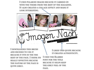
Top of double page spread.
- 1. I used polaroid images because it carried on with the theme from the rest of the magazine. It also created a collage effect and made it look interesting. I downloaded this brush and decided to use it because it fits in the the rest of the page. I think its really effective because the nature of the page is quite girly. I liked this quote because it creates authenticity. I used the Elabris font for the title because it helps keep the girly feel of the page.