Here is two magazine deconstructions on different music magazines explaining the codes and conventions as well as what the magazine is trying to tell and show us as the audience so we by their magazine.
The document analyzes the cover designs of several music magazines, noting elements like the masthead, cover image, headlines, and lists of artists. For Rolling Stone, the large Amy Winehouse cover image dominates but still allows recognition of the masthead brand. Kerrang uses a jagged font to identify the masthead and features an intense image of Biffy Clyro. Q breaks conventions with its masthead placement and features a revealing Lady Gaga image. Vibe uses a simple yet stylish masthead and monochrome close-up of T.I. NME draws attention to Rihanna as the cover star through prominent pink font and her leaning pose. Common elements across magazines are also examined.
This document analyzes and summarizes several music magazine covers. It discusses elements like fonts, colors, images, and text used on the covers and what they convey about the magazines' target audiences and content. Specific magazines summarized include ones focused on rap music, R&B, classical music, and country music. Key details like intended gender of audiences and topics covered are identified for each magazine cover analyzed.
How my magazine appeals to the target audienceJoshd96
The document discusses how the magazine's design appeals to its target rock music audience. Key design elements discussed include using aggressive colors like red, black and grey on the cover and throughout for their rock connotations. Fonts and images are also chosen to be bold and eye-catching as is typical for rock magazines. The content focuses on rock news, bands and articles written in an informal tone to appeal to younger readers. Overall, the document emphasizes using conventional rock magazine design tropes to attract the target audience.
The document discusses the design elements of the masthead and cover of a magazine. The masthead is lime green and bold with the name "source" to identify the established brand. The consistent logo creates safety for readers by assuring them of the quality content. The main colors are lime green and black for contrast, tying into the story on Kendrick Lamar. The strapline "the good, the bad, and the ugly" suggests the magazine covers diverse topics to attract a large fan base. Smaller stories follow the color scheme while emphasizing the most important story in the largest, boldest font to easily identify the magazine.
This magazine cover features Ciara holding a camera against a pink background. Her zebra print outfit stands out and matches the text lines. The mix of colors, youthful language, and focus on Ciara's image suggest the magazine targets both male and female young readers interested in R&B music.
The document provides details about the design and layout of magazine covers and contents pages. It analyzes visual elements like fonts, colors, images and text to understand how they are used to attract readers and convey information. Specific magazines discussed include music magazines Q and Top of the Pops, as well as a magazine targeted towards preteens. Design choices are explained as aiming to entice fans, showcase artists, and appeal to different audiences like males and females of various ages.
How does my magazine appeal to the target audience? amydedman1
The document discusses the design choices for a magazine targeted towards teenage audiences. It notes that a sans serif font was used for the masthead to give an informal, young, and exciting feel. The color scheme of red, white, and black was chosen to appear masculine and eye-catching. Photographs of fashionably dressed teenage girls and lists of popular bands are used to appeal to the target audience's interests in fashion and music. Consistent colors and fonts maintain the magazine's style across pages.
This summarizes the front cover of a pop magazine. It follows conventions like having a masthead, main celebrity image relating to the main sell line, and uses pink/purple colors. The masthead is in a unique speech bubble font placed in the top left corner for visibility. The main image is singer Ariana Grande, wearing a pink dress and addressing the reader with a smile. Quotes from her interview come out of her mouth. The layout uses feminine colors and images of celebrities to appeal to its target audience of young girls. It maintains a similar style across issues to reinforce the brand identity.
The document analyzes and makes inferences about the intended audience of a magazine based on visual elements of its cover and contents page. Some of the key points made are:
- The minimalist and classical style suggests an audience that is older, more educated and higher income.
- Bold colors and images are used to draw attention and emphasize important people and content.
- Busy layouts imply more content while simplistic styles suggest a focus on quality over quantity.
- Dark themes and intimidating images may attract an audience interested in edgier music genres.
- Placement and size of mastheads, images and text provide clues about the hierarchy of importance.
The document provides details about the magazine "Vinyl" that was created as a media product. It summarizes the ways in which Vinyl uses and develops conventions of real media products, such as using fonts, colors, and layouts similar to other magazines. It also discusses how Vinyl represents its target audience of teenage girls interested in indie music and fashion. Technologies used in creating Vinyl included Photoshop, fonts, and research on other magazines online. The creator learned important skills in using layers, editing photos, and creating a more polished final product compared to their initial plans.
This document discusses the styles and conventions used in magazine front covers. It notes that Vogue magazine covers vary in style from minimal designs with few cover lines to brighter more colorful designs. The model images are always prominently featured and wearing trendy designer clothes. Love magazine shows imaginative and unique styling of models in supernatural outfits or accessories. Their covers have a minimalist style focusing on the themed cover image with few cover lines to draw the reader in.
This magazine cover features the singer Ciara wearing a bright pink zebra print playsuit. The pink background and Ciara's revealing outfit target both male and female readers. Ciara is holding a camera, possibly referencing her song "Click Flash," and her outfit stands out against the pink background. The cover lines promote R&B artists, signaling the type of music featured in the magazine.
The document discusses magazine cover designs for various publications including Blender, Q Magazine, Billboard, and Rolling Stone. Some common features highlighted across magazines are prominent mastheads to grab attention, use of different fonts and styles for subheadings, and placement of artists on covers to match their image. Plugs with buzzwords are used to draw readers, and bright colors like red, white, pink and green are prevalent. Research findings on successful aspects like fonts, colors and plugs will influence the design of the author's own work, which will also consider the target audience profile.
The contents page for Kanye West's "Vibe" magazine maintains the magazine's brand identity through its stylish urban design. It follows conventions like including page numbers and categorizing sections to provide a clear layout for readers. Kanye West is pictured standing confidently in a suit with a woman's arm around him, reflecting the celebrity lifestyle. Grey and black colors lend an elegant, sophisticated feel. A question about Kanye West leaves readers intrigued to learn more by reading the magazine.
Glamour magazine targets women in their 20s. It uses pink and red colors throughout that represent femininity, passion, and power to appeal to its target demographic. The front cover features an article on easy beauty tips and how to eat without gaining weight during the holidays to relate to issues important to women. It also includes a photo of Michelle Obama, seen as a role model, wearing a red dress to represent strength. The contents page continues this color scheme and features a young, stylish woman to appeal to women in their 20s seeking to look glamorous.
The contents page of a rock music magazine uses a cluttered and bold layout to attract their target audience. Large bold fonts are used for section headings to emphasize the magazine's angsty style. Images of rockers in rebellious poses provide a taste of the magazine's content without revealing too much. A short note from the informal editor builds rapport with readers by relating to the target market.
The magazine cover uses various techniques to target young female readers of the pop genre. Bright feminine colors like pink, purple and white are used throughout to attract this audience. Pictures and headlines about popular artists like Justin Bieber draw in fans. Exclamations and questions address readers directly to excite interest in articles. Sell lines about secrets, fashion bargains and fun in the summer employ emotive language to encourage purchase.
This document provides an analysis of magazine covers and pages. It examines elements like layout, color schemes, images, and text to understand how they attract readers and represent the magazine's brand. Specific covers and pages from magazines like Q, Billboard, and Vibe are deconstructed in detail. The purpose is to understand techniques used to make the content appealing and informative for the target audience.
Magazine research really official [recovered]Karis Hays
The document provides an analysis of the front covers of two magazines: Q magazine and Mixmag.
For Q magazine, the summary discusses the feature photo of Cheryl Cole looking straight at the camera to create a connection with audiences. It also notes the unusual styling of Cheryl in the photo that suggests a different side to her persona.
For Mixmag, the summary discusses the feature photo of David Guetta, noting that he would appeal to the target audience interested in dance/club music. It also comments on David Guetta's sunglasses and the bright color scheme relating to the atmosphere of clubs.
In both summaries, the key elements of the front covers are hit upon like the mastheads, dates
The document provides an analysis of the front covers of two magazines: Q magazine and Mixmag.
For Q magazine, the summary discusses the feature photo of Cheryl Cole looking straight at the camera to create a connection with audiences. It also notes the unusual styling of Cheryl in the photo that suggests a different side to her persona.
For Mixmag, the summary discusses the feature photo of David Guetta, noting that he is well-known for dance/club music and his sunglasses imply an international audience. It also mentions the colorful design appeals to those who enjoy dance/club culture.
In both summaries, the key elements of the magazine covers are hit upon in under 3 sentences to give a
Magazine research really official [recovered]eleanorwaring1
The document provides an analysis of the front covers of two magazines: Q magazine and Mixmag.
For Q magazine, the summary discusses the feature photo of Cheryl Cole looking straight at the camera to create a connection with audiences. It also notes the unusual styling of Cheryl in the photo that suggests a different side to her persona.
For Mixmag, the summary discusses the feature photo of David Guetta, noting that he would appeal to the target audience interested in dance/club music. It also comments on the bright, summery color scheme despite it being a winter issue, implying an international audience.
This document analyzes the front cover of a pop magazine. It follows conventions such as including a masthead, main celebrity image related to the headline, and placing articles strategically. The masthead uses a bright pink color and fun font to appeal to its target audience of young girls. The main image features Cheryl Cole smiling to seem positive. Sell lines use excitement and address the reader directly to encourage buying the magazine. Color, images and layout keep the brand consistent across issues while enticing readers with various article placements and styles.
This document analyzes the front cover layout of the magazine "Top of the Pops". It discusses several elements of the cover including the masthead, main image, sell lines, fonts, and layout. The masthead uses stars and bold fonts to represent the magazine's focus on pop stars. The main image of Rita Ora presents her as cool and stylish to inspire young readers. The sell lines use informal language and focus on gossip about celebrities to attract teenage girls. Overall, the cover aims to appeal to its target audience through bright colors, multiple images, and gossip about popular artists.
The document discusses the considerations, codes and conventions of digital and print magazines. It outlines pros and cons of each format, noting digital magazines are cheaper to distribute but require internet access, while print magazines are portable without internet but more expensive to produce and distribute. The purpose of fashion magazines is to advertise products through popular influencers and topics that appeal to women aged 13-50, using attractive images and feminine colors to promote the audience achieving those looks and buying featured products. Magazines effectively market to audiences made insecure by social media influencers.
This document analyzes the layout conventions of various music magazines, including Q Magazine, Musical Theatre Magazine, Top of the Pops magazine, We Love Pop magazine, and Musical Theatre Magazine. Key conventions identified include placement of coverlines, use of primary and secondary images, section names, fonts, and color schemes. The document also analyzes sample double page spreads from Top of the Pops and Musical Theatre Magazine to identify their adherence to magazine layout conventions like headline placement, use of columns, and inclusion of a block quote.
Here are 3 potential sources that could be cited in the bibliography:
1. Anon. (Date). Magazine Title - Issue Details. Publisher Website URL. Date Accessed.
This format was used for sources 1 and 2, which provided digital copies of magazine covers and issues.
2. Models.com. (Date). Magazine Title Details. Model Website URL. Date Accessed.
This format matches source 3, which showed a magazine cover on a modeling website.
3. Anon. (Date). Magazine Article Title and Details. Car Manufacturer or Related Website URL. Date Accessed.
This format matches source 4, which discussed a specific magazine article about a car found on a car
The document analyzes the design elements of magazine covers for different music magazines, summarizing how each element appeals to the target audience. For the Mixmag cover: The masthead, color scheme, and images are designed to target young adults interested in dance music and clubbing. The main image of DJ David Guetta presents him as cool and laid back to appeal to readers. For Kerrang magazine: The masthead, black color, and broken glass motif represent genres like punk and appeal to fans of rebellious music. The Black Veil Brides cover focuses on their threatening frontman to intrigue heavy metal fans. Design elements across the magazines aim to connect with readers through shared interests in music and lifestyle.
This document analyzes the front cover of 'The Fly' magazine. It follows typical magazine layout conventions, with the main artist Jessie Ware taking up the entire frame. The masthead is the largest text as on other issues. Unlike other magazines, it does not include a skyline. The artist's name is displayed in both landscape and portrait orientations, making it unique compared to other issues that only use landscape. The color scheme of black, blue and rose gives it an edgy yet soft look reflecting the indie rock genre. The front cover effectively showcases Jessie Ware and other artist names to draw in the target audience and make them want to read more inside.
- The magazine cover features singer Liam Gallagher posing alone in sunglasses, symbolizing he has a secret and personal view to share with readers about his former band Oasis splitting up.
- The cover uses bold fonts and colors to draw attention to Liam Gallagher's name and quotes from him criticizing his brother and former bandmate Noel Gallagher.
- The cover is designed to intrigue readers and capitalize on gossip and drama around the breakup of the famous band Oasis.
The document provides an analysis of the covers of several magazines, including Q Magazine, Billboard, Vibe, and Rolling Stone. Some key points summarized:
1) The Q Magazine cover features British musician Liam Gallagher and uses bold colors and fonts to draw attention to interviews and stories about Gallagher and his former band Oasis.
2) The Billboard cover focuses on Katy Perry, with her image overlapping the masthead to emphasize her prominence. It uses floral imagery and fonts to portray Perry as feminine but still edgy.
3) The Vibe cover features Alicia Keys in a dark, cool aesthetic that aims to appeal to younger audiences. It promotes Keys' first interview in the magazine.
4
The document discusses the cover of a magazine featuring Katy Perry. It notes that Katy Perry is the iconic sign of the magazine as she is the only person featured prominently on the cover. It describes how her confident and sensual pose represents the magazine. It also discusses some of the cover lines that promote other articles in the magazine and how they relate to Katy Perry's image and popularity.
The document provides an analysis of the cover design elements of several magazines, including their use of images, fonts, colors and layouts to attract readers. For a Rolling Stone magazine cover featuring Lana Del Rey, it notes the vintage black and white photo contrasts modern and 1960s generations. The large eye-catching masthead and sell lines about exclusive stories aim to increase sales. A Q magazine cover uses a close-up image of Adele looking directly at the reader to convey her confident personality. Bold colors and text emphasize the magazine's brand identity. A Vibe magazine cover pictures Alicia Keys looking rebelliously at the camera against a dark background to intrigue readers about her rule-breaking nature.
This document summarizes a magazine article about country music artist Trace Adkins. The main image takes up a full page and shows Adkins wearing a cowboy hat, a symbol of country music. At the top it says "fan exclusive," appealing to readers by making them feel special. Throughout the article there is a consistent green and white color scheme reflecting the calming nature of country music. The masthead font is blurred and words faded, suggesting Adkins' long career while the white text represents the purity and future of his music.
The main image on the contents page is of singer Amy Heidermann rather than the cover artist Adele, breaking conventions. Heidermann is portrayed as mysterious and talented to attract readers to learn more about her career. Additional sections like "National Affairs" and diverse artists discussed appeal to both music and older audiences. Larger fonts, cover lines, and descriptions guide readers to the most interesting sections. Credits and clothing brand names at the bottom provide subtle advertisements.
The document analyzes the front covers of several music magazines. It discusses the images, colors, text and layout featured on the covers and how they are used to target audiences and convey information about the artists and stories featured in the magazines. Key details like the size and placement of images and text are examined and what they imply about the focus of the magazines and how they position the artists.
This document analyzes the design conventions used in a student-created R&B magazine.
The front cover uses a central image of an artist looking at the camera to engage the viewer. Stereotypical R&B elements like headphones, piercings and jewelry are included. Red, black and white colors are used consistently throughout to brand the magazine.
The contents page diverges from conventions by omitting "contents" and using a feature page format and image. Page numbers are in black with descriptions in red to draw the eye.
A double-page spread uses a large side profile image of an artist to invite readers into her perspective. Quotes from her discuss deeper lyrics and her desire to
This document summarizes the design elements of the cover of a Q magazine edition dedicated to Amy Winehouse. The target audience is fans of Amy Winehouse aged 25 and over. The main image on the cover follows the rule of thirds, positioning Amy Winehouse to allow space for text. The lead article promises new revelations about Amy Winehouse that have never been seen before. Consistent colors, typefaces, and layout are used across issues to create a recognizable house style for Q magazine. Banners and flashes are employed to attract audiences with promises of exclusive content and rare photos related to famous musicians.
This document summarizes the key elements and design features of the front covers of two music magazines - Q magazine and NME magazine. For Q magazine, the cover features Cheryl Cole in a seductive pose to attract male readers. It promotes new music acts and reviews to draw in new customers. The color scheme, layout, and use of names of famous artists are meant to appeal to a broad audience. For NME magazine, the cover features controversial artist Liam Gallagher to gain attention. His photo is in black and white while surrounding text is in red. It also lists other indie/rock bands to appeal to different ages of fans. Both magazines use their iconic mastheads and prominent text to maintain their brand identities.
The magazine cover features Tyler, The Creator dressed in women's clothing holding flowers, alluding to the magazine's focus on rebellion against traditional norms. The price of £2.40 suggests the magazine targets working and middle class youth. Bold red and black colors and rebellious language portray an anti-authority stance aimed at 15-25 year olds. Images of rock bands and articles on music and the music business indicate the magazine covers rock music and associated topics for fans across genres.
This magazine cover features the singer Ciara wearing a zebra print playsuit against a pink background. The bright colors and revealing outfit target both male and female readers. Ciara is making direct eye contact with the camera to engage readers. The cover lines promote popular R&B artists, indicating the target audience enjoys this music genre.
This classical music magazine cover features an animated blue silhouette of a man playing the violin. The cover promotes exclusive interviews and extracts to attract readers. References to the BBC and being the "world's best-selling classical magazine" signal the target audience enjoys and follows classical music.
This magazine features singer Usher dominating the cover while making eye contact with readers. His outfit and accessories convey
This double page spread features an interview with artist Lily Allen. A large photo of Allen dominates one page, showing her in casual clothing reflecting her indie music style. The title of the interview takes up most of the other page in an unusual font, perhaps representing the strange topics discussed. The subtitle further describes the unconventional nature of the article. Overall, the layout draws readers in with the photo of Allen and intriguing title and subtitle of the unconventional interview.
This double page spread features an interview with artist Lily Allen. A large photo of Allen dominates one page, showing her in casual clothing relating to indie music. The title of the article, a quote from the interview, spans both pages in an uneven font possibly representing the article's unusual topics. The center fold has been limited by having just the title and photo overlap slightly.
The document analyzes several music magazine covers and contents pages. Some key points:
- Color schemes, font styles, and image placement are used consistently across covers and interior pages to maintain a coherent style.
- Main artists/features are highlighted through larger images and fonts to draw reader attention.
- Contents pages list key articles and use formatting like bolding to make sections stand out.
- Double page spreads maximize the main image size and use columns, fonts, and colors to lay out text in a clear, visually appealing manner. Quotes and headers entice readers into articles.
The document provides an analysis of the layout and design elements of magazine spreads featuring hip hop artists. Key points analyzed include:
- The use of bold fonts, colors, positioning and sizing of images and text to draw attention to important details and guide the reader through the content.
- Symbolic meanings and messages conveyed through artistic choices such as costumes, poses, colors and styles that relate to the themes and subjects featured.
- Formats and styles used that are tailored for younger audiences to make the content easy to read and engaging.
- Branding and identifying elements included to clearly indicate the publication and topic of coverage.
The document provides an analysis of the layout, design and visual elements of magazine spreads featuring hip hop artists. Key points analyzed include:
- The use of logos, cover lines and mastheads to identify the magazine brand and focus each article on a particular artist
- Visual elements like bold text, formatting and color schemes that guide the reader through the content and make it engaging
- Stylistic choices in images of the artists that reflect themes in the articles and attract reader attention through poses, costumes and use of color/lighting.
- Division of text into clearly numbered and labeled columns and sections to make dense information accessible for younger audiences.
This front cover of Vibe magazine features R&B singer Ciara posing nude. The target audience of Vibe is between 18-34 years old and interested in urban music, culture and lifestyle. Ciara's revealing image and quote that she "won't hold back too much" intrigues the audience. Inside, a double page spread further reveals Ciara standing while nude, reflecting the cover line "Stand Up! Ciara". She discusses her new music and time away in an intimate interview layout against a light background, keeping the focus on her words.
This front cover of Vibe magazine features R&B singer Ciara posing nude. The target audience of Vibe is between 18-34 years old and interested in urban music, culture and lifestyle. Ciara's revealing image and quote that she "won't hold back too much" intrigues the audience. Inside, a double page spread further reveals Ciara standing nude while discussing her career and new music ventures, maintaining the sophisticated tone of the issue focusing on Ciara.
Codes and conventions are used in media to convey meaning symbolically or technically. Symbolic codes show settings and genres, while technical codes use equipment and techniques. Conventions are normal practices that provide context within genres. Camera movements like tilting, panning, and zooming shape shots, while mise-en-scene elements like costumes, lighting, and locations add realism. Effective editing is needed to smoothly integrate shots with music.
Roland Barthes was a semiologist who analyzed how texts can have multiple meanings and narratives. He viewed a text as a "galaxy of signifiers" or a ball of threads with many narrative strands that could be pulled on in different ways to derive different interpretations. In his book Mythologies, Barthes examined how meanings are constructed in everyday objects, showing that meanings are not fixed but are shaped by social conventions.
The document discusses audience feedback received by Charlie Norris. It appears to be a short article or report focused on reactions and responses from people who experienced or interacted with some aspect of Charlie Norris' work. In just a few sentences, the document aims to convey the overall sentiment and key takeaways from audience members.
Roland Barthes concluded that a text can have multiple meanings and interpretations, like a galaxy of signifiers that can be unravelled in many ways. A text is like a ball of threads with different narrative threads that can be pulled. Barthes identified different narrative codes used in texts, the most common being action codes which help audiences understand what will happen, and enigma codes which create tension by presenting a mystery like "who committed the murder" that drives the narrative and satisfies audiences.
The document discusses various codes, conventions, and techniques used in media production. It describes symbolic and technical codes that convey meaning, and genre-specific conventions. It also outlines different camera movements like tilting, panning, and zooming. Mise-en-scene elements like hair, makeup, location, and lighting are discussed as important for creating realism and sophistication. Proper editing is also described as key to making media look professional by smoothly integrating shots with music or other elements.
The document compares the student's preliminary and final fronts covers and contents pages for an indie-pop music magazine project. For the front cover, the student learned to properly lay out the magazine, use the right color shading, employ good camera angles and lighting to make the models look like a realistic band. For the contents page, the student learned to improve the brightness of background images, develop better camera skills, maintain color scheme consistency and include more content about the magazine's featured artists. Overall, the student feels they have come a long way and improved dramatically by taking on challenges they didn't think were possible, such as using photo editing software. Feedback from peers confirmed how much better the final magazine looked compared to the preliminary version.
The simplified electron and muon model, Oscillating Spacetime: The Foundation...RitikBhardwaj56
Discover the Simplified Electron and Muon Model: A New Wave-Based Approach to Understanding Particles delves into a groundbreaking theory that presents electrons and muons as rotating soliton waves within oscillating spacetime. Geared towards students, researchers, and science buffs, this book breaks down complex ideas into simple explanations. It covers topics such as electron waves, temporal dynamics, and the implications of this model on particle physics. With clear illustrations and easy-to-follow explanations, readers will gain a new outlook on the universe's fundamental nature.
Introduction to AI for Nonprofits with Tapp NetworkTechSoup
Dive into the world of AI! Experts Jon Hill and Tareq Monaur will guide you through AI's role in enhancing nonprofit websites and basic marketing strategies, making it easy to understand and apply.
This presentation was provided by Steph Pollock of The American Psychological Association’s Journals Program, and Damita Snow, of The American Society of Civil Engineers (ASCE), for the initial session of NISO's 2024 Training Series "DEIA in the Scholarly Landscape." Session One: 'Setting Expectations: a DEIA Primer,' was held June 6, 2024.
A Strategic Approach: GenAI in EducationPeter Windle
Artificial Intelligence (AI) technologies such as Generative AI, Image Generators and Large Language Models have had a dramatic impact on teaching, learning and assessment over the past 18 months. The most immediate threat AI posed was to Academic Integrity with Higher Education Institutes (HEIs) focusing their efforts on combating the use of GenAI in assessment. Guidelines were developed for staff and students, policies put in place too. Innovative educators have forged paths in the use of Generative AI for teaching, learning and assessments leading to pockets of transformation springing up across HEIs, often with little or no top-down guidance, support or direction.
This Gasta posits a strategic approach to integrating AI into HEIs to prepare staff, students and the curriculum for an evolving world and workplace. We will highlight the advantages of working with these technologies beyond the realm of teaching, learning and assessment by considering prompt engineering skills, industry impact, curriculum changes, and the need for staff upskilling. In contrast, not engaging strategically with Generative AI poses risks, including falling behind peers, missed opportunities and failing to ensure our graduates remain employable. The rapid evolution of AI technologies necessitates a proactive and strategic approach if we are to remain relevant.
How to Build a Module in Odoo 17 Using the Scaffold MethodCeline George
Odoo provides an option for creating a module by using a single line command. By using this command the user can make a whole structure of a module. It is very easy for a beginner to make a module. There is no need to make each file manually. This slide will show how to create a module using the scaffold method.
This presentation includes basic of PCOS their pathology and treatment and also Ayurveda correlation of PCOS and Ayurvedic line of treatment mentioned in classics.
বাংলাদেশের অর্থনৈতিক সমীক্ষা ২০২৪ [Bangladesh Economic Review 2024 Bangla.pdf] কম্পিউটার , ট্যাব ও স্মার্ট ফোন ভার্সন সহ সম্পূর্ণ বাংলা ই-বুক বা pdf বই " সুচিপত্র ...বুকমার্ক মেনু 🔖 ও হাইপার লিংক মেনু 📝👆 যুক্ত ..
আমাদের সবার জন্য খুব খুব গুরুত্বপূর্ণ একটি বই ..বিসিএস, ব্যাংক, ইউনিভার্সিটি ভর্তি ও যে কোন প্রতিযোগিতা মূলক পরীক্ষার জন্য এর খুব ইম্পরট্যান্ট একটি বিষয় ...তাছাড়া বাংলাদেশের সাম্প্রতিক যে কোন ডাটা বা তথ্য এই বইতে পাবেন ...
তাই একজন নাগরিক হিসাবে এই তথ্য গুলো আপনার জানা প্রয়োজন ...।
বিসিএস ও ব্যাংক এর লিখিত পরীক্ষা ...+এছাড়া মাধ্যমিক ও উচ্চমাধ্যমিকের স্টুডেন্টদের জন্য অনেক কাজে আসবে ...
A review of the growth of the Israel Genealogy Research Association Database Collection for the last 12 months. Our collection is now passed the 3 million mark and still growing. See which archives have contributed the most. See the different types of records we have, and which years have had records added. You can also see what we have for the future.
This slide is special for master students (MIBS & MIFB) in UUM. Also useful for readers who are interested in the topic of contemporary Islamic banking.
How to Fix the Import Error in the Odoo 17Celine George
An import error occurs when a program fails to import a module or library, disrupting its execution. In languages like Python, this issue arises when the specified module cannot be found or accessed, hindering the program's functionality. Resolving import errors is crucial for maintaining smooth software operation and uninterrupted development processes.
Thinking of getting a dog? Be aware that breeds like Pit Bulls, Rottweilers, and German Shepherds can be loyal and dangerous. Proper training and socialization are crucial to preventing aggressive behaviors. Ensure safety by understanding their needs and always supervising interactions. Stay safe, and enjoy your furry friends!
Physiology and chemistry of skin and pigmentation, hairs, scalp, lips and nail, Cleansing cream, Lotions, Face powders, Face packs, Lipsticks, Bath products, soaps and baby product,
Preparation and standardization of the following : Tonic, Bleaches, Dentifrices and Mouth washes & Tooth Pastes, Cosmetics for Nails.
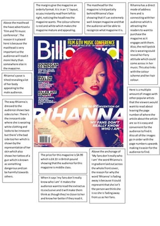
1. Whenit says‘my fansdon’treally
knowwhoI am’ it makesthe
audience wanttoread the extractas
itsexclusive anditwill make them
thinkas thoughthey’re closertoher
and knowherbetterif theyreadit.
Rihannahas a direct
mode of address
here and is
connectingwithher
audience whichis
attractingthe
readersto wantto
purchase the
magazine asit
engageswiththem.
Also,the redlipstick
she iswearingcould
reveal herfiery
attitude whichcould
come across in her
music.Thisalsolinks
withthe colour
scheme andher hair
colour.
Rhianna’spose is
tiltedrevealingalot
of herbody
appealingtothe
male audience.
The way Rhiannais
dressedtothe
audience showstwo
sidestoher.There’s
the innocentside
where she iswearing
white clothingand
looksto be innocent
but there’sthe bad
side tooher whichis
shownbythe
representationof her
skinwhichalso
showshertattoo of a
gun whichisknown
as something
dangerousandcan
be harmful towards
others.
The mastheadfor the
magazine ishidpartially
behindRhianna’sface
showingthatit’san extremely
well-knownmagazine andthat
the audience will be able to
recognize whatmagazine itis.
The marginsgive the magazine an
orderlyformat.Itis inan ‘L’ layout,
so youinstantlyreadfromleftto
right,noticingthe headlinesthe
magazine wants.The colourscheme
isred and white whichmakesthe
magazine mature andappealing.
Above the masthead
the have advertiseda
‘filmandTV music
conference’.The
reasonit isplaced
here isbecause the
mastheadisvery
importantsothe
audience will readit
more likelythan
somewhere else in
the magazine.
The price for thismagazine is$4.99
whichis£4.33 inBritishpound
showingthatthe audience forthis
magazine ismiddle class.
Above the anchorage of
‘My fansdon’treallywho
I am’ the wordRhiannais
ingradientlaidoutacross
the whole frontcover,
the reasonfor whythe
word‘Rhianna’isfading
away isbecause itcould
representthatshe isn’t
the personwe thinkshe
isso she is fadingaway
fromus as her fans.
Here is a multiple
amountof imageswith
otherpopularartists
that the viewerswould
wantto read about
leavingthe page
numberof where the
article aboutthe artists
are so itis easyand
convenientforthe
audience tofindit.
Alsoall of the images
go inorder withthe
page numbersupwards
makingiteasierforthe
audience tofind.
2. The layoutof the contents
page is goodbecause
everythinghasbeensplit
up intosectionsmakingit
easyto readand
understandwhere
everythingisinthe
magazine.
The colour layoutisvery
sophisticatedandprofessional all
the colourssuittogetherwell and
create a goodcolourscheme
throughoutthe page.
None of the artists
are actually
performedandnone
of theirnamescome
up showingthat
they’re well-known
musicians.All of this
artistsare also
wearingblack,thisis
to linktothe
‘contents’masthead
and blacktext
showingthatthey’re
the most spoken
aboutmusicianin
the magazine.
All of the fontson the left
handside of the page
aren’tverybigand exciting
to try and catch the
audience’s eye andmake
themwantto read the text.
But because it’sa well-
knownmagazine we get
fromthisthat theyspend
more time intocreating
theirmagazinesbyfinding
goodmusicand other
subjectsrelatedtomusicto
talkabout insteadof
makingthe whole magazine
lookgood.
The mastheadisin a bigblack text
suitedtothe house style forthe
contentsbutis ina differentfontto
show that itisn’ton subjectwith
whatthe magazine istellingthe
audience aboutthe latestmusic
gossipandhits.
There’sa varietyof differentcolours
usedinthiscontentspage to helpsplit
up all of the differentsectionsandtopics.
Thisis to make iteasierforthe audience
to readthrough the magazine about
differentpartswhichthey’ll preferto
othersmakingiteasiertoread throughif
it isall colourcoded.
The female artistinthe middle of the contents
page isn’tlookingdirectlyintothe camerafor
the contentspage unlike the otherartistsin
thiscontentspage.Thismakesherstandout
to themand because she isinthe middle of
the contentspage and biggerthanthem
showingthatshe isthe biggesttalkedabout
artistin the contentspage.
3. The headingis‘Amysink house’linkto Amy
Winehouse herself.Thisisbecause AmyWinehouse
has tattoosherself sothe double page spreadlinks
to hershowingthattattoos are somethingthatshe
ispassionate aboutandhas a great interestandare
part of herlife.Theyhave alsolinked ‘ink’intobeing
AmyWinehouse’sname bycallingher ‘AmyInk
House’ insteadof ‘AmyWinehouse’ showingthatit
ispart of her.
The layoutand textinthe double
page spreadis verysmall.Thiscould
show that the mainfocusto this
double page spreadbeingAmy
Winehouse herself andwhatshe is
doinginthe image rather thanthe
textand whatit’ssaying.
The main focusto thisdouble page spreadisAmy
Winehouse andwhatshe isactuallydoing.Inthisit
showsthe image inblackand white withherinbed,as
the image istakenit makesusfeel asthoughshe
doesn’tknow thatthe photoof heris beingtaken,this
makesus feel asthoughit’sherbeingherselfbecause
she isshowinga lotof skinina bra and shortswithher
legsopenina comfortable positionshowingthatthis
double page spreadwascreatedfora male target
audience tolookat.The blackand white showsusthat
there’sadark side as well asa lightside toAmy
Winehouse andthatshe onlyshowsone of themas we
can tell.
The target audience
isfor youngadults
and olderteenagers
whoare thinking
abouthaving
tattoosor have
themand alsoshow
an equal interestto
themwiththe
majorityof them
beinginterestedin
popmusic.
The article inthis double page spread
talksaboutAmy Winehouse andhow
she has a tattoo parlour.Nearthe
bottomof the article itsays ‘The smile
of gleamsfromAmy’showingthatshe
isproud of what she has createdandis
proudto showit off to the
photographersandpublic.Whenshe
says‘sorry I’mlate’and she isonlyfour
minuteslate itshowshowanxiousand
desperate Amywasintoshowingthis
all off to everyone andhowmuchshe
didn’twantto missit.
4. There isalso some gutterspace inthisfront
coverbut not a massive amount
In thisshotof Adele she’s
makingdirectmode of
addresswiththe audience
inthe shotthat istakenof
her.Thisis so she is
makingcontact withusas
below she says‘If you’ve
got it,flauntit…’so she is
talkingtothe audience
and givingdirectmode of
addressmakesthemfeel
like she istalkingtothem
personallymore thanif
she wasn’t.
The mastheadfor this frontcoveris
’Q’ andas you can see the main
image doesn’toverlapitverymuch
as it standsout a lotwiththe strong
redbackgroundbehindthe white
textmakingiteasyfor people to
readand understand.Thisissothe
audience caneasyreadand see
whatmagazine itis.
Adele’shairispushedbackwardsfromwhatit
lookslike afanwhichyou can’t see.Thisis
because of the angle she is standingat because
else herhairwouldcoverherface,the reasonshe
isat thisangle isso she can hide herbodyas she is
doingwithherhair at the lowerareaof the image
of hershowingthat she istryingto hide
something.
Where issays ‘THE
300th
ISSUE’it’strying
to catch the
audience’sattention.
It has the background
aroundthe textin
goldand the font
colouris white
makingitstand out
as well lookinglike its
goldand silverwhich
are seentobeen
winningcolourlikean
achievementforthe
businesstohave
made it’sthe 300th
issue sotheywant
more people tobuy
the issue sotheyfeel
like they’re partof
the winningteamas
well.
In thisfrontcoverthere is
a little bitof gutterspace
behindthe topof Adele’s
headand to the left of the
lowerside of the front
cover.Thisshowsthat it’s
a well-knownmagazine
and theymaybe spending
more time intofindinggo
thingsto write aboutand
goodartists to putinto
the magazine as they
know people won’tbuy
theirmagazine through
the front coveras much as
of what’sinthe magazine
as itswell-known.
The headline says‘Adele’inbold,thisshowsthe readersthatthe
mainsubjectof thisissue isAdele.The fontsuggeststhat‘Q’is
more focusedonthe musicrather than the musiciansand
celebritiesandthathervoice isso amazingitdoesn’tneedany
snazzyfontsto showhowgood itreallyisto listento.
The barcode and
price are at the
bottomleftof the
frontcover.This is
£3.99 beingaimedat
middle classwho
wouldbe able to
affordthe issue.
5. The colour scheme tothe
contentspage isveryconsistent
and professional stickingtothe
maincolourscheme to ‘Q’being
red,white andblack.It isa very
simple contentspage though
showingthatthey’re thinking
more about the musicthey’re
talkingaboutandshowingus
that how the magazine islaid
out.
The extreme close-upof the
female soloartistsshowsthe
readersthat she islooking
straightintothe camera and
staringrightintothem.It also
showsthat she ishurt which
couldshow herpassionfor
music,show that she’shurtso
she may have some sortof
dangerlinkedtoher.Thisisto
try and make the readersbuy
the magazine as itcould
representalotof different
thingswhichmakesthemwant
to findout.
The layoutis veryeasyto read
structuredand orderedvery
well soyoucan findwhatyou
wantto read abouteasilyandif
it takesyourinterestinthe
typesof musicand artists they
talkabout inthe music
magazine.Thismakespeople
wantto buy the magazine asit
isveryconvenientandeasyto
readthe musicmagazine.
A lotof wordsusedare informal andsometimes
rude,the reasonfor thisisbecause the magazine is
aimedat an oldertargetaudience whichmakes
themfeel more comfortable andenjoythe music
magazine more if itis puttingwordsintocontextto
whattheywouldspeaklike andnotlike how you
shouldtalkto andin frontof childrenandteenagers.
Plug‘140 songsto
downloadnow’
interestsand attracts
the audience because it
soundsas thoughthere
isno cost to
downloadingthem
whichwill make people
buythe magazine if
there isseveral songs
theylike andtheythink
they’re downloadingfor
free evenif theycan’t.It
isalso quite alot of
musicwhichwill catch
theirattentioninto
buyingthe magazine.
The tagline ‘discovergreatmusic’
makesthe audience wanttoread
more and findnew greatsongs
and albumstheywill enjoy.
The sub-heading-
‘features’grabsthe
audience’sattention
because it’ssaying that
everythingthere isa
one-time affecttothe
magazine whichwill
make the audience buy
that specificmagazine if
there’ssomethingin
there thoughwon’tbe
able to readabout again
for a longtime if no
ever.
6. The main image inthisdouble page spreadisthe four
mengivingdirectmode of addressstaringintothe
camera make contact withthe readersbutnone of
themare posingtellingusasthe readersthatthey
don’tneedtopose to the camera to showtheirpassion
and enthusiasmtowardsmusic.Twoof the menare
holdingguitarstellingusthatthey’re talented
musicians.
As the man at the frontis a lotclose to the
camera comparedto the other3 musiciansthis
tellsusthat he isthe leaderof the bandas the
otherthree are a lotclosertogetherbutbehind
him.
The layoutfor the colourscheme inthisdouble page
spreadisblue,blackandgritty tone beingveryeasyto
readand basic butthe blue alsocatches the reader’seye
drawingthemto the importantpartsof the double page
spreadthat theyshouldmaybe readandtake care into
readingandlookingat.
The headingis‘The Vaccines’whichismade tocatch
the readerseye byit beinginblack,boldandcapital
letterssothe readersare made of the band’sname as it
up and comingsotheywant to increase the audience
and fansfor thisband.The main image makesusknow
that that’sthe band’sname as we have neverheardof
the band vaccinesandhaven’tseenwhattheylooking
like immediatelygivingusthe impressionthatthatis
the four menband’sname.
The main image inthisdouble page spreadof the four
menisthe mainattractionof the double page spread.
Thisis shownastheytake up2/ 3 of the double page
spreadand the textisin a verysmall fontshowingthat
it’sthe image of themthat is more importantthanthe
textintryingto get themto create more fansand
supportfor the musicthey’re creatingandreleasingfor
people tolistento.