Exploring Middle Page Spreads


       Sophie Hudson
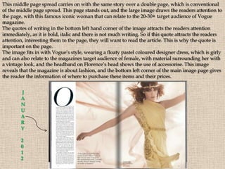
This middle page spread carries on with the same story over a double page, which is conventional
of the middle page spread. This page stands out, and the large image draws the readers attention to
the page, with this famous iconic woman that can relate to the 20-30+ target audience of Vogue
magazine.
The quotes of writing in the bottom left hand corner of the image attracts the readers attention
immediately, as it is bold, italic and there is not much writing. So if this quote attracts the readers
attention, interesting them to the page, they will want to read the article. This is why the quote is
important on the page.
The image fits in with Vogue’s style, wearing a floaty pastel coloured designer dress, which is girly
and can also relate to the magazines target audience of female, with material surrounding her with
a vintage look, and the headband on Florence’s head shows the use of accessorise. This image
reveals that the magazine is about fashion, and the bottom left corner of the main image page gives
the reader the information of where to purchase these items and their prices.


        J
        A
        N
        U
        A
        R
        Y

        2
        0
        1
        2
This middle page spread has become more popular, continuing the same topic
over the double page, but not continuing the same image or text across the pages.
These pages will attract the reader, as they will first see the page on the left, with
the larger images catching the attention of the reader, making them want to find
out where to buy the items, and what other items similar to these are available.
The white background creates a minimalistic effect, ensuring the main focus of the
pages are the images and text. However the thick, orange border makes the
atmosphere of the page look neat.
The black capital lettered text ‘STYLE’, informs the audience about the page
subject, and keeps the audience updated about the items.
It is common for a contents page to show an
image of the main model image that has
previously been shown on the front cover
on the magazine, similar to this one. This
gives the reader an idea of the main
article/story of the magazine. In this
contents page the main model image is
wearing a red dress, which could suggest
lust, love or danger, with a lot of accessorise
including big necklaces, a wrist cuff and
belt; these accessories create a busy
atmosphere on the models outfit making
the outfit look exciting and more
interesting, rather than simple, minimal
accessorise with a plain outfit. The model
has part other leg showing which is quite
provocative, although this dress is not
particularly revealing, then her left arm is
holding the dress on her thigh while the
right arm is on her hips. This could suggest
power and strength, relating to the gesture
code of the models head, which is slightly
tilted upwards, revealing her high status
and confidence. The model does not appear
to be showing any facial expressions,
almost making me as the reader result to
thinking of aggression.
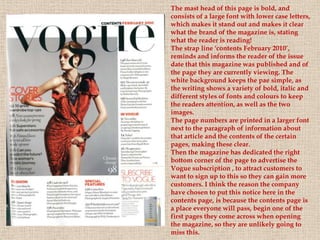
The mast head of this page is bold, and
consists of a large font with lower case letters,
which makes it stand out and makes it clear
what the brand of the magazine is, stating
what the reader is reading!
The strap line ‘contents February 2010’,
reminds and informs the reader of the issue
date that this magazine was published and of
the page they are currently viewing. The
white background keeps the pae simple, as
the writing shows a variety of bold, italic and
different styles of fonts and colours to keep
the readers attention, as well as the two
images.
The page numbers are printed in a larger font
next to the paragraph of information about
that article and the contents of the certain
pages, making these clear.
Then the magazine has dedicated the right
bottom corner of the page to advertise the
Vogue subscription , to attract customers to
want to sign up to this so they can gain more
customers. I think the reason the company
have chosen to put this notice here in the
contents page, is because the contents page is
a place everyone will pass, begin one of the
first pages they come across when opening
the magazine, so they are unlikely going to
miss this.
Masthead- Large, curvy, bold white letters, with
                                     grammatically correct placed capital letters, placed in
                                     front of a burgundy background, making the letters
                                     stand out and engage the audience into picking up the
                                     magazine and take interest in browsing its content.


                                       Cover lines- These are spread out, so they are clearer to
                                       notice, and do not look muddled or mixed up. This
                                       layout of the cover lines makes them easier to read, and
                                       will make the reader want to read them because they are
                                       short, just giving the main information needed to
                                       persuade the reader to look inside. The bold burgundy
                                       capital letters give variety from the black and pink bold
                                       capitals, making the page look more appealing to its
                                       audience. The larger font of the ‘28’ draws the reader in,
                                       making them want to read that cover line, then being
                                       fascinated by this information, they will want to read
                                       others below this one.
Main cover line- ‘The Style Secrets Issue’, is printed in a larger font than the cover lines, so
the reader will spot this one first and be informed of the main topic of the magazine. This
includes white, black and pink colours, which all contrasts against the background model
image of Katy Perry’s clothing colours. It is feminine colours, with the pink, so he target
audience is obvious and looks interesting.
Model image- Katy Perry is a well known, famous singer who can relate to
many people, including the audience of this ‘InStyle’ magazine. Her gesture
codes include her right elbow resting in the dip of her waist with her hand
naturally closed, suggesting sophistication and dominance, as f she is daring
the reader to purchase the magazine. Her left hand is resting on her left hip
which shows confidence and could be used to show that she is flaunting
herself to the cameras. She seems to be slightly sitting on her right hip which
could imply that she is relaxed. She is showing a smiling facial expression,
which could connote happiness and joy, and success, while her jewelled dress,
teamed with a wide, patent waist belt, cuff bracelet, rings and nail varnish
could suggest wealth, and pride in her appearance. Her make up is natural,
although her red lipstick could connote lust, love, or even danger, and her
wavy, neat pink hair stands out, and is girly and feminine, so will make the
magazine cover stand out and catch the readers eyes, it is also smart and classy.
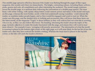
This middle page spread is effective, because if the reader was flicking through the pages of this vogue
magazine, this would catch their eye immediately. The bright, contrasting colours, including blues, yellows,
pinks, greens and reds, all compliment each other interesting the audience. The model image continues
across the double page, in a medium shot, following the conventions of a double page spread. The mast
head, with white writing, with capital, sharp letters could connote power and status of the model and topic
on this page, whereas the more bolder, swirly white font underneath saying ‘sunshine,’ could interest the
reader, as sunshine makes people happy, and so they would be engaged, and want to read on. When the
reader sees this page, and the models style of clothing and accessories, they will know that these items are
the latest trends, as the magazine ‘Vogue’ is about fashion, so they will want to find out what she is wearing,
who it is by, so they can also follow this trend. The heading, informing the reader about the topics of the
page, includes adjectives to make the reader fascinated with the page, and ensure they will want to read
more about it . For example it says, ‘swinging with punchy accessories’. The information of what the model
is wearing is placed in the bottom right corner of the right page, so it will most likely be the last bit of text the
reader sees, after they have noticed the models clothing. Whereas the head mast is placed in the top left
corner, so the title will catch the readers attention.
This cover of ELLE magazine, is an example of Janice
Winship’s theory, as she said models on the covers of
magazines are nearly always blonde, white, young, fresh
faced and blue eyed, and Dakota Fanning is all of these
features. Her dress codes include a pale pink blouse, with
a white button at the top and white, cotton, cut out collar,
which could suggest femininity, purity and immaturity,
showing that she is young. However, her red lips and nail
varnish go against this, as they would connote danger or
love, showing a more provocative image. This provocative
image could also be mentioned by the gesture codes of
Dakota Fanning, as her right hand and fingers are almost
resting on her lips, while her lips are not fully closed,
suggesting a flirtatious image. Her blonde hair is also
styled, being curly, but it is not neatly groomed, but
instead it looks natural but tamed. Along with her red
lips, her blue eyes also stand out in this image, and would
be the first feature the audience spot, as they are so bright.
Her direct eye contact could reveal the confidence of this
woman, however the fact she is staring straight on to the
camera in this close up image, implies that she is of no
higher or lower status than the reader. The target audience
is around the ages of 18-49 years old, and Elle magazine is
a best seller, being more popular than Vogue! So the head
mast shows a pale pink, fine lined, unfilled, capital letters
to inform the reader of the magazine title, but instead of
using the name to attract the audience, the producers have
used the model image to catch their attention. The date
line is placed just underneath the title on the right side of
the page, in black writing, so this will stand out to ensure
the reader knows the issue of the magazine and price. The
main sell line is almost hidden, being in front of the
white collar of Dakotas top, so this will not be the first
text the audience view.
ELLE CONTENTS PAGE
This contents page looks effective because it
includes a large image on the top half of the
page, so there is a balance between image and
text for the reader to view. The contents page
information is printed in bold, black writing
so it is clear to follow and read, while the red/
burgundy larger text makes the most
important topics in the magazine stand out, so
the reader can realise where the editors want
them to look. The smaller image on the left
side of the page is also interesting, as it gives
the reader information about the magazine
editor, and what she wanted to achieve with
this magazine issue. The bold, red, original
ELLE title reminds the reader of the text they
are reading, which is useful, as it shows this
page has a purpose. The first image the
audience will see is the top image, which will
then interest the reader and make them want
to read on, so by putting this image on the
contents page, the reader can pinpoint the
pages they would like to read.
GLAMOUR CONTENTS PAGE
This contents page is also effective, as the large
image of the model will give the reader an idea of
the type of magazine this is and the style it
includes. The information about the skirt, arrowed
at the side of the skirt also tells the reader the price
of it and gives them an idea that there will be more
items similar to this in the magazine. The bold title
defines the page and the April 2010 heading
informs the reader of the issue date, which is
helpful, as magazines can sometimes be in the
shops before and after the dates on the texts. This
date will also give the reader an idea of the
seasonal trends. There is also a reminder of the
magazine address to the left of the page, which
persuades the reader to visit the site, after reading
the contents page and finding out what the
magazine consists of, it makes the reader want to
research more on the page to see what else it offers.
There are pale pink headings, which are more bold
than the page numbers and information, to give the
page more of a format and guide the reader. Then
there are quotes from each page to the right of the
page number, and these are used to attract the
readers attention and leave them wondering what
the quote is about, so this will engage the reader.
Also, the white background leaves a sense of
simplicity to the page, so it is not too busy, and the
reader will be able to relax while reading this page,
which is clear and easy to read.
S
T
Y
L
E
S
    FEBRUARY 2012     AUGUST 2011       DECEMBER 2009     MAY 2008           MAY 2005
        Vogue has a wi d e v ari e t y o f s t yl e s i n whi c h i t i s pres ented ,
      wi th s o me i s s ue s be i ng mi ni mal , i nc l ud e fe w c ov er l i nes and
O    c onc e nt rat i ng o n t he mo d e l i mage , whi l s t o thers are bri ghter,
F        mo re c o l o urful and i nc l ud e mo re i nfo rmat i on on the front
         c ov e r. Co v e r I s s ue s o f Vo gue are ne v e r pac ked wi th c ov er
    l i nes , but e qual l y s pre ad al o ng t he s i d e s o f the page. Cl othes
M       on t re nd are al ways us e d o n t he mo d e l s and are c reated by
A       many d e s i gne r name s . The c o l o ur o f t he mas t head c hanges
G     wi th eac h i s s ue, however the format of the ti tl e i s al ways the
A      s ame . The mai n s e l l l i ne i s pl ac e d at t he bo ttom of the page,
      and t he c o v e r l i ne s s urro und t he page , be i ng both on the l eft
Z
            and t he ri ght s i d e s o f t he c o v e r. The mo d el i mages are
I   phot o graphe d wi t h a v ari e t y o f d i ffe re nt s hots , whether thes e
N      are me d i um, l o ng o r c l o s e c ame ra s ho t s , t he mod el i mage i s
E       al ways the i mage the audi enc e s pot fi rs t and noti c e before
S                          anyt hi ng e l s e o n t he fro nt c o v er.
Love ma ga z ine sho ws a va r iety o f ima gina tive a nd unique idea s, dr essing their
models in super na tur a l o utfits , o r using super na tur a l a ccesso r ies, a nd dr essing
them a s their fa vo ur ite ico ns, eg Agness Deyn dr essed a s the Q ueen in the to p
left co r ner o f the slide. Lo ve’s style is minima lis ti c, so the a udience will
concentra te on the image on the fron t of the cover, whic h is usually themed.
While ther e a r e few if a ny co ver lines, giving quo tes such a s ‘FASHIO N AN D
FAME’, o r info r mi ng the a udience o f the issue, ‘Super N a tur a l’ to ca ught the
rea der s eye, giving them a n idea o f the issue’s to pics. T he ma in sell lines include
the na mes o f the mo dels, o r to pics with sma ller wr iting under nea t h this, a lso
expla ining mor e a b o ut the issue, so the r ea der kno ws wha t to ex pect. T he titles
of the magazine change also, with some of the ma ga z ines showing a sharp,
ca pita l letter ed LO VE sign spr ea ding thr o ug h the width o f the co ver pa ge,
wherea s the o ther issues do the sa me a s this with a dded deta il o f wild swir ls,
pla nt effects , whic h a r e inter es ti ng a nd effective a s they b r ing va r iety to the
ma ga z ine a nd a dd deta il to the minima l deco r a tio n o f the pa ge. T he b a ckgr o und
colo urs o f the ma ga z ine co ver s r ela te to the mo del ima ge, with the seco nd fr o m
left magazine image on this slide includin g a beige/ brown backgrou nd , adding
wa r mth to the mo dels ima ge, a nd co mplimen ti n g her ha ir co lo ur .
From my latest research while researching these covers and middle page spreads, I
have decided that I would like to create a middle page spread in the style of this page
of Vogue. It follows the conventions of a middle page spread, is eye catching to the
audience, and the image makes the reader want to read the writing on the left side
page of the double page. I think the image following through across the double page
looks effective, as it includes quotes in the corner of the image, which then shows that
the producer has thought about the layout of the page and how they can make the
reader be interested in the page and want to read on.
I have also decided that I want one image on the right side or left side of the page
on the contents page, and this will be of the main model image. I have hosen this
because it is the main topic of the magazine, and I will be able to quote the model
and put this quote in the image, so the reader will catch the attention of the image
and quote and will want to read the page about it.


I will also put the                                               This is all to ensure
title and date of my                                              the reader can enjoy
magazine at the top                                               reading the
of the page, possibly                                             magazine without
including the email                                               getting confused
address, and a small                                              about the layout, and
heading informing                                                 will be able to find
the reader that the                                               what they are
page is the contents                                              looking for, so they
page.                                                             will want to
                                                                  purchase the
                                                                  magazine again at a
                                                                  further date.

Middle page spreads

  • 1.
    Exploring Middle PageSpreads Sophie Hudson
  • 2.
    This middle pagespread carries on with the same story over a double page, which is conventional of the middle page spread. This page stands out, and the large image draws the readers attention to the page, with this famous iconic woman that can relate to the 20-30+ target audience of Vogue magazine. The quotes of writing in the bottom left hand corner of the image attracts the readers attention immediately, as it is bold, italic and there is not much writing. So if this quote attracts the readers attention, interesting them to the page, they will want to read the article. This is why the quote is important on the page. The image fits in with Vogue’s style, wearing a floaty pastel coloured designer dress, which is girly and can also relate to the magazines target audience of female, with material surrounding her with a vintage look, and the headband on Florence’s head shows the use of accessorise. This image reveals that the magazine is about fashion, and the bottom left corner of the main image page gives the reader the information of where to purchase these items and their prices. J A N U A R Y 2 0 1 2
  • 3.
    This middle pagespread has become more popular, continuing the same topic over the double page, but not continuing the same image or text across the pages. These pages will attract the reader, as they will first see the page on the left, with the larger images catching the attention of the reader, making them want to find out where to buy the items, and what other items similar to these are available. The white background creates a minimalistic effect, ensuring the main focus of the pages are the images and text. However the thick, orange border makes the atmosphere of the page look neat. The black capital lettered text ‘STYLE’, informs the audience about the page subject, and keeps the audience updated about the items.
  • 4.
    It is commonfor a contents page to show an image of the main model image that has previously been shown on the front cover on the magazine, similar to this one. This gives the reader an idea of the main article/story of the magazine. In this contents page the main model image is wearing a red dress, which could suggest lust, love or danger, with a lot of accessorise including big necklaces, a wrist cuff and belt; these accessories create a busy atmosphere on the models outfit making the outfit look exciting and more interesting, rather than simple, minimal accessorise with a plain outfit. The model has part other leg showing which is quite provocative, although this dress is not particularly revealing, then her left arm is holding the dress on her thigh while the right arm is on her hips. This could suggest power and strength, relating to the gesture code of the models head, which is slightly tilted upwards, revealing her high status and confidence. The model does not appear to be showing any facial expressions, almost making me as the reader result to thinking of aggression.
  • 5.
    The mast headof this page is bold, and consists of a large font with lower case letters, which makes it stand out and makes it clear what the brand of the magazine is, stating what the reader is reading! The strap line ‘contents February 2010’, reminds and informs the reader of the issue date that this magazine was published and of the page they are currently viewing. The white background keeps the pae simple, as the writing shows a variety of bold, italic and different styles of fonts and colours to keep the readers attention, as well as the two images. The page numbers are printed in a larger font next to the paragraph of information about that article and the contents of the certain pages, making these clear. Then the magazine has dedicated the right bottom corner of the page to advertise the Vogue subscription , to attract customers to want to sign up to this so they can gain more customers. I think the reason the company have chosen to put this notice here in the contents page, is because the contents page is a place everyone will pass, begin one of the first pages they come across when opening the magazine, so they are unlikely going to miss this.
  • 6.
    Masthead- Large, curvy,bold white letters, with grammatically correct placed capital letters, placed in front of a burgundy background, making the letters stand out and engage the audience into picking up the magazine and take interest in browsing its content. Cover lines- These are spread out, so they are clearer to notice, and do not look muddled or mixed up. This layout of the cover lines makes them easier to read, and will make the reader want to read them because they are short, just giving the main information needed to persuade the reader to look inside. The bold burgundy capital letters give variety from the black and pink bold capitals, making the page look more appealing to its audience. The larger font of the ‘28’ draws the reader in, making them want to read that cover line, then being fascinated by this information, they will want to read others below this one. Main cover line- ‘The Style Secrets Issue’, is printed in a larger font than the cover lines, so the reader will spot this one first and be informed of the main topic of the magazine. This includes white, black and pink colours, which all contrasts against the background model image of Katy Perry’s clothing colours. It is feminine colours, with the pink, so he target audience is obvious and looks interesting.
  • 7.
    Model image- KatyPerry is a well known, famous singer who can relate to many people, including the audience of this ‘InStyle’ magazine. Her gesture codes include her right elbow resting in the dip of her waist with her hand naturally closed, suggesting sophistication and dominance, as f she is daring the reader to purchase the magazine. Her left hand is resting on her left hip which shows confidence and could be used to show that she is flaunting herself to the cameras. She seems to be slightly sitting on her right hip which could imply that she is relaxed. She is showing a smiling facial expression, which could connote happiness and joy, and success, while her jewelled dress, teamed with a wide, patent waist belt, cuff bracelet, rings and nail varnish could suggest wealth, and pride in her appearance. Her make up is natural, although her red lipstick could connote lust, love, or even danger, and her wavy, neat pink hair stands out, and is girly and feminine, so will make the magazine cover stand out and catch the readers eyes, it is also smart and classy.
  • 8.
    This middle pagespread is effective, because if the reader was flicking through the pages of this vogue magazine, this would catch their eye immediately. The bright, contrasting colours, including blues, yellows, pinks, greens and reds, all compliment each other interesting the audience. The model image continues across the double page, in a medium shot, following the conventions of a double page spread. The mast head, with white writing, with capital, sharp letters could connote power and status of the model and topic on this page, whereas the more bolder, swirly white font underneath saying ‘sunshine,’ could interest the reader, as sunshine makes people happy, and so they would be engaged, and want to read on. When the reader sees this page, and the models style of clothing and accessories, they will know that these items are the latest trends, as the magazine ‘Vogue’ is about fashion, so they will want to find out what she is wearing, who it is by, so they can also follow this trend. The heading, informing the reader about the topics of the page, includes adjectives to make the reader fascinated with the page, and ensure they will want to read more about it . For example it says, ‘swinging with punchy accessories’. The information of what the model is wearing is placed in the bottom right corner of the right page, so it will most likely be the last bit of text the reader sees, after they have noticed the models clothing. Whereas the head mast is placed in the top left corner, so the title will catch the readers attention.
  • 9.
    This cover ofELLE magazine, is an example of Janice Winship’s theory, as she said models on the covers of magazines are nearly always blonde, white, young, fresh faced and blue eyed, and Dakota Fanning is all of these features. Her dress codes include a pale pink blouse, with a white button at the top and white, cotton, cut out collar, which could suggest femininity, purity and immaturity, showing that she is young. However, her red lips and nail varnish go against this, as they would connote danger or love, showing a more provocative image. This provocative image could also be mentioned by the gesture codes of Dakota Fanning, as her right hand and fingers are almost resting on her lips, while her lips are not fully closed, suggesting a flirtatious image. Her blonde hair is also styled, being curly, but it is not neatly groomed, but instead it looks natural but tamed. Along with her red lips, her blue eyes also stand out in this image, and would be the first feature the audience spot, as they are so bright. Her direct eye contact could reveal the confidence of this woman, however the fact she is staring straight on to the camera in this close up image, implies that she is of no higher or lower status than the reader. The target audience is around the ages of 18-49 years old, and Elle magazine is a best seller, being more popular than Vogue! So the head mast shows a pale pink, fine lined, unfilled, capital letters to inform the reader of the magazine title, but instead of using the name to attract the audience, the producers have used the model image to catch their attention. The date line is placed just underneath the title on the right side of the page, in black writing, so this will stand out to ensure the reader knows the issue of the magazine and price. The main sell line is almost hidden, being in front of the white collar of Dakotas top, so this will not be the first text the audience view.
  • 10.
    ELLE CONTENTS PAGE Thiscontents page looks effective because it includes a large image on the top half of the page, so there is a balance between image and text for the reader to view. The contents page information is printed in bold, black writing so it is clear to follow and read, while the red/ burgundy larger text makes the most important topics in the magazine stand out, so the reader can realise where the editors want them to look. The smaller image on the left side of the page is also interesting, as it gives the reader information about the magazine editor, and what she wanted to achieve with this magazine issue. The bold, red, original ELLE title reminds the reader of the text they are reading, which is useful, as it shows this page has a purpose. The first image the audience will see is the top image, which will then interest the reader and make them want to read on, so by putting this image on the contents page, the reader can pinpoint the pages they would like to read.
  • 11.
    GLAMOUR CONTENTS PAGE Thiscontents page is also effective, as the large image of the model will give the reader an idea of the type of magazine this is and the style it includes. The information about the skirt, arrowed at the side of the skirt also tells the reader the price of it and gives them an idea that there will be more items similar to this in the magazine. The bold title defines the page and the April 2010 heading informs the reader of the issue date, which is helpful, as magazines can sometimes be in the shops before and after the dates on the texts. This date will also give the reader an idea of the seasonal trends. There is also a reminder of the magazine address to the left of the page, which persuades the reader to visit the site, after reading the contents page and finding out what the magazine consists of, it makes the reader want to research more on the page to see what else it offers. There are pale pink headings, which are more bold than the page numbers and information, to give the page more of a format and guide the reader. Then there are quotes from each page to the right of the page number, and these are used to attract the readers attention and leave them wondering what the quote is about, so this will engage the reader. Also, the white background leaves a sense of simplicity to the page, so it is not too busy, and the reader will be able to relax while reading this page, which is clear and easy to read.
  • 12.
    S T Y L E S FEBRUARY 2012 AUGUST 2011 DECEMBER 2009 MAY 2008 MAY 2005 Vogue has a wi d e v ari e t y o f s t yl e s i n whi c h i t i s pres ented , wi th s o me i s s ue s be i ng mi ni mal , i nc l ud e fe w c ov er l i nes and O c onc e nt rat i ng o n t he mo d e l i mage , whi l s t o thers are bri ghter, F mo re c o l o urful and i nc l ud e mo re i nfo rmat i on on the front c ov e r. Co v e r I s s ue s o f Vo gue are ne v e r pac ked wi th c ov er l i nes , but e qual l y s pre ad al o ng t he s i d e s o f the page. Cl othes M on t re nd are al ways us e d o n t he mo d e l s and are c reated by A many d e s i gne r name s . The c o l o ur o f t he mas t head c hanges G wi th eac h i s s ue, however the format of the ti tl e i s al ways the A s ame . The mai n s e l l l i ne i s pl ac e d at t he bo ttom of the page, and t he c o v e r l i ne s s urro und t he page , be i ng both on the l eft Z and t he ri ght s i d e s o f t he c o v e r. The mo d el i mages are I phot o graphe d wi t h a v ari e t y o f d i ffe re nt s hots , whether thes e N are me d i um, l o ng o r c l o s e c ame ra s ho t s , t he mod el i mage i s E al ways the i mage the audi enc e s pot fi rs t and noti c e before S anyt hi ng e l s e o n t he fro nt c o v er.
  • 13.
    Love ma gaz ine sho ws a va r iety o f ima gina tive a nd unique idea s, dr essing their models in super na tur a l o utfits , o r using super na tur a l a ccesso r ies, a nd dr essing them a s their fa vo ur ite ico ns, eg Agness Deyn dr essed a s the Q ueen in the to p left co r ner o f the slide. Lo ve’s style is minima lis ti c, so the a udience will concentra te on the image on the fron t of the cover, whic h is usually themed. While ther e a r e few if a ny co ver lines, giving quo tes such a s ‘FASHIO N AN D FAME’, o r info r mi ng the a udience o f the issue, ‘Super N a tur a l’ to ca ught the rea der s eye, giving them a n idea o f the issue’s to pics. T he ma in sell lines include the na mes o f the mo dels, o r to pics with sma ller wr iting under nea t h this, a lso expla ining mor e a b o ut the issue, so the r ea der kno ws wha t to ex pect. T he titles of the magazine change also, with some of the ma ga z ines showing a sharp, ca pita l letter ed LO VE sign spr ea ding thr o ug h the width o f the co ver pa ge, wherea s the o ther issues do the sa me a s this with a dded deta il o f wild swir ls, pla nt effects , whic h a r e inter es ti ng a nd effective a s they b r ing va r iety to the ma ga z ine a nd a dd deta il to the minima l deco r a tio n o f the pa ge. T he b a ckgr o und colo urs o f the ma ga z ine co ver s r ela te to the mo del ima ge, with the seco nd fr o m left magazine image on this slide includin g a beige/ brown backgrou nd , adding wa r mth to the mo dels ima ge, a nd co mplimen ti n g her ha ir co lo ur .
  • 14.
    From my latestresearch while researching these covers and middle page spreads, I have decided that I would like to create a middle page spread in the style of this page of Vogue. It follows the conventions of a middle page spread, is eye catching to the audience, and the image makes the reader want to read the writing on the left side page of the double page. I think the image following through across the double page looks effective, as it includes quotes in the corner of the image, which then shows that the producer has thought about the layout of the page and how they can make the reader be interested in the page and want to read on.
  • 15.
    I have alsodecided that I want one image on the right side or left side of the page on the contents page, and this will be of the main model image. I have hosen this because it is the main topic of the magazine, and I will be able to quote the model and put this quote in the image, so the reader will catch the attention of the image and quote and will want to read the page about it. I will also put the This is all to ensure title and date of my the reader can enjoy magazine at the top reading the of the page, possibly magazine without including the email getting confused address, and a small about the layout, and heading informing will be able to find the reader that the what they are page is the contents looking for, so they page. will want to purchase the magazine again at a further date.