1. Imagery
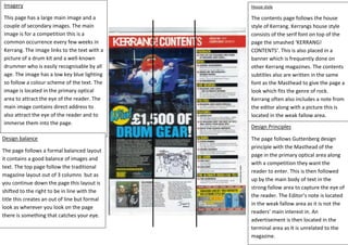
This page has a large main image and a
couple of secondary images. The main
image is for a competition this is a
common occurrence every few weeks in
Kerrang. The image links to the text with a
picture of a drum kit and a well-known
drummer who is easily recognisable by all
age. The image has a low key blue lighting
so follow a colour scheme of the text. The
image is located in the primary optical
area to attract the eye of the reader. The
main image contains direct address to
also attract the eye of the reader and to
immerse them into the page.
Design balance
The page follows a formal balanced layout
it contains a good balance of images and
text. The top page follow the traditional
magazine layout out of 3 columns but as
you continue down the page this layout is
shifted to the right to be in line with the
title this creates an out of line but formal
look as wherever you look on the page
there is something that catches your eye.
House style
The contents page follows the house
style of Kerrang. Kerrangs house style
consists of the serif font on top of the
page the smashed ‘KERRANG!
CONTENTS’. This is also placed in a
banner which is frequently done on
other Kerrang magazines. The contents
subtitles also are written in the same
font as the Masthead to give the page a
look which fits the genre of rock.
Kerrang often also includes a note from
the editor along with a picture this is
located in the weak fallow area.
Design Principles
The page follows Guttenberg design
principle with the Masthead of the
page in the primary optical area along
with a competition they want the
reader to enter. This is then followed
up by the main body of text in the
strong fallow area to capture the eye of
the reader. The Editor’s note is located
in the weak fallow area as it is not the
readers’ main interest in. An
advertisement is then located in the
terminal area as It is unrelated to the
magazine.