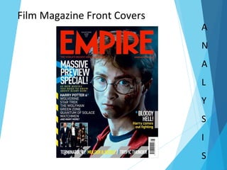
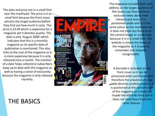
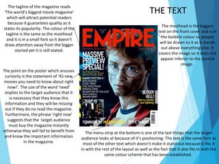
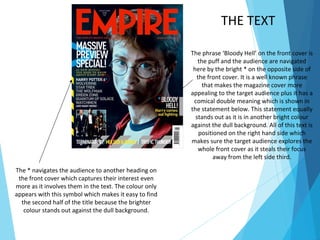
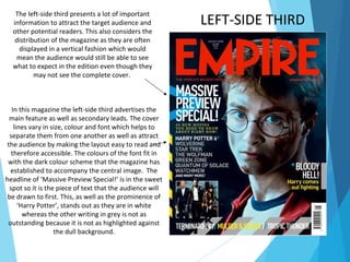
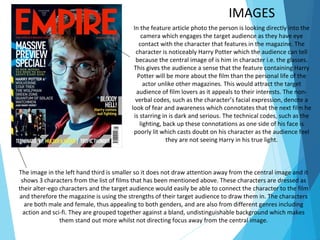
Film Magazine Front Covers
A
N
A
L
Y
S
I
S
The magazine includes their web
address so the target audience of
film lovers can find out more
exclusive news about new
releases and more. It is
positioned under and is in the
same colour as the masthead yet
it does not steal any focus from
the central image or cover lines
because it is in a small font. The
website is simply the name of
the magazine so it is easy to
remember and instantly
recognisable.
The date and price are in a small font
near the masthead. The price is in a
small font because the front cover
attracts the target audience before
they find out how much it costs. The
price is £3.99 which is expensive for a
magazine yet it denotes quality. The
date is only ‘August 2008’ which
indicates that this is a monthly
magazine as no specific date of
publication is mentioned. This also
links to the cost of the magazine as it
is more expensive because it is only
released once a month. The mention
of a date helps collectors/ subscribers
keep up to date with the magazine as
well as having a sense of exclusivity
because the magazine is only released
monthly.
THE BASICS
A barcode is included on the
front cover so it can be
processed when purchased and
therefore the presence of a bar
code denotes professionalism. It
is positioned at the bottom right
of the magazine so it does not
invade the left-side third and it
does not steal focus from any
other feature.
The menu strip at the bottom is one of the last things that the target
audience looks at because of it’s positioning. The text is the same font as
most of the other text which doesn’t make it stand out because it fits it
in with the rest of the layout as well as the fact that it also fits in with the
same colour scheme that has been established.
THE TEXT
The tagline of the magazine reads
‘The world’s biggest movie magazine’
which will attract potential readers
because it guarantees quality as it
states its popularity. The colour of the
tagline is the same as the masthead
and it is in a small font so it doesn’t
draw attention away from the bigger
storied yet it is still stated.
The masthead is the biggest
text on the front cover and is in
the boldest colour so people
will be drawn to it as it stands
out above everything else. It
covers the image so it does not
appear inferior to the central
image.
The point on the poster which arouses
curiosity is the statement of ’45 new
movies you need to know about right
now!’. The use of the word ‘need’
implies to the target audience that it
is necessary that they know this
information and they will be missing
out if they do no read the magazine.
Furthermore, the phrase ‘right now’
suggests that the target audience
must buy the magazine instantly
otherwise they will fail to benefit from
and know the important information
in the magazine.
The phrase ‘Bloody Hell’ on the front cover is
the puff and the audience are navigated
here by the bright * on the opposite side of
the front cover. It is a well known phrase
that makes the magazine cover more
appealing to the target audience plus it has a
comical double meaning which is shown in
the statement below. This statement equally
stands out as it is in another bright colour
against the dull background. All of this text is
positioned on the right hand side which
makes sure the target audience explores the
whole front cover as it steals their focus
away from the left side third.
The * navigates the audience to another heading on
the front cover which captures their interest even
more as it involves them in the text. The colour only
appears with this symbol which makes it easy to find
the second half of the title because the brighter
colour stands out against the dull background.
THE TEXT
LEFT-SIDE THIRD
The left-side third presents a lot of important
information to attract the target audience and
other potential readers. This also considers the
distribution of the magazine as they are often
displayed in a vertical fashion which would
mean the audience would still be able to see
what to expect in the edition even though they
may not see the complete cover.
In this magazine the left-side third advertises the
main feature as well as secondary leads. The cover
lines vary in size, colour and font which helps to
separate them from one another as well as attract
the audience by making the layout easy to read and
therefore accessible. The colours of the font fit in
with the dark colour scheme that the magazine has
established to accompany the central image. The
headline of ‘Massive Preview Special!’ is in the sweet
spot so it is the piece of text that the audience will
be drawn to first. This, as well as the prominence of
‘Harry Potter’, stands out as they are in white
whereas the other writing in grey is not as
outstanding because it is not as highlighted against
the dull background.
IMAGES
In the feature article photo the person is looking directly into the
camera which engages the target audience as they have eye
contact with the character that features in the magazine. The
character is noticeably Harry Potter which the audience can tell
because the central image of is him in character i.e. the glasses.
This gives the audience a sense that the feature containing Harry
Potter will be more about the film than the personal life of the
actor unlike other magazines. This would attract the target
audience of film lovers as it appeals to their interests. The non-
verbal codes, such as the character’s facial expression, denote a
look of fear and awareness which connotates that the next film he
is starring in is dark and serious. The technical codes, such as the
lighting, back up these connotations as one side of his face is
poorly lit which casts doubt on his character as the audience feel
they are not seeing Harry in his true light.
The image in the left hand third is smaller so it does not draw attention away from the central image and it
shows 3 characters from the list of films that has been mentioned above. These characters are dressed as
their alter-ego characters and the target audience would easily be able to connect the character to the film
and therefore the magazine is using the strengths of their target audience to draw them in. The characters
are both male and female, thus appealing to both genders, and are also from different genres including
action and sci-fi. They are grouped together against a bland, undistinguishable background which makes
them stand out more whilst not directing focus away from the central image.

Magazine Analysis

  • 1.
    Film Magazine FrontCovers A N A L Y S I S
  • 2.
    The magazine includestheir web address so the target audience of film lovers can find out more exclusive news about new releases and more. It is positioned under and is in the same colour as the masthead yet it does not steal any focus from the central image or cover lines because it is in a small font. The website is simply the name of the magazine so it is easy to remember and instantly recognisable. The date and price are in a small font near the masthead. The price is in a small font because the front cover attracts the target audience before they find out how much it costs. The price is £3.99 which is expensive for a magazine yet it denotes quality. The date is only ‘August 2008’ which indicates that this is a monthly magazine as no specific date of publication is mentioned. This also links to the cost of the magazine as it is more expensive because it is only released once a month. The mention of a date helps collectors/ subscribers keep up to date with the magazine as well as having a sense of exclusivity because the magazine is only released monthly. THE BASICS A barcode is included on the front cover so it can be processed when purchased and therefore the presence of a bar code denotes professionalism. It is positioned at the bottom right of the magazine so it does not invade the left-side third and it does not steal focus from any other feature.
  • 3.
    The menu stripat the bottom is one of the last things that the target audience looks at because of it’s positioning. The text is the same font as most of the other text which doesn’t make it stand out because it fits it in with the rest of the layout as well as the fact that it also fits in with the same colour scheme that has been established. THE TEXT The tagline of the magazine reads ‘The world’s biggest movie magazine’ which will attract potential readers because it guarantees quality as it states its popularity. The colour of the tagline is the same as the masthead and it is in a small font so it doesn’t draw attention away from the bigger storied yet it is still stated. The masthead is the biggest text on the front cover and is in the boldest colour so people will be drawn to it as it stands out above everything else. It covers the image so it does not appear inferior to the central image. The point on the poster which arouses curiosity is the statement of ’45 new movies you need to know about right now!’. The use of the word ‘need’ implies to the target audience that it is necessary that they know this information and they will be missing out if they do no read the magazine. Furthermore, the phrase ‘right now’ suggests that the target audience must buy the magazine instantly otherwise they will fail to benefit from and know the important information in the magazine.
  • 4.
    The phrase ‘BloodyHell’ on the front cover is the puff and the audience are navigated here by the bright * on the opposite side of the front cover. It is a well known phrase that makes the magazine cover more appealing to the target audience plus it has a comical double meaning which is shown in the statement below. This statement equally stands out as it is in another bright colour against the dull background. All of this text is positioned on the right hand side which makes sure the target audience explores the whole front cover as it steals their focus away from the left side third. The * navigates the audience to another heading on the front cover which captures their interest even more as it involves them in the text. The colour only appears with this symbol which makes it easy to find the second half of the title because the brighter colour stands out against the dull background. THE TEXT
  • 5.
    LEFT-SIDE THIRD The left-sidethird presents a lot of important information to attract the target audience and other potential readers. This also considers the distribution of the magazine as they are often displayed in a vertical fashion which would mean the audience would still be able to see what to expect in the edition even though they may not see the complete cover. In this magazine the left-side third advertises the main feature as well as secondary leads. The cover lines vary in size, colour and font which helps to separate them from one another as well as attract the audience by making the layout easy to read and therefore accessible. The colours of the font fit in with the dark colour scheme that the magazine has established to accompany the central image. The headline of ‘Massive Preview Special!’ is in the sweet spot so it is the piece of text that the audience will be drawn to first. This, as well as the prominence of ‘Harry Potter’, stands out as they are in white whereas the other writing in grey is not as outstanding because it is not as highlighted against the dull background.
  • 6.
    IMAGES In the featurearticle photo the person is looking directly into the camera which engages the target audience as they have eye contact with the character that features in the magazine. The character is noticeably Harry Potter which the audience can tell because the central image of is him in character i.e. the glasses. This gives the audience a sense that the feature containing Harry Potter will be more about the film than the personal life of the actor unlike other magazines. This would attract the target audience of film lovers as it appeals to their interests. The non- verbal codes, such as the character’s facial expression, denote a look of fear and awareness which connotates that the next film he is starring in is dark and serious. The technical codes, such as the lighting, back up these connotations as one side of his face is poorly lit which casts doubt on his character as the audience feel they are not seeing Harry in his true light. The image in the left hand third is smaller so it does not draw attention away from the central image and it shows 3 characters from the list of films that has been mentioned above. These characters are dressed as their alter-ego characters and the target audience would easily be able to connect the character to the film and therefore the magazine is using the strengths of their target audience to draw them in. The characters are both male and female, thus appealing to both genders, and are also from different genres including action and sci-fi. They are grouped together against a bland, undistinguishable background which makes them stand out more whilst not directing focus away from the central image.
  • 7.
    IMAGES In the featurearticle photo the person is looking directly into the camera which engages the target audience as they have eye contact with the character that features in the magazine. The character is noticeably Harry Potter which the audience can tell because the central image of is him in character i.e. the glasses. This gives the audience a sense that the feature containing Harry Potter will be more about the film than the personal life of the actor unlike other magazines. This would attract the target audience of film lovers as it appeals to their interests. The non- verbal codes, such as the character’s facial expression, denote a look of fear and awareness which connotates that the next film he is starring in is dark and serious. The technical codes, such as the lighting, back up these connotations as one side of his face is poorly lit which casts doubt on his character as the audience feel they are not seeing Harry in his true light. The image in the left hand third is smaller so it does not draw attention away from the central image and it shows 3 characters from the list of films that has been mentioned above. These characters are dressed as their alter-ego characters and the target audience would easily be able to connect the character to the film and therefore the magazine is using the strengths of their target audience to draw them in. The characters are both male and female, thus appealing to both genders, and are also from different genres including action and sci-fi. They are grouped together against a bland, undistinguishable background which makes them stand out more whilst not directing focus away from the central image.