Measures of Dispersion and Variability: Range, QD, AD and SD
Mags
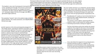
1. Jennifer Lawrence is the actress portraying the protagonist of
‘The Hunger Games’, meaning the method of centring her on the
cover is extremely significant. The actress is well liked and holds
a lot of star power, reeling in the teen to young adult target
audience. Lawrence also is known to stand for female
empowerment, hues of fire and danger signifying the power of
both her on screen and real persona. The black costuming
further presents her to be a fighter, appearing as an army suit
with the shoulder pads and the bow and arrow. Wearing
trousers, the picture is chosen to interest both genders, making
her appear slightly gender mutual. Jennifer Lawrence is staring
into the camera in the image, giving 'the gaze' and therefore
addressing the viewer and persuading their attention.
The font of the feature article title matches the movie’s
trademark. The orange fire-like tones in this anchorage
text fits with the ongoing colour palette and result in a
more satisfying aesthetic and therefore attracting more
readers. It is the classic tone of the logo found
throughout the franchise, further igniting the theme
and promoting the movie as the colours become
memorable.
The headline is clear and is found placed in the top left hand
corner, spreading over the page. This ensures it can be seen
clearly and returning customers can recognise the brand
immediately. The logo is bold yet slightly transparent, giving it a
sci-fi atmosphere against the fire on the page, catering to
gamers(the target audience).
This banner informs the reader of what is found in the magazine and what the focuses are. Each category
listed is heavily related to the action genre, making the feature of 'The Hunger Games' very fitting to the
magazine and audience. The orange hues mimicking those of fire make the cover page more aesthetically
pleasing and keeps the viewers attention on the main image.
The issue number and price is in a simple font, yet due to being
white it is still clearly visible. Whilst visible, it still blends slightly
into the background to avoid being a distraction from the main
image and headline. The placement being on the right hand
upper corner means the eyes generally do not gravitate to the
text.
The alliteration of 'c' works as a lure to the article line in a
white font with a slight shadows beneath, standing out
against the main image.
This question is direct address, interacting with the
audience. Ghibli is a well known film making company,
interesting movie fanatics viewing the magazine.
The vocabulary “massive” reels in the audience and is in bold to
capture attention. This creates excitement, mirroring the action
themed cover page.
A bar code allows the magazine to be purchased and is
therefore essential to have on a magazine. The
placement is on the left bottom corner, avoiding being
in the first left third and therefore not standing out too
much and becoming a distraction from the stories.Additional content is listed in the bottom strip: clear
capitals in a white font, meaning the text is easily read
and visible, yet it is in a smaller font to not take any
attention away from the main cover lines being
advertised.
2. The vocabulary mimicking a swear word creates controversy and
therefore interest in the content of the magazine. It is in a larger
font, the bright blue standing out against the background visibly.
The relation to bad language will be humorous to the target
audience: younger people or children generally do not take a
high interest in ‘Sherlock Holmes’ due to complex storylines.
However, because it is not the actual storyline, it makes the
magazine appear family friendly and allowing the target audience
to expand through more ages and increasing buyers.
The very well-known actor, Robert Downey Jr, is making
direct address to the audience through eye contact. His
star power allows this to appear impressive, emphasised
by the powerful expression on his face (in character of
Sherlock Holmes). His costuming shows the time period in
which the film is set, informing the viewer of the film
without being obvious and obnoxious. Downey Jr is a very
well respected actor, gaining readers through knowledge
of his previous work (which often was targeted to a
mature audience). The background is blue themed,
enhancing his masculine stance. This reels in both genders:
women find him compelling whilst men envy him as a
character. His costuming also shows that his character is
intelligent, once again hinting that the film is for a more
mature audience.
These sub images give information of the variety found inside of
the magazine: all images from films from different genres. This
interests a wider audience.
By using the adjective “coolest”, the magazine is more informal
and therefore reaches a wider audience as it is understandable
through many age groups. The exaggeration is eye catching and
aims to perk the interest of the viewer. It is located on the top
left third (in the top strip), meaning it is highly visible to the
reader’s eye and will not go unnoticed. The font further ensures
this, the bold blue text standing out clearly against the darkened
background.
The website is given to widen the magazines following,
being accessible on different formats and therefore
catering to many needs. It also means it reels in a more
youthful audience due to being technologically advanced.
This is stated in a smaller font, however, to avoid the
audience to not bother buying the magazine and just look
online instead.
Total Film is an extremely well known magazine in the UK
having a following no matter what the magazine features.
Due to having a good reputation, the name is stated bold
across the top half of the page, catching the viewers eye
immediately. In an extremely large white font, it is
unmissable. The edges of the text are sharp, making the
headline even more impressive.
The issue number, date and price is easily understandable:
a black font against pale blue. This is not overwhelming
due to being in a smaller font, avoiding distraction from
the main stories.
Sherlock Holmes is a well known franchise with an incredibly
large following, the text being enlarged purposefully to attract
fans of the film. The colour pattern is continued in the feature
line, emphasizing the masculinity of the character and magazine.
With a blue colour block behind, texts reads that it is an exclusive
in white clear and bold capitals. The block is used to ensure the
text is visible. A quote is used to prove that it is an “exclusive”,
attracting those who follow the franchise as it is something new,
making this issue of the magazine important.
The feature article is presented in the center of the image,
ensuring it catches the eye.
The barcode is listed at the bottom on the right side, less
visible to the audience. It is small to avoid taking up space
which could be used by the main image and it is avoiding
being distracting.
3. Empire is an extremely well known magazine in which
focuses on film. The red font is easily recognised and
is a signature of the brand, inviting returning buyers.
It is centred to ensure it is easily seen. This is useful as
the brand name itself allows the audience to know
that it is a film magazine-and a successful one (which
makes it more reliable).
The top strip includes the hyperbole of “biggest”,
persuading the reader of the importance of the read.
The claim is shown in a bright yellow bold font,
contrasting against the pale blue background and
therefore being extremely visible.
Being released in 2010, listing the following year
(2011) to the viewer and a bright and noticeable font
causes excitement and appears as if the information
is exclusive as it is a “preview”.
Johnny Depp has an extreme star power, his presence
being a large selling point for the magazine. He is in
the foreground staring into the camera, creating
direct address between him and the viewer and
making them feel included in the content of the
magazine. The lighting is softened on his costuming,
allowing it to be easily understood whilst the lighting
on his face is slightly harder, presenting the danger of
the character. His costuming is the classic traditional
costume of Jack Sparrow, reeling in fans of the
franchise and being recognised by plenty. If the
reader is not interested in Johnny Depp, they are
bound to have knowledge of the film or have interest.
The off-centred composure hints of the reckless
nature of the character, whilst still being slightly
centred to ensure that he is the main focus on the
page.
The exclusive notice is found overlaid in a circle, the
black background of the shape ensuring that it
catches the audience’s attention alongside being
placed on the left side of the page (following the rule
of the left thirds). The film title is abbreviated to fit
and is in a bright font, creating a more casual
atmosphere which convinces the reader that the
exclusive will be personal and detailed.
These contrasting statements compliment one
another, the humour interesting the audience. The
actor’s names are listed in the bold yellow
typography, proving star power and attracting their
fans (therefore increasing the audience).
Article lines less relevant to the cover page’s main
focus (Pirates of the Caribbean) are listed down the
right bottom third of the magazine. This means the
reader’s eye can see them clearly (due to bright and
bold fonts) but only when looking more closely. This is
important as it ensures the audience is mostly
persuaded for the main article. Other films are listed
to redeem the interest of those whom aren’t
interested in the cover image’s main story.
The background of the film fits the storyline and
location of the film and also promotes an exotic
lifestyle, perking the interest of the English audience
due to envy of good weather.
The barcode is found on the left right bottom corner
of the page, easily found (being on a corner: a typical
placement) yet not distracting from the main image
and article lines.