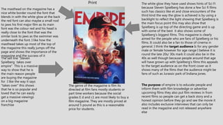
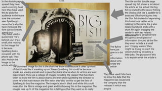
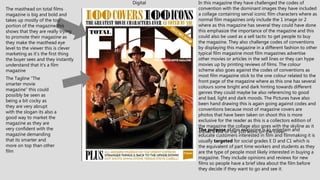
MAGAZINE ASSIGNMENT
The masthead on the magazine has a
nice white border round the font that
blends in with the white glow at the back
the red font can also maybe a small nod
to jaws his first major film as its main
font was the colour red and his head is
really close to the font that was the
similar look to jaws as the swimmer was
underneath the font. I like how the
masthead takes up most of the top of
the magazine this really jumps off the
page and shows the importance of the
magazine and the success of it
The white glow they have used shows hints of Sci Fi
because Steven Spielberg has done a few Sci fi films
such has classics like et and close encounters of the
third kind the way the glow is achieved is by using a
backlight to reflect the light showing that Spielberg is
the main focus point this may also show that
Spielberg is up top of the directing game and is up
with some of the best it also shows some of
Spielberg's biggest films. This magazine is clearly
aimed for the people who are fans of Spielberg or his
films. It could also be a fan to those of cinema in
general. I think the target audience Is for any gender
male or female however for age range I believe it is
round the late 20s/ 30s mark it could also be in the
40s as well though because people around that age
will have grown up with Spielberg's films this appeals
to the target audience as on the front cover as it
shows many of the films that the audience might be
fans of such as Jurassic park of Indiana jones.
Print
The sell line ”Steven
Spielberg takes over
empire” This is a massive
way to show that he is
the main reason people
are buying the magazine
for I like the way it says
“takes over” this shows
that he is so popular and
loved that he can easily
get a massive viewings
on a big magazine
franchise
The purpose of empire is to educate people and
inform them with film knowledge or advertise
upcoming films they also put film reviews in from
recent films so people can get a back story and a
honest opinion before they go and see the movie it
also includes exclusive interviews that can only be
read in the magazine and not released anywhere
else
The genre of the magazine is film its
directed at film fans mostly students or
part time workers because the social
grades E d and c1 are most likely to buy a
film magazine. They are mostly priced at
around 5 pound as this is a reasonable
price for students.
Print
The title on this double page
spread big fish shows a lot about
the article as the actual title big
fish is related to the sea or fishing
the I looks a lot like a paddle for a
boat and I like how it joins into
the I for fish instead of separating
this looks tons better as its
relating to the name the g also
loops round and ends with a
shark fin again dragging the
reader in with sea related
references.
The dominant image for this is the shark we know this because it takes up most
of the it looks like it sneaking up on Steven Spielberg this could be because
sharks are sneaky animals and in jaws the shark attacks when its victims are least
expecting it. They use a collage of images including the clapper that has shark
teeth to show the film is about sharks and they show Spielberg the director to
show he's the main reason the film exists they also do this to get the fans of
Spielberg to buy the magazine. The image is also in black and white this could
mean that the film is vintage and great and its showing this in the magazine. The
images take up ¾ of the magazine this is telling us that they want us to really
In the double page
spread they have
used a running head
here they have used
this to grab the
audience in the make
sure the customer
sees Spielberg's
name that’s why the
have increased the
font size so it really
stands out
The Byline
here just
give us a bit
of
information
about who
wrote the
article
They have used Folio here
to show the date that the
magazine was issued and
the company that the
released it which was
empire
They included a strapline here
this gives a small piece of
information directed at the film
they even include a a small
pun ”choppy waters” they
might be trying to reach the
viewers here by including a
little joke. The purpose of this
is to explain what the article is
They have used a
quote here ”he's
behind you” it’s a
small joke relating
to the image this
is because
Spielberg looks
occupied with his
phone call. They
also Anchor the
image to the
article with this
Digital
The masthead on total films
magazine is big and bold and
takes up mostly of the top
portion of the magazine this
shows that they are really trying
to promote their magazine as
they make the masthead eye
level to the viewer this is clever
marketing as it’s the first thing
the buyer sees and they instantly
understand that it’s a film
magazine
In this magazine they have challenged the codes of
convention with the dominant images they have included
a collage containing serval iconic film characters where as
normal film magazines only include the 1 image or 2
where as this magazine has several they could have done
this emphasize the importance of the magazine and this
could also be used as a sell tactic to get people to buy
the magazine. They also challenge codes of conventions
by displaying this magazine in a different fashion to other
typical film magazine most film magazines advertise
other movies or articles in the sell lines or they can hype
movies up by printing reviews of films. The colour
scheme also goes against the codes of conventions as
most film magazine stick to the one colour related to the
front page of the magazine where as this one has several
colours some bright and dark hinting towards different
genres they could maybe be also referencing to good
and bad, light and dark moods. The Pictures have also
been hand drawing this is again going against codes and
conventions because most of magazine covers are
photos that have been taken on shoot this is more
exclusive for the reader as this is a collectors edition of
the magazine the collage also goes with the skyline as it
shows a few of the 100 icons on the cover.The purpose of this magazine is to entertain and
educate customers interested in film and filmmaking it is
usually targeted for social grades E D and C1 which is
the equivalent of part time workers and students as they
are the type of people most likely interested in buying a
magazine. They include opinions and reviews for new
films so people have a brief idea about the film before
they decide if they want to go and see it.
The Tagline “The
smarter movie
magazine” this could
possibly be seen as
being a bit cocky as
they are very abrupt
with the slogan its also a
good way to market the
magazine as they are
very confident with the
magazine demanding
that its smarter and
more on top than other
film
The Skyline advertises 100
greatest film characters of all
time it also references this with
the collectors edition as it has
writing in gold showing that
some of these characters are
legendary the font they use for
the numbers has small holes in
them it looks a bit like film reels
the gold they use looks old/
vintage this could also be
hinting towards these films
shown ion the images as classic
icons.
The bottom banner they use
Includes the gold and black
again matching with the skyline
hinting at the vintage signs
again it also includes articles
about stuff ion the magazine
promoting shows and films they
do this to get people to get
people interested in buying the
magazine they have plus in big
font included in the bottom to
show that the magazine includes
much more this again lures
customers in to buy the
magazine
Digital
The Running head they use the big
screen the most trusted film reviews this
off the top tells you that it’s a trusted film
review company and that they are giving
you a brief explanation to their article
this also can you pull as it says they are
trusted and this is what people are
looking for a honest review about a film
they may be interested in watching.
The Strapline, burns so very very
brightly includes an ellipses at the end
this maybe hints to sci fi and action.
They have also included the ellipsis so
the reader buys the magazine and
wants to read and find out what is
burning and why its burning so
brightly.
The Pull quote they have included here is
interesting as it goes against codes and
conventions normally the pull quotes are
included at the center of the mag however in
this instance its placed at the bottom most
movie based magazines the pull quotes are
based in the middle of the spread could they
have done this cause this a special type or
article and they want to make feel different or
been as blade runner is futuristic they could be
The table in the article is a very
strange inclusion to the magazine
as its very rare that a magazine
includes a table this again goes
against codes and conventions
because in other film magazines
tables aren't regularly included in
film magazines the table they have
included shows a interest meter
this is cool because they have
actually included peoples opinions
during certain times of the film and
how much they enjoyed them this
gives the reader a honest opinion
about the film maybe interesting
them to buy the magazine and
possibly go and see the film.
The drop cap starting the article
they have used is interesting as
they have started with the font
in red and the rest of the article
is written in black they have
used the red font because the
colour red is very eye catching
and it could also hint at action
and maybe even danger in the
film possibly hinting towards the
characters in the film being in
danger. This goes with codes
and conventions as most film
magazines start with this and
have a drop caps included
They have put the verdict in Bold to
show the end the of article and their
honest response of the film they also
put it in bold to show it’s a important
piece of the magazine they have done
in a way that it stands out at the end
of the magazine they have put a red
line above giving it its own section at
the bottom of the magazine to show
that its important.
They included the byline at the end of
the article they are normally at start
this goes against codes and
conventions because in a normal film
magazine the byline is at the start this
could suggest they have done this to
show that the article is coming to a
close and they have included the
writers name to show who wrote the
article.
DigitalThe key info they include
here the director of the film
and the cast in it this is just
to give the reader a small
view of what the film entitles
its also to inform of the film
maybe it has an actor that
they like in it maybe they are
a fan of the director, it also
gives information such as
the run time to tell viewers
how long the film is so they
are prepared when they
watch itThe article here makes it
clear about what film you
are going to be reading
about they put in bold so it
stands out right to the
readers and so its clear to
read they instantly know its
about blade runner 2049
they have it in a large font
so it jumps off the page.
They have placed Recommendations here to interest the
reader into buying this magazine and reading to this
article it says “see this if you liked…” the … at the end
shows that they have more information coming for the
recomendations its also good for marketing as they arent
giving to much away in the tagline they have also
included this in bold for to catch the readers eye and
make it stand out as an important part of the magazine.
The way they ahve layed this out in a straight lne at the
The subheads in article are all in bold
this again is to catch the eye of the
reader they could be doing this to split
the massive article up and single out the
important parts of the spread, they
could have also done this to make its
easier for the reader to view so its not
all piled up and dumped on the page.
The dominant image here shows
Harrison ford fighting people this
is an extract from the film, they
have done this to immerse the
reader into this article by showing
a stunning picture filled with
action they have clearly done this
to show that blade runner isn't a
film to miss it takes up most of
the page to show that its an
important piece of the spread and
its also used as a marketing
technique because fans of the
previous blade runner might be
interested in buying this just to
for the blade runner extract. The
lighten they use is low key they
could have done this to show that
the film is futuristic as it give off
that gritty urban feeling with the
fog in the background it gives off
mystery the viewer can question
the magazine why are these
people fighting him.They have used a caption here in the picture it
says I'm too old for this is entertaining for the
reader as it includes a small joke to liven up the
picture more, this can has been used to reach
out to the viewer as well it also has a question
who too old for what is Harrison ford too old
for intense action films or is his character too
old for the fighting as shown in the picture.
There are many pros to digital one pro is that digital is good and can be accessed anywhere at anytime around the world, another is
that its cheaper and can be sent anywhere another pro is that digital magazines can’t be damaged other pros are that it can be
monetized better as there is lots of spaces you can place a ad in. Digital magazines are more eco friendly. On the other hand there is
several cons to digital like slow internet connection or complete internet failure another is website crashing, another con is that if the
magazine is large is that the reader might get migraines or eye strain and it can cause sleep trouble it can also be uncomfortable for
people to be scrolling with their fingers constantly it can cause pain and future conditions it can be also be harder to read other than
print with the smaller text.
Pros and cons for digital
Pros and cons for print
There are many pros to as well like the fact that it can be mass produced many people prefer the physical copy another pro is that it
can printed magazine can hold value and even become rare in time and be worth money, also printed magazines can stay popular for
months print is good because not everyone has access to digital so for example if they don’t have any internet or they don’t have
access to a smartphone or computer etc. cons to print is that its bad for the environment and many trees have to be cut down for print
magazines to be mass produced another con is that print magazines need to planned for months in advance where as digital can be
planned much sooner and be released.
TECHNICAL CONSIDERATIONS
• The technical considerations for print is like what size should it most prints are in a4. you also need to
think about your print magazine will be layed out the type of font that will be used will it be clear to
see will it fit fine make sure that the writing doesn't go past the bleedline otherwise it wouldn't work if
it did. Also with print magazines its crucial to include a gutter line so the magazine is neat and its not
complicated to navigate through. Its also important to have page numbers at the bottom so readers
can remember what page they where on and they can scan through the magazine and if they see
something they like they have found it with ease its also important to have running heads so its easier
to find what your looking for. Colour settings for print they use rgb colours this insures everything is
in its full colour scheme.
• The technical considerations for digital is the device or app compatible for that type of magazine your
releasing as some devices do not fully support digital magazines and some don’t have access to
internet this could be frustrating to the reader if they cant get access to their magazine, also some
colours and fonts may make the magazine look strange or unprofessional and this needs to be taken
in consideration as if you are releasing a magazine that Is unreadable it wont work. You also need to
take how the viewer will, navigate with digital magazine will they swipe to get to a new page or will
you scroll all the way to the bottom and select a new page at the bottom you also have to in
consideration if they will have to zoom in or will the font be big enough to see.
DISTRIBUTION
• For digital distribution one type of content could be sold on amazon maybe though kindles
or mobe the issues with these is that it can result to content loss and this can be frustrating
to the creator as not all their full content will be available another form of digital distribution
can be Barnes and noble who use epub which again when you sell a digital magazine you
have fewer options.
• For print distribution it can be sold almost anywhere including cinemas for promotional
material for the film. print magazines can be found in almost any big supermarket like tesco
or asda it can also be sent to you through mail if you are subscribed to a magazine
subscription service it can also be received in petrol station or service stations. Magazines
can also be bought at film rental shops and in book shops like wwh smiths

Magazine assignment

  • 1.
  • 2.
    The masthead onthe magazine has a nice white border round the font that blends in with the white glow at the back the red font can also maybe a small nod to jaws his first major film as its main font was the colour red and his head is really close to the font that was the similar look to jaws as the swimmer was underneath the font. I like how the masthead takes up most of the top of the magazine this really jumps off the page and shows the importance of the magazine and the success of it The white glow they have used shows hints of Sci Fi because Steven Spielberg has done a few Sci fi films such has classics like et and close encounters of the third kind the way the glow is achieved is by using a backlight to reflect the light showing that Spielberg is the main focus point this may also show that Spielberg is up top of the directing game and is up with some of the best it also shows some of Spielberg's biggest films. This magazine is clearly aimed for the people who are fans of Spielberg or his films. It could also be a fan to those of cinema in general. I think the target audience Is for any gender male or female however for age range I believe it is round the late 20s/ 30s mark it could also be in the 40s as well though because people around that age will have grown up with Spielberg's films this appeals to the target audience as on the front cover as it shows many of the films that the audience might be fans of such as Jurassic park of Indiana jones. Print The sell line ”Steven Spielberg takes over empire” This is a massive way to show that he is the main reason people are buying the magazine for I like the way it says “takes over” this shows that he is so popular and loved that he can easily get a massive viewings on a big magazine franchise The purpose of empire is to educate people and inform them with film knowledge or advertise upcoming films they also put film reviews in from recent films so people can get a back story and a honest opinion before they go and see the movie it also includes exclusive interviews that can only be read in the magazine and not released anywhere else The genre of the magazine is film its directed at film fans mostly students or part time workers because the social grades E d and c1 are most likely to buy a film magazine. They are mostly priced at around 5 pound as this is a reasonable price for students.
  • 3.
    Print The title onthis double page spread big fish shows a lot about the article as the actual title big fish is related to the sea or fishing the I looks a lot like a paddle for a boat and I like how it joins into the I for fish instead of separating this looks tons better as its relating to the name the g also loops round and ends with a shark fin again dragging the reader in with sea related references. The dominant image for this is the shark we know this because it takes up most of the it looks like it sneaking up on Steven Spielberg this could be because sharks are sneaky animals and in jaws the shark attacks when its victims are least expecting it. They use a collage of images including the clapper that has shark teeth to show the film is about sharks and they show Spielberg the director to show he's the main reason the film exists they also do this to get the fans of Spielberg to buy the magazine. The image is also in black and white this could mean that the film is vintage and great and its showing this in the magazine. The images take up ¾ of the magazine this is telling us that they want us to really In the double page spread they have used a running head here they have used this to grab the audience in the make sure the customer sees Spielberg's name that’s why the have increased the font size so it really stands out The Byline here just give us a bit of information about who wrote the article They have used Folio here to show the date that the magazine was issued and the company that the released it which was empire They included a strapline here this gives a small piece of information directed at the film they even include a a small pun ”choppy waters” they might be trying to reach the viewers here by including a little joke. The purpose of this is to explain what the article is They have used a quote here ”he's behind you” it’s a small joke relating to the image this is because Spielberg looks occupied with his phone call. They also Anchor the image to the article with this
  • 4.
    Digital The masthead ontotal films magazine is big and bold and takes up mostly of the top portion of the magazine this shows that they are really trying to promote their magazine as they make the masthead eye level to the viewer this is clever marketing as it’s the first thing the buyer sees and they instantly understand that it’s a film magazine In this magazine they have challenged the codes of convention with the dominant images they have included a collage containing serval iconic film characters where as normal film magazines only include the 1 image or 2 where as this magazine has several they could have done this emphasize the importance of the magazine and this could also be used as a sell tactic to get people to buy the magazine. They also challenge codes of conventions by displaying this magazine in a different fashion to other typical film magazine most film magazines advertise other movies or articles in the sell lines or they can hype movies up by printing reviews of films. The colour scheme also goes against the codes of conventions as most film magazine stick to the one colour related to the front page of the magazine where as this one has several colours some bright and dark hinting towards different genres they could maybe be also referencing to good and bad, light and dark moods. The Pictures have also been hand drawing this is again going against codes and conventions because most of magazine covers are photos that have been taken on shoot this is more exclusive for the reader as this is a collectors edition of the magazine the collage also goes with the skyline as it shows a few of the 100 icons on the cover.The purpose of this magazine is to entertain and educate customers interested in film and filmmaking it is usually targeted for social grades E D and C1 which is the equivalent of part time workers and students as they are the type of people most likely interested in buying a magazine. They include opinions and reviews for new films so people have a brief idea about the film before they decide if they want to go and see it. The Tagline “The smarter movie magazine” this could possibly be seen as being a bit cocky as they are very abrupt with the slogan its also a good way to market the magazine as they are very confident with the magazine demanding that its smarter and more on top than other film
  • 5.
    The Skyline advertises100 greatest film characters of all time it also references this with the collectors edition as it has writing in gold showing that some of these characters are legendary the font they use for the numbers has small holes in them it looks a bit like film reels the gold they use looks old/ vintage this could also be hinting towards these films shown ion the images as classic icons. The bottom banner they use Includes the gold and black again matching with the skyline hinting at the vintage signs again it also includes articles about stuff ion the magazine promoting shows and films they do this to get people to get people interested in buying the magazine they have plus in big font included in the bottom to show that the magazine includes much more this again lures customers in to buy the magazine
  • 6.
    Digital The Running headthey use the big screen the most trusted film reviews this off the top tells you that it’s a trusted film review company and that they are giving you a brief explanation to their article this also can you pull as it says they are trusted and this is what people are looking for a honest review about a film they may be interested in watching. The Strapline, burns so very very brightly includes an ellipses at the end this maybe hints to sci fi and action. They have also included the ellipsis so the reader buys the magazine and wants to read and find out what is burning and why its burning so brightly. The Pull quote they have included here is interesting as it goes against codes and conventions normally the pull quotes are included at the center of the mag however in this instance its placed at the bottom most movie based magazines the pull quotes are based in the middle of the spread could they have done this cause this a special type or article and they want to make feel different or been as blade runner is futuristic they could be The table in the article is a very strange inclusion to the magazine as its very rare that a magazine includes a table this again goes against codes and conventions because in other film magazines tables aren't regularly included in film magazines the table they have included shows a interest meter this is cool because they have actually included peoples opinions during certain times of the film and how much they enjoyed them this gives the reader a honest opinion about the film maybe interesting them to buy the magazine and possibly go and see the film. The drop cap starting the article they have used is interesting as they have started with the font in red and the rest of the article is written in black they have used the red font because the colour red is very eye catching and it could also hint at action and maybe even danger in the film possibly hinting towards the characters in the film being in danger. This goes with codes and conventions as most film magazines start with this and have a drop caps included They have put the verdict in Bold to show the end the of article and their honest response of the film they also put it in bold to show it’s a important piece of the magazine they have done in a way that it stands out at the end of the magazine they have put a red line above giving it its own section at the bottom of the magazine to show that its important. They included the byline at the end of the article they are normally at start this goes against codes and conventions because in a normal film magazine the byline is at the start this could suggest they have done this to show that the article is coming to a close and they have included the writers name to show who wrote the article.
  • 7.
    DigitalThe key infothey include here the director of the film and the cast in it this is just to give the reader a small view of what the film entitles its also to inform of the film maybe it has an actor that they like in it maybe they are a fan of the director, it also gives information such as the run time to tell viewers how long the film is so they are prepared when they watch itThe article here makes it clear about what film you are going to be reading about they put in bold so it stands out right to the readers and so its clear to read they instantly know its about blade runner 2049 they have it in a large font so it jumps off the page. They have placed Recommendations here to interest the reader into buying this magazine and reading to this article it says “see this if you liked…” the … at the end shows that they have more information coming for the recomendations its also good for marketing as they arent giving to much away in the tagline they have also included this in bold for to catch the readers eye and make it stand out as an important part of the magazine. The way they ahve layed this out in a straight lne at the The subheads in article are all in bold this again is to catch the eye of the reader they could be doing this to split the massive article up and single out the important parts of the spread, they could have also done this to make its easier for the reader to view so its not all piled up and dumped on the page. The dominant image here shows Harrison ford fighting people this is an extract from the film, they have done this to immerse the reader into this article by showing a stunning picture filled with action they have clearly done this to show that blade runner isn't a film to miss it takes up most of the page to show that its an important piece of the spread and its also used as a marketing technique because fans of the previous blade runner might be interested in buying this just to for the blade runner extract. The lighten they use is low key they could have done this to show that the film is futuristic as it give off that gritty urban feeling with the fog in the background it gives off mystery the viewer can question the magazine why are these people fighting him.They have used a caption here in the picture it says I'm too old for this is entertaining for the reader as it includes a small joke to liven up the picture more, this can has been used to reach out to the viewer as well it also has a question who too old for what is Harrison ford too old for intense action films or is his character too old for the fighting as shown in the picture.
  • 8.
    There are manypros to digital one pro is that digital is good and can be accessed anywhere at anytime around the world, another is that its cheaper and can be sent anywhere another pro is that digital magazines can’t be damaged other pros are that it can be monetized better as there is lots of spaces you can place a ad in. Digital magazines are more eco friendly. On the other hand there is several cons to digital like slow internet connection or complete internet failure another is website crashing, another con is that if the magazine is large is that the reader might get migraines or eye strain and it can cause sleep trouble it can also be uncomfortable for people to be scrolling with their fingers constantly it can cause pain and future conditions it can be also be harder to read other than print with the smaller text. Pros and cons for digital Pros and cons for print There are many pros to as well like the fact that it can be mass produced many people prefer the physical copy another pro is that it can printed magazine can hold value and even become rare in time and be worth money, also printed magazines can stay popular for months print is good because not everyone has access to digital so for example if they don’t have any internet or they don’t have access to a smartphone or computer etc. cons to print is that its bad for the environment and many trees have to be cut down for print magazines to be mass produced another con is that print magazines need to planned for months in advance where as digital can be planned much sooner and be released.
  • 9.
    TECHNICAL CONSIDERATIONS • Thetechnical considerations for print is like what size should it most prints are in a4. you also need to think about your print magazine will be layed out the type of font that will be used will it be clear to see will it fit fine make sure that the writing doesn't go past the bleedline otherwise it wouldn't work if it did. Also with print magazines its crucial to include a gutter line so the magazine is neat and its not complicated to navigate through. Its also important to have page numbers at the bottom so readers can remember what page they where on and they can scan through the magazine and if they see something they like they have found it with ease its also important to have running heads so its easier to find what your looking for. Colour settings for print they use rgb colours this insures everything is in its full colour scheme. • The technical considerations for digital is the device or app compatible for that type of magazine your releasing as some devices do not fully support digital magazines and some don’t have access to internet this could be frustrating to the reader if they cant get access to their magazine, also some colours and fonts may make the magazine look strange or unprofessional and this needs to be taken in consideration as if you are releasing a magazine that Is unreadable it wont work. You also need to take how the viewer will, navigate with digital magazine will they swipe to get to a new page or will you scroll all the way to the bottom and select a new page at the bottom you also have to in consideration if they will have to zoom in or will the font be big enough to see.
  • 10.
    DISTRIBUTION • For digitaldistribution one type of content could be sold on amazon maybe though kindles or mobe the issues with these is that it can result to content loss and this can be frustrating to the creator as not all their full content will be available another form of digital distribution can be Barnes and noble who use epub which again when you sell a digital magazine you have fewer options. • For print distribution it can be sold almost anywhere including cinemas for promotional material for the film. print magazines can be found in almost any big supermarket like tesco or asda it can also be sent to you through mail if you are subscribed to a magazine subscription service it can also be received in petrol station or service stations. Magazines can also be bought at film rental shops and in book shops like wwh smiths