1. MAGAZINE ADVERT ANALYSIS
The red font highlights the intertextuality between the three products as it was one
of our motifs. Symbolic of danger, lust and even love it reflects many themes
throughout the album as well as the music video.
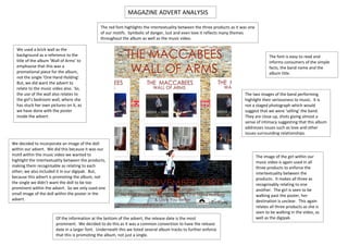
We used a brick wall as the
background as a reference to the The font is easy to read and
title of the album ‘Wall of Arms’ to informs consumers of the simple
emphasise that this was a facts, the band name and the
promotional piece for the album, album title.
not the single ‘One Hand Holding’.
But, we did want the advert to
relate to the music video also. So,
the use of the wall also relates to The two images of the band performing
the girl’s bedroom wall, where she highlight their seriousness to music. It is
has stuck her own pictures on it, as not a staged photograph which would
we have done with the poster suggest that we were ‘selling’ the band.
inside the advert. They are close up, shots giving almost a
sense of intimacy suggesting that this album
addresses issues such as love and other
issues surrounding relationships.
We decided to incorporate an image of the doll
within our advert. We did this because it was our
motif within the music video we wanted to The image of the girl within our
highlight the intertextuality between the products, music video is again used in all
making them recognisable as relating to each three products to enforce the
other; we also included it in our digipak. But, intertextuality between the
because this advert is promoting the album, not products. It makes all three as
the single we didn’t want the doll to be too recognisably relating to one
prominent within the advert. So we only used one another. The girl is seen to be
small image of the doll within the poster in the walking past the poster, her
advert. destination is unclear. This again
relates all three products as she is
seen to be walking in the video, as
Of the information at the bottom of the advert, the release date is the most well as the digipak.
prominent. We decided to do this as it was a common convention to have the release
date in a larger font. Underneath this we listed several album tracks to further enforce
that this is promoting the album, not just a single.