1. DIGIPAK ANALYSIS: FLORENCE + THE MACHINE’S
‘LUNGS’
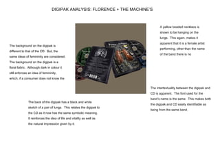
A yellow beaded necklace is
shown to be hanging on the
lungs. This again, makes it
apparent that it is a female artist
The background on the digipak is
performing, other than the name
different to that of the CD. But, the
of the band there is no
same ideas of femininity are considered.
suggestion of the music being
The background on the digipak is a
floral fabric. Although dark in colour it
still enforces an idea of femininity,
which, if a consumer does not know the
The intertextuality between the digipak and
CD is apparent. The font used for the
band’s name is the same. This makes both
The back of the digipak has a black and white
the digipak and CD easily identifiable as
sketch of a pair of lungs. This relates the digipak to
being from the same band.
the CD as it now has the same symbolic meaning.
It reinforces the idea of life and vitality as well as
the natural impression given by it.
2. The font used to write the band
name appears quite childlike.
This san serif font is curved and
The flowers again, like the font
stereotypically feminine. This
highlight the lead singer’s femininity.
suggests that the target audience
is possibly young women, or
alternatively that the lead vocalist
The main focal point is the artist. Her white,
The lead singer’s lungs are visible
flowing top gives an almost ethereal sense.
and are a direct reference to the title
Whilst her posture suggests a nature of
of the album. As lungs are vital for
innocence, an almost ‘damsel in distress’ look.
breathing, living, this use of lungs
This again, highlights her femininity. Also, as
could symbolize life, nature almost.
she is the only member of the band shown on The font used for the album is a
the cover it shows how they are selling her serif font in capitals and italics.
image as an artist. It implies that her voice and