Model Call Girls In Ariyalur WhatsApp Booking 7427069034 call girl service 24...
My Digipak Analysis
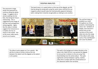
1. DIGIPAK ANALYSIS
The band name is in capital letters at the top of the digipak, we felt
The panoramic image that by doing this along with using the same colour and font for our
shows the pavement to magazine advert would make the intertextuality apparent between
continue along the whole both, making them instantly recognisable as relating to one another.
image. It suggests she is
almost walking into her
fate, that being her future
relationship. This is The red font helps to
suggested by the image of establish our motif
the two main protagonists throughout our three
sitting together. Again, products, that being the
like the video it initially colour red. Symbolic of
suggests her innocence as danger, love and lust it
it implies she has no almost hints at the
choice in the matter. But narrative of the music
as the music video warns, video but also the songs
not all is as it seems. of the album with songs
such as ‘Kiss and Resolve’
and ‘Love You Better’
The album tracks appear as if on a poster. We The wall in the background relates literally to the
did this to help to further enforce the link album title ‘Wall Of Arms’ we wanted the digipak
between the advert and the digipak as the advert to not just be in relation to the one song ‘One
is of a poster. Hand Holding’ but the whole album. The walls
signify the contrast between a gritty, realistic
urban life in London with the unnaturalness of
her obsession within the narrative.
2. An image of our doll motif is under the CD. This
The colour red is used would suggest that not all is as it appears, a
again, to relate the common idea used within our music video. These song lyrics are the
three products to one
chorus of the song, (and
another, as it is a
album name) ‘Wall of
motif used
Arms’. This is so the
throughout the three
digipak is recognisable as a
products. It also as
product selling the album
previously mentioned
rather than just the ‘One
is symbolic of danger,
Hand Holding’ single.
love and lust, all
common ideas used
within our music
video and a relating to
the album tracks.
We decided to make the images appear as if they
had been stuck on to the digipak to give an The image of the girl with the rose has
almost hand-made effect. This also relates back connotations of love and affection, common
to the music video where the female protagonist ideas incorporated under the indie genre. It does
is seen sticking photos up on her all. These not suggest a progression of her obsessive nature
images differ from the ones she uses to portray a as their ‘love’ grows as it does with our music
loving relationship between the girl and the boy, video.
a common convention of indie music. But as the
doll behind the CD suggests not all is as it seems.