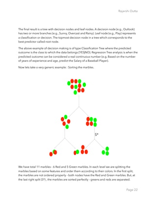
This document is a compilation by Rajarshi Dutta aimed at introducing machine learning concepts for beginners, highlighting key aspects like supervised vs unsupervised learning, feature engineering, and the importance of training and test data. It covers fundamental definitions, algorithms, and evaluation metrics such as mean squared error and confusion matrices, while also emphasizing the need for balance between flexibility and bias in models. The content is designed to demystify machine learning and encourage further exploration in the field of data analytics.


![Rajarshi Dutta
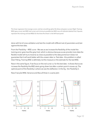
As a general rule, as we use more flexible methods, the variance will increase and the bias will
decrease. The relative rate of change of these two quantities determines whether the test
MSE increases or decreases. As we increase the flexibility of a class of methods, the bias
tends to initially decrease faster than the variance increases. Consequently, the expected test
MSE declines. However, at some point increasing flexibility has little impact on the bias but
starts to significantly increase the variance. When this happens the test MSE increases. In
order to minimize the expected test error, we need to select a statistical learning method that
simultaneously achieves low variance and low bias.
Type I and Type II Error / True Positives and False
Positives / Confusion Matrix
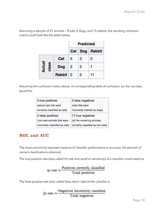
In the field of machine learning and specifically the problem of statistical classification, a
confusion matrix, also known as an error matrix,[4] is a specific table layout that allows
visualization of the performance of an algorithm, typically a supervised learning one (in
unsupervised learning it is usually called a matching matrix).
If a classification system has been trained to distinguish between cats, dogs and rabbits, a
confusion matrix will summarize the results of testing the algorithm for further inspection.
Page 13](https://image.slidesharecdn.com/machinelearningandbuzzwords-170519002927/85/Machine-learning-and_buzzwords-13-320.jpg)
![Rajarshi Dutta
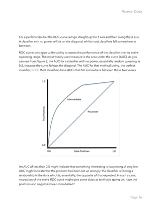
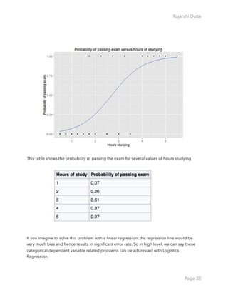
Additional term associated with ROC curves is
Let’s consider a sample of patients data and the objective is to classify whether the patients
have cancers or not. E.g. The Algorithm f will produce the score from low (0.0) [Without
Cancer] to high (1.0) [With Cancer]
Most classifiers produce a score, which is then thresholded to decide the classification. If a
classifier produces a score between 0.0 (definitely negative) and 1.0 (definitely positive), it is
common to consider anything over 0.5 as positive. But this dashed line depends on the
experimenter - where she wants to draw the threshold. If we draw the threshold at 0.0 - which
means we will correctly classify all the positive cases but incorrectly classify all the negative
cases. And similarly if we draw the threshold at we will correctly classify all the negative cases
and incorrectly classify the positive ones. While we
gradually move the threshold from 0.0 to 1.0 we will
have different TPR (True Positive Rate) and FPR(false
Positive Rate) at each threshold point; progressively
decreasing the number of false positives and increasing
the number of true positives. If we plot these series of
TPR and FPR (Y Axis - TPR and X Axis - FPR) we get the
ROC (Receiver operating characteristic) Curve. AUC is
the Area under the cure.
Page 15](https://image.slidesharecdn.com/machinelearningandbuzzwords-170519002927/85/Machine-learning-and_buzzwords-15-320.jpg)

![Rajarshi Dutta
library(randomForest)
library(ROCR)
#Divide the datasets into train and test datasets
ind <- sample(2,nrow(data),replace=TRUE,prob=c(0.7,0.3))
trainData <- data[ind==1,]
testData <- data[ind==2,]
#Running the RF Algorithm with 100 Trees
adult.rf <-randomForest(income~.,data=trainData, mtry=2,
ntree=100,keep.forest=TRUE,importance=TRUE,test=testData)
print(adult.rf)
#Output
#varImpPlot will plot the importance of the features. The
importance of the features are relative to each other.
varImpPlot(adult.rf)
Page 28](https://image.slidesharecdn.com/machinelearningandbuzzwords-170519002927/85/Machine-learning-and_buzzwords-28-320.jpg)
![Rajarshi Dutta
#Get the probability score for the output label and download
this data
adult.rf.pr = predict(adult.rf,type=“prob”,newdata=testData)[,2]
write.csv(adult.rf.pr, file=“Test_Prob.csv”)
#Sample output of the file
# Performance of the prediction, ROC Curve and AUC
adult.rf.pred = prediction(adult.rf.pr, testData$income)
adult.rf.perf = performance(adult.rf.pred,"tpr","fpr")
Page 29](https://image.slidesharecdn.com/machinelearningandbuzzwords-170519002927/85/Machine-learning-and_buzzwords-29-320.jpg)
![Rajarshi Dutta
plot(adult.rf.perf,main="ROC Curve for Random
Forest",col=2,lwd=2)
abline(a=0,b=1,lwd=2,lty=2,col=“gray")
adult.rf.auc = performance(adult.rf.pred,"auc")
AUC <- adult.rf.auc@y.values[[1]]
print(AUC)
[1] 0.8948409
Page 30](https://image.slidesharecdn.com/machinelearningandbuzzwords-170519002927/85/Machine-learning-and_buzzwords-30-320.jpg)

![Rajarshi Dutta
## Loading Training Data ##
training.data.raw <- read.csv("train.csv",header=T,na.strings=c(""))
## Now we need to check for missing values and look how many unique
values there are
## for each variable using the sapply() function which applies the
function passed
## as argument to each column of the dataframe.
sapply(training.data.raw,function(x) sum(is.na(x)))
# getting only the relevant columns
data <- subset(training.data.raw,select=c(2,3,5,6,7,8,10,12))
# Now note that we have missing values on Age also and that needs to
be
# fixed. One possible way to fix is replace the nulls with the Mean,
Median or Mode.
data$Age[is.na(data$Age)] <- mean(data$Age,na.rm=T)
# Treatment on the categorical variables. in R when we read the file
via
Page 34](https://image.slidesharecdn.com/machinelearningandbuzzwords-170519002927/85/Machine-learning-and_buzzwords-34-320.jpg)
![Rajarshi Dutta
# read.table() or read.csv() by default it encodes the categorical
is.factor(data$Sex)
is.factor(data$Embarked)
train <- data[1:800,]
test <- data[801:889,]
# model training with the training data
model <- glm(Survived ~.,family=binomial(link='logit'),data=train)
summary(model)
Now we can analyze the fitting and interpret what the model is telling us.
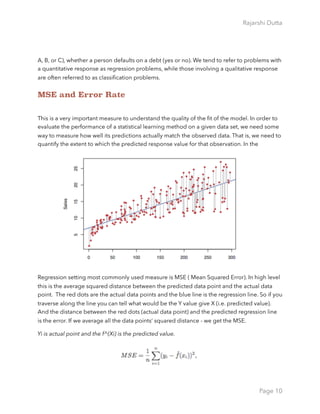
First of all, we can see that SibSp, Fare and Embarked are not statistically significant. As for the
statistically significant variables, sex has the lowest p-value suggesting a strong association of
the sex of the passenger with the probability of having survived. The negative coefficient for
this predictor suggests that all other variables being equal, the male passenger is less likely to
have survived. Remember that in the logit model the response variable is log odds: ln(odds)
Page 35](https://image.slidesharecdn.com/machinelearningandbuzzwords-170519002927/85/Machine-learning-and_buzzwords-35-320.jpg)
![Rajarshi Dutta
= ln(p/(1-p)) = a*x1 + b*x2 + … + z*xn. Since male is a dummy variable, being male reduces
the log odds by 2.75 while a unit increase in age reduces the log odds by 0.037.
library(ROCR)
p <- predict(model, newdata=subset(test,select=c(2,3,4,5,6,7,8)),
type="response")
pr <- prediction(p, test$Survived)
prf <- performance(pr, measure = "tpr", x.measure = "fpr")
plot(prf)
auc <- performance(pr, measure = "auc")
auc <- auc@y.values[[1]]
auc
0.8621652
Page 36](https://image.slidesharecdn.com/machinelearningandbuzzwords-170519002927/85/Machine-learning-and_buzzwords-36-320.jpg)
![Rajarshi Dutta
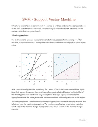
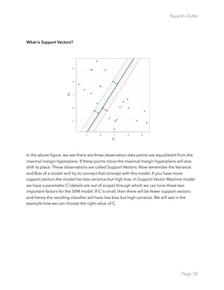
What is Support Vector Machine?
Most cases we find our observations cannot be separated by a linear approach.
In this figure (top-left), the Support vector classifier does the poor job. Where as in the top-
middle and the right most figure we see the perfect non-linear classification.
The support vector machine (SVM) is an extension of the support vector classifier that results
from enlarging the feature space in a specific way, using kernels. We will now discuss this
extension, the details of which are somewhat complex and beyond the scope of this book.
We want to enlarge our feature space in order to accommodate a non-linear boundary
between the classes. The kernel approach that we describe here is simply an efficient
computational approach for enacting this idea. In the top-middle figure - the kernel of degree
3 applied to the non-linear data and in the top right figure the radial kernel was applied. We
can see , either kernel was capable to capture the boundaries.
library(e1071)
set.seed(1)
x=matrix(rnorm(200*2), ncol=2)
x[1:100,]=x[1:100,]+2
x[101:150,]=x[101:150,]-2
Page 39](https://image.slidesharecdn.com/machinelearningandbuzzwords-170519002927/85/Machine-learning-and_buzzwords-39-320.jpg)
![Rajarshi Dutta
y=c(rep(1,150),rep(2,50))
dat=data.frame(x=x,y=as.factor(y))
plot(x, col=y)
svmfit=svm(y~.,data=dat[train,], kernel="radial", gamma=2,cost =1)
plot(svmfit , dat[train ,])
tune.out=tune(svm, y~., data=dat[train,], kernel="radial",
ranges=list(cost=c(0.1,1,10,100,1000),
gamma=c(0.5,1,2,3,4) ))
summary(tune.out)
Page 40](https://image.slidesharecdn.com/machinelearningandbuzzwords-170519002927/85/Machine-learning-and_buzzwords-40-320.jpg)
![Rajarshi Dutta
data <-read.csv("Wholesale customers data.csv",header=T) ## Download
the data from https://archive.ics.uci.edu/ml/datasets/Wholesale
+customers
summary(data)
There’s obviously a big difference for the top customers in each category (e.g. Fresh goes
from a min of 3 to a max of 112,151). Normalizing / scaling the data won’t necessarily remove
those outliers. Doing a log transformation might help. We could also remove those
customers completely. From a business perspective, you don’t really need a clustering
algorithm to identify what your top customers are buying. You usually need clustering and
segmentation for your middle 50%.
With that being said, let’s try removing the top 5 customers from each category. We’ll use a
custom function and create a new data set called data.rm.top
top.n.custs <- function (data,cols,n=5) { #Requires some data frame
and the top N to remove
idx.to.remove <-integer(0) #Initialize a vector to hold customers
being removed
for (c in cols){ # For every column in the data we passed to this
function
col.order <-order(data[,c],decreasing=T) #Sort column "c" in
descending order (bigger on top)
#Order returns the sorted index (e.g. row 15, 3, 7, 1, ...) rather
than the actual values sorted.
Page 46](https://image.slidesharecdn.com/machinelearningandbuzzwords-170519002927/85/Machine-learning-and_buzzwords-46-320.jpg)
![Rajarshi Dutta
idx <-head(col.order, n) #Take the first n of the sorted column C
to
idx.to.remove <-union(idx.to.remove,idx) #Combine and de-duplicate
the row ids that need to be removed
}
return(idx.to.remove) #Return the indexes of customers to be removed
}
top.custs <-top.n.custs(data,cols=3:8,n=5)
length(top.custs) #How Many Customers to be Removed?
data[top.custs,] #Examine the customers
data.rm.top<-data[-c(top.custs),] #Remove the Customers
summary(data.rm.top) ## removed the top customers
set.seed(76964057) #Set the seed for reproducibility
#Create 5 clusters, Remove columns 1 and 2
k <-kmeans(data.rm.top[,-c(1,2)], centers=5)
k$centers #Display cluster centers
Page 47](https://image.slidesharecdn.com/machinelearningandbuzzwords-170519002927/85/Machine-learning-and_buzzwords-47-320.jpg)

![Rajarshi Dutta
k.temp <-kmeans(data.rm.top,centers=v) #Run kmeans
v.totw.ss[i] <-k.temp$tot.withinss#Store the total withinss
}
avg.totw.ss[v-1] <-mean(v.totw.ss) #Average the 100 total withinss
}
plot(rng,avg.totw.ss,type="b", main="Total Within SS by Various K",
ylab="Average Total Within Sum of Squares",
xlab="Value of K")
Page 49](https://image.slidesharecdn.com/machinelearningandbuzzwords-170519002927/85/Machine-learning-and_buzzwords-49-320.jpg)


![Rajarshi Dutta
different, the network activates different neural paths from input to the output. However, the
output is still recognizes both images as the digit “6”.
We are going to use the Boston dataset in the MASS package.
The Boston dataset is a collection of data about housing values in the suburbs of Boston. Our
goal is to predict the median value of owner-occupied homes (medv) using all the other
continuous variables available.
set.seed(500)
library(MASS)
library(neuralnet)
data <- Boston
index <- sample(1:nrow(data),round(0.75*nrow(data)))
train <- data[index,]
test <- data[-index,]
maxs <- apply(data, 2, max)
mins <- apply(data, 2, min)
#It is good practice to normalize your data before training a neural
#network. I cannot emphasize enough how important this step is:
#depending on your dataset, avoiding normalization may lead to useless
#results or to a very difficult training process (most of the times
#the algorithm will not converge before the number of maximum
#iterations allowed). You can choose different methods to scale the
#data (z-normalization, min-max scale, etc…). I chose to use the min-
#max method and scale the data in the interval [0,1]. Usually scaling
#in the intervals [0,1] or [-1,1] tends to give better results.
scaled <- as.data.frame(scale(data, center = mins, scale = maxs -
mins)) ## Neural
train_ <- scaled[index,]
test_ <- scaled[-index,]
n <- names(train_)
Page 55](https://image.slidesharecdn.com/machinelearningandbuzzwords-170519002927/85/Machine-learning-and_buzzwords-55-320.jpg)
![Rajarshi Dutta
f <- as.formula(paste("medv ~", paste(n[!n %in% "medv"], collapse = "
+ ")))
nn <- neuralnet(f,data=train_,hidden=c(5,3),linear.output=T)
plot(nn)
pr.nn <- compute(nn,test_[,1:13])
pr.nn_ <- pr.nn$net.result*(max(data$medv)-min(data$medv))+min(data
$medv)
test.r <- (test_$medv)*(max(data$medv)-min(data$medv))+min(data$medv)
Page 56](https://image.slidesharecdn.com/machinelearningandbuzzwords-170519002927/85/Machine-learning-and_buzzwords-56-320.jpg)