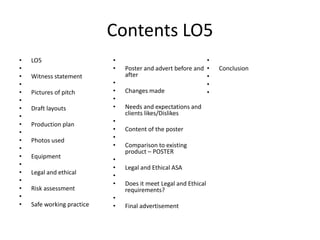
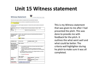
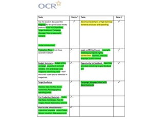
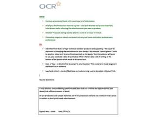
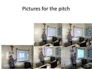
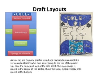
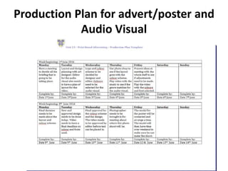
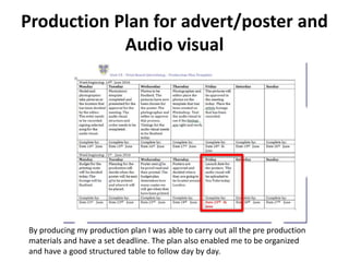
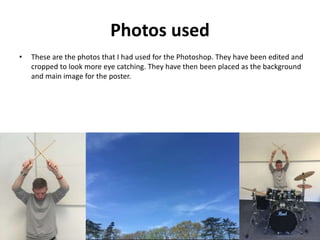
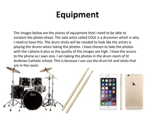
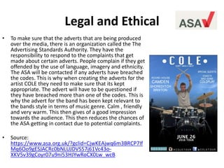
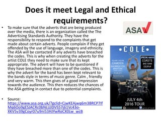
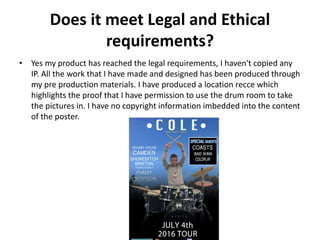
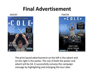
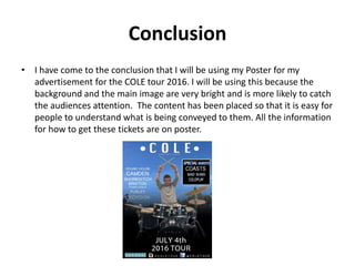
Contents LO5
• LO5
•
• Witness statement
•
• Pictures of pitch
•
• Draft layouts
•
• Production plan
•
• Photos used
•
• Equipment
•
• Legal and ethical
•
• Risk assessment
•
• Safe working practice
•
• Poster and advert before and
after
•
• Changes made
•
• Needs and expectations and
clients likes/Dislikes
•
• Content of the poster
•
• Comparison to existing
product – POSTER
•
• Legal and Ethical ASA
•
• Does it meet Legal and Ethical
requirements?
•
• Final advertisement
•
• Conclusion
•
•
•
Unit 15 Witness statement
This is my Witness statement
that was given to me after I had
presented the pitch. This was
done to provide me with
feedback for the pitch. It
outlines the what went well and
what could be better. The
criteria wall highlighter during
he pitch to make sure it was all
completed.
Pictures for the pitch
Draft Layouts
As you can see from my graphic layout and my hand drawn draft it is
very easy to identify what I am advertising. At the top of the poster
you have the name and logo of the solo artist. The main image is
placed in the centre of the poster. I have the social media synergy links
placed at the bottom.
Production Plan for advert/poster and
Audio Visual
Production Plan for advert/poster and
Audio visual
By producing my production plan I was able to carry out all the pre production
materials and have a set deadline. The plan also enabled me to be organized
and have a good structured table to follow day by day.
Photos used
• These are the photos that I had used for the Photoshop. They have been edited and
cropped to look more eye catching. They have then been placed as the background
and main image for the poster.
Equipment
The images below are the pieces of equipment that I need to be able to
conduct the photo-shoot. The solo artist called COLE is a drummer which is why
I need to have this. The drum sticks will be needed to look like the artists is
playing the drums when taking the photos. I have chosen to take the photos
with the I phone 6 plus as the quality of the images are high. I have the access
to the phone as I own one. I am taking the photos in the drum room of St
Andrews Catholic school. This is because I can use the drum kit and sticks that
are in the room.
Legal and Ethical
• To make sure that the adverts that are being produced
over the media, there is an organization called the The
Advertising Standards Authority. They have the
responsibility to respond to the complaints that get
made about certain adverts. People complain if they get
offended by the use of language, imagery and ethnicity.
The ASA will be contacted if any adverts have breached
the codes. This is why when creating the adverts for the
artist COLE they need to make sure that its kept
appropriate. The advert will have to be questioned if
they have breached more than one of the codes. This is
why the advert for the band has been kept relevant to
the bands style in terms of music genre. Calm , friendly
and very warm. This then gives of a good impression
towards the audience. This then reduces the chances of
the ASA getting in contact due to potential complaints.
• Source:
https://www.asa.org.uk/?gclid=CjwKEAjwq6m3BRCP7If
Mq6Oo9gESJACRc0bNLUJDVS57j61Vc43o-
XKV5v39gCoyr07u9ni53HJYwRoCX0Lw_wcB
Risk Assessment
This is the risk assessment that I had to do for the photo shoot plan. I had to
make sure that all the hazards while taking the photos. I have taken photos of
what I think will cause an accident while taking the photos. I have then written
a short description explaining how they are classed as hazards and what to be
aware of when taking the pictures.
Safe working Practice
• To create my Photoshop version for the poster and advert I used
Adobe Photoshop CS5.1. I have selected this program because it
has all the features that I need on it to be able to edit the
pictures for the poster and advert. I used tools such as the crop
tool, gradient tool, shape tool, text tool and added in my own
images. I used the gradient tool to be able to fade the colour
from the bottom to the top. I had the colour swatches saved in
the program which means that I could keep the colour consistent
and the same when editing.
Poster - before and after and
feedback
I have been given lots of feedback for my Photoshop drafts after I had done my pitch. I have
then made action my editing the poster and advert on Photoshop. I have changed the size of
the text on both drafts to make it easier to read. I have made the tour date a lot bigger. This
is so people are made aware clearer when the tour will be starting. I have added the special
guests section into a box with a stroke around the “Special Guests” verbal code to make it
stand out as this is my USP.
Advert - before and after
BEFORE AFTER
As this is an advert that will be inside a magazine I have decided to add more information than the poster as people
will most likely read more as it is a magazine. Therefore, I have changed the layout. I have added in the ‘Special
Guests’ box and a stroke around the writing as this is my USP. I have made the starting Tour date bigger so it stands
out and people can find the date easily. I have also added onto the left more venues that the tour will be and on the
right I have added more information such as where you can download the album, what star rating it is and a few of
the singles from the album – this gives the reader a better insight on them and they can go and check out their
music.
Changes made over the Feedback
I also to add in a extra slide about the IP and how this can be protected.
This had to then be added into my pitch.
Needs and expectations and clients
likes/Dislikes
• I have have used the feedback from the survey monkey and my client. One
dislike that my client didn't’ like was the lack of text and size of font on the
poster for the tour. Therefore I had to then change this to meet the
expectation for the client. My client did like all my pre-production material
as they thought it was very accurate and also my proposals. On my advert
and poster my client really liked the images on my advert and poster and
thought they were very well taken therefore I did not change the images.
On the previous slides I have stated what my client disliked and changes
this and made the corrections.
Content of the Product
• Is the content of the product of the correct based on form and style
compared to a existing campaign. The purpose of the content is to inform
the target audience when and where the tour will be. The poster content
will also inform you where you who else will be performing on the special
guest list. The final piece of content will inform you when the tour music
will be available to download on the I tunes store. At the bottom of the
poster there is social media synergy along with the website. I have taken a
screen shot of my proposal below which highlights this.
Comparison to existing product -
POSTER
• As you can see below in the screen shots of my poster on the right and the existing
product by COASTS on the left. They both have similar colours and information
displayed on the poster. They both have social media synergy at the bottom of the
poster. The background both feature the sky and clouds to produce a open
background.
Does it meet Legal and Ethical
requirements?
• To make sure that the adverts that are being produced
over the media, there is an organization called the The
Advertising Standards Authority. They have the
responsibility to respond to the complaints that get
made about certain adverts. People complain if they get
offended by the use of language, imagery and ethnicity.
The ASA will be contacted if any adverts have breached
the codes. This is why when creating the adverts for the
artist COLE they need to make sure that its kept
appropriate. The advert will have to be questioned if
they have breached more than one of the codes. This is
why the advert for the band has been kept relevant to
the bands style in terms of music genre. Calm , friendly
and very warm. This then gives of a good impression
towards the audience. This then reduces the chances of
the ASA getting in contact due to potential complaints.
• Source:
https://www.asa.org.uk/?gclid=CjwKEAjwq6m3BRCP7If
Mq6Oo9gESJACRc0bNLUJDVS57j61Vc43o-
XKV5v39gCoyr07u9ni53HJYwRoCX0Lw_wcB
Does it meet Legal and Ethical
requirements?
• Yes my product has reached the legal requirements, I haven't copied any
IP. All the work that I have made and designed has been produced through
my pre production materials. I have produced a location recce which
highlights the proof that I have permission to use the drum room to take
the pictures in. I have no copyright information imbedded into the content
of the poster.
Final Advertisement
The print based advertisement on the left is the advert and
on the right is the poster. The size of both the poster and
advert will be A4. It successfully conveys the campaign
message by highlighting and enlarging the tour date.
POSTERADVERT
Conclusion
• I have come to the conclusion that I will be using my Poster for my
advertisement for the COLE tour 2016. I will be using this because the
background and the main image are very bright and is more likely to catch
the audiences attention. The content has been placed so that it is easy for
people to understand what is being conveyed to them. All the information
for how to get these tickets are on poster.

Lo5

  • 2.
    Contents LO5 • LO5 • •Witness statement • • Pictures of pitch • • Draft layouts • • Production plan • • Photos used • • Equipment • • Legal and ethical • • Risk assessment • • Safe working practice • • Poster and advert before and after • • Changes made • • Needs and expectations and clients likes/Dislikes • • Content of the poster • • Comparison to existing product – POSTER • • Legal and Ethical ASA • • Does it meet Legal and Ethical requirements? • • Final advertisement • • Conclusion • • •
  • 3.
    Unit 15 Witnessstatement This is my Witness statement that was given to me after I had presented the pitch. This was done to provide me with feedback for the pitch. It outlines the what went well and what could be better. The criteria wall highlighter during he pitch to make sure it was all completed.
  • 6.
  • 7.
    Draft Layouts As youcan see from my graphic layout and my hand drawn draft it is very easy to identify what I am advertising. At the top of the poster you have the name and logo of the solo artist. The main image is placed in the centre of the poster. I have the social media synergy links placed at the bottom.
  • 8.
    Production Plan foradvert/poster and Audio Visual
  • 9.
    Production Plan foradvert/poster and Audio visual By producing my production plan I was able to carry out all the pre production materials and have a set deadline. The plan also enabled me to be organized and have a good structured table to follow day by day.
  • 10.
    Photos used • Theseare the photos that I had used for the Photoshop. They have been edited and cropped to look more eye catching. They have then been placed as the background and main image for the poster.
  • 11.
    Equipment The images beloware the pieces of equipment that I need to be able to conduct the photo-shoot. The solo artist called COLE is a drummer which is why I need to have this. The drum sticks will be needed to look like the artists is playing the drums when taking the photos. I have chosen to take the photos with the I phone 6 plus as the quality of the images are high. I have the access to the phone as I own one. I am taking the photos in the drum room of St Andrews Catholic school. This is because I can use the drum kit and sticks that are in the room.
  • 12.
    Legal and Ethical •To make sure that the adverts that are being produced over the media, there is an organization called the The Advertising Standards Authority. They have the responsibility to respond to the complaints that get made about certain adverts. People complain if they get offended by the use of language, imagery and ethnicity. The ASA will be contacted if any adverts have breached the codes. This is why when creating the adverts for the artist COLE they need to make sure that its kept appropriate. The advert will have to be questioned if they have breached more than one of the codes. This is why the advert for the band has been kept relevant to the bands style in terms of music genre. Calm , friendly and very warm. This then gives of a good impression towards the audience. This then reduces the chances of the ASA getting in contact due to potential complaints. • Source: https://www.asa.org.uk/?gclid=CjwKEAjwq6m3BRCP7If Mq6Oo9gESJACRc0bNLUJDVS57j61Vc43o- XKV5v39gCoyr07u9ni53HJYwRoCX0Lw_wcB
  • 13.
    Risk Assessment This isthe risk assessment that I had to do for the photo shoot plan. I had to make sure that all the hazards while taking the photos. I have taken photos of what I think will cause an accident while taking the photos. I have then written a short description explaining how they are classed as hazards and what to be aware of when taking the pictures.
  • 14.
    Safe working Practice •To create my Photoshop version for the poster and advert I used Adobe Photoshop CS5.1. I have selected this program because it has all the features that I need on it to be able to edit the pictures for the poster and advert. I used tools such as the crop tool, gradient tool, shape tool, text tool and added in my own images. I used the gradient tool to be able to fade the colour from the bottom to the top. I had the colour swatches saved in the program which means that I could keep the colour consistent and the same when editing.
  • 15.
    Poster - beforeand after and feedback I have been given lots of feedback for my Photoshop drafts after I had done my pitch. I have then made action my editing the poster and advert on Photoshop. I have changed the size of the text on both drafts to make it easier to read. I have made the tour date a lot bigger. This is so people are made aware clearer when the tour will be starting. I have added the special guests section into a box with a stroke around the “Special Guests” verbal code to make it stand out as this is my USP.
  • 16.
    Advert - beforeand after BEFORE AFTER As this is an advert that will be inside a magazine I have decided to add more information than the poster as people will most likely read more as it is a magazine. Therefore, I have changed the layout. I have added in the ‘Special Guests’ box and a stroke around the writing as this is my USP. I have made the starting Tour date bigger so it stands out and people can find the date easily. I have also added onto the left more venues that the tour will be and on the right I have added more information such as where you can download the album, what star rating it is and a few of the singles from the album – this gives the reader a better insight on them and they can go and check out their music.
  • 17.
    Changes made overthe Feedback I also to add in a extra slide about the IP and how this can be protected. This had to then be added into my pitch.
  • 18.
    Needs and expectationsand clients likes/Dislikes • I have have used the feedback from the survey monkey and my client. One dislike that my client didn't’ like was the lack of text and size of font on the poster for the tour. Therefore I had to then change this to meet the expectation for the client. My client did like all my pre-production material as they thought it was very accurate and also my proposals. On my advert and poster my client really liked the images on my advert and poster and thought they were very well taken therefore I did not change the images. On the previous slides I have stated what my client disliked and changes this and made the corrections.
  • 19.
    Content of theProduct • Is the content of the product of the correct based on form and style compared to a existing campaign. The purpose of the content is to inform the target audience when and where the tour will be. The poster content will also inform you where you who else will be performing on the special guest list. The final piece of content will inform you when the tour music will be available to download on the I tunes store. At the bottom of the poster there is social media synergy along with the website. I have taken a screen shot of my proposal below which highlights this.
  • 20.
    Comparison to existingproduct - POSTER • As you can see below in the screen shots of my poster on the right and the existing product by COASTS on the left. They both have similar colours and information displayed on the poster. They both have social media synergy at the bottom of the poster. The background both feature the sky and clouds to produce a open background.
  • 21.
    Does it meetLegal and Ethical requirements? • To make sure that the adverts that are being produced over the media, there is an organization called the The Advertising Standards Authority. They have the responsibility to respond to the complaints that get made about certain adverts. People complain if they get offended by the use of language, imagery and ethnicity. The ASA will be contacted if any adverts have breached the codes. This is why when creating the adverts for the artist COLE they need to make sure that its kept appropriate. The advert will have to be questioned if they have breached more than one of the codes. This is why the advert for the band has been kept relevant to the bands style in terms of music genre. Calm , friendly and very warm. This then gives of a good impression towards the audience. This then reduces the chances of the ASA getting in contact due to potential complaints. • Source: https://www.asa.org.uk/?gclid=CjwKEAjwq6m3BRCP7If Mq6Oo9gESJACRc0bNLUJDVS57j61Vc43o- XKV5v39gCoyr07u9ni53HJYwRoCX0Lw_wcB
  • 22.
    Does it meetLegal and Ethical requirements? • Yes my product has reached the legal requirements, I haven't copied any IP. All the work that I have made and designed has been produced through my pre production materials. I have produced a location recce which highlights the proof that I have permission to use the drum room to take the pictures in. I have no copyright information imbedded into the content of the poster.
  • 23.
    Final Advertisement The printbased advertisement on the left is the advert and on the right is the poster. The size of both the poster and advert will be A4. It successfully conveys the campaign message by highlighting and enlarging the tour date. POSTERADVERT
  • 24.
    Conclusion • I havecome to the conclusion that I will be using my Poster for my advertisement for the COLE tour 2016. I will be using this because the background and the main image are very bright and is more likely to catch the audiences attention. The content has been placed so that it is easy for people to understand what is being conveyed to them. All the information for how to get these tickets are on poster.

Editor's Notes