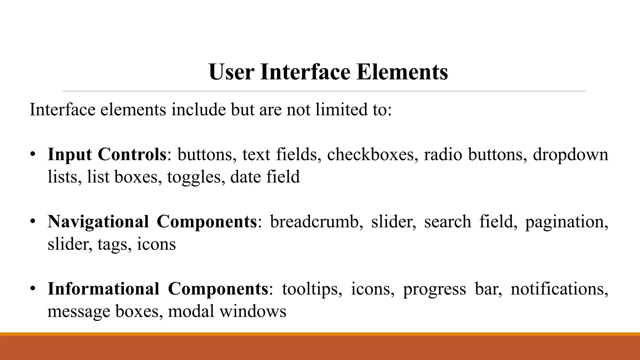
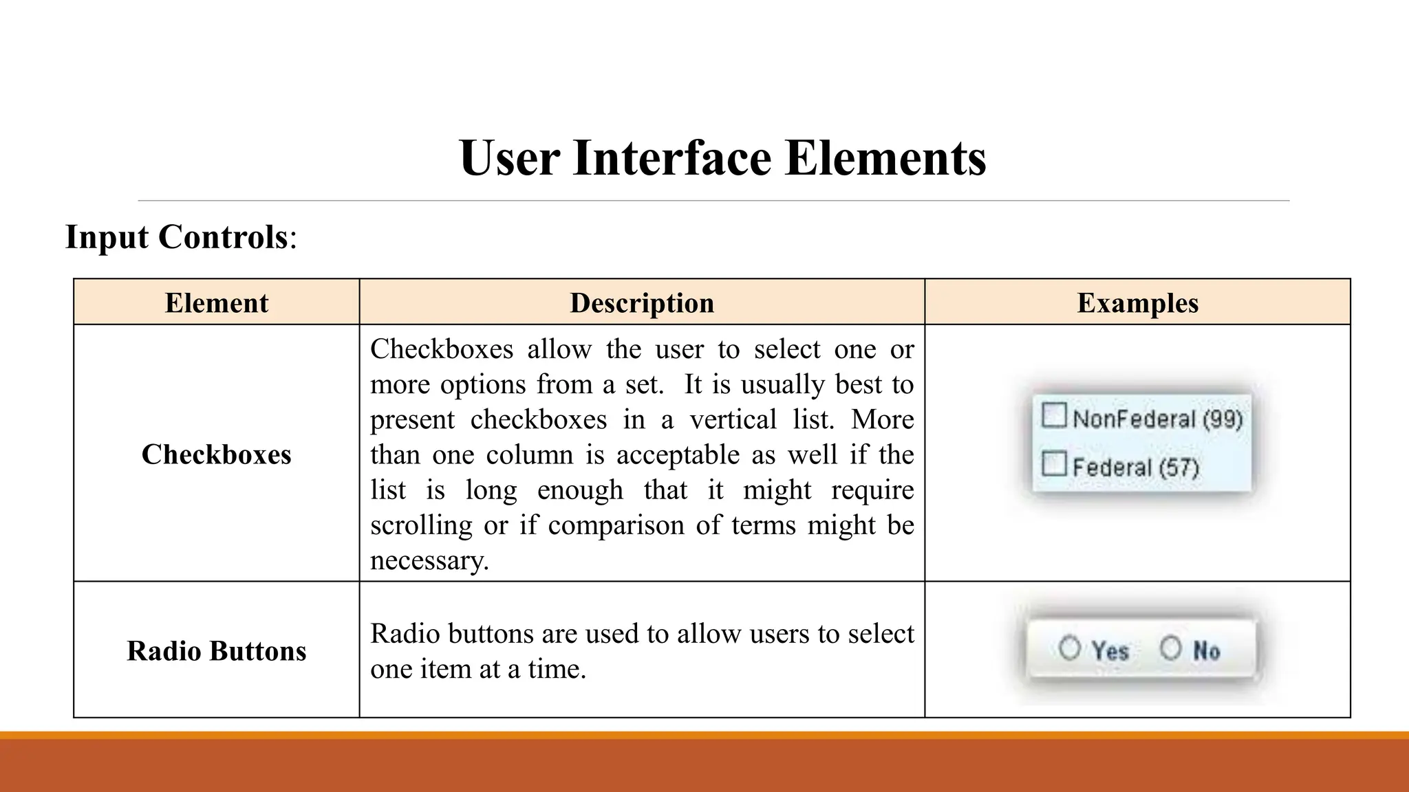
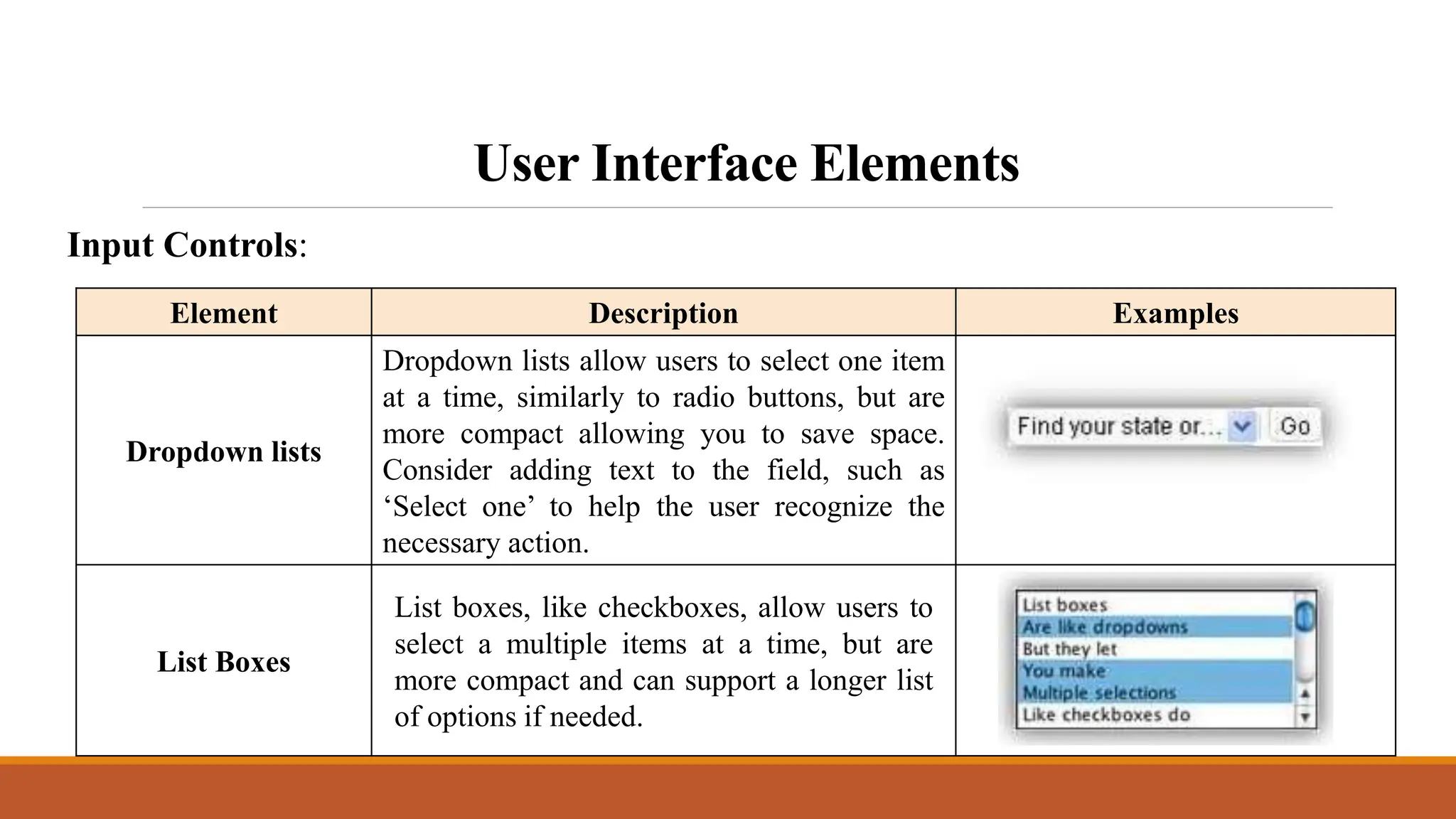
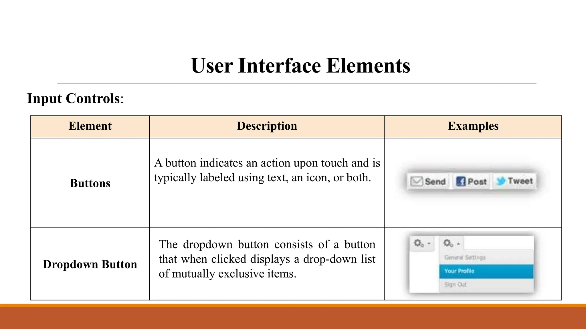
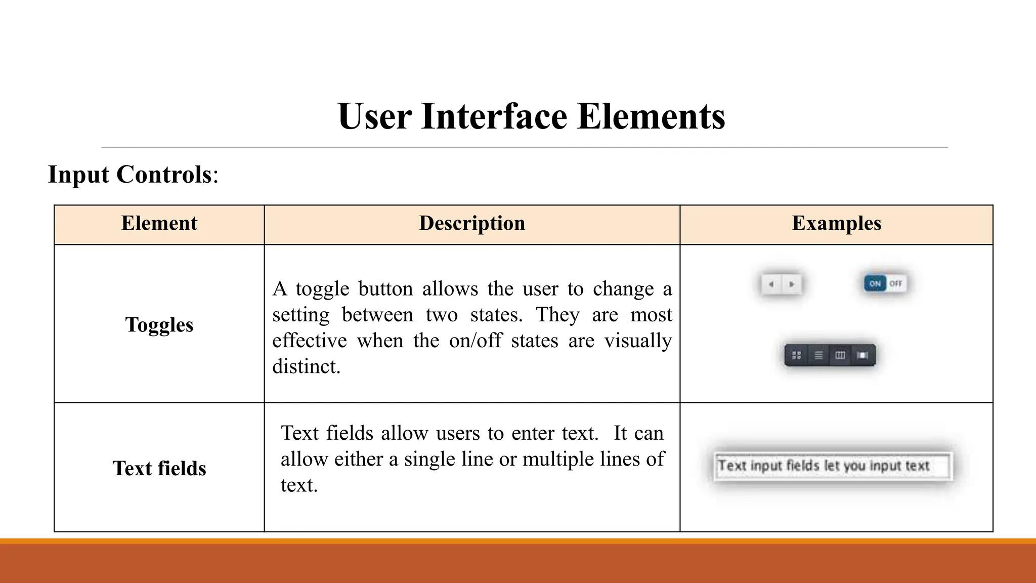
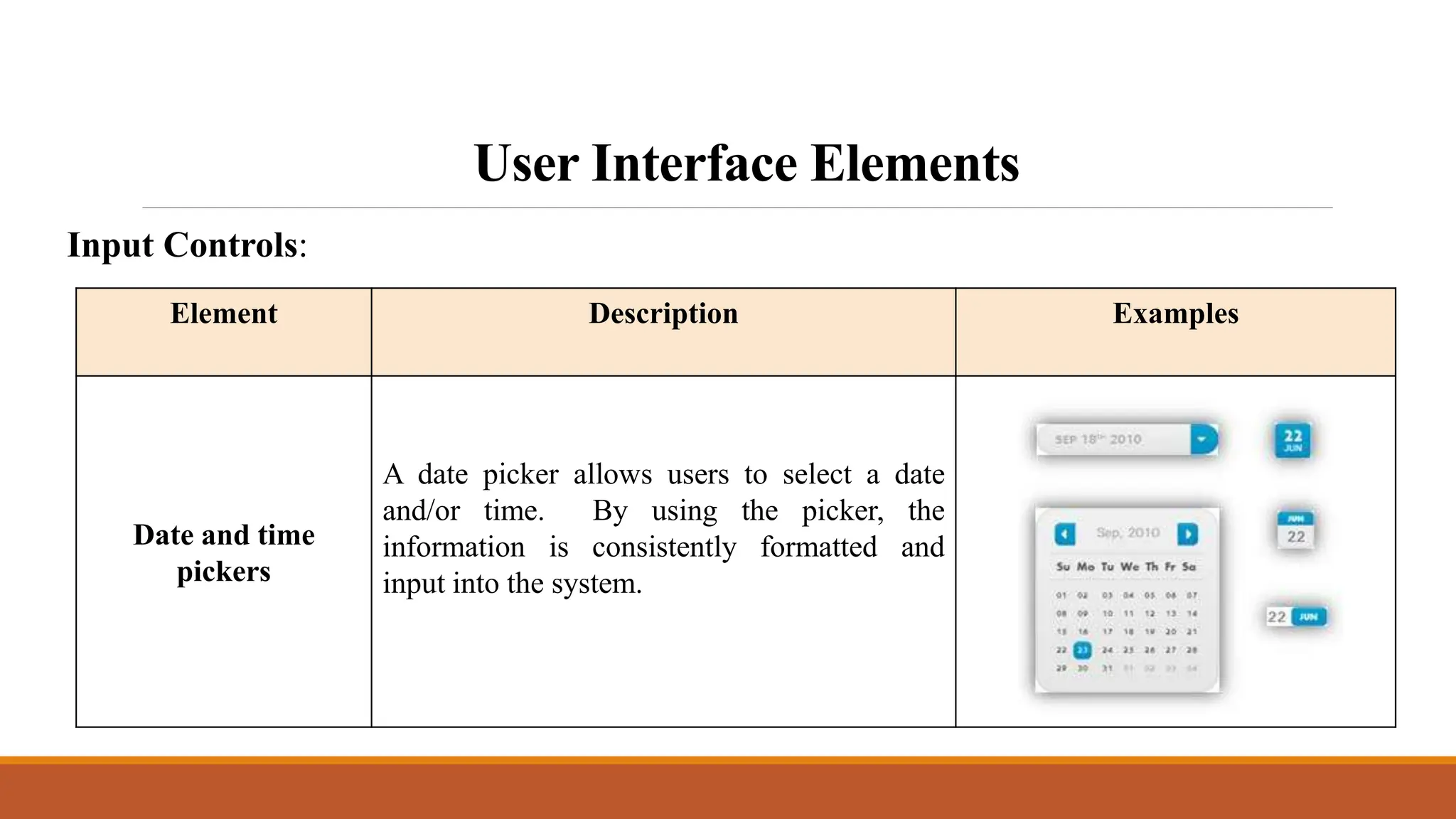
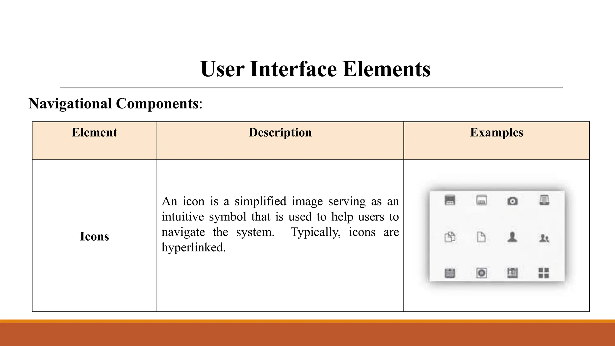
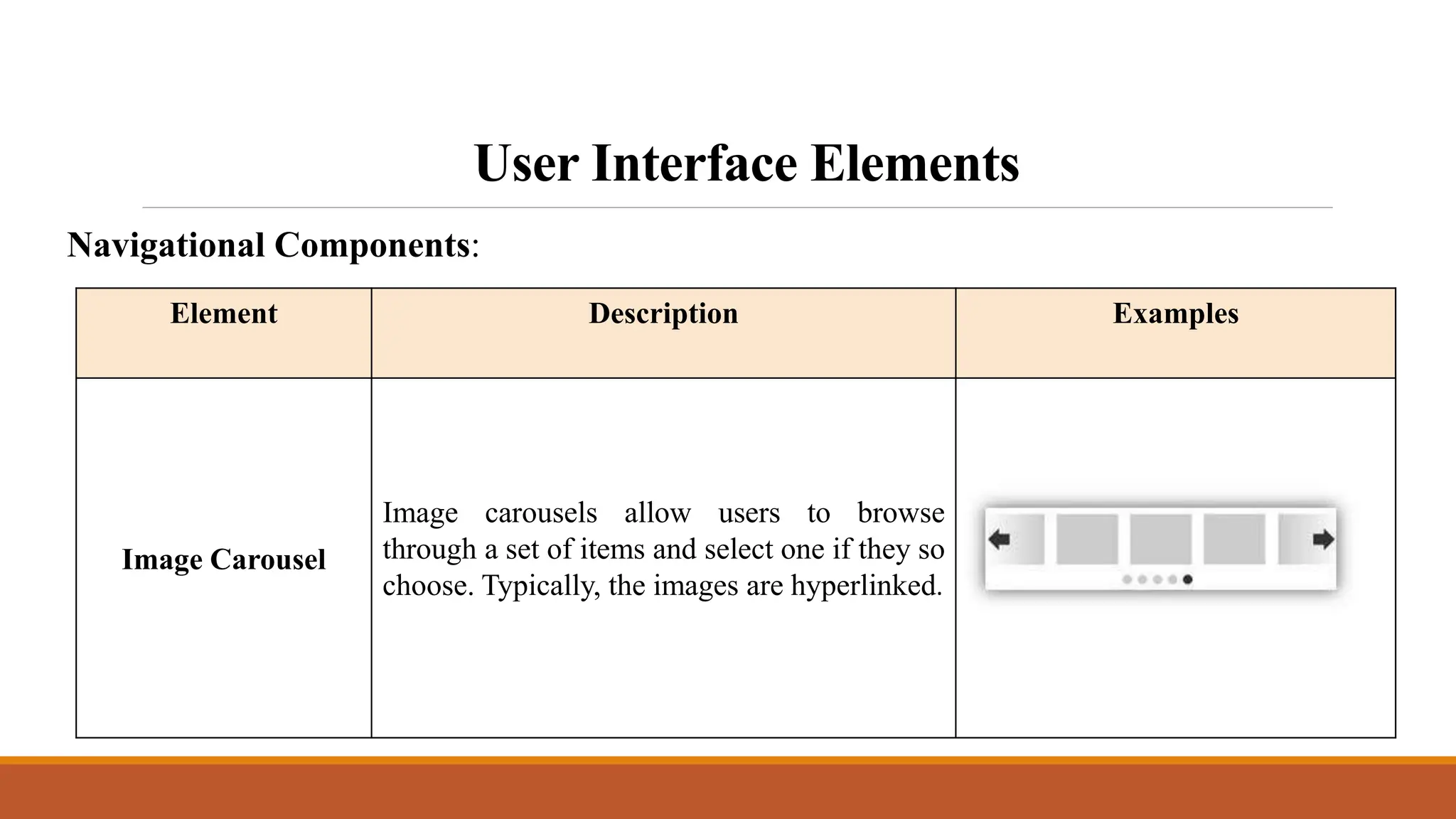
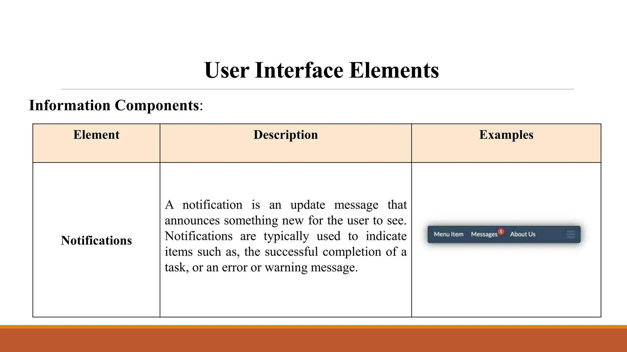
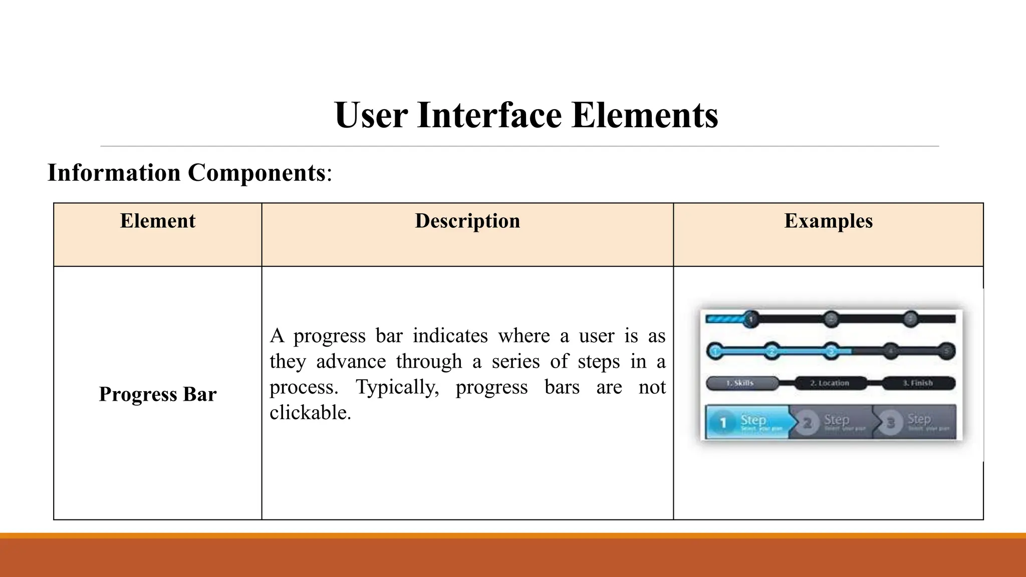
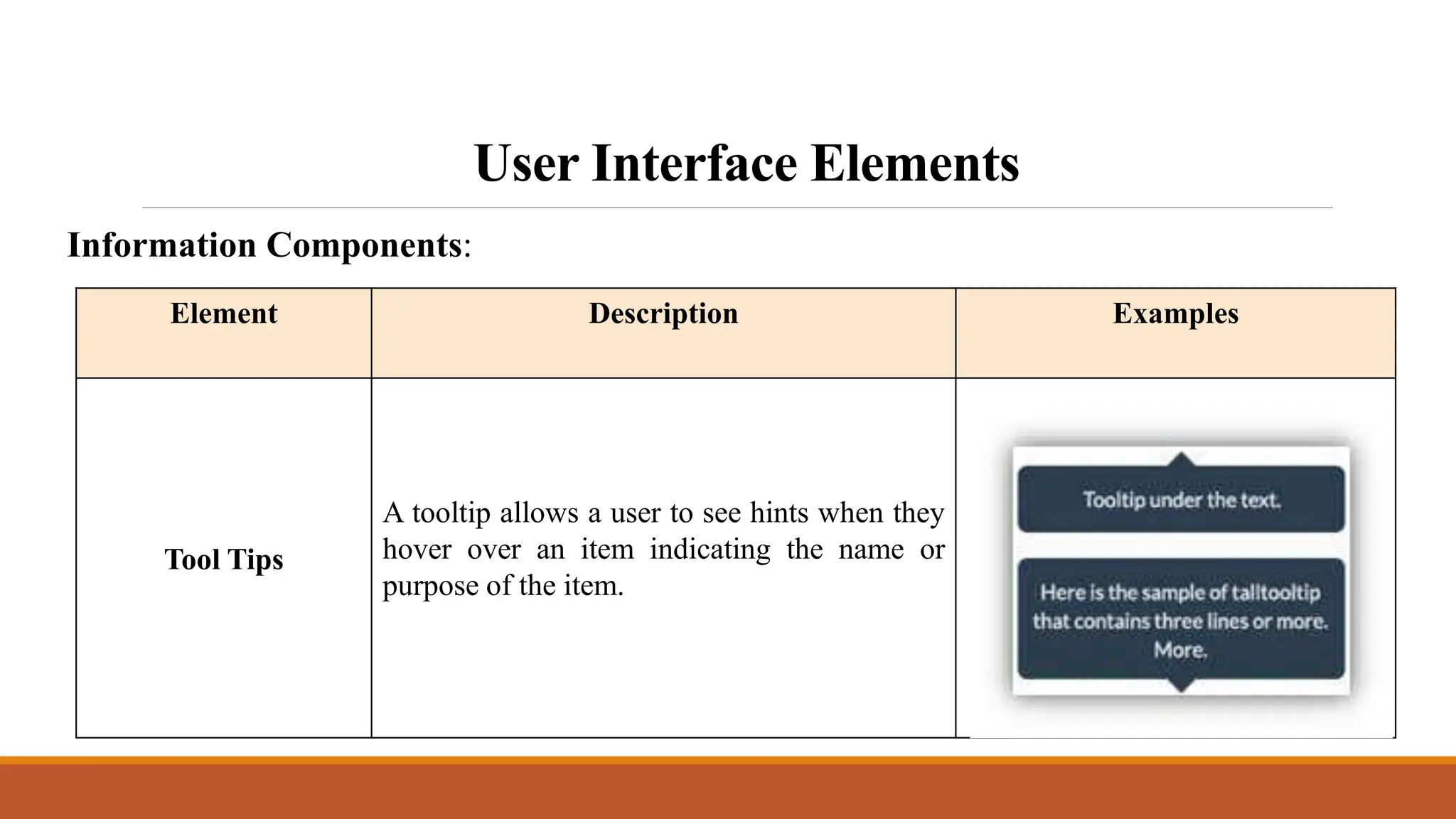
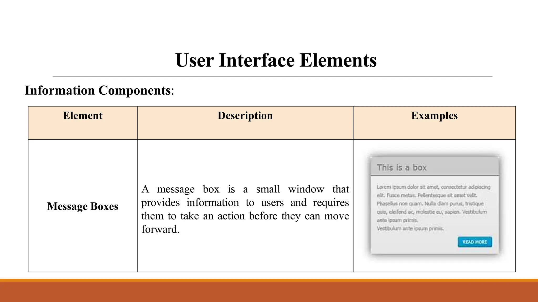
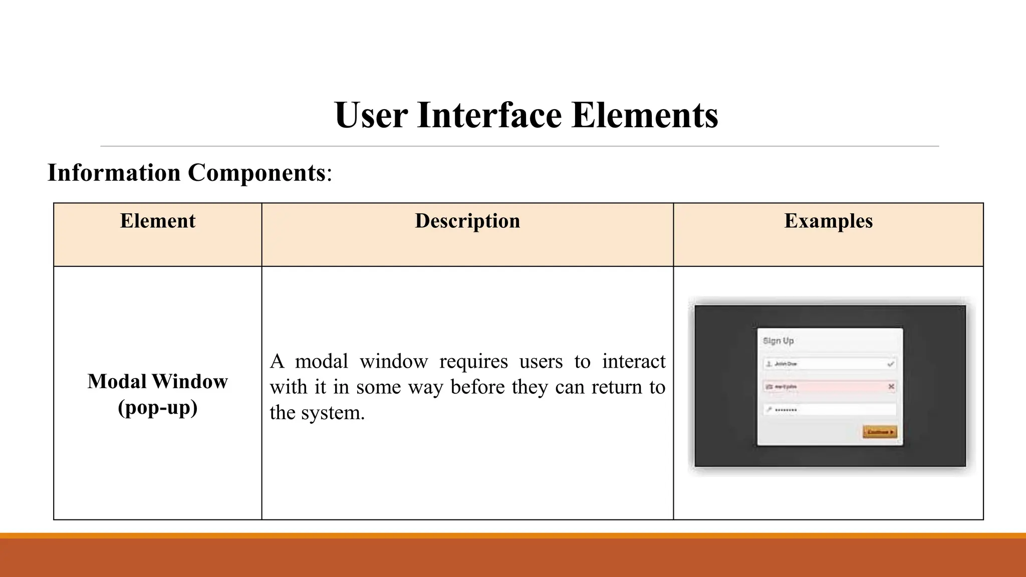
Introduction to Human
Computer Interaction
Instructor:
Ellen Grace Porras
Overview
• User Interface Elements
• Input Controls
• Navigational Components
• Information Components
• Best practices for designing an interface
User Interface Elements
Interface elements include but are not limited to:
• Input Controls: buttons, text fields, checkboxes, radio buttons, dropdown
lists, list boxes, toggles, date field
• Navigational Components: breadcrumb, slider, search field, pagination,
slider, tags, icons
• Informational Components: tooltips, icons, progress bar, notifications,
message boxes, modal windows
User Interface Elements
Input Controls:
Element Description Examples
Checkboxes
Checkboxes allow the user to select one or
more options from a set. It is usually best to
present checkboxes in a vertical list. More
than one column is acceptable as well if the
list is long enough that it might require
scrolling or if comparison of terms might be
necessary.
Radio Buttons
Radio buttons are used to allow users to select
one item at a time.
User Interface Elements
Input Controls:
Element Description Examples
Dropdown lists
Dropdown lists allow users to select one item
at a time, similarly to radio buttons, but are
more compact allowing you to save space.
Consider adding text to the field, such as
‘Select one’ to help the user recognize the
necessary action.
List Boxes
List boxes, like checkboxes, allow users to
select a multiple items at a time, but are
more compact and can support a longer list
of options if needed.
User Interface Elements
Input Controls:
Element Description Examples
Buttons
A button indicates an action upon touch and is
typically labeled using text, an icon, or both.
Dropdown Button
The dropdown button consists of a button
that when clicked displays a drop-down list
of mutually exclusive items.
User Interface Elements
Input Controls:
Element Description Examples
Toggles
A toggle button allows the user to change a
setting between two states. They are most
effective when the on/off states are visually
distinct.
Text fields
Text fields allow users to enter text. It can
allow either a single line or multiple lines of
text.
User Interface Elements
Input Controls:
Element Description Examples
Date and time
pickers
A date picker allows users to select a date
and/or time. By using the picker, the
information is consistently formatted and
input into the system.
User Interface Elements
Navigational Components:
Element Description Examples
Search Field
A search box allows users to enter a keyword
or phrase (query) and submit it to search the
index with the intention of getting back the
most relevant results. Typically search fields
are single-line text boxes and are often
accompanied by a search button.
User Interface Elements
Element Description Examples
Breadcrumb
Breadcrumbs allow users to identify their
current location within the system by
providing a clickable trail of proceeding
pages to navigate by.
Pagination
Pagination divides content up between
pages and allows users to skip between
pages or go in order through the content.
Navigational Components:
User Interface Elements
Element Description Examples
Tags
Tags allow users to find content in the same
category. Some tagging systems also allow
users to apply their own tags to content by
entering them into the system.
Navigational Components:
User Interface Elements
Element Description Examples
Sliders
A slider, also known as a track bar, allows
users to set or adjust a value. When the user
changes the value, it does not change the
format of the interface or other info on the
screen.
Navigational Components:
User Interface Elements
Element Description Examples
Icons
An icon is a simplified image serving as an
intuitive symbol that is used to help users to
navigate the system. Typically, icons are
hyperlinked.
Navigational Components:
User Interface Elements
Element Description Examples
Image Carousel
Image carousels allow users to browse
through a set of items and select one if they so
choose. Typically, the images are hyperlinked.
Navigational Components:
User Interface Elements
Element Description Examples
Notifications
A notification is an update message that
announces something new for the user to see.
Notifications are typically used to indicate
items such as, the successful completion of a
task, or an error or warning message.
Information Components:
User Interface Elements
Element Description Examples
Progress Bar
A progress bar indicates where a user is as
they advance through a series of steps in a
process. Typically, progress bars are not
clickable.
Information Components:
User Interface Elements
Element Description Examples
Tool Tips
A tooltip allows a user to see hints when they
hover over an item indicating the name or
purpose of the item.
Information Components:
User Interface Elements
Element Description Examples
Message Boxes
A message box is a small window that
provides information to users and requires
them to take an action before they can move
forward.
Information Components:
User Interface Elements
Element Description Examples
Modal Window
(pop-up)
A modal window requires users to interact
with it in some way before they can return to
the system.
Information Components:
Best practices for designing an Interface
Everything stems from knowing your users, including
understanding their goals, skills, preferences, and
tendencies. Once you know about your user, make sure to
consider the following when designing your interface:
Best practices for designing an Interface
 Keep the interface simple. The best interfaces are almost invisible
to the user. They avoid unnecessary elements and are clear in the
language they use on labels and in messaging.
 Create consistency and use common UI elements. By
using common elements in your UI, users feel more comfortable
and are able to get things done more quickly. It is also important to
create patterns in language, layout and design throughout the site to
help facilitate efficiency. Once a user learns how to do something,
they should be able to transfer that skill to other parts of the site.
Best practices for designing an Interface
 Be purposeful in page layout. Consider the spatial relationships
between items on the page and structure the page based on
importance. Careful placement of items can help draw attention to
the most important pieces of information and can aid scanning and
readability.
 Strategically use color and texture. You can direct attention
toward or redirect attention away from items using color, light,
contrast, and texture to your advantage.
Best practices for designing an Interface
 Use typography to create hierarchy and clarity. Carefully
consider how you use typeface. Different sizes, fonts, and
arrangement of the text to help increase scannability, legibility and
readability.
 Make sure that the system communicates what’s
happening. Always inform your users of location, actions,
changes in state, or errors. The use of various UI elements to
communicate status and, if necessary, next steps can reduce
frustration for your user.
Best practices for designing an Interface
 Think about the defaults. By carefully thinking about and
anticipating the goals people bring to your site, you can create
defaults that reduce the burden on the user. This becomes
particularly important when it comes to form design where you
might have an opportunity to have some fields pre-chosen or filled
out.
THANK YOU!

Lesson 3 Introduction to Human Computer Interaction.pptx

  • 1.
    Introduction to Human ComputerInteraction Instructor: Ellen Grace Porras
  • 2.
    Overview • User InterfaceElements • Input Controls • Navigational Components • Information Components • Best practices for designing an interface
  • 3.
    User Interface Elements Interfaceelements include but are not limited to: • Input Controls: buttons, text fields, checkboxes, radio buttons, dropdown lists, list boxes, toggles, date field • Navigational Components: breadcrumb, slider, search field, pagination, slider, tags, icons • Informational Components: tooltips, icons, progress bar, notifications, message boxes, modal windows
  • 4.
    User Interface Elements InputControls: Element Description Examples Checkboxes Checkboxes allow the user to select one or more options from a set. It is usually best to present checkboxes in a vertical list. More than one column is acceptable as well if the list is long enough that it might require scrolling or if comparison of terms might be necessary. Radio Buttons Radio buttons are used to allow users to select one item at a time.
  • 5.
    User Interface Elements InputControls: Element Description Examples Dropdown lists Dropdown lists allow users to select one item at a time, similarly to radio buttons, but are more compact allowing you to save space. Consider adding text to the field, such as ‘Select one’ to help the user recognize the necessary action. List Boxes List boxes, like checkboxes, allow users to select a multiple items at a time, but are more compact and can support a longer list of options if needed.
  • 6.
    User Interface Elements InputControls: Element Description Examples Buttons A button indicates an action upon touch and is typically labeled using text, an icon, or both. Dropdown Button The dropdown button consists of a button that when clicked displays a drop-down list of mutually exclusive items.
  • 7.
    User Interface Elements InputControls: Element Description Examples Toggles A toggle button allows the user to change a setting between two states. They are most effective when the on/off states are visually distinct. Text fields Text fields allow users to enter text. It can allow either a single line or multiple lines of text.
  • 8.
    User Interface Elements InputControls: Element Description Examples Date and time pickers A date picker allows users to select a date and/or time. By using the picker, the information is consistently formatted and input into the system.
  • 9.
    User Interface Elements NavigationalComponents: Element Description Examples Search Field A search box allows users to enter a keyword or phrase (query) and submit it to search the index with the intention of getting back the most relevant results. Typically search fields are single-line text boxes and are often accompanied by a search button.
  • 10.
    User Interface Elements ElementDescription Examples Breadcrumb Breadcrumbs allow users to identify their current location within the system by providing a clickable trail of proceeding pages to navigate by. Pagination Pagination divides content up between pages and allows users to skip between pages or go in order through the content. Navigational Components:
  • 11.
    User Interface Elements ElementDescription Examples Tags Tags allow users to find content in the same category. Some tagging systems also allow users to apply their own tags to content by entering them into the system. Navigational Components:
  • 12.
    User Interface Elements ElementDescription Examples Sliders A slider, also known as a track bar, allows users to set or adjust a value. When the user changes the value, it does not change the format of the interface or other info on the screen. Navigational Components:
  • 13.
    User Interface Elements ElementDescription Examples Icons An icon is a simplified image serving as an intuitive symbol that is used to help users to navigate the system. Typically, icons are hyperlinked. Navigational Components:
  • 14.
    User Interface Elements ElementDescription Examples Image Carousel Image carousels allow users to browse through a set of items and select one if they so choose. Typically, the images are hyperlinked. Navigational Components:
  • 15.
    User Interface Elements ElementDescription Examples Notifications A notification is an update message that announces something new for the user to see. Notifications are typically used to indicate items such as, the successful completion of a task, or an error or warning message. Information Components:
  • 16.
    User Interface Elements ElementDescription Examples Progress Bar A progress bar indicates where a user is as they advance through a series of steps in a process. Typically, progress bars are not clickable. Information Components:
  • 17.
    User Interface Elements ElementDescription Examples Tool Tips A tooltip allows a user to see hints when they hover over an item indicating the name or purpose of the item. Information Components:
  • 18.
    User Interface Elements ElementDescription Examples Message Boxes A message box is a small window that provides information to users and requires them to take an action before they can move forward. Information Components:
  • 19.
    User Interface Elements ElementDescription Examples Modal Window (pop-up) A modal window requires users to interact with it in some way before they can return to the system. Information Components:
  • 20.
    Best practices fordesigning an Interface Everything stems from knowing your users, including understanding their goals, skills, preferences, and tendencies. Once you know about your user, make sure to consider the following when designing your interface:
  • 21.
    Best practices fordesigning an Interface  Keep the interface simple. The best interfaces are almost invisible to the user. They avoid unnecessary elements and are clear in the language they use on labels and in messaging.  Create consistency and use common UI elements. By using common elements in your UI, users feel more comfortable and are able to get things done more quickly. It is also important to create patterns in language, layout and design throughout the site to help facilitate efficiency. Once a user learns how to do something, they should be able to transfer that skill to other parts of the site.
  • 22.
    Best practices fordesigning an Interface  Be purposeful in page layout. Consider the spatial relationships between items on the page and structure the page based on importance. Careful placement of items can help draw attention to the most important pieces of information and can aid scanning and readability.  Strategically use color and texture. You can direct attention toward or redirect attention away from items using color, light, contrast, and texture to your advantage.
  • 23.
    Best practices fordesigning an Interface  Use typography to create hierarchy and clarity. Carefully consider how you use typeface. Different sizes, fonts, and arrangement of the text to help increase scannability, legibility and readability.  Make sure that the system communicates what’s happening. Always inform your users of location, actions, changes in state, or errors. The use of various UI elements to communicate status and, if necessary, next steps can reduce frustration for your user.
  • 24.
    Best practices fordesigning an Interface  Think about the defaults. By carefully thinking about and anticipating the goals people bring to your site, you can create defaults that reduce the burden on the user. This becomes particularly important when it comes to form design where you might have an opportunity to have some fields pre-chosen or filled out.
  • 25.