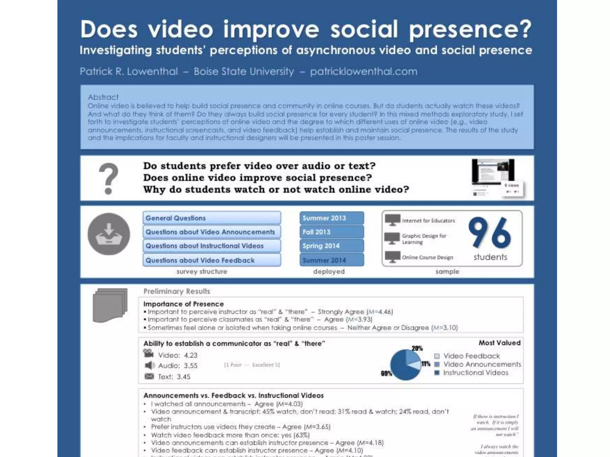
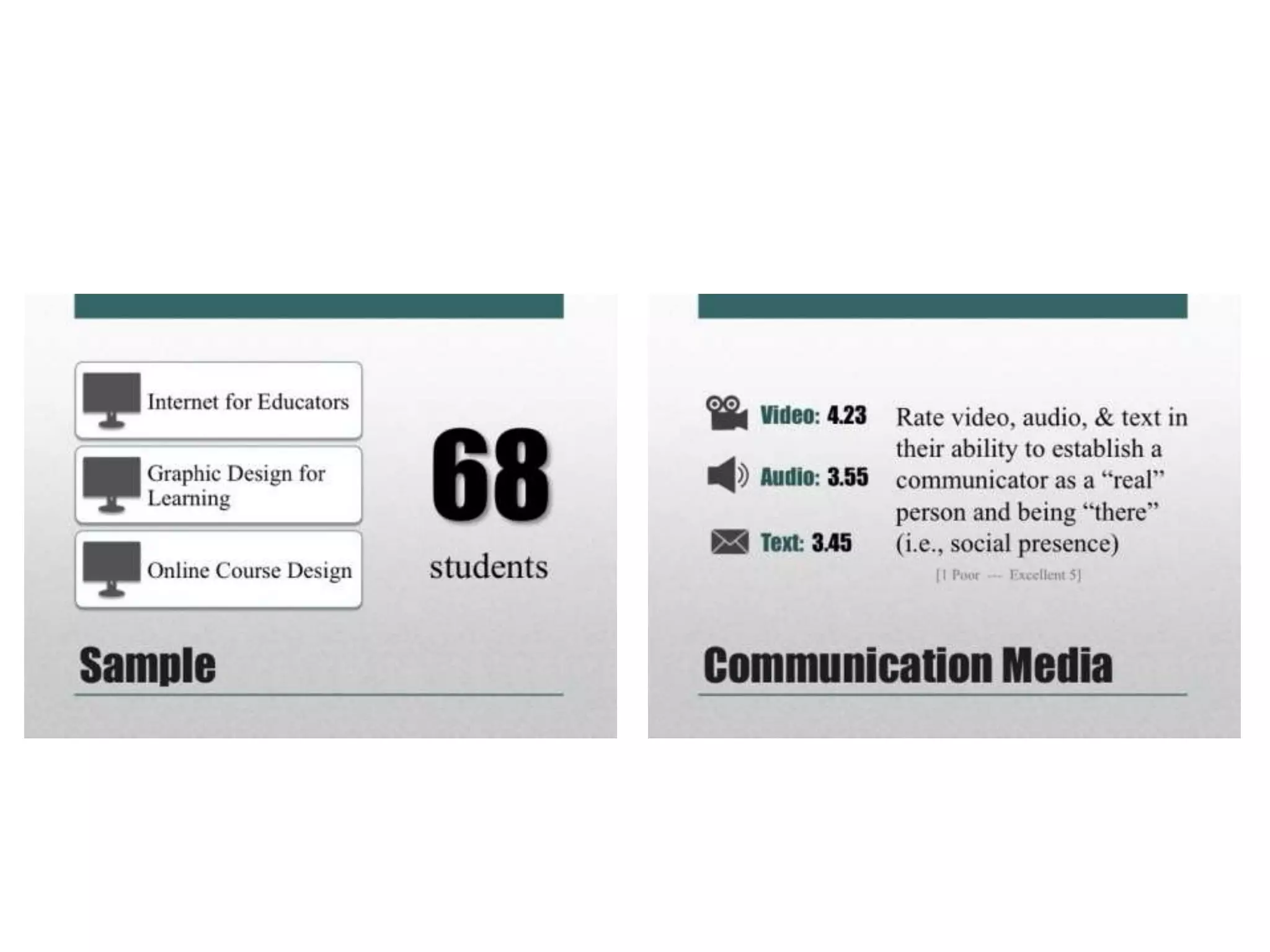
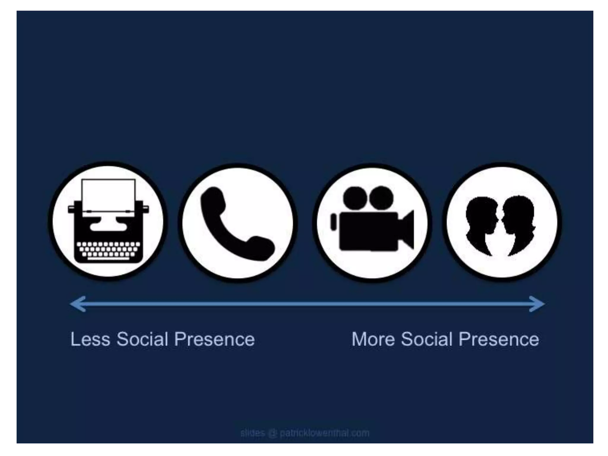
Downloaded 20 times


![Definitions…
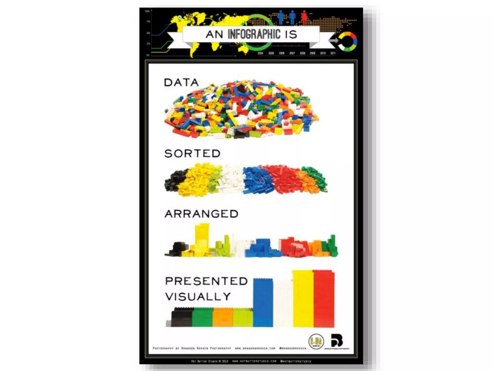
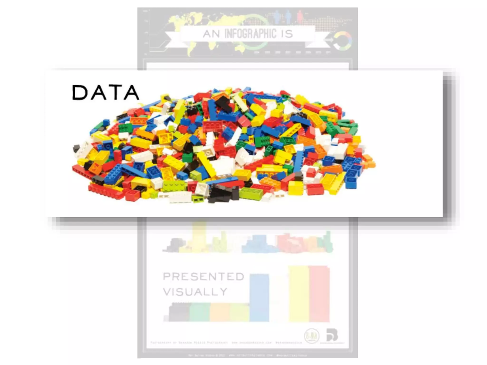
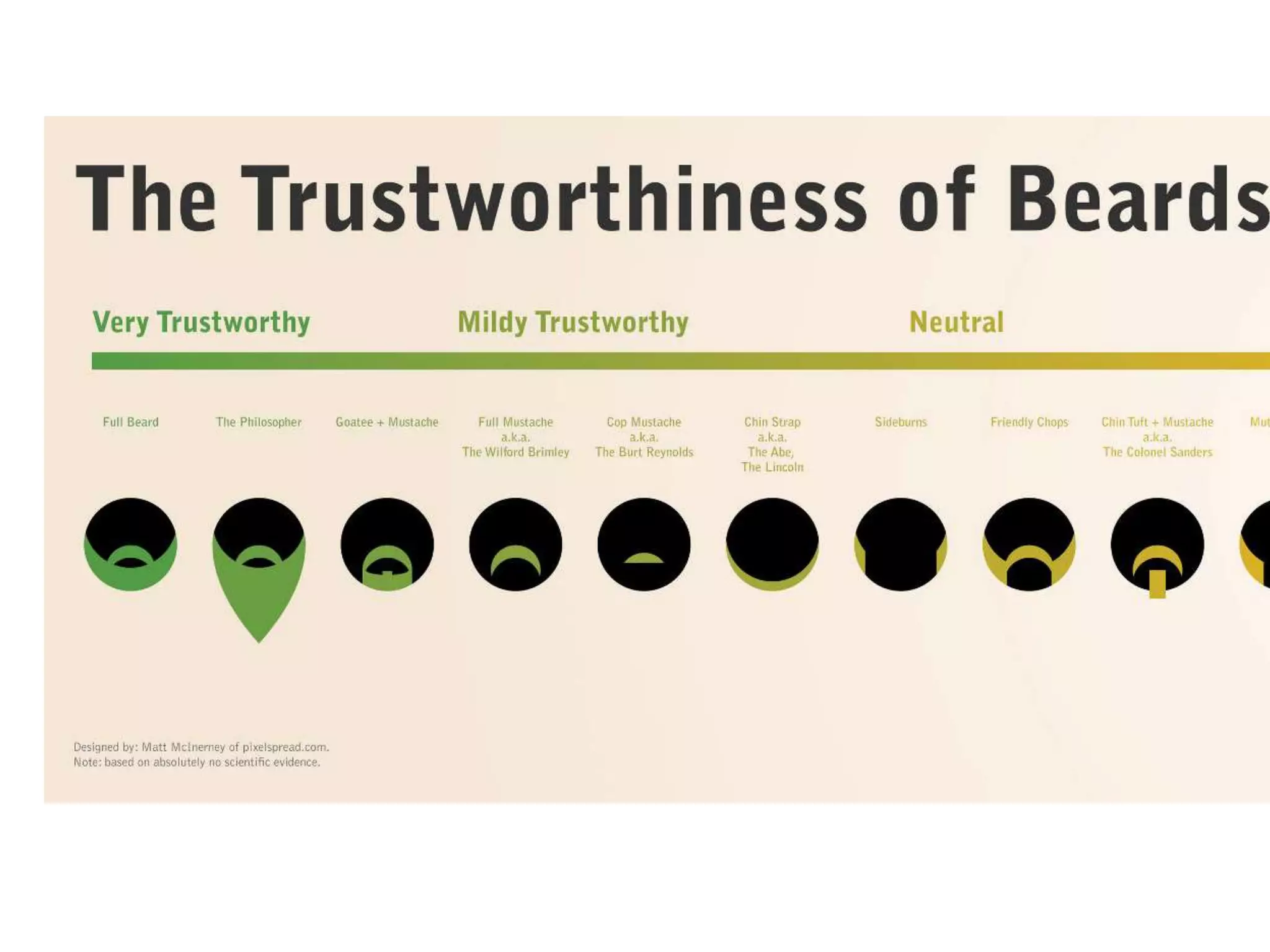
“A visual representation of data”
(data visualization = infographic)
“Information or data that is shown in a chart,
diagram…so that it is easy to understand”
(2011 added to Oxford dictionary)
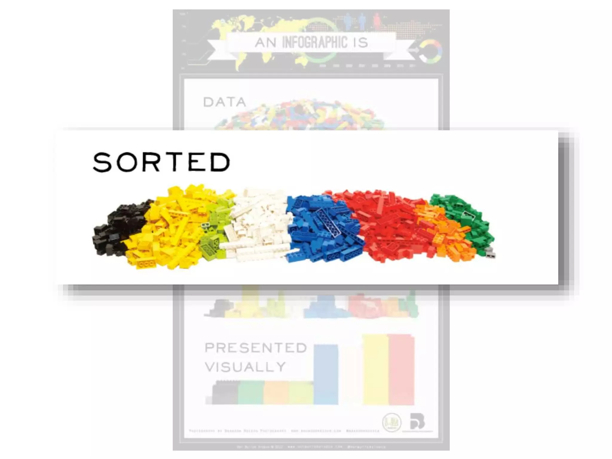
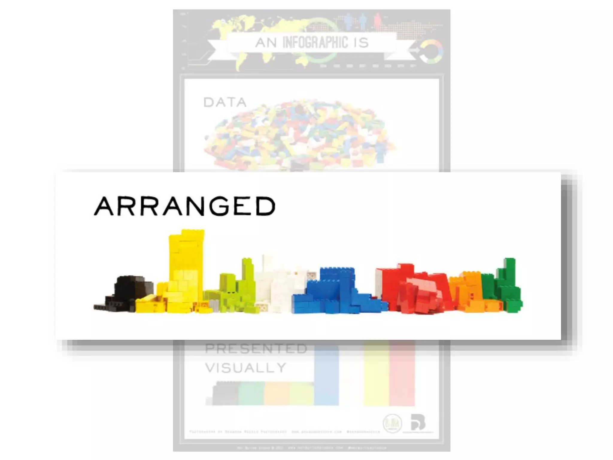
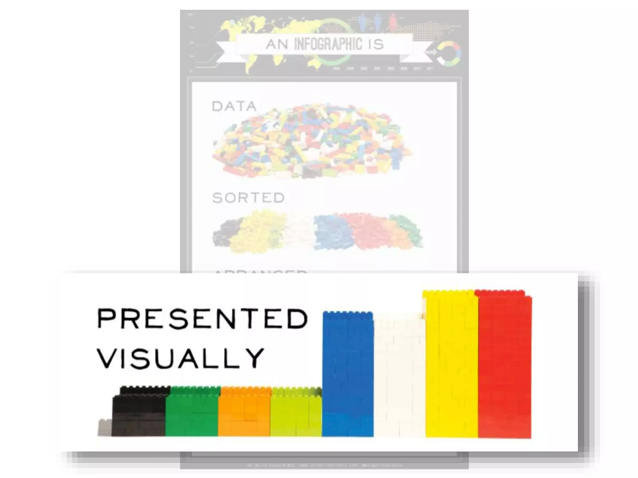
“Larger graphic design that combines data
visualizations, illustrations, text, and images
together into a format that tells a complete story”
[ general specific
]](https://image.slidesharecdn.com/learnit2015-keynoteinfographics-150502081633-conversion-gate02/75/Learn-it2015-keynote-infographics-20-2048.jpg)
![Definitions…
“A visual representation of data”
(data visualization = infographic)
“Information or data that is shown in a chart,
diagram…so that it is easy to understand”
(2011 added to Oxford dictionary)
“Larger graphic design that combines data
visualizations, illustrations, text, and images
together into a format that tells a complete story”
[ general specific
]](https://image.slidesharecdn.com/learnit2015-keynoteinfographics-150502081633-conversion-gate02/75/Learn-it2015-keynote-infographics-21-2048.jpg)
![Definitions…
“A visual representation of data”
(data visualization = infographic)
“Information or data that is shown in a chart,
diagram…so that it is easy to understand”
(2011 added to Oxford dictionary)
“Larger graphic design that combines data
visualizations, illustrations, text, and images
together into a format that tells a complete story”
[ general specific
]](https://image.slidesharecdn.com/learnit2015-keynoteinfographics-150502081633-conversion-gate02/75/Learn-it2015-keynote-infographics-22-2048.jpg)
![Definitions…
“A visual representation of data”
(data visualization = infographic)
“Information or data that is shown in a chart,
diagram…so that it is easy to understand”
(2011 added to Oxford dictionary)
“Larger graphic design that combines data
visualizations, illustrations, text, and images together
into a format that tells a complete story”
[ general specific
]](https://image.slidesharecdn.com/learnit2015-keynoteinfographics-150502081633-conversion-gate02/75/Learn-it2015-keynote-infographics-23-2048.jpg)


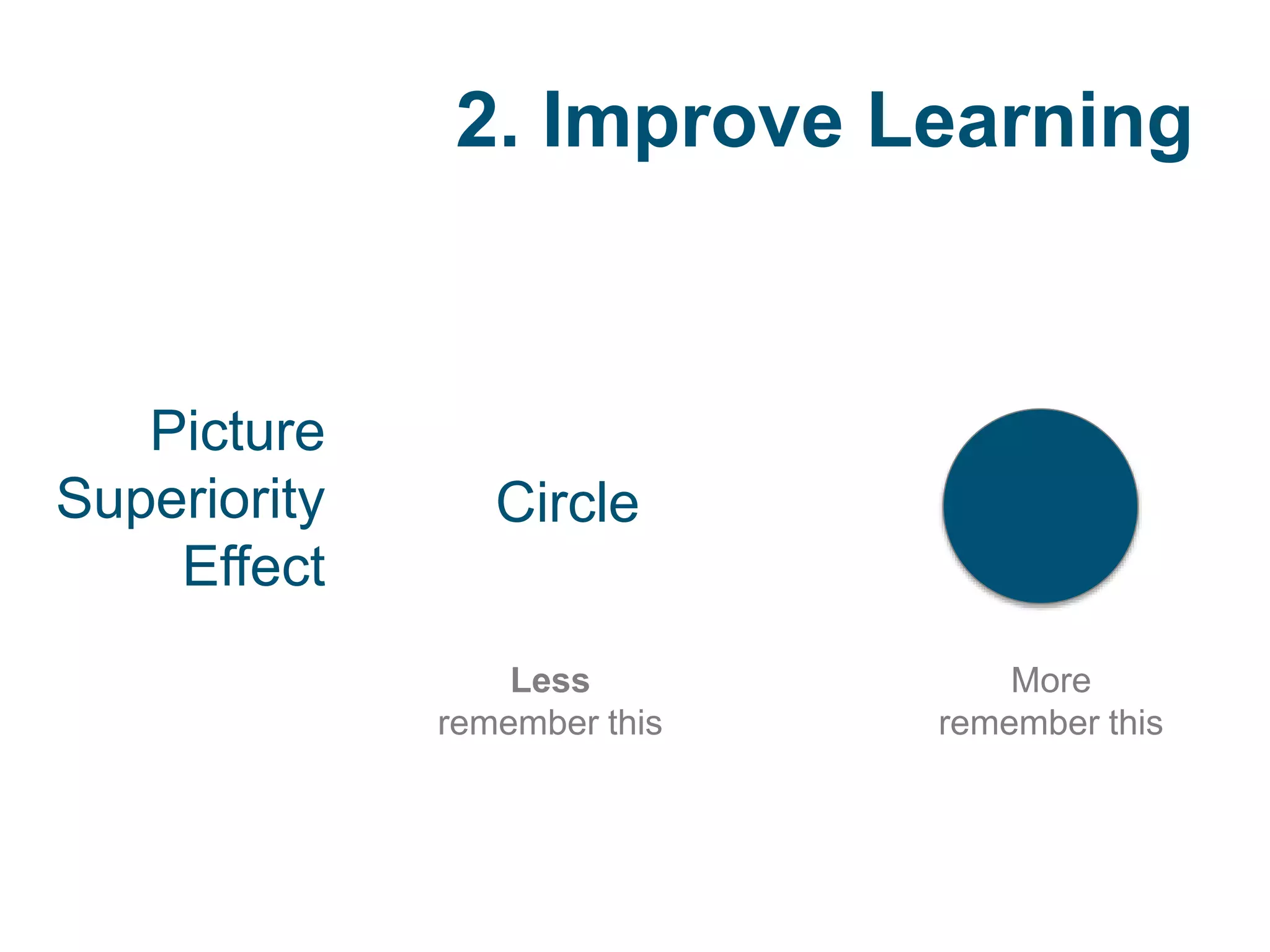


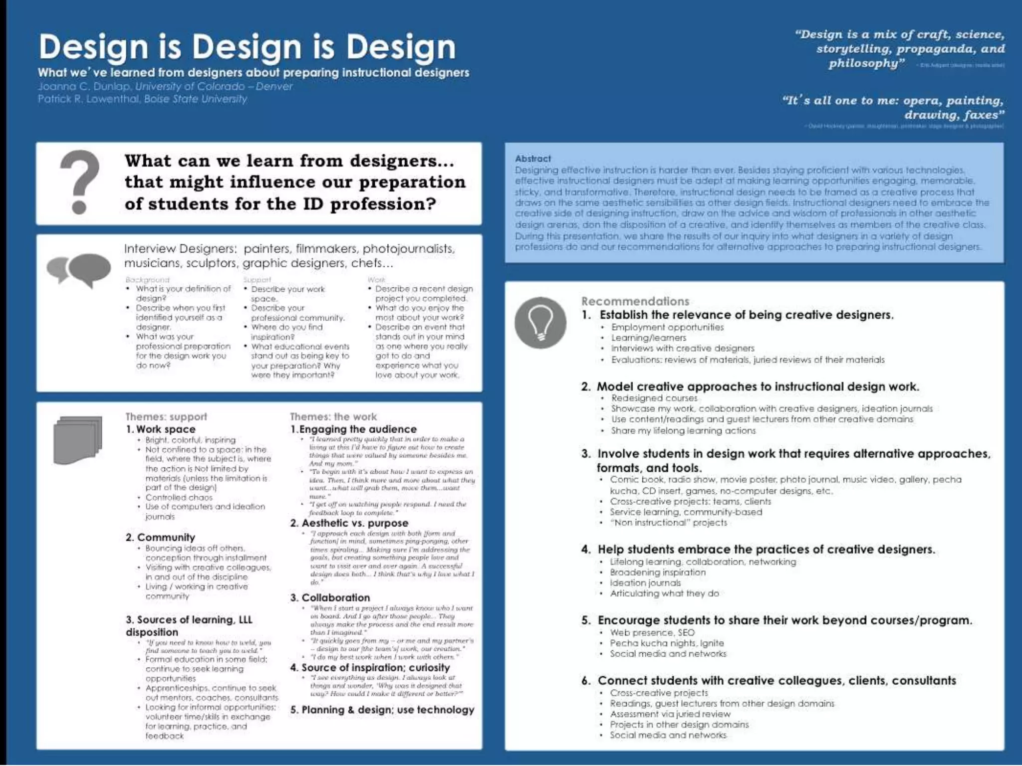


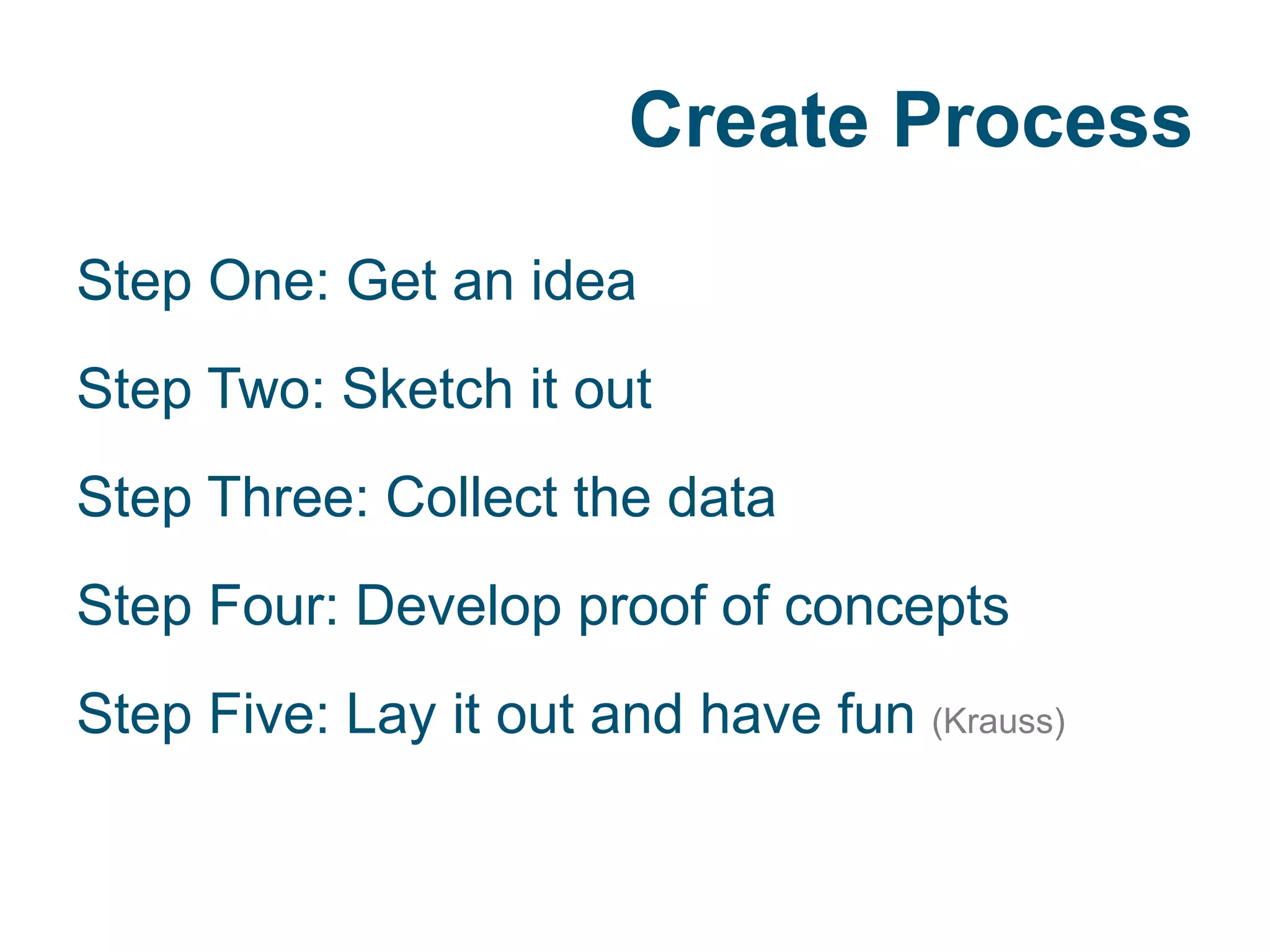
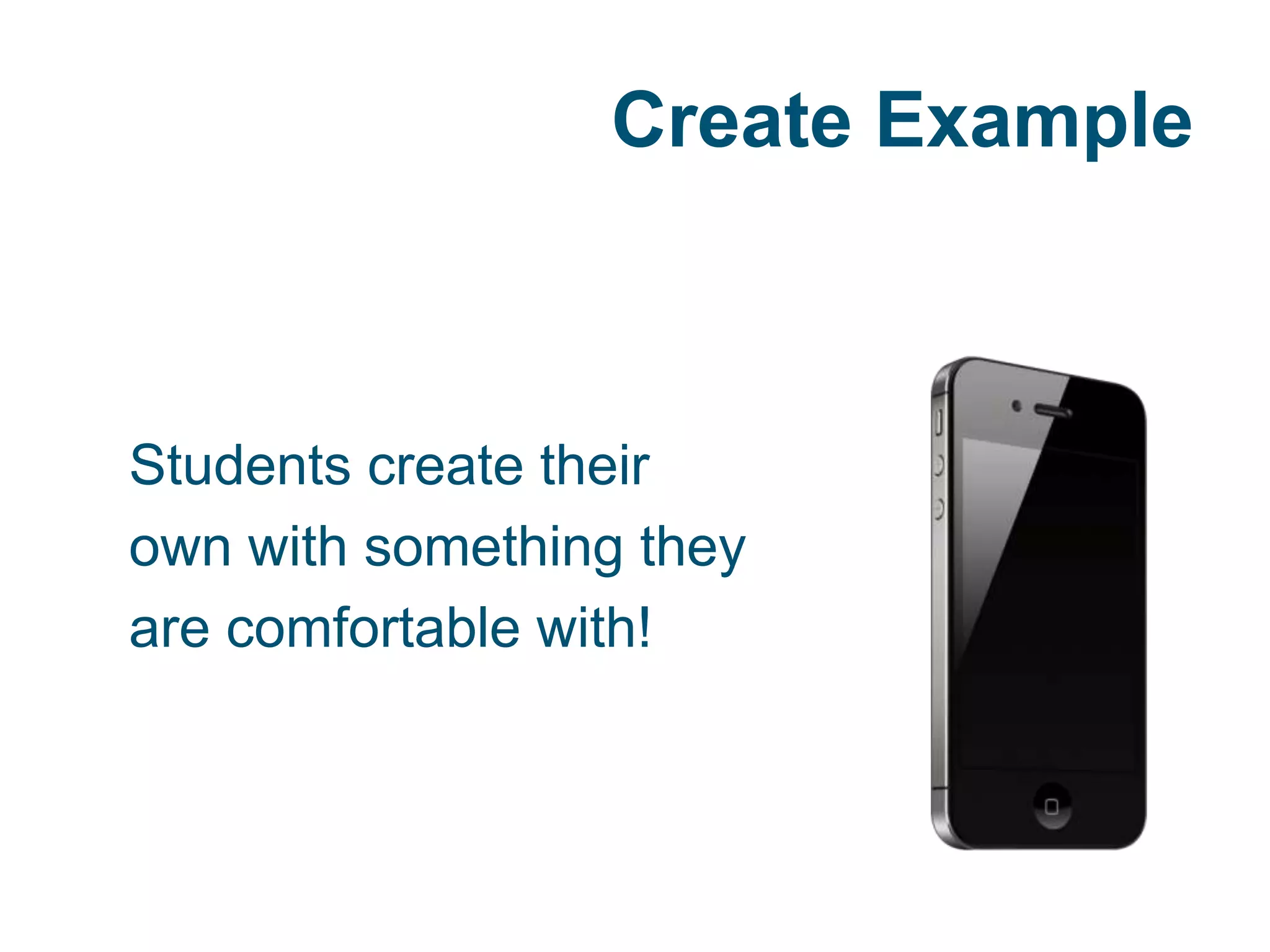


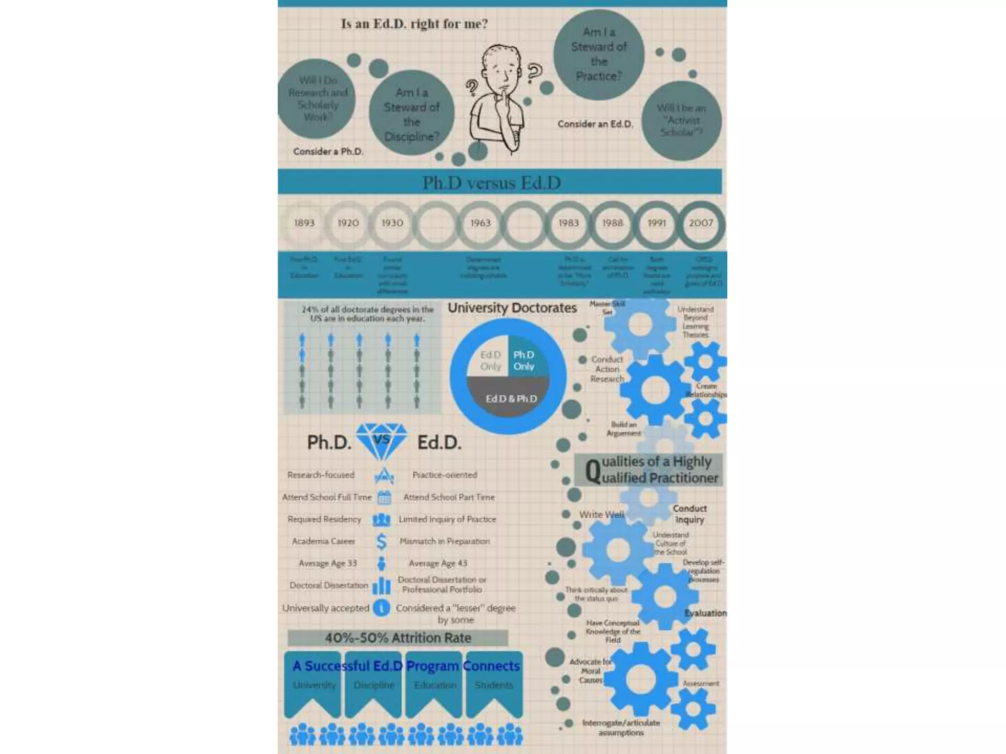

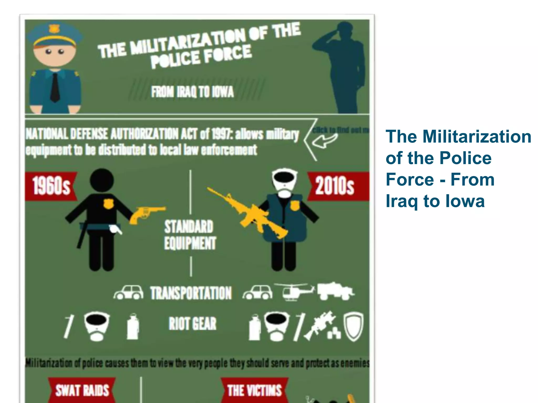
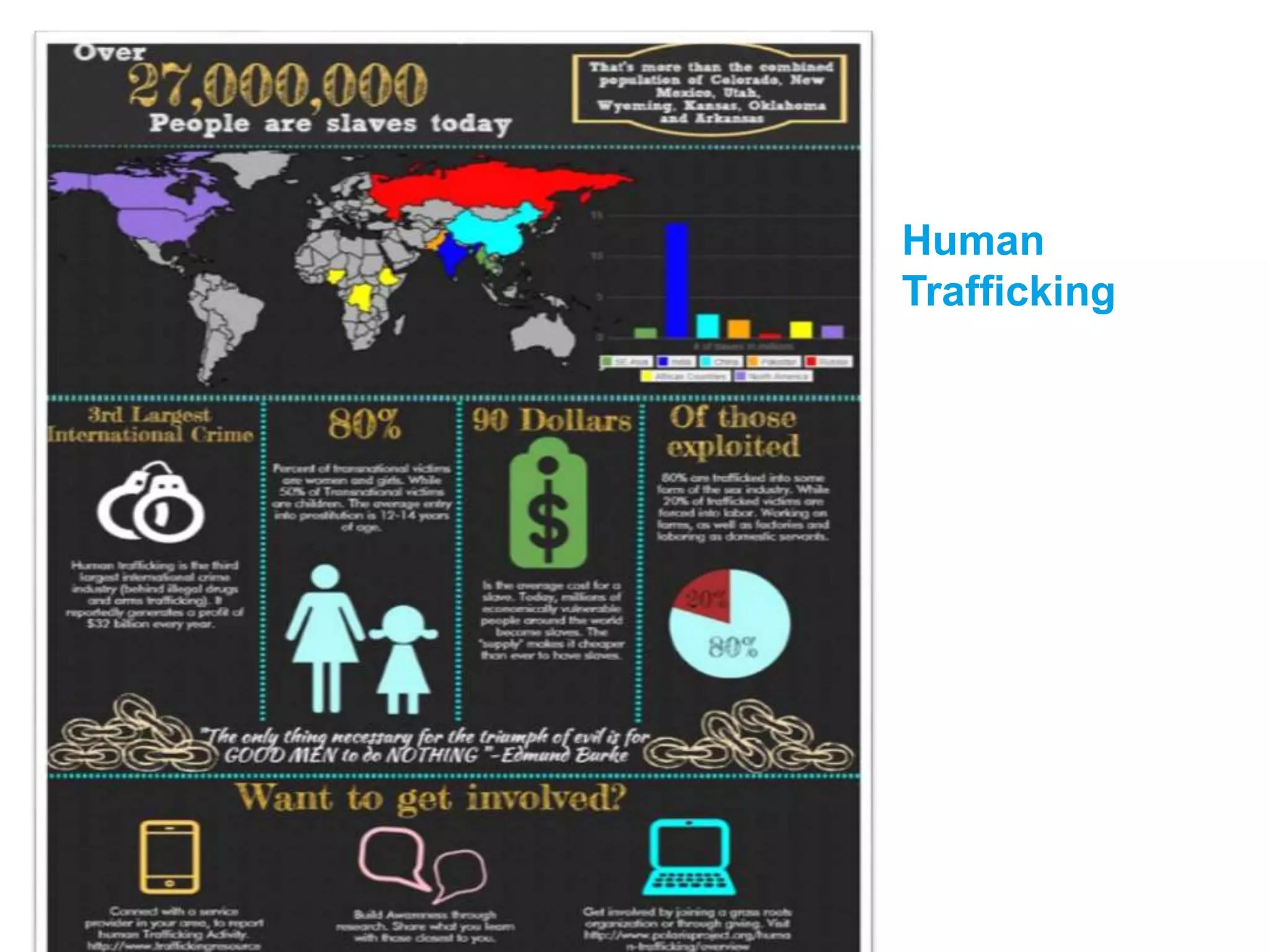


This document discusses strategies for incorporating infographics in the classroom. It begins with definitions of infographics as visual representations of data or information presented in a way that is easy to understand. The document then discusses why infographics should be used, noting they can improve learning by tapping into visual memory and being more engaging. Tips are provided on how to interpret existing infographics or have students create their own. Guidelines are offered for the effective design of infographics, such as using a clear focus, visual elements to represent relationships, and credible data sources. Examples of potential student-created infographics are also presented.


