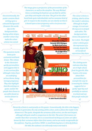
The poster provides insights into the personalities of the characters and the storyline of the film. Michael Cera's character seems ditzy and slow based on how he is scratching his head in the image, while the girl appears more individualistic and no-nonsense. The storyline of the film involves teenage pregnancy with parents-to-be who are not ready for the responsibility. The bright color scheme and cartoonish style of the poster suggest this will be a comedic film, despite the serious subject matter of unplanned teenage pregnancy.
1. The image gives a perspective of the personalities of the
characters, as well as the storyline. The way Michael
Cera is scratching his head we can see that he will be
Unconventionally, the quit ditzy and maybe a bit slow. The girl on the other The colour scheme is
poster contains black hand looks quite individualistic and nononsense kind of striking, ideal to draw
writing upon a girl. In respect to the storyline, we can clearly see that it the reader’s attention,
coloured background. is based upon a teen pregnancy with tobe parents that although its bright
However this works aren’t ready. orange, it is not over
due to the the top as it is striped
background also with white. The
having white stripes, background also
another colour may mimics the pattern of
make the colour her tshirt. The bright
scheme too varied. colour scheme gives
the impression of a
comedy, despite the
serious facial
The quotation marks
expressions they have.
looks quite
cartoonist and hand
drawn. This relates
to the characters The clothing worn
quirky personalities indicates that they
and suggests that it are in high school,
is not a serious film from his gym kit. Also
although it does have it gives a lot away
an underlying about their
serious theme, being personalities for
teenage pregnancy. example the way he
They also highlight is wearing his clothes
that the writing is a suggests he’s a
quote, and for the ‘geeky’ type boy and
people that choose to probably an outcast
see a film based on in school and one
reviews drawn to that people make fun
this. of.
Hierarchy of texts is used greatly on this poster. Conventionally, the title is the biggest,
and also in green font, the only writing of this colour, and so allows the reader to be
drawn to it. The quote, alongside the surnames of the actors, are the next largest,
although still quite small in comparison to the title. The actors’ first names are
smaller than their surnames, this is a conventional technique as actors are often
known by their surnames before their first names, and so are easily recognisable for
the audience. Tag line, just below ‘JUNO’, is small lettering but as it directly follows
the title, the audience can still easily notice and read it.