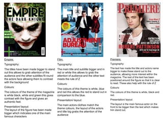
Magazines

By Ashleigh Stevens and Alice
           Pearce
Empire:                                      Film:                                         Premiere:

Typography:                                  Typography:                                   Typography:

The titles have been made bigger to stand    The main title and subtitle bigger and in     The text has made the title and actors name
                                                                                           bigger to make these stand out to the
out this allows to grab attention of the     red or white this allows to grab the
                                                                                           audience, allowing more interest within the
audience and the other subtitles fit round   attention of audience and the other text
                                                                                           magazine. The rest of the text has been
the actors face allowing them to contrast    meets the rule of Z                           positioned around the figure so that it is clear
with the background                                                                        to read. These also help with the rule of Z
                                             Colours:
Colours:                                                                                   Colours:
                                             The colours of this theme is white, blue
The colours of the theme of the magazine     and red this allows the red to stand out in   The colours of this theme is white, black and
is white black, white and green this gives   comparison to the blue.                       red.
contrast with the figure and gives an                                                      Presentation/ layout:
                                             Presentation/ layout:
authentic feel.
                                             The main actors clothes match the             The layout is the main famous actor on the
Presentation/ layout:                                                                      front to be bigger then the text which makes
                                             theme colours, the layout of the actors
The layout of the figure has been made                                                     him stand out.
                                             and title big grabs the attention of the
bigger which indicates one of the main
                                             audience
famous characters
Magazine title name ideas:
•   Flip                • Boom
•   Wipe                • Clip
•   Fade                • Cut
•   Frame               • Mise-en-scene
•   Take                • Parallel
•   Mask                • Shot
                        • Still
•   Out-take
•   Tilt

http://www.psu.edu/dept/inart10_110/inart10/film.html
Fonts


FRAME   TILT
           FRAM Tilt   Tilt
Tilt
           E
           FRAME
TILT
Masthead Colours
Rule of 3-
Red, Blue, Black
Red, Green, Black
Red, Orange, Yellow
Blue White black
White, Green, Blue

Film magazines

  • 1.
  • 2.
    Empire: Film: Premiere: Typography: Typography: Typography: The titles have been made bigger to stand The main title and subtitle bigger and in The text has made the title and actors name bigger to make these stand out to the out this allows to grab attention of the red or white this allows to grab the audience, allowing more interest within the audience and the other subtitles fit round attention of audience and the other text magazine. The rest of the text has been the actors face allowing them to contrast meets the rule of Z positioned around the figure so that it is clear with the background to read. These also help with the rule of Z Colours: Colours: Colours: The colours of this theme is white, blue The colours of the theme of the magazine and red this allows the red to stand out in The colours of this theme is white, black and is white black, white and green this gives comparison to the blue. red. contrast with the figure and gives an Presentation/ layout: Presentation/ layout: authentic feel. The main actors clothes match the The layout is the main famous actor on the Presentation/ layout: front to be bigger then the text which makes theme colours, the layout of the actors The layout of the figure has been made him stand out. and title big grabs the attention of the bigger which indicates one of the main audience famous characters
  • 3.
    Magazine title nameideas: • Flip • Boom • Wipe • Clip • Fade • Cut • Frame • Mise-en-scene • Take • Parallel • Mask • Shot • Still • Out-take • Tilt http://www.psu.edu/dept/inart10_110/inart10/film.html
  • 4.
    Fonts FRAME TILT FRAM Tilt Tilt Tilt E FRAME TILT
  • 5.
    Masthead Colours Rule of3- Red, Blue, Black Red, Green, Black Red, Orange, Yellow Blue White black White, Green, Blue