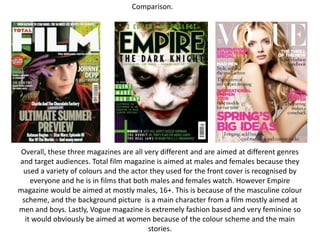
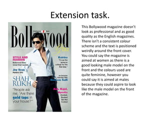
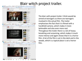
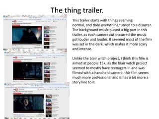
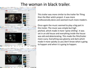
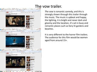
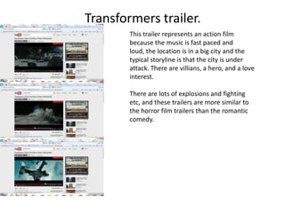
Summer task.

Lucy Fitzsimmons.
Big bold                  Total Film Magazine.                Main image, Johnny
heading to catch                                              Depp, dressed in
the target                                                    kooky unusual
audience eyes.                                                clothing to
White font,                                                   represent his
contrast to the                                               personality. He is
bright                                                        the main feature.
background
colours. The
font isn’t either                                             Green is the
feminine nor                                                  background
masculine so it                                               colour, and this
would attract a                                               colour would
wider audience.                                               attract men and
                                                              women, which the
                                                              magazine is aimed
Blank space, the front                                        at. It is a bright
cover is not over                                             bold colour which
crowded and shows that                                        would stand out
                            The star shapes are a purple
the magazine is good                                          from other
                            colour which matches with his
quality and classy. It                                        magazines and
                            gloves so the colour scheme
leaves more emphasis                                          looks individual
                            all co-ordinates which works
on the main stories and                                       and different.
                            well and is a nice touch to the
the main image.
                            magazine.
The title is very bold
and quite masculine. It      Empire magazine.                          The background
would catch your                                                       image is a main
eye, especially because                                                character from a
of the green outlining                                                 popular film, he is
because it contrasts                                                   quite scary looking
against the darker                                                     so the target
colours. The darker                                                    audience would
colours makes it                                                       be an older male.
masculine, as women                                                    He is looking
would usually be                                                       straight to the
attracted to                                                           camera which is
bright, pastel colours.                                                captivating to the
                                                                       customer and to
Blank spaces, the front                                                catches their
cover isn’t over crowded                                               attention and it
which makes it look                                                    stands out from
more classy and                                                        other magazines.
expensive. Compared to
a magazine like ‘Hello’
for example, the front       Everything on the magazine co-ordinates well. Green and black
cover has no blank space     seem to be the colour scheme and it works well for this type of
and it is very busy and      magazine. The title has a green outline/glow around it and
confusing, ‘Hello’ is also   other parts of text on the magazine is in green.
a cheap magazine.
The title is in white
                             Vogue magazine.               The model is very
which is very                                              feminine and
delicate, and even                                         beautiful, and this
though the                                                 expresses that the
masthead is bold, it                                       magazine will be
is also delicate and                                       similar to that.
feminine. It goes
well with the model                                       There isn’t much blank
used for the front                                        space on this
cover and she fits in                                     magazine, which is a typical
between where the                                         occurrence for womens
G would be.                                               magazines as it tells women
                                                          that the magazine is full of
The colour scheme is pink                                 interesting stories and
and white, which shows                                    pictures.
the magazine is aimed at
women. It colours used             The expression on the models face is very
are very subtle and pretty         relaxed and it’s almost like she hasn’t even
looking which suits the            got any emotions at all, which shows that
whole entire theme for             the magazine isn’t too serious or intense.
the magazine, which is             She is acting as inspiration for other women,
fashion, men and beauty.           as they will aspire to look like her.
Comparison.


 Overall, these three magazines are all very different and are aimed at different genres
and target audiences. Total film magazine is aimed at males and females because they
 used a variety of colours and the actor they used for the front cover is recognised by
    everyone and he is in films that both males and females watch. However Empire
magazine would be aimed at mostly males, 16+. This is because of the masculine colour
 scheme, and the background picture is a main character from a film mostly aimed at
men and boys. Lastly, Vogue magazine is extremely fashion based and very feminine so
  it would obviously be aimed at women because of the colour scheme and the main
                                         stories.
Extension task.
       This Bollywood magazine doesn’t
       look as professional and as good
       quality as the English magazines.
       There isn’t a consistent colour
       scheme and the text is positioned
       weirdly around the front cover.
       You could say the magazine is
       aimed at women as there is a
       good looking male model on the
       front and the colours used are
       quite feminine, however you
       could say it is aimed at males
       because they could aspire to look
       like the male model on the front
       of the magazine.
Blair witch project trailer.

            The blair with project trailer I think would be
            aimed at teenagers as there are teenagers
            involved in the actual film. The trailer
            emphasises the fact that it is filmed with a
            handheld camera, which makes it more
            believable and also even more real.
            Throughout the trailer there is a lot of heavy
            breathing and screaming, which makes it much
            more intense and again shows that it is a horror
            film. A lot of the film is set in the dark and in the
            woods, which is a typical place is set a horror
            film.
The thing trailer.
       This trailer starts with things seeming
       normal, and then everything turned to a disaster.
       The background music played a big part in this
       trailer, as each camera cut occurred the music
       got louder and louder. It seemed most of the film
       was set in the dark, which makes it more scary
       and intense.

       Unlike the blair witch project, I think this film is
       aimed at people 15+, as the blair witch project
       seemed to mostly have teenagers in and was
       filmed with a handheld camera, this film seems
       much more professional and it has a bit more a
       story line to it.
The woman in black trailer.

         This trailer was more similar to the trailer for Thing
         than the Blair witch project. It was more
         professionally done and seemed much more modern.

         Once again the music seemed to play a big part in
         this trailer. The music was simple but high
         pitched, which made it more ‘spine chilling’. It was
         set in an old house and everything inside the house
         was old and deteriorating. This made the film/trailer
         more scary. Everything was gloomy and dark which
         made it more spooky as you don’t know what is going
         to happen and when it is going to happen.
The vow trailer.
     The vow is romantic comedy, and this is
     strongly shown through this trailer through
     the music. The music is upbeat and happy,
     the lighting, it is bright and never dark and
     gloomy and the location, it’s set in busy and
     romantic places such as fairy lit gardens and
     beaches.

     It is very different to the horror film trailers.
     The audience for this film would be women
     aged from around 15+.
Transformers trailer.
        This trailer represents an action film
        because the music is fast paced and
        loud, the location is in a big city and the
        typical storyline is that the city is under
        attack. There are villians, a hero, and a love
        interest.

        There are lots of explosions and fighting
        etc, and these trailers are more similar to
        the horror film trailers than the romantic
        comedy.

Summer task year 13!!!!

  • 1.
  • 2.
    Big bold Total Film Magazine. Main image, Johnny heading to catch Depp, dressed in the target kooky unusual audience eyes. clothing to White font, represent his contrast to the personality. He is bright the main feature. background colours. The font isn’t either Green is the feminine nor background masculine so it colour, and this would attract a colour would wider audience. attract men and women, which the magazine is aimed Blank space, the front at. It is a bright cover is not over bold colour which crowded and shows that would stand out The star shapes are a purple the magazine is good from other colour which matches with his quality and classy. It magazines and gloves so the colour scheme leaves more emphasis looks individual all co-ordinates which works on the main stories and and different. well and is a nice touch to the the main image. magazine.
  • 3.
    The title isvery bold and quite masculine. It Empire magazine. The background would catch your image is a main eye, especially because character from a of the green outlining popular film, he is because it contrasts quite scary looking against the darker so the target colours. The darker audience would colours makes it be an older male. masculine, as women He is looking would usually be straight to the attracted to camera which is bright, pastel colours. captivating to the customer and to Blank spaces, the front catches their cover isn’t over crowded attention and it which makes it look stands out from more classy and other magazines. expensive. Compared to a magazine like ‘Hello’ for example, the front Everything on the magazine co-ordinates well. Green and black cover has no blank space seem to be the colour scheme and it works well for this type of and it is very busy and magazine. The title has a green outline/glow around it and confusing, ‘Hello’ is also other parts of text on the magazine is in green. a cheap magazine.
  • 4.
    The title isin white Vogue magazine. The model is very which is very feminine and delicate, and even beautiful, and this though the expresses that the masthead is bold, it magazine will be is also delicate and similar to that. feminine. It goes well with the model There isn’t much blank used for the front space on this cover and she fits in magazine, which is a typical between where the occurrence for womens G would be. magazines as it tells women that the magazine is full of The colour scheme is pink interesting stories and and white, which shows pictures. the magazine is aimed at women. It colours used The expression on the models face is very are very subtle and pretty relaxed and it’s almost like she hasn’t even looking which suits the got any emotions at all, which shows that whole entire theme for the magazine isn’t too serious or intense. the magazine, which is She is acting as inspiration for other women, fashion, men and beauty. as they will aspire to look like her.
  • 5.
    Comparison. Overall, thesethree magazines are all very different and are aimed at different genres and target audiences. Total film magazine is aimed at males and females because they used a variety of colours and the actor they used for the front cover is recognised by everyone and he is in films that both males and females watch. However Empire magazine would be aimed at mostly males, 16+. This is because of the masculine colour scheme, and the background picture is a main character from a film mostly aimed at men and boys. Lastly, Vogue magazine is extremely fashion based and very feminine so it would obviously be aimed at women because of the colour scheme and the main stories.
  • 6.
    Extension task. This Bollywood magazine doesn’t look as professional and as good quality as the English magazines. There isn’t a consistent colour scheme and the text is positioned weirdly around the front cover. You could say the magazine is aimed at women as there is a good looking male model on the front and the colours used are quite feminine, however you could say it is aimed at males because they could aspire to look like the male model on the front of the magazine.
  • 7.
    Blair witch projecttrailer. The blair with project trailer I think would be aimed at teenagers as there are teenagers involved in the actual film. The trailer emphasises the fact that it is filmed with a handheld camera, which makes it more believable and also even more real. Throughout the trailer there is a lot of heavy breathing and screaming, which makes it much more intense and again shows that it is a horror film. A lot of the film is set in the dark and in the woods, which is a typical place is set a horror film.
  • 8.
    The thing trailer. This trailer starts with things seeming normal, and then everything turned to a disaster. The background music played a big part in this trailer, as each camera cut occurred the music got louder and louder. It seemed most of the film was set in the dark, which makes it more scary and intense. Unlike the blair witch project, I think this film is aimed at people 15+, as the blair witch project seemed to mostly have teenagers in and was filmed with a handheld camera, this film seems much more professional and it has a bit more a story line to it.
  • 9.
    The woman inblack trailer. This trailer was more similar to the trailer for Thing than the Blair witch project. It was more professionally done and seemed much more modern. Once again the music seemed to play a big part in this trailer. The music was simple but high pitched, which made it more ‘spine chilling’. It was set in an old house and everything inside the house was old and deteriorating. This made the film/trailer more scary. Everything was gloomy and dark which made it more spooky as you don’t know what is going to happen and when it is going to happen.
  • 10.
    The vow trailer. The vow is romantic comedy, and this is strongly shown through this trailer through the music. The music is upbeat and happy, the lighting, it is bright and never dark and gloomy and the location, it’s set in busy and romantic places such as fairy lit gardens and beaches. It is very different to the horror film trailers. The audience for this film would be women aged from around 15+.
  • 11.
    Transformers trailer. This trailer represents an action film because the music is fast paced and loud, the location is in a big city and the typical storyline is that the city is under attack. There are villians, a hero, and a love interest. There are lots of explosions and fighting etc, and these trailers are more similar to the horror film trailers than the romantic comedy.