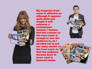
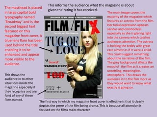
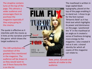
The magazine front cover effectively depicts the genre of drama through its sole focus on the film's main character. Her serious facial expression and the gloomy grey background create an unsettling atmosphere that draws viewers in. Key elements like the masthead, film still, and tagline clearly communicate the magazine's purpose and topic to potential readers. Overall, the simple yet professionally designed cover achieves its goal of enticing audiences to learn more about the films featured inside.
1. How effective is the
combination of your main
product and ancillary texts?
2. ANCILLARY TEXTS
Both my poster and magazine front cover are effective as they contain many of the codes and
conventions featured in professional published copies. The main character is only featured on
the magazine front cover to highlight all focus on the film itself and not particularly her role.
3. My poster is
effective as it holds
many of the codes
and conventions of
a real life poster. I
can also imagine my
poster being
presented in the
community.
4. The masthead is written in large The tagline, ‘A conflict of
typography placed in the centre custody’ hints to the
of the page enabling it to stand audience, a brief idea of
out. I have chosen to go for a the content of the film.
handwritten font The word, ‘custody’ has
named, ‘freestyle script’ been placed in red
because it creates an air or typography for emphasis.
mystery. This quote is also
The mise-en-scene in the main featured as a caption in
image highlights an empty our trailer.
pathway. This highlights the
long journey of fear, the
unknown and desperation. It Here displays all those
also shows that the journey to involved in the creation
find the missing child is a long of the film varying from
one. Some link to the films sound, editing etc. This
storyline or plot is made is a re-occuring code
through the use of the scenery and convention
where the film is set. featured in many film
posters.
This highlights the release date of the film. The date is in large
capital bold typography. A website is also featured so the
audience can research the film before and after its released.
5. The main image features a
The significance of the red teddy tugging onto a balloon.
balloon is effective as it This links with the narrative
stands out against the rest and title of the film as it
of the image. It displays indicates the Mother and
the idea of hope as red Father tugging for custody of
holds the connotations of their child.
strength, power, desire
and love. These props also have great
significance within the
narrative as they are toys
Here displays the main played with by the young boy.
actors who feature in the They highlight important
film. The use of the red font aspects in the trailer. On one
follows the colour scheme of occasion the Mother uses the
the poster. The large capital teddy as a symbol of comfort
bold typography highlights and hope reminding her of her
and raises the profiles of the long lost child. Also, the
actors. The first names of the balloon is significant as the boy
actors are written in a was holding it when he was
handwritten typography The teddy is significant as it is last seen. It was seen flying
giving the impression the featured regularly throughout
away into the distance
the trailer. It also appears on
actor has written this illustrating the feeling of
both my poster and magazine
themselves. front cover. emptiness and heavy-
6. We placed our posters around school to advertise our film night. This was a planned night
for our target audience to come and watch our trailer and answer a set questionnaire
about it. Overall, the film night was a great success. Personally, I feel that the use of the
posters promoting our trailer was effective and helped promote the film night. Also the
posters grabbed the audiences attention as I would have individuals approach me and ask
me about the film. I witnessed individuals looking at, and discussing the posters with
their peers. This illustrates the poster has fulfilled its role as it has the target audience
discussing its content.
7. My magazine front
cover is effective as
although it appears
quite plain and
simple it still
achieves a
professional
manner. I believe
that the content on
the front cover is
enough to lure the
audience in, as I
decided not to put
too many stories on
the front cover so
that the audience
become keen to
know what is
featured inside.
8. This informs the audience what the magazine is about
The masthead is placed
given the rating it has received.
in large capital bold The main image covers the
typography named majority of the magazine which
‘Broadway’ and is the features an actress from the film.
second biggest text Her facial expression appears
serious and emotionless
featured on this
especially as she is glaring right
magazine front cover. A into the camera which catches
blue lens flare has been audiences attention. The actress
used behind the title is holding the teddy with great
enabling it to be care almost as if it were a child.
enhanced and appear This could suggest something
more visible to the about the narrative of the film.
audience. The grey background affects the
mood of the film as it creates an
unsettling, meaningless
This draws the atmosphere. This draws the
audience in to other audience in to the film more as
situations inside the they would want to know what
magazine especially if exactly is going on.
they recognise and are
fond of any of these
films named.
The first way in which my magazine front cover is effective is that it clearly
depicts the genre of the film being drama. This is because all attention is
focused on the films main character.
9. The strapline contains The masthead is written in
lures at the top of the large capital black
page. This attracts a typography, placed at the
wider audience and top of the page enabling it
encourages them to to stand out. I chose to go
purchase the for the font named
magazine especially if ‘Britannic Bold’ as it has
they enjoy going to thick text which highlights
the cinema. its power and dominance
on the page. I positioned
The quote is effective as it the ‘X’ in the masthead at
interlinks with the movie as an angle as it created a
it hints at the narrative and sense of liveliness bringing
the genre which draws the more energy to the
target audience in. magazine. I also created it
red as it sets a brand
The 100 symbolises the identity for which all
countdown of the copies of this magazine
greatest films mentioned can relate to.
in the magazine. The
audience will be drawn in Date, price, barcode and
as they would want to website all visible to the
see if there favourite film audience.
is on the list.