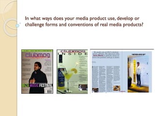
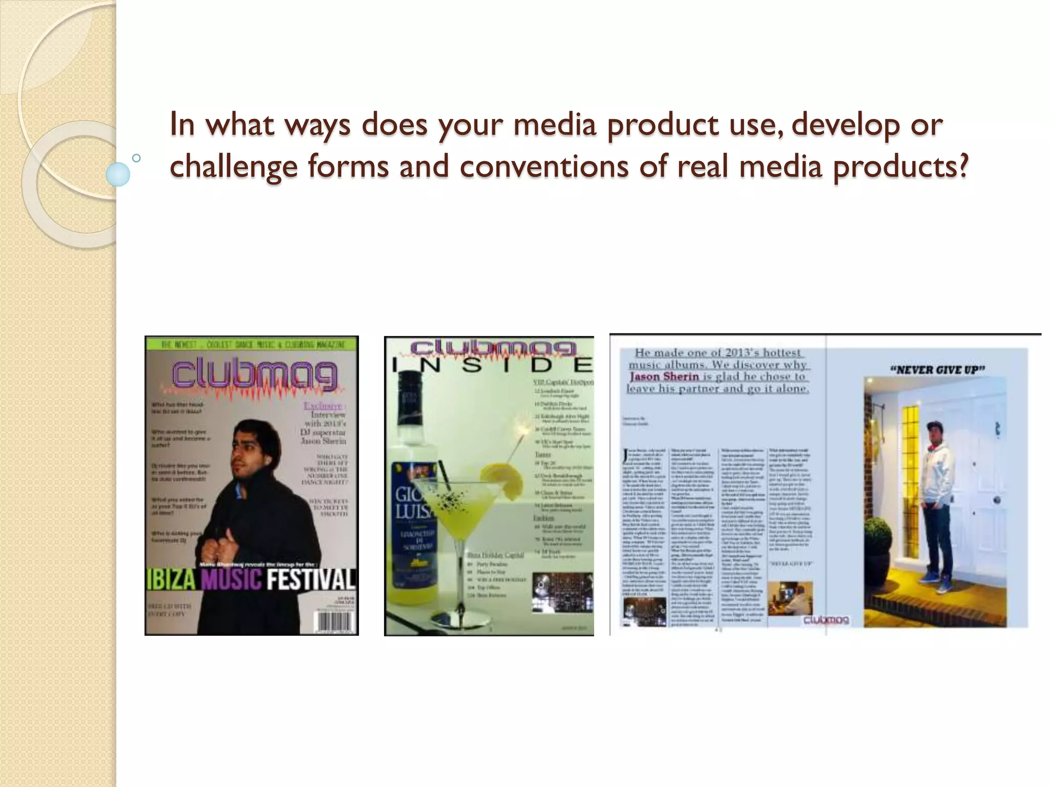
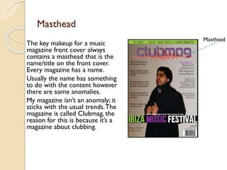
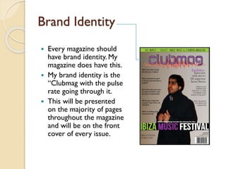
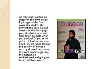
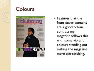
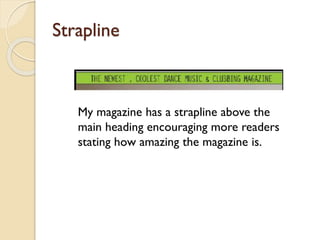
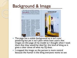
In what ways does your media product use, develop or
challenge forms and conventions of real media products?
Masthead
The key makeup for a music
magazine front cover always
contains a masthead that is the
name/title on the front cover.
Every magazine has a name.
Usually the name has something
to do with the content however
there are some anomalies.
My magazine isn’t an anomaly; it
sticks with the usual trends. The
magazine is called Clubmag, the
reason for this is because it’s a
magazine about clubbing.

Masthead
Magazine Features
Other features magazines
always have are cover lines.
These lines give an idea of
what’s in the magazine
without giving the story
away.
 The cover lines are there to
entice reader to continue
or start to read the
magazine.
 My magazine followed this
conventional idea by
containing a variety of cover
lines; some are more
dramatic than others.


Coverline
Brand Identity
Every magazine should
have brand identity. My
magazine does have this.
 My brand identity is the
“Clubmag with the pulse
rate going through it.
 This will be presented
on the majority of pages
throughout the magazine
and will be on the front
cover of every issue.



All magazines contain an
image on the front cover.
My image on the front
cover does follow the
conventional idea. Not all
images on the front page
go with what you would
expect for example when
you think of DJ you at no
point think of someone in
a suit , my magazine follows
this pattern of having a
smartly dressed person on
the front cover suggesting
the magazine is
sophisticated and going to
be a read that’s worth it.
Colours


Features that the
front cover contains
are a good colour
contrast my
magazine follows this
with some vibrant
colours standing out
making the magazine
more eye-catching.
Strapline

My magazine has a strapline above the
main heading encouraging more readers
stating how amazing the magazine is.
The type face I use on
my front cover is
rounder giving a vinyl
feel, going with the DJ
theme.

Typeface

Variety of
Typefaces

I used a range of
typefaces and colours
but tried not to let the
colours overpower it.
My magazine I would
say is very conventional
containing lots of
interesting facts and
images
Contents page
All contents pages state
what the content of the
magazine is. I designed my
contents page so it has and
image-text balance so
neither is over powering.
Like all contents pages
sectioned the lists into
groups depending what topic
they are covering. My
contents page I consider to
be very conventional. It has a
cocktail in a glass continuing
the night out fun theme but
it is more of an upper-class
kind of drink.
Mass Marketing
While creating the
magazine I have
tried to make the
magazine for a mass
market with
content for music,
club & dance lovers.
By doing this the
magazine should be
more saleable.
Double Page Spread


The double page spread for Clubmag has good image-text
content used 4 columns as I decided like many other
magazines that is looked more balanced using 4 columns,
and even number, compared to 3 columns.
Background & Image

The page has a subtle background so it isn’t over
powering but yet it isn’t plain white have used a few
images on this page of my model as I thought when I took
them that they would be ideal for this kind of thing as it
gives a clear sense of what my DJ does.
 I cropped the image so the person is more central
because the human is the thing everyone wants to see


John conventions

  • 1.
    In what waysdoes your media product use, develop or challenge forms and conventions of real media products?
  • 2.
    Masthead The key makeupfor a music magazine front cover always contains a masthead that is the name/title on the front cover. Every magazine has a name. Usually the name has something to do with the content however there are some anomalies. My magazine isn’t an anomaly; it sticks with the usual trends. The magazine is called Clubmag, the reason for this is because it’s a magazine about clubbing. Masthead
  • 3.
    Magazine Features Other featuresmagazines always have are cover lines. These lines give an idea of what’s in the magazine without giving the story away.  The cover lines are there to entice reader to continue or start to read the magazine.  My magazine followed this conventional idea by containing a variety of cover lines; some are more dramatic than others.  Coverline
  • 4.
    Brand Identity Every magazineshould have brand identity. My magazine does have this.  My brand identity is the “Clubmag with the pulse rate going through it.  This will be presented on the majority of pages throughout the magazine and will be on the front cover of every issue. 
  • 5.
     All magazines containan image on the front cover. My image on the front cover does follow the conventional idea. Not all images on the front page go with what you would expect for example when you think of DJ you at no point think of someone in a suit , my magazine follows this pattern of having a smartly dressed person on the front cover suggesting the magazine is sophisticated and going to be a read that’s worth it.
  • 6.
    Colours  Features that the frontcover contains are a good colour contrast my magazine follows this with some vibrant colours standing out making the magazine more eye-catching.
  • 7.
    Strapline My magazine hasa strapline above the main heading encouraging more readers stating how amazing the magazine is.
  • 8.
    The type faceI use on my front cover is rounder giving a vinyl feel, going with the DJ theme. Typeface Variety of Typefaces I used a range of typefaces and colours but tried not to let the colours overpower it. My magazine I would say is very conventional containing lots of interesting facts and images
  • 9.
    Contents page All contentspages state what the content of the magazine is. I designed my contents page so it has and image-text balance so neither is over powering. Like all contents pages sectioned the lists into groups depending what topic they are covering. My contents page I consider to be very conventional. It has a cocktail in a glass continuing the night out fun theme but it is more of an upper-class kind of drink.
  • 10.
    Mass Marketing While creatingthe magazine I have tried to make the magazine for a mass market with content for music, club & dance lovers. By doing this the magazine should be more saleable.
  • 11.
    Double Page Spread  Thedouble page spread for Clubmag has good image-text content used 4 columns as I decided like many other magazines that is looked more balanced using 4 columns, and even number, compared to 3 columns.
  • 12.
    Background & Image Thepage has a subtle background so it isn’t over powering but yet it isn’t plain white have used a few images on this page of my model as I thought when I took them that they would be ideal for this kind of thing as it gives a clear sense of what my DJ does.  I cropped the image so the person is more central because the human is the thing everyone wants to see 