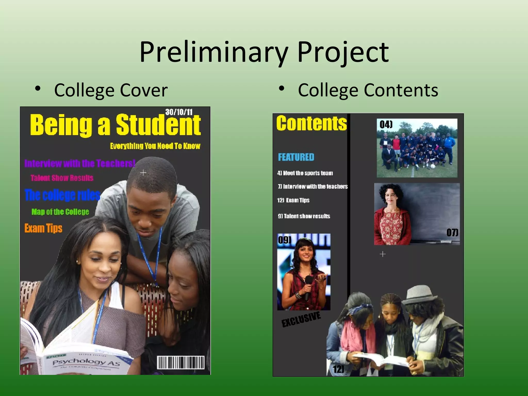
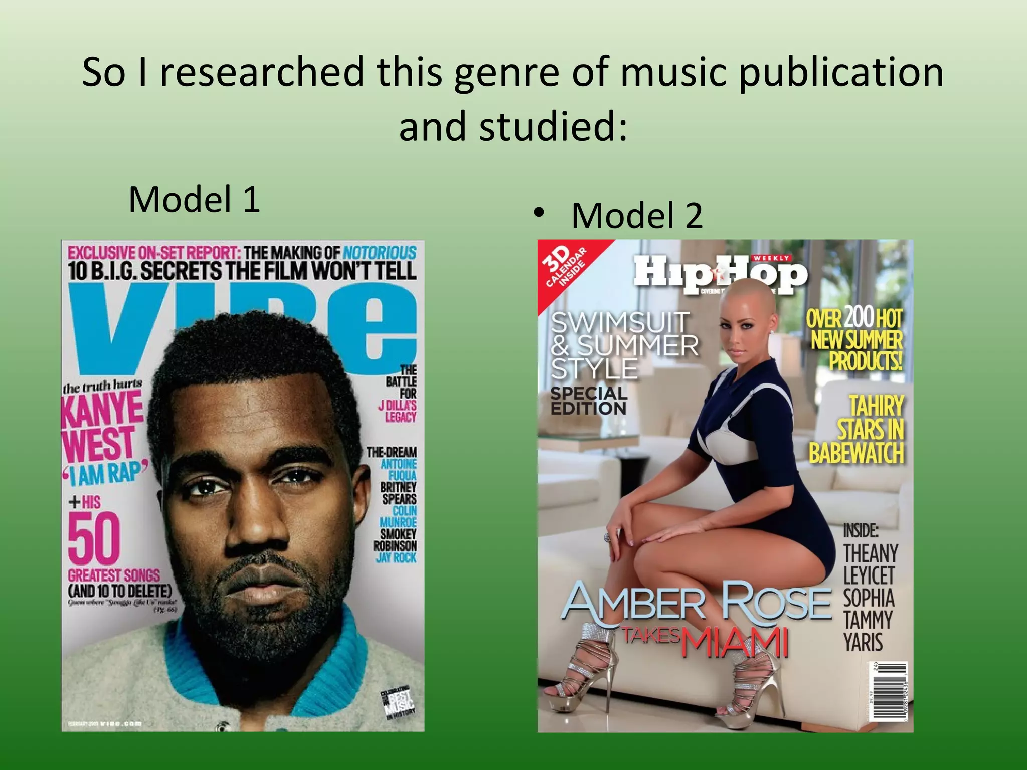
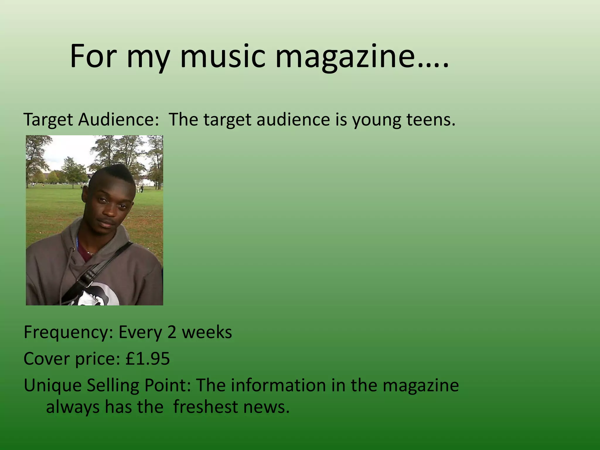
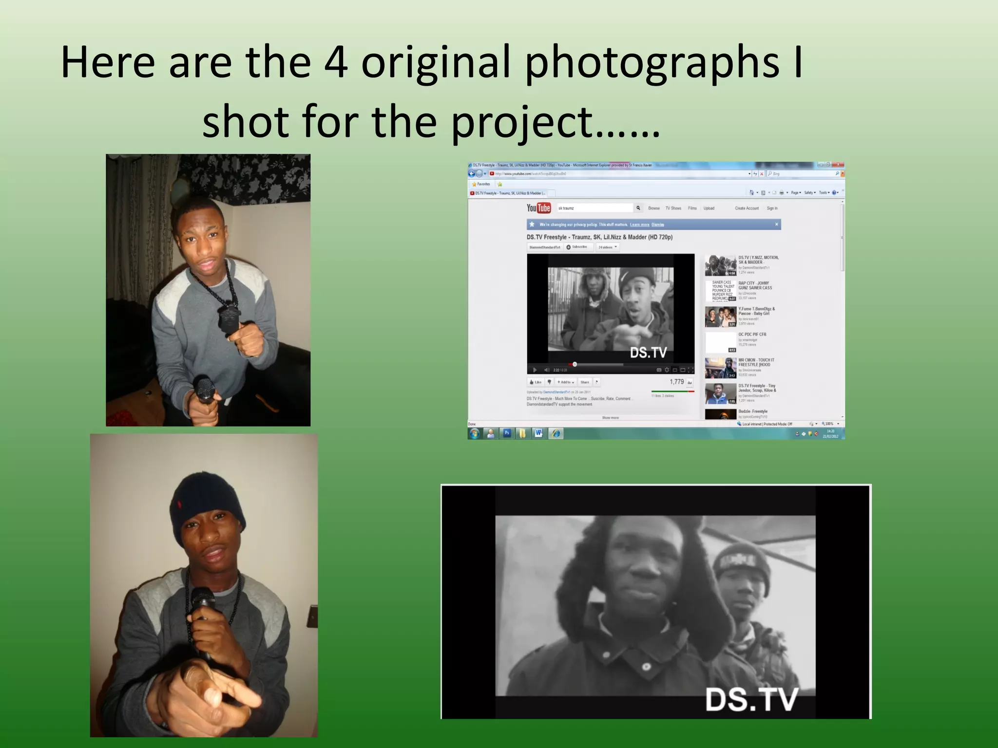
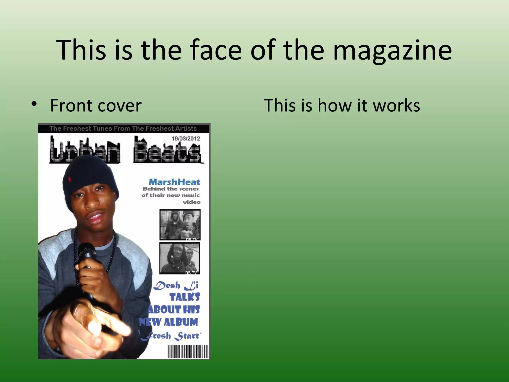
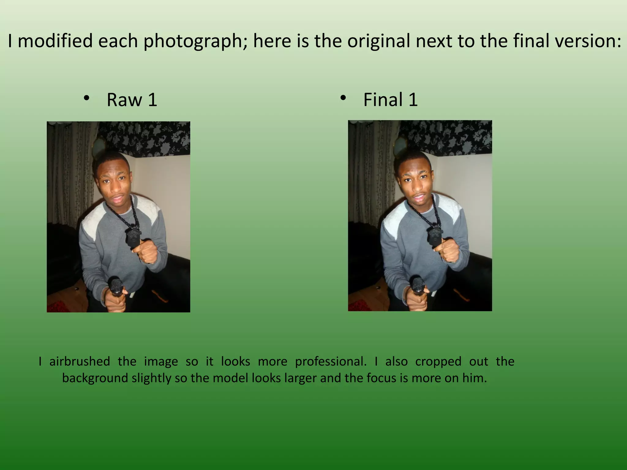
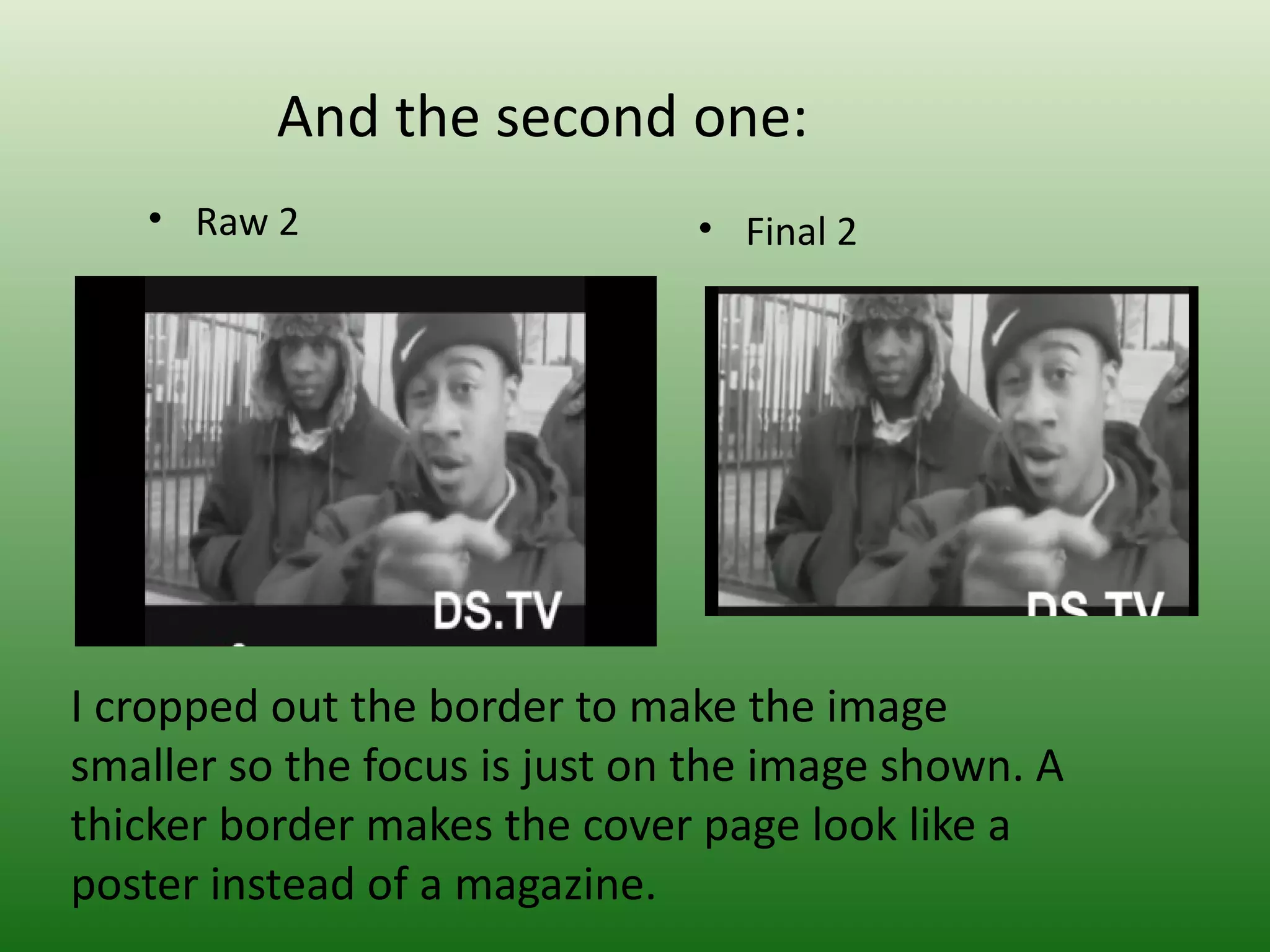
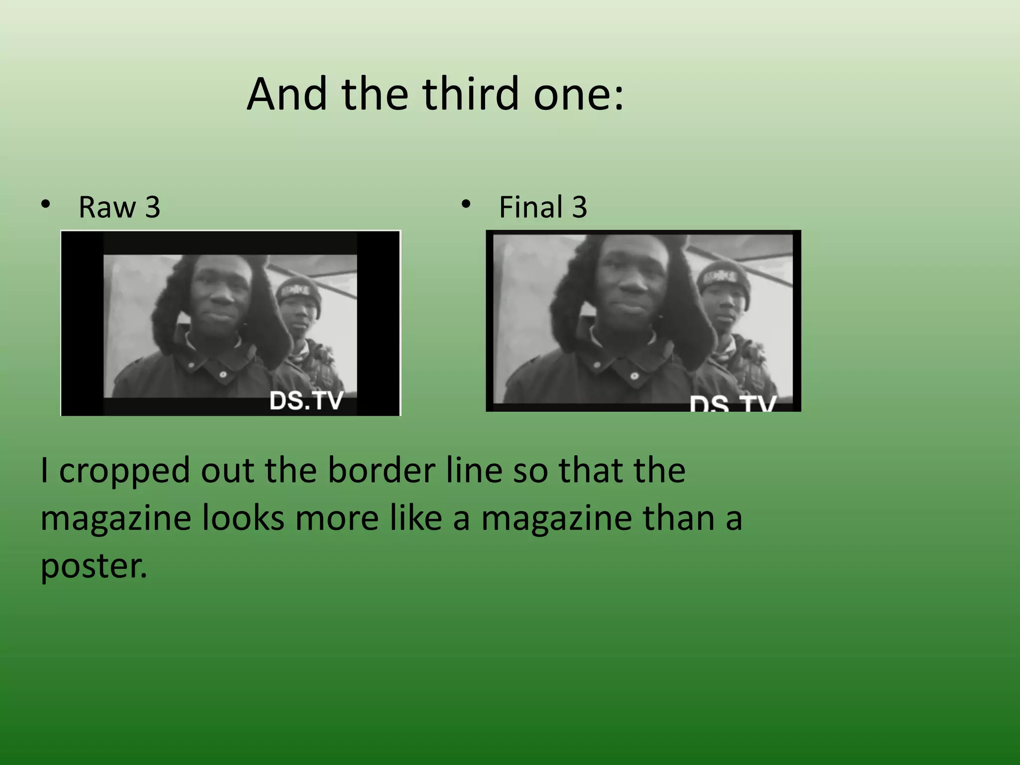
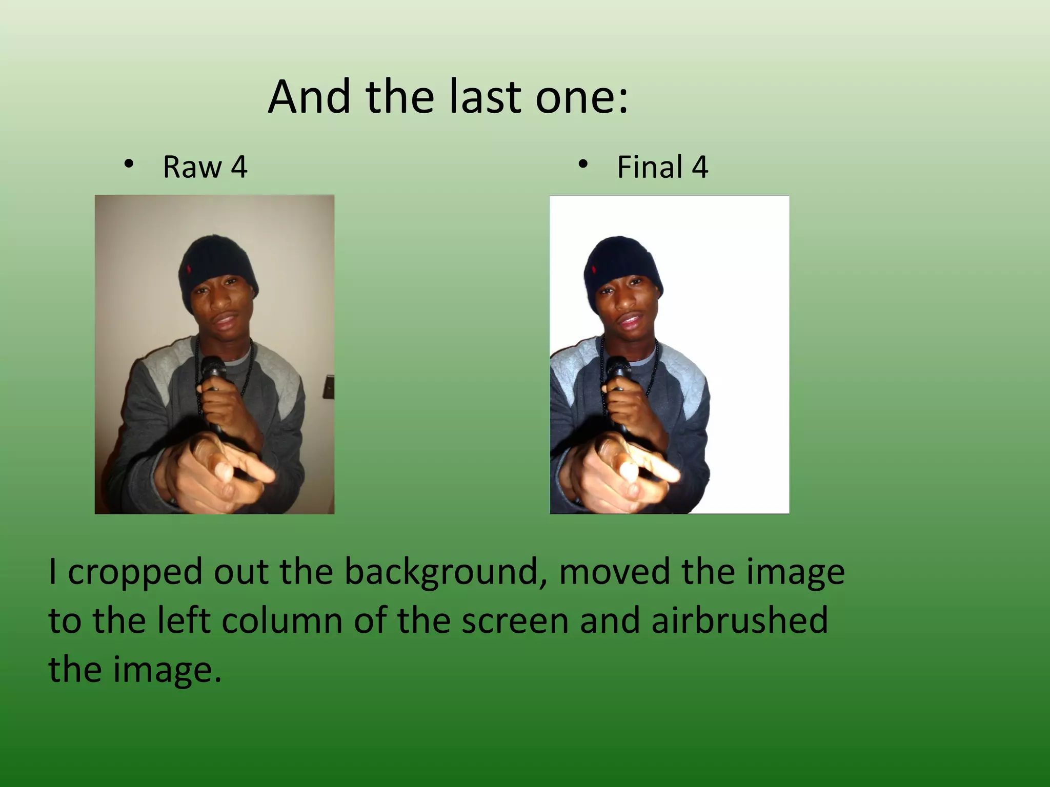
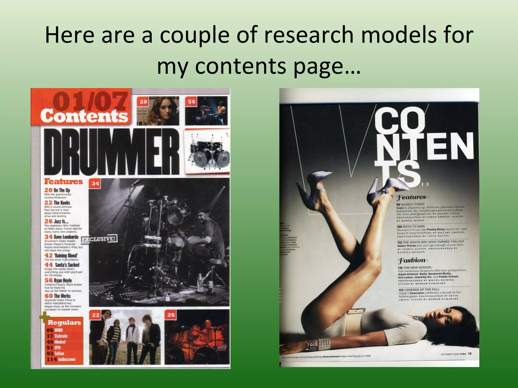
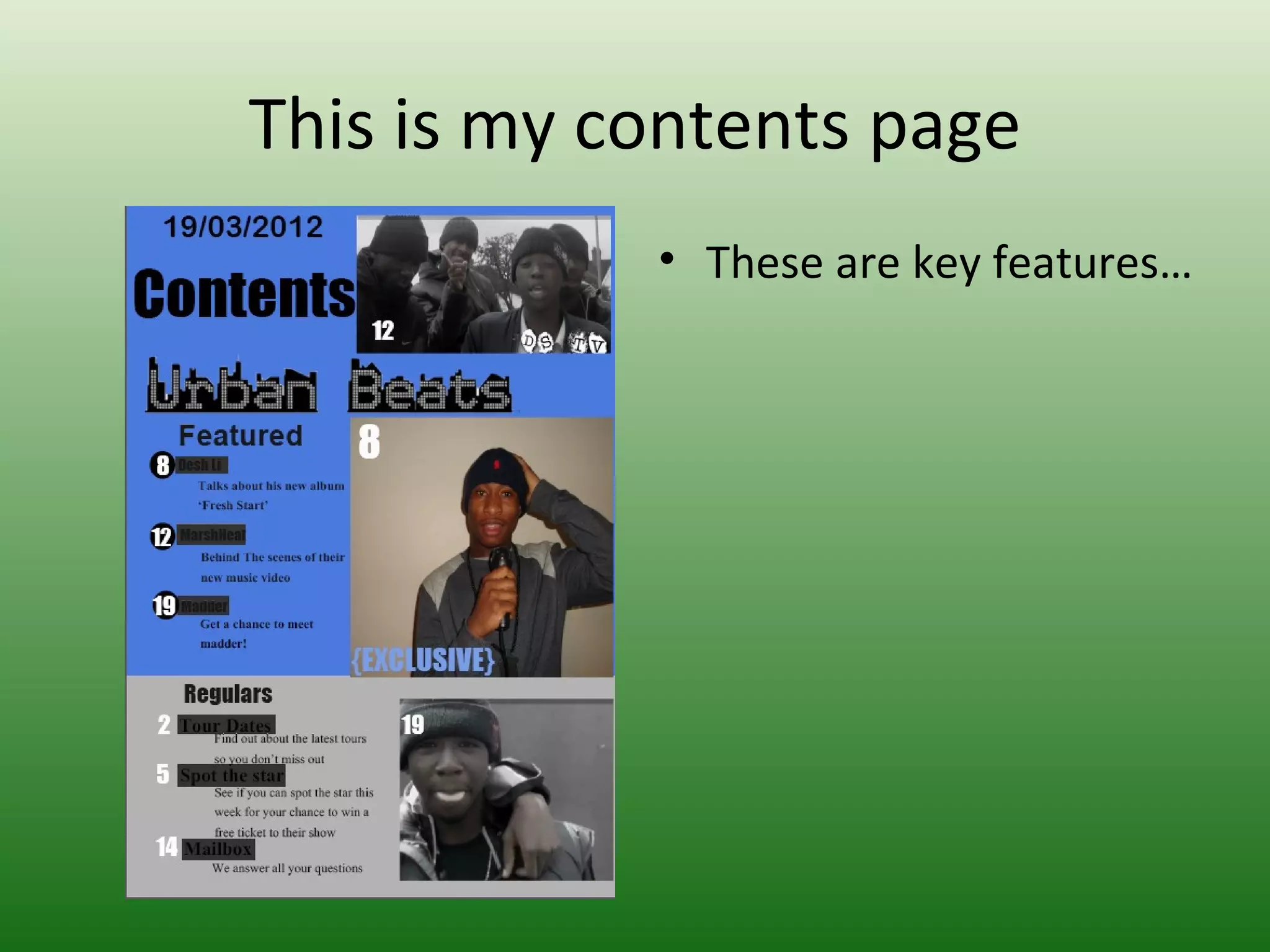
AS MEDIA STUDIES
 FOUNDATION PORTFOLIO

  RESEARCH & PLANNING

    CENTRE NO: 11049

ST FRANCIS XAVIER COLLEGE
My name is:David Eshun


Candidate No:30027150
Preliminary Project
• College Cover      • College Contents
Preliminary Project – Research & Planning

How did you think about target audience?
I thought about the target audience by the images, style of
text and layout I used.
How did awareness of that audience impact upon your visual
design and choice of language? I used colours and images
that suited to the target audience by using models from
similar age groups as the target audience and the text was
bright colours. I used the layout of professional magazines as
the basis of my student magazine layout. I did research by
getting examples of the front cover and contents page of
student magazines from the internet.
What key points did you learn about Adobe Photoshop and
InDesign in constructing your artefacts? I learnt about editing
images by cutting out the background and feathering it.
Reflections & Feedback
• What would you do differently next time? I would
  work on colour and text.
• What kind of feedback did you get that might
  influence you? I needed to keep the colours of the
  text simple but have more of a variety of the text and
  size. I would keep the editing of images by cutting
  out the background and feathering the image.
• What aspects of your understanding of Adobe
  Photoshop & InDesign do you need to improve? I
  needed to learn how to use InDesign as I didn't know
  how to import images.
The music genre of my music magazine is:

• Hip Hop.


• I decided to name my magazine Urban Beats
  because Hip Hop artists are usually from urban
  backgrounds and so are the audiences who
  listen to Hip Hop.
So I researched this genre of music publication
                 and studied:
  Model 1               • Model 2
Cover Design                Cover Lines
I learnt that there are     The cover lines needed
certain layouts needed to   to be interesting to
make the cover page look    attract the readers.
like a magazine. I needed   Also the cover lines
to put 3 columns in which   need to be on the side
there is a main image,      columns as that is the
cover lines etc.            layout for a magazine.
How did you think about target audience? There are a lot of genres
  in music, so I thought about the genre I would base my magazine
  on and research about the audience that listen to the genre of
  music.
How did awareness of that audience impact upon your visual design
  and choice of language? I used images of the models in clothing
  that the target audience or the artist from the music genre would
  dress as. I spoke in casual language as the target audience are
  normally young and tend to prefer casual language but kept it
  professional by using formal language also.
What key points did you learn about Adobe Photoshop and InDesign
  in constructing your artefacts? I learnt about editing images by
  cutting out the background and feathering it.
For my music magazine….
Target Audience: The target audience is young teens.


Frequency: Every 2 weeks
Cover price: £1.95
Unique Selling Point: The information in the magazine
   always has the freshest news.
Here are the 4 original photographs I
       shot for the project……
This is the face of the magazine
• Front cover     This is how it works
I modified each photograph; here is the original next to the final version:

          • Raw 1                                    • Final 1


   I airbrushed the image so it looks more professional. I also cropped out the
        background slightly so the model looks larger and the focus is more on him.
And the second one:
   • Raw 2                     • Final 2


I cropped out the border to make the image
smaller so the focus is just on the image shown. A
thicker border makes the cover page look like a
poster instead of a magazine.
And the third one:

• Raw 3                  • Final 3


I cropped out the border line so that the
magazine looks more like a magazine than a
poster.
And the last one:
    • Raw 4                    • Final 4


I cropped out the background, moved the image
to the left column of the screen and airbrushed
the image.
Here are a couple of research models for
          my contents page…
This is my contents page
            • These are key features…
How does the contents page link back to
           the cover page?
The contents page links to my cover page. The
coverlines on the cover page are included in
the contents page. The models on the cover
page are also on the contents page. The main
colours are on both the pages to show
simlarity. The date and masthead on the cover
page is on the contents page also.
Key points of contents page
I made the reader want to read on by making
a featured section to make the articles seem
important. The images and words are linked
as the image is off what the text says. The
important stories have larger images to what
correlates to the text. This shows importance.
Also the important stories are written under
subheading that states features. The
information is all on the left column on the
page and all the images and text are lined up
to each other.
How does the contents page flag up your
        double page spread?
The colours on the contents page and double
page spread are both the same/similar. The
double page spread is talked about in the
contents page by using it as a featured topic in
the magazine. An image of the same music
artist is on both the double page spread and
contents page.
Here’s an example of an inspiring double
             page spread…
This is why I think that double spread
                  works
I think it works because it links to the contents
page using colour, text, style of writing,
images etc. It also works because it follows
the codes and conventions of a music
magazine double page spread; large image,
quote, stand-first and by-lines.
Double-page spread
This is how my double page spread works

It follows codes and conventions of a double
page spread. The main image is on the left of
the double page where there is a quote and
by-line. On the right page, the text is written
in columns and has a standfirst.
This is how all three components are
          linked together….
This is my re-drafted cover page
• Cover Page      • Key modifications from
                    feedback
This is my re-drafted contents page

• Cover Page          • Key modifications from
                        feedback
This is my re-drafted double spread

• Double spread
Key modifications to double spread from
               feedback
Evaluation
• You can find my blog here:

(URL) http://daviddesh.blogspot.co.uk/

David eshun presentation slides for_research_planning_evaluation

  • 1.
    AS MEDIA STUDIES FOUNDATION PORTFOLIO RESEARCH & PLANNING CENTRE NO: 11049 ST FRANCIS XAVIER COLLEGE
  • 2.
    My name is:DavidEshun Candidate No:30027150
  • 3.
    Preliminary Project • CollegeCover • College Contents
  • 4.
    Preliminary Project –Research & Planning How did you think about target audience? I thought about the target audience by the images, style of text and layout I used. How did awareness of that audience impact upon your visual design and choice of language? I used colours and images that suited to the target audience by using models from similar age groups as the target audience and the text was bright colours. I used the layout of professional magazines as the basis of my student magazine layout. I did research by getting examples of the front cover and contents page of student magazines from the internet. What key points did you learn about Adobe Photoshop and InDesign in constructing your artefacts? I learnt about editing images by cutting out the background and feathering it.
  • 5.
    Reflections & Feedback •What would you do differently next time? I would work on colour and text. • What kind of feedback did you get that might influence you? I needed to keep the colours of the text simple but have more of a variety of the text and size. I would keep the editing of images by cutting out the background and feathering the image. • What aspects of your understanding of Adobe Photoshop & InDesign do you need to improve? I needed to learn how to use InDesign as I didn't know how to import images.
  • 6.
    The music genreof my music magazine is: • Hip Hop. • I decided to name my magazine Urban Beats because Hip Hop artists are usually from urban backgrounds and so are the audiences who listen to Hip Hop.
  • 7.
    So I researchedthis genre of music publication and studied: Model 1 • Model 2
  • 8.
    Cover Design Cover Lines I learnt that there are The cover lines needed certain layouts needed to to be interesting to make the cover page look attract the readers. like a magazine. I needed Also the cover lines to put 3 columns in which need to be on the side there is a main image, columns as that is the cover lines etc. layout for a magazine.
  • 9.
    How did youthink about target audience? There are a lot of genres in music, so I thought about the genre I would base my magazine on and research about the audience that listen to the genre of music. How did awareness of that audience impact upon your visual design and choice of language? I used images of the models in clothing that the target audience or the artist from the music genre would dress as. I spoke in casual language as the target audience are normally young and tend to prefer casual language but kept it professional by using formal language also. What key points did you learn about Adobe Photoshop and InDesign in constructing your artefacts? I learnt about editing images by cutting out the background and feathering it.
  • 10.
    For my musicmagazine…. Target Audience: The target audience is young teens. Frequency: Every 2 weeks Cover price: £1.95 Unique Selling Point: The information in the magazine always has the freshest news.
  • 11.
    Here are the4 original photographs I shot for the project……
  • 12.
    This is theface of the magazine • Front cover This is how it works
  • 13.
    I modified eachphotograph; here is the original next to the final version: • Raw 1 • Final 1 I airbrushed the image so it looks more professional. I also cropped out the background slightly so the model looks larger and the focus is more on him.
  • 14.
    And the secondone: • Raw 2 • Final 2 I cropped out the border to make the image smaller so the focus is just on the image shown. A thicker border makes the cover page look like a poster instead of a magazine.
  • 15.
    And the thirdone: • Raw 3 • Final 3 I cropped out the border line so that the magazine looks more like a magazine than a poster.
  • 16.
    And the lastone: • Raw 4 • Final 4 I cropped out the background, moved the image to the left column of the screen and airbrushed the image.
  • 17.
    Here are acouple of research models for my contents page…
  • 18.
    This is mycontents page • These are key features…
  • 19.
    How does thecontents page link back to the cover page? The contents page links to my cover page. The coverlines on the cover page are included in the contents page. The models on the cover page are also on the contents page. The main colours are on both the pages to show simlarity. The date and masthead on the cover page is on the contents page also.
  • 20.
    Key points ofcontents page I made the reader want to read on by making a featured section to make the articles seem important. The images and words are linked as the image is off what the text says. The important stories have larger images to what correlates to the text. This shows importance. Also the important stories are written under subheading that states features. The information is all on the left column on the page and all the images and text are lined up to each other.
  • 21.
    How does thecontents page flag up your double page spread? The colours on the contents page and double page spread are both the same/similar. The double page spread is talked about in the contents page by using it as a featured topic in the magazine. An image of the same music artist is on both the double page spread and contents page.
  • 22.
    Here’s an exampleof an inspiring double page spread…
  • 23.
    This is whyI think that double spread works I think it works because it links to the contents page using colour, text, style of writing, images etc. It also works because it follows the codes and conventions of a music magazine double page spread; large image, quote, stand-first and by-lines.
  • 24.
  • 25.
    This is howmy double page spread works It follows codes and conventions of a double page spread. The main image is on the left of the double page where there is a quote and by-line. On the right page, the text is written in columns and has a standfirst.
  • 26.
    This is howall three components are linked together….
  • 27.
    This is myre-drafted cover page • Cover Page • Key modifications from feedback
  • 28.
    This is myre-drafted contents page • Cover Page • Key modifications from feedback
  • 29.
    This is myre-drafted double spread • Double spread
  • 30.
    Key modifications todouble spread from feedback
  • 31.
    Evaluation • You canfind my blog here: (URL) http://daviddesh.blogspot.co.uk/