
Recommended
More Related Content
What's hot
What's hot (19)
Viewers also liked
Viewers also liked (10)
Similar to Logbook and evaluation
Similar to Logbook and evaluation (20)
Recently uploaded
Recently uploaded (20)
Logbook and evaluation
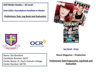
- 1. OCR Media Studies – AS Level Unit G321: Foundation Portfolio in Media Preliminary Task, Log Book and Evaluation Name: Ella Bamford Candidate Number: 8237 Center Name: St. Paul’s Catholic College Center Number: 64770 Set Brief - Print Music Magazine – Production Preliminary Task Progression, Log Book and Evaluation
- 2. Preliminary Task Progression– Evidence Front Cover Step-by-step
- 3. Step-by-step guide. Firstly I began by placing my main image and background picture, to ensure that it looks interesting and gripped the attention of the audience. I will plan to use the colour’s present as a colour scheme for my cover lines. Step 1 Step 3Step 2 After this I will add my masthead and strapline, I found these via ‘www.dafont.co.uk’ and I chose ‘THEMINION’, because it seems to be quite bubbly, therefore giving the magazine a more light-hearted feel. I also made the writing white, as there is little white included in the background image, therefore helping it to stand out. I used the colour’s that were on my background images to create boxes to surround my coverline. I aimed not to have these coverline overtake my main images, to ensure that this continued to be the main focus of the cover. The coverlines that I included I tried to make as interesting as possible to draw the most attention to it.
- 4. Step 4 Step 5 Step 6 It was important for me to include images that showed a light hearted feel to the magazine, and made the students remiss on what has previously happened. As well as this I have placed my social media connections for the magazine, to make the magazine seem more current and allow people to view articles without having to buy the magazine. Finally to tie together my magazine, I included I added my PUFF promotion in a bright bubble, to draw attention to its importance. As well as this I placed an arrow to the QR code, and and put a message to make people look into the QR code. I then added the most important features of a cover page, these include the date, issue, and price. As well as this I have put in a barcode and QR code, that is connected to my wordpress account, to show other examples of what I have done.
- 5. Preliminary Task Progression– Evidence Contents Page Step-by-step
- 6. Step-by-step guide. Step 1 Step 2 Step 3 I began my content page, by placing a background image that I found in the school with the name of my magazine, as well as the label of what the page is and the month its appearing in. I then placed a selection of guides to allow me to pace all the numbers and writing straight. I then placed my two main boxes where I would include the necessary information. I matched the colour of the boxes to the colour used for the cover lines on my front cover, to create a running colour scheme, that could become associated with the magazine. After I added my editorial piece, I used the same font (‘THE MINION’) as seen on my font cover, so that the readership could automatically associated this with the magazine brand. I aimed to include snippets of stories that would feature in the magazine, as well as create a welcoming feel to the magazine. I then included my name, signature and picture so that it created a more professional feel.
- 7. Step 4 Step 5 Step 6 After I began to create the content page itself, by including stories that are on the front cover, as well as other stories that would be associated with a school. For this I used the necessary guides to ensure that everything was precisely aligned. I began by placing the subheading for each other the categories that information would feel under, and underlining them, then I placed the stories and numbers under each category, with the numbers falling in chronological order based on each heading. I then added photos that I had taken in and around the sixth form to the content page to support the stories that I had included. I made sure that the numbers coordinated with the numbers present for each story. I made sure that the pictures and numbers were large that they would catch the readerships eye. After I had added the pictures, I included the finishing touches of adding the website name, and the number of the page. This then created my finished content page.
- 8. Section 1) – Log Book
- 9. Why Q magazine? I have decided to initially research and deconstruct Q magazine as it is considered as one of the most established and popular music magazines, this would therefore show a basis structure to follow in the creation of a music magazine. Q magazine covers a variety of different genres of music within each copy; these are produced monthly and can be focused on Hip Hop stars Jay Z, to pop star Cheryl Cole, to rock bands The Muse. By looking in-depth at Q magazine that looks at all music that is current, regardless of it initial genre. This helps to show when pop culture is focused on, how this differs to a rock magazine and what conventions make this obvious. By deconstructing a variety of Q magazines from each music genre, this will allow me to gain know of what genre I find the most interesting, and therefore help me to decide what I would like to focus on genre wise.
- 10. Music Magazine – Genre research Q was first published in October 1984, by the media group EMAP. Q is produced on a monthly version, to therefore encourage higher quality photography and production. In January 2008 EMAP sold its consumer magazine titles, including Q, to the Bauer Media Group. It includes many sub-genres such as Hip-hop, rock , pop and R&B artists. Q magazine aims to include as much information about music from the month as possible this is done through interviews, essays, PUFF promotions, as well as information that you would struggle to find elsewhere. The circulation of the magazine is 43,997 stated from ABC total, from 01 Jan 2015 - 30 Jun 2015 (http://www.abc.org.uk/Prod ucts-Services/Product- Page/?tid=1321) Beginning to place articles on line
- 11. Masthead: The masthead is large and bold. This will instantly catch the readers attention, although not all of it is shown, due to the bold colour red with the Q being white. The masthead and colour scheme is consistent with the brand, therefore allowing brand recognition to take place Cover lines: Q magazine has a broad audience of readers, and therefore needs to ensure that the stories that they provide account for these groups, therefore the include a variety of different musicians from all generations to ensure that it can be enjoyed by all the target audiences. Price and date: £4.20 – May 2015 Barcode Story Separators Name of artist: Bring attention to who the article was about – draws more attention to the magazine knowing who it was the main star was. Main headline: This is positioned at the bottom of the page, towards the left-hand side. This represents ‘difference’ (Steve Neale) as normally the headline is position in the centre of the page with the main image behind. Strapline: Q magazine has two straplines that it alternates between, the other being ‘The UK’s biggest music magazine’
- 12. Established Magazine for my Research The chart above denotes that the percentage of male readers is exceedingly larger that the percentage of female readership, with 68.3% being male; whereas 31.7% are female, showing that the likelihood is the target audience is aim at the male gender. In addition it states that the age range which attracts the most interest to the magazine is 15-24 with 35.5% of readership being between these ages, with the second most common readership being aged between 25-34 at 26.3%. This implies that the target audience for this magazine is aimed at young males, aged 15-24. Publisher – Bauer Media Group Country – United Kingdom Language – English Frequency – Monthly Circulation – 52,781 (ABC Jul – Dec 2013) Readership-377,000 Editor – Phil Alexander First Issue – October 1986 Website – qthemusic.com ISSN – 0955-4955 The chart of the Q Reader also indicates that 70% of the readership belongs to the ABC1 profile, making it appear as a popular magazine within this profile, as well as making it appear as a high-class magazine as the ABC1 includes individuals in the jobs: A – higher managerial, administrative and professional B – Intermediate managerial, administrative and professional C1 – Supervisory, clerical and junior managerial, administrative and professional roles.
- 13. Target Audience The target audience for Q magazine can be denoted as males aged 15-24 that belong to a middle-class background (The Hartley Classification), this would primarily be due to the magazine being considered more up-market due to its price of £4.20, which is perceived as expensive for a magazine of this genre, however would still be considered within the middle-class bracket, as it is released on a monthly basis. Q magazine would conform to being both for ‘social climbers’ and ‘explorers’(Maslow’s Hierarchy of Needs) this is primarily due to ‘social climbers’ will aspire to resemble the people they read about because of their wealth and status, meaning that they will belong to the ‘upper class’; whereas ‘explorers’ will look at the magazine for inspiration for social change, from controversial singers that are using their music to make a difference for the people, an example of music that would likely appear in Q magazine and cause this change is Imagine, by John Lennon, which lead to a sense of peace and equality around the world, which ‘explorers’ would strive for finding in Q. Q magazines target audience are likely to belong to the main percentage of the readership, as they feel the need for ‘diversion’ (Katz uses and gratification) this is due to them feeling the necessity to escape their own lives, and immerse themselves in the lives of the singers and bands through the an array of interviews with popular artists. What is the USP of this magazine? From the research completed into this media product, one of the unique selling points that they commonly use in Q magazine is its ‘special editions’ that are released every other month alongside it’s sister magazine ‘Mojo’ these focus on the ‘top greatest’ musical times, genres, musicians, and bands for example. Q also uses a USP in the placing of what is referred to as ‘ spine-line’ on each edition of the magazine, this message is seen to be an indication of what the magazine will include, and allow the readers to work this out, therefore making it interactive. Steve Neale would state that this complies with his concept of ‘difference’ as typically most magazines leave the spine relatively blank, with only the name, date and issue.
- 14. Publisher research http://magazines.bauermediaadvertising.com/magazines/detail/Q http://www.bauermedia.co.uk/brands/q Europe’s largest privately owned publishing Group Offers over 300 magazines in 15 different countries, as well as other media platforms including online, TV and radio. Website www.bauermedia.co.uk The CEO is Paul Keenan The revenue in 2013 was approximately 2.4 Billion Euros Attracts 19 million consumers every week through their various media products Their strap line is ‘we think popular’ connoting that they aim to reach the mass audiences with the media products they’re supplying Bauer only publishes 4 entertainment magazines Founded in 1875
- 15. Genre - Popular Music Masthead The brand is considered as recognisable to the masses – the actual logo for the brand alternate, between white and black based on the background colour of cover photo. Price $6.99 – US $8.99 – CANADA £5.50 - UK Strap line ‘Experience the Buzz’ First issue was released on the 1st November 1894 Issues are released biweekly Owned by the Prometheus Global group. Website – www.billboard.com
- 16. Founded on 9th November 1967 Founded by Jann Wenner and Ralph J. Gleason Publisher – Jann Wenner Website – www.rollingstone.com Genre - Popular Culture/Rock/Entertainment Released biweekly Price - £6.00 Colour scheme – Red, Black and White Total circulation 1,464,943 (2014) In the 1990’s Rolling Stone changed their approach with the magazine to make it more appealing to the younger generation, they done this by including more youth-oriented shows, film actors and popular music. The Rolling Stone magazine is primarily based on the distribution of music new to the masses, although it ha been seen to place a heavy emphasis on politics and have written some controversial stories
- 17. Genre – Rock/ Indie/ Alternative Founded in 1949, by Theodore Ingham This is published by Time Inc. UK Colour Scheme – Red, Black and White Website – www.nme.com Total Circulation (2015) 15,380 NME magazine provide a number of events that work alongside the magazine, these include the NME awards and the NME involvement at festivals such as Reading and Leeds. Released on a Biweekly basis Based in the London, UK NME have also made ventures into the radio and TV industry, which focused on indie and rock playlist that were easily accessible to all. In July 2015 it was confirmed that NME would become a free title magazine. The first free title was published on the 18th September 2015, with Rihanna posing as the main cover star. The initial print run for the free title was 300,000; whereas weekly sales for the paid title in 2015 was around 15,000. The free NME includes a broad coverage of films, fashion, video games, although the main focus still remains on music.
- 18. Genre – Pop Founded in Autumn 2011 by Egmont UK Egmont have claimed to be ‘a leading UK children’s publisher of books and magazines’ Released on a monthly basis Target market is young girls, aged between 13-15 Website – www.welovepop.co.uk As well as being a music magazine with al the pop gossip, we love pop also includes information on different styles that are current, as well as advice on boys and problems that can arise in school or socially. This is considered to make it a very rounded magazine for young girls as they are impressionable and therefore need guidance from a source that will have the least confrontation approach possible The magazine will allows aim to include a puff promotion in local shops that are considered well known to entice the young girls. The magazine understands the importance of social media and the internet, so therefore aim to ensure that they have the current magazine cover up on their website, as well as a variety of snippets for the stories present in the magazine, so that the young girls are always able to see what is coming up in the next issue. The magazine uses words like ‘you’ and ‘I’ to make the readers feel like the editor is speaking directly to them, and therefore have active engagement in the magazine.
- 19. My Chosen Music Magazine Genre I have chosen to focus my magazine on Popular culture, I felt this was a suitable choice of genre as when completing my research on a variety of different magazines and the conventions, as well as the target audience were both interesting and something that I could change to make it more applicable to the magazine I wanted to create. The magazine I decided to focus my work around, and model what I was creating on was ‘Top of the Pops’ this is primarily due to it being the most brought and read popular culture magazine for this generation in this niche of market. I also feel that Top of Pops is a good magazine to base my own magazine on due to it being quite colourful as well as a clear structure. As well as modelling my magazine on Top of the Pops, I felt it was important to refer to another popular culture magazine for inspiration on colour schemes and the placement of cover lines and photos. Whilst looking into the Popular culture genre I have noticed that there are many ‘similarities’ (Steve Neal) between magazines in this genre.
- 20. Conventions of a Music Magazine – Front Cover Masthead Headline (Main cover story) Barcode Date Price Issue Picked out quote Branding Cover lines Cover line images
- 21. Conventions of a Music Magazine – Contents Page Subheading about what the page is about. All the different parts of the content page is separated into heading. They use swirly writing and hearts to show that they are for a specific target audience. Picture that is related to an article is made to standout to draw attention to it. Number related to the picture The content page number is consistent with the rest of the content page. A screenshot of the front cover which has the numbers linked to each story meaning that they can navigate their way around what they want to read by referring to the front cover.
- 22. Conventions of a Music Magazine – Double Page spread Main image, focus primarily just on him, and his to an extent his laid back approach to life. Informing the readership what They are about to read. Pulled out quote from his interview, showing the what the article is going to include, therefore making the readership more Interested. Page numbers, same according content page Information on Personal demands An insight to what the interview will be about, and what it should include. Key information about release dates Article – conversional Image relating to article
- 23. Target Audience The target audience for Top of the Pops magazine can be denoted as young girls aged 12-15, due to the initial design and contents of the magazine (Hartley’s seven subjectivities). Priced at £3.99 the magazine have chosen to price it at a mid-range, so that these teens will be able to afford it with pocket money which they would considered as an ‘achievement’ to have saved this money in accordance to Maslow Hierarchy of needs. Top of the Pops would also aim ‘Inform & Educate’ (Katz uses and gratification) by allowing the the readership to learn about the celebrities and the latest music trends through an array of music interviews and chart updates; as well as this it allows the readership to build up a ‘personal relationship’ as they are encountering information that makes that they would not usually be able to know about the celebrity, making them feel like they know them personally, and therefore will help the celebrity gain a larger fan base. What is the USP of this magazine? From the research completed into this media product, I think the unique selling point of Top of the Pops is that there is not a variety of music magazine that are accessible to this genre, this means that as a magazine itself it makes it unique; this would therefore be considered as a ‘difference’ by Steve Neal, as many would not be able to view a music magazine for this target market. As well as this Top of the Pops magazine began from a music television program that appeared weekly and discussed the top charts, this means that many individuals will find this as a Unique Selling Point as they will have prior knowledge of what the magazines will include and that it is based around the popular culture.
- 24. Publisher research Founded in London and Bristol, England on November 1st 2011 Publishes over 34 magazine titles and maintains over 50 websites CEO –Tom Bureau Immediate media is made up of BBC magazines and Magicalia Provides magazines for a number of different target markets AdultTeen Pre-teen Educational Pre-school Website – www.immediate.co.uk Owned by Exponent Private Equity ‘Immediate Media Co is an award-winning special interest content and platform company, and one of the biggest consumer media businesses in the UK.’
- 25. Photography planning In order to take a successful photos for my magazine, I needed to ensure that I had a carefully planned photoshoots in place. This meant I had to think a suitable location, a model that would fit with my genre and the mise-scene that could be used. I thought that my friend Sara would be a perfect fit for my genre and the celebrity that I had chosen to focus on , I was very lucky that she was co-operative through the whole process. We spoke of a suitable time that would benefit that would benefit the two of us, as well as the chose of costume. In total we completed two photoshoots; one for the front cover and the second for my double page spread. I encouraged her to try a variety of different poses, to help find the one most suitable for my magazine. By taking into consideration the questionnaires that took place, I decided that it would be important that the cover photo to have a message, as the young girls reading it will be more susceptible to what is shown in media magazines, therefore I didn't’t want it to be primarily on what she was wearing or the make-up that she has on but isn’t the meaning of the article.
- 26. Questionnaire Prep I devised this questionnaire to ask my target audience, based on questions that I found while researching magazines, from different genres. I thought that it would be important to see what girls from this target audience wanted to see, as well as why they though this was important, by asking them to state why.
- 27. Questionnaire results These are two examples of questionnaires that were filled out by my target audience on what they wanted to see on magazine. This meant that I was able to avoid things that my target audience did not like, and focus around what they feel is important. The two examples I gave, work in accordance to Steve Neal ‘similarities’ as they show that the target audience, wants the see many of the same thing in the magazine.
- 28. Questionnaire results a - effective colour scheme 20% b - large and catching masthead 25% c - interesting stories 11% d - celebrity front cover 16% e - promotion 28% What do you look for on a front cover? a - effective colour scheme b - large and catching masthead c - interesting stories d - celebrity front cover e - promotion Interesting stories was considered as the most important element of a front cover by my target audience, therefore giving it the smallest percentage; whereas a promotion was considered as ineffective to make my magazine more desirable by my target audience, therefore giving it the largest percent. a - bold and bright 50% b - short and memorable 40% c - a play on words 10% d - unique 0% What does the name have to achieve in attracting you to read/buy the magazine? a - bold and bright b - short and memorable c - a play on words d - unique I then assessed what my target audience found the most to appear on my front cover, this showed that my target audience found that it was important to include a bold and bright title with half of my target audience rating this the most important. This is in contrast with unique which none of my target audience ranked as the most important.
- 29. Questionnaire Results 0 2 4 6 a - White and Silver b - As colourful as possible c - Black and red d - White and blue What do you feel is an effective colour scheme that would attract you? Most effective colour scheme 0 5 10 a - Large images b - Smaller images c - Both of the above Should the article focus on a large image, a group of smaller images or both? Image sizes for double page spread I thought it would be important to look into what my target market would find as the most effective colour scheme for the magazine, although it was quite close between the white and silver option and as colourful as possible, I found that making the magazine colourful would be more effective as then I could follow the general colour scheme that is used for other magazines in this genre. I found it was necessary for my target audience to see what they felt would be more effective regarding my double page spread, as it would need to be eye- catching to draw in the attention of my audience, it was clearly shown that they wanted to see a collection of large images and smaller images, so that they would be able to see more able the musician than merely the image taken for the initial interview.
- 30. Questionnaire Results a - Yes 80% b - No 20% Should the article be conversional with questions being asked, or merely a block speech that has been scribed from what they have said? a - Yes b - No 0 2 4 6 8 10 a - Yes b - No Is social media involvement important? Is social media involvement important? Due to the age of my target audience, it was clear that a conversional interview would be more effective, due to them finding it easier to navigate and are able to have a clear understanding of what the musician is being asked, without having to infer, this was clearly shown through my questionnaire as the option for a conversional interview was far more desirable by my target audience. I felt that social media’s involvement throughout the magazine was important, due the extent it’s used within this age range, therefore I found that the readership would benefit from this by having the ability to refer back to this, and look at certain stories online. My target audience seemed to be in agreement with this opinion as primarily it was voted highly on due to the opinion that it made the magazine ‘current’.