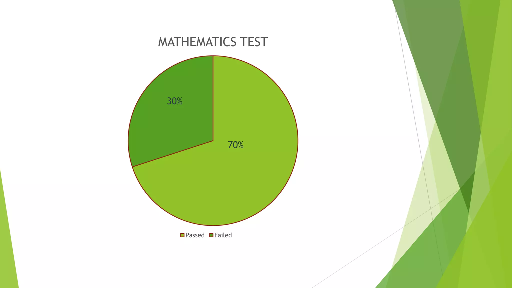
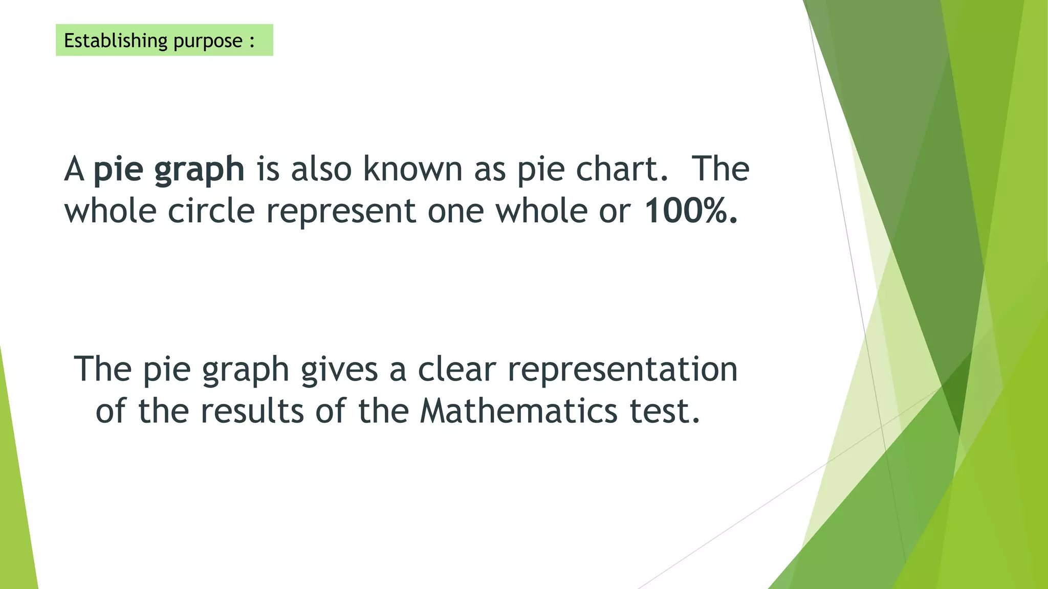
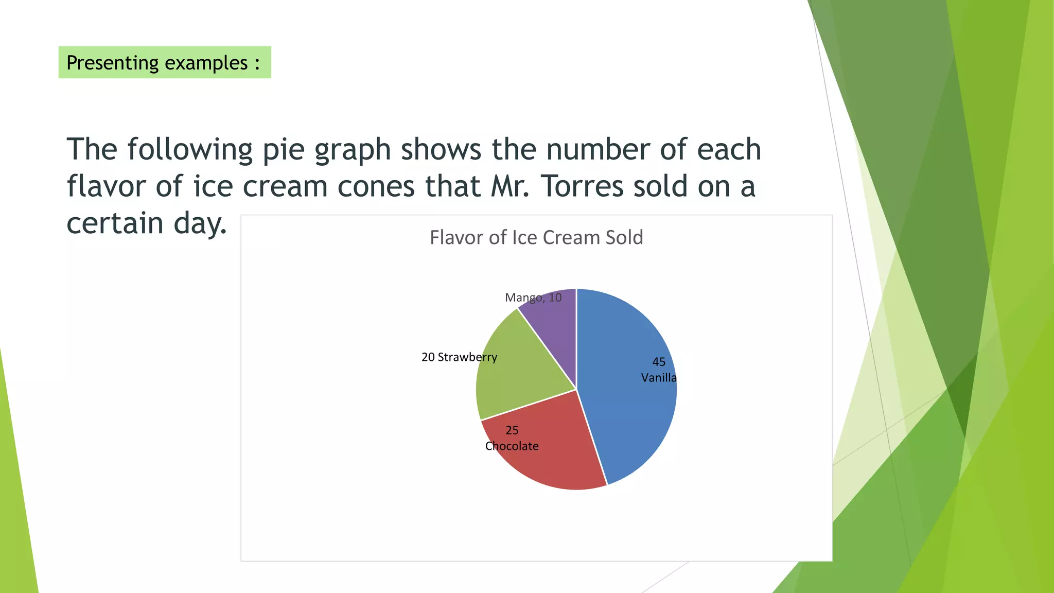
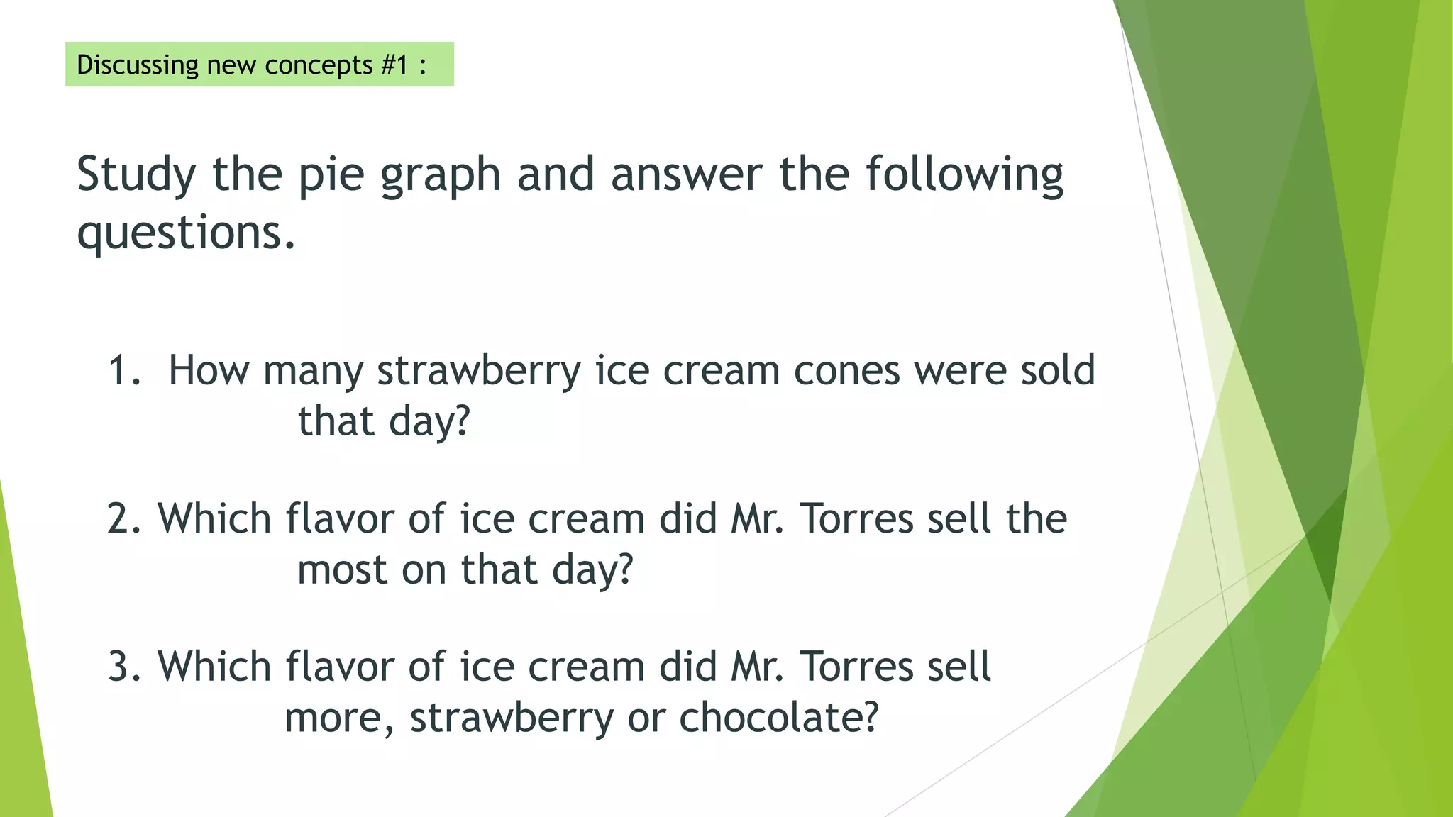
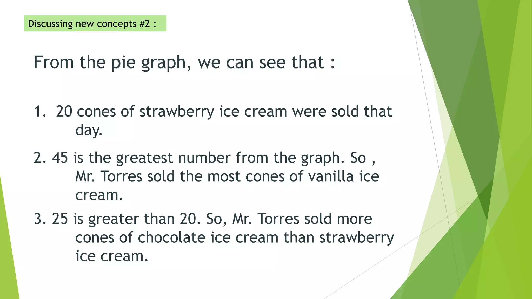
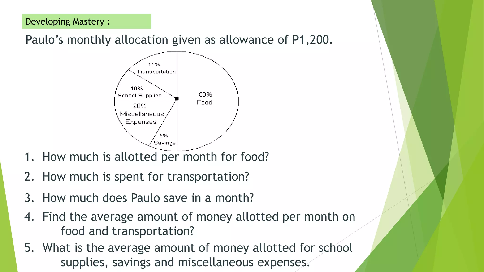
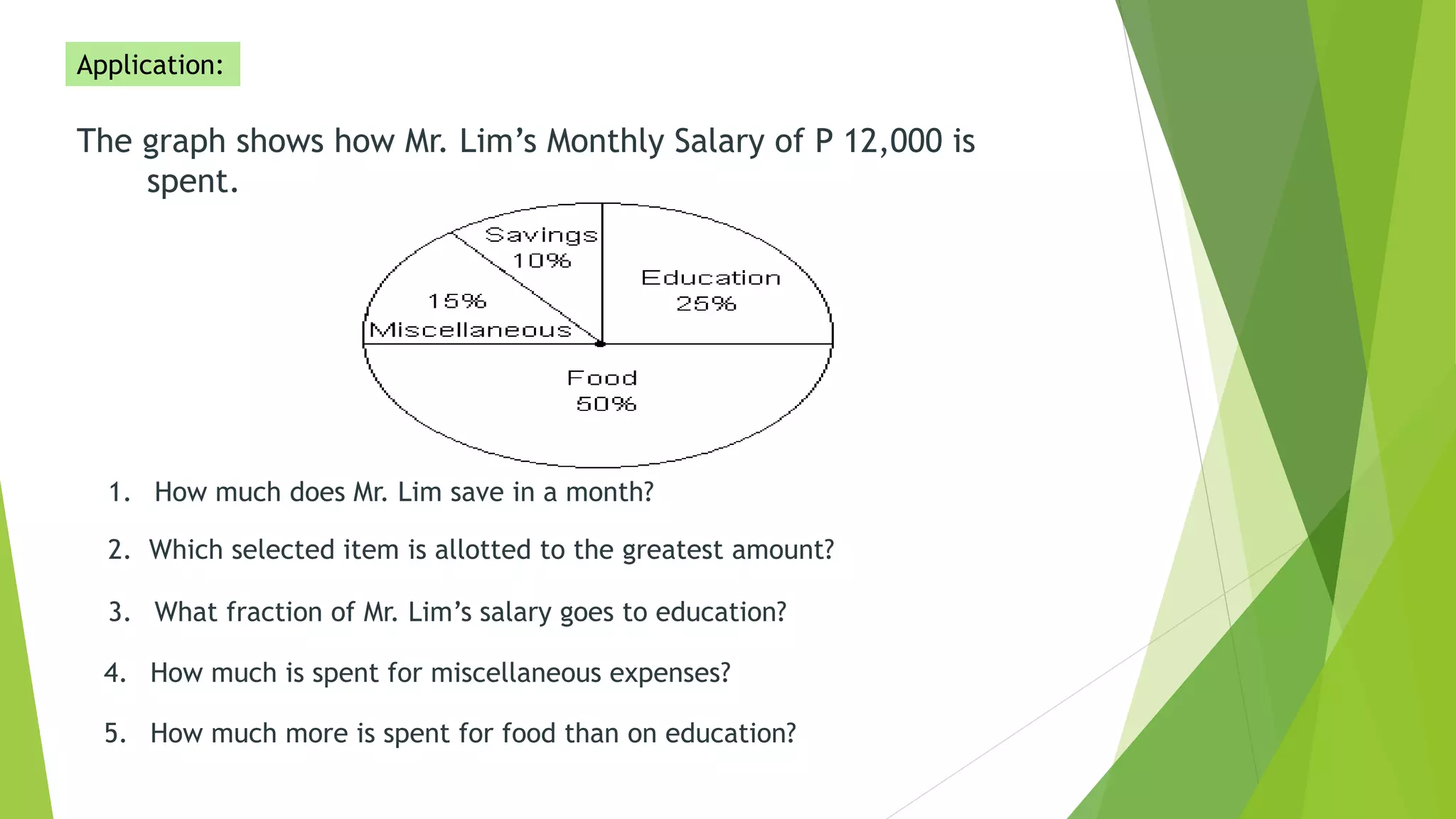
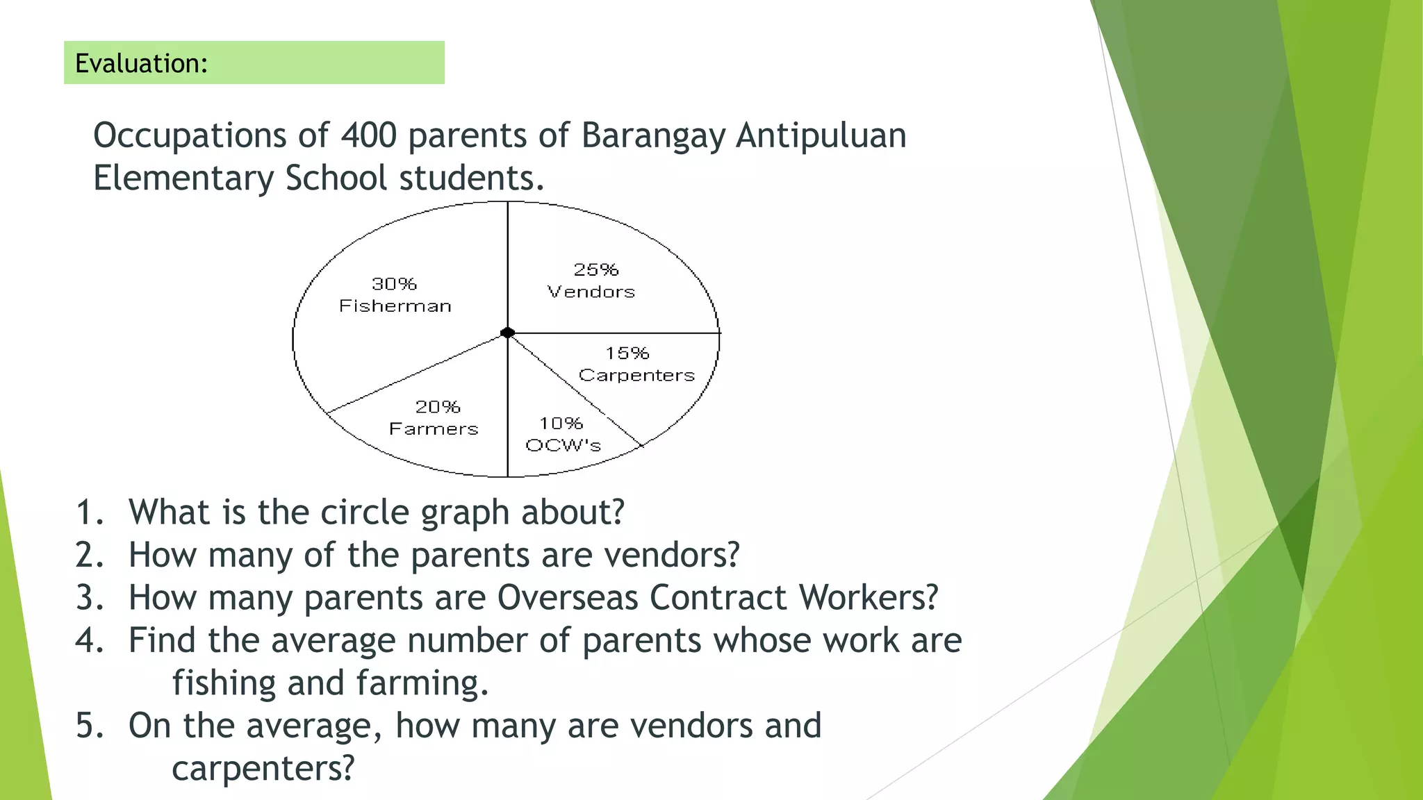
The document provides information about interpreting data presented in pie graphs. It discusses key pie graph concepts like the whole circle representing 100% and different sections indicating percentages. It provides examples of pie graphs showing ice cream sales and monthly budget allocation. Questions are presented and answered to demonstrate how to interpret the information in a pie graph, such as identifying the largest section or calculating totals and averages.