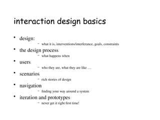
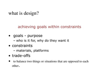
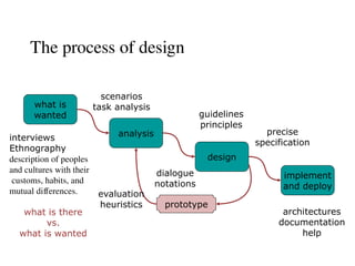
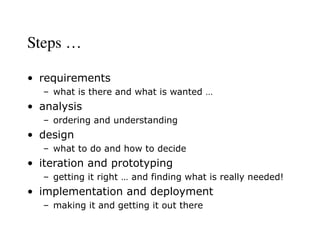
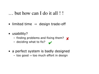
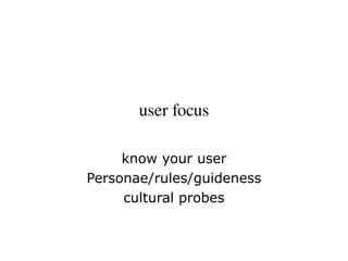
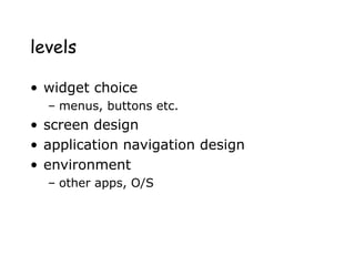
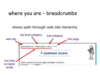
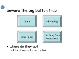
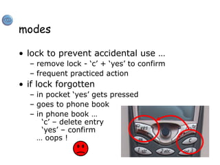
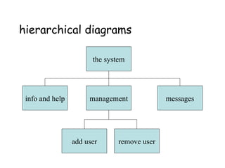
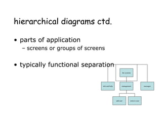
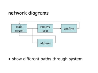
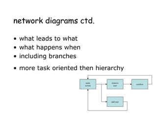
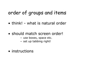
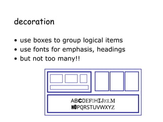
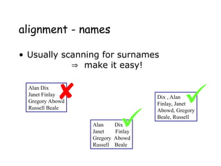
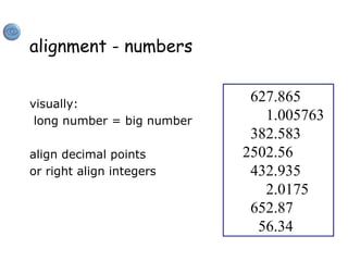
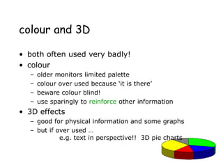
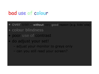
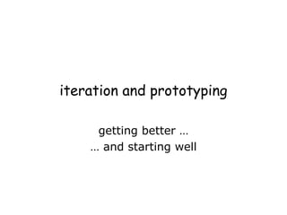
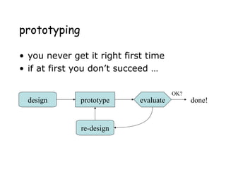
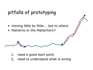
Interaction design basics
interaction design basics
• design:
– what it is, interventions/interferance, goals, constraints
• the design process
– what happens when
• users
– who they are, what they are like …
• scenarios
– rich stories of design
• navigation
– finding your way around a system
• iteration and prototypes
– never get it right first time!
interactions and interventions
design interactions not just interfaces
not just the immediate interaction
e.g. stapler in office – technology changes interaction style
• manual: write, print, staple, write, print, staple, …
• electric: write, print, write, print, …, staple
designing interventions not just
artefacts/work of art
not just the system, but also …
• documentation, manuals, tutorials
• what we say and do as well as what we make
what is design?
what is design?
achieving goals within constraints
• goals - purpose
– who is it for, why do they want it
• constraints
– materials, platforms
• trade-offs
• ​
to balance two things or situations that are opposed to each
other.
golden rule of design
understand your materials
for Human–Computer Interaction
understand your materials
• understand computers
– limitations, capacities, tools, platforms
• understand people
– psychological, social aspects
– human error
• and their interaction …
To err is human
• accident reports ..
– aircrash, industrial accident, hospital mistake
– enquiry … blames … ‘human error’
• human ‘error’ is normal
– we know how users behave under stress
– so design for it!
• treat the user at least as well as physical materials!
Central message …
the user
The process of design
what is
wanted
analysis
design
implement
and deploy
prototype
interviews
Ethnography
description of peoples
and cultures with their
customs, habits, and
mutual differences.
what is there
vs.
what is wanted
guidelines
principles
dialogue
notations
precise
specification
architectures
documentation
help
evaluation
heuristics
scenarios
task analysis
Steps …
• requirements
– what is there and what is wanted …
• analysis
– ordering and understanding
• design
– what to do and how to decide
• iteration and prototyping
– getting it right … and finding what is really needed!
• implementation and deployment
– making it and getting it out there
… but how can I do it all ! !
• limited time  design trade-off
• usability?
– finding problems and fixing them?
– deciding what to fix?
• a perfect system is badly designed
– too good  too much effort in design


user focus
know your user
Personae/rules/guideness
cultural probes
know your user
• who are they?
• probably not like you!
• talk to them
• watch them
• use your imagination
persona
• the identity that a person takes on to adapt to
the outside world or to a certain situation
• description of an ‘example’ user
– not necessarily a real person
• use as substitute user
• details matter
– makes her ‘real’
scenarios
stories for design
use and reuse
scenarios
• stories for design
– communicate with others
– validate other models
– understand dynamics
• linearity
– time is linear - our lives are linear
– but don’t show alternatives
scenarios …
• what will users want to do?
• step-by-step walkthrough
– what can they see (sketches, screen shots)
– what do they do (keyboard, mouse etc.)
– what are they thinking?
• use and reuse throughout design
also play act …
• mock up device
• pretend you are doing it
• internet-connected swiss army knife …
use toothpick as stylus
but where is that thumb?
… explore the depths
• explore interaction
– what happens when
• explore cognition/understanding
– what are the users thinking
• explore architecture
– what is happening inside
use scenarios to ..
• communicate with others
– designers, clients, users
• validate other models
– ‘play’ it against other models
• express dynamics
– screenshots – appearance
– scenario – behaviour
navigation design
local structure – single screen
global structure – whole site
start
the systems
info and help management messages
add user remove user
main
screen
remove
user
confirm
add user
levels
• widget choice
– menus, buttons etc.
• screen design
• application navigation design
• environment
– other apps, O/S
the web …
• widget choice
• screen design
• navigation design
• environment
• elements and tags
– <a href=“...”>
• page design
• site structure
• the web, browser,
external links
physical devices
• widget choice
• screen design
• navigation design
• environment
• controls
– buttons, knobs, dials
• physical layout
• modes of device
• the real world
think about structure
• within a screen
• local
– looking from this screen
• global
– structure of site, movement between
screens
• wider still
– relationship with other applications
local
from one screen looking out
goal seeking
goal
start
goal seeking
start
goal
progress with local knowledge only ...
goal seeking
goal
start
… but can get to the goal
goal seeking
… try to avoid these bits!
goal
start
four golden rules
• knowing where you are
• knowing what you can do
• knowing where you are going
– or what will happen
• knowing where you’ve been
– or what you’ve done
where you are – breadcrumbs
shows path through web site hierarchy
web site
top level category sub-category
this page
live links
to higher
levels
beware the big button trap
• where do they go?
– lots of room for extra text!
things
the thing from
outer space
more things
other things
modes
• lock to prevent accidental use …
– remove lock - ‘c’ + ‘yes’ to confirm
– frequent practiced action
• if lock forgotten
– in pocket ‘yes’ gets pressed
– goes to phone book
– in phone book …
‘c’ – delete entry
‘yes’ – confirm
… oops !
global
between screens
within the application
hierarchical diagrams
the system
info and help management messages
add user remove user
hierarchical diagrams ctd.
• parts of application
– screens or groups of screens
• typically functional separation
the systems
info and help management messages
add user remove user
network diagrams
• show different paths through system
main
screen
remove
user
confirm
add user
network diagrams ctd.
• what leads to what
• what happens when
• including branches
• more task oriented then hierarchy
main
screen
remove
user
confirm
add user
wider still
between applications
and beyond ...
wider still …
• style issues:
– platform standards, consistency
• functional issues
– cut and paste
• navigation issues
– embedded applications
– links to other apps … the web
screen design and layout
basic principles
grouping, structure, order
alignment
use of white space
ABCDEFHIJKLM
NOPQRSTUVWXYZ
Dix , Alan
Finlay, Janet
Abowd, Gregory
Beale, Russell

basic principles
• ask
– what is the user doing?
• think
– what information, comparisons, order
• design
– form follows function
available tools
• grouping of items
• order of items
• decoration - fonts, boxes etc.
• alignment of items
• white space between items
grouping and structure
logically together  physically together
Billing details:
Name
Address: …
Credit card no
Delivery details:
Name
Address: …
Delivery time
Order details:
item quantity cost/item cost
size 10 screws (boxes) 7 3.71 25.97
…… … … …
order of groups and items
• think! - what is natural order
• should match screen order!
– use boxes, space etc.
– set up tabbing right!
• instructions
decoration
• use boxes to group logical items
• use fonts for emphasis, headings
• but not too many!!
ABCDEFHIJKLM
NOPQRSTUVWXYZ
alignment - text
• you read from left to right (English and
European)
 align left hand side
Willy Wonka and the Chocolate Factory
Winston Churchill - A Biography
Wizard of Oz
Xena - Warrior Princess
Willy Wonka and the Chocolate Factory
Winston Churchill - A Biography
Wizard of Oz
Xena - Warrior Princess
fine for special effects
but hard to scan
boring but
readable!
alignment - names
• Usually scanning for surnames
 make it easy!
Alan Dix
Janet Finlay
Gregory Abowd
Russell Beale
Alan Dix
Janet Finlay
Gregory Abowd
Russell Beale
Dix , Alan
Finlay, Janet
Abowd, Gregory
Beale, Russell
 

alignment - numbers
think purpose!
which is biggest?
532.56
179.3
256.317
15
73.948
1035
3.142
497.6256
alignment - numbers
visually:
long number = big number
align decimal points
or right align integers
627.865
1.005763
382.583
2502.56
432.935
2.0175
652.87
56.34
multiple columns
• scanning across gaps hard:
(often hard to avoid with large data base
fields)
sherbert 75
toffee 120
chocolate 35
fruit gums 27
coconut dreams 85
multiple columns - 2
• use leaders
sherbert 75
toffee 120
chocolate 35
fruit gums 27
coconut dreams 85
multiple columns - 3
• or greying (vertical too)
sherbert 75
toffee 120
chocolate 35
fruit gums 27
coconut dreams 85
sherbert 75
toffee 120
chocolate 35
fruit gums 27
coconut dreams 85
multiple columns - 4
• or even (with care!) ‘bad’ alignment
white space - the counter
WHAT YOU SEE
white space - the counter
WHAT YOU SEE
THE GAPS BETWEEN
space to separate
space to structure
space to highlight
physical controls
• grouping of items
– defrost settings
– type of food
– time to cook
type of food
time to cook
defrost settings
physical controls
• grouping of items
• order of items
1) type of heating
2) temperature
3) time to cook
4) start
4
4) start
2
2) temperature
3
3) time to cook
1
1) type of heating
physical controls
• grouping of items
• order of items
• decoration
– different colours
for different functions
– lines around related
buttons
different colours for
different functions
lines around related
buttons (temp up/down)
physical controls
• grouping of items
• order of items
• decoration
• alignment
– centered text in buttons
? easy to scan ?
? easy to scan ?
centred text in buttons
physical controls
• grouping of items
• order of items
• decoration
• alignment
• white space
– gaps to aid grouping
gaps to aid grouping
user action and control
entering information
knowing what to do
affordances
affordances
• psychological term
• for physical objects
– shape and size suggest actions
• pick up, twist, throw
– also cultural – buttons ‘afford’ pushing
• for screen objects
– button–like object ‘affords’ mouse click
– physical-like objects suggest use
• culture of computer use
– icons ‘afford’ clicking
– or even double clicking … not like real buttons!
mug handle
‘affords’
grasping
appropriate appearance
presenting information
aesthetics and utility
colour and 3D
localisation & internationalisation
presenting information
• purpose matters
– sort order (which column, numeric alphabetic)
– text vs. diagram
– scatter graph vs. histogram
• use paper presentation principles!
• but add interactivity
– softens design choices
• e.g. re-ordering columns
• ‘dancing histograms’ (chap 21)
chap1
chap10
chap11
chap12
chap13
chap14
…
17
12
51
262
83
22
…
size
name size
chap10
chap5
chap1
chap14
chap20
chap8
…
12
16
17
22
27
32
…
name size
aesthetics and utility
• aesthetically pleasing designs
– increase user satisfaction and improve productivity
• beauty and utility may conflict
– mixed up visual styles  easy to distinguish
– clean design – little differentiation  confusing
– backgrounds behind text
… good to look at, but hard to read
• but can work together
– e.g. the design of the counter
– in consumer products – key differentiator (e.g. iMac)
colour and 3D
• both often used very badly!
• colour
– older monitors limited palette
– colour over used because ‘it is there’
– beware colour blind!
– use sparingly to reinforce other information
• 3D effects
– good for physical information and some graphs
– but if over used …
e.g. text in perspective!! 3D pie charts
bad use of colour
• over use - without very good reason (e.g. kids’ site)
• colour blindness
• poor use of contrast
• do adjust your set!
– adjust your monitor to greys only
– can you still read your screen?
across countries and cultures
• localisation & internationalisation
– changing interfaces for particular cultures/languages
• globalisation
– try to choose symbols etc. that work everywhere
• simply change language?
– use ‘resource’ database instead of literal text
… but changes sizes, left-right order etc.
• deeper issues
– cultural assumptions and values
– meanings of symbols
e.g tick and cross … +ve and -ve in some cultures
… but … mean the same thing (mark this) in others


prototyping
iteration and prototyping
getting better …
… and starting well
prototyping
• you never get it right first time
• if at first you don’t succeed …
prototype evaluate
design
re-design
done!
OK?
pitfalls of prototyping
• moving little by little … but to where
• Malverns or the Matterhorn?
1. need a good start point
2. need to understand what is wrong

Interaciton desing lect05.ppt Human Computer Interaction

  • 1.
  • 2.
    interaction design basics •design: – what it is, interventions/interferance, goals, constraints • the design process – what happens when • users – who they are, what they are like … • scenarios – rich stories of design • navigation – finding your way around a system • iteration and prototypes – never get it right first time!
  • 3.
    interactions and interventions designinteractions not just interfaces not just the immediate interaction e.g. stapler in office – technology changes interaction style • manual: write, print, staple, write, print, staple, … • electric: write, print, write, print, …, staple designing interventions not just artefacts/work of art not just the system, but also … • documentation, manuals, tutorials • what we say and do as well as what we make
  • 4.
  • 5.
    what is design? achievinggoals within constraints • goals - purpose – who is it for, why do they want it • constraints – materials, platforms • trade-offs • ​ to balance two things or situations that are opposed to each other.
  • 6.
    golden rule ofdesign understand your materials
  • 7.
    for Human–Computer Interaction understandyour materials • understand computers – limitations, capacities, tools, platforms • understand people – psychological, social aspects – human error • and their interaction …
  • 8.
    To err ishuman • accident reports .. – aircrash, industrial accident, hospital mistake – enquiry … blames … ‘human error’ • human ‘error’ is normal – we know how users behave under stress – so design for it! • treat the user at least as well as physical materials!
  • 9.
  • 10.
    The process ofdesign what is wanted analysis design implement and deploy prototype interviews Ethnography description of peoples and cultures with their customs, habits, and mutual differences. what is there vs. what is wanted guidelines principles dialogue notations precise specification architectures documentation help evaluation heuristics scenarios task analysis
  • 11.
    Steps … • requirements –what is there and what is wanted … • analysis – ordering and understanding • design – what to do and how to decide • iteration and prototyping – getting it right … and finding what is really needed! • implementation and deployment – making it and getting it out there
  • 12.
    … but howcan I do it all ! ! • limited time  design trade-off • usability? – finding problems and fixing them? – deciding what to fix? • a perfect system is badly designed – too good  too much effort in design  
  • 14.
    user focus know youruser Personae/rules/guideness cultural probes
  • 15.
    know your user •who are they? • probably not like you! • talk to them • watch them • use your imagination
  • 16.
    persona • the identitythat a person takes on to adapt to the outside world or to a certain situation • description of an ‘example’ user – not necessarily a real person • use as substitute user • details matter – makes her ‘real’
  • 17.
  • 18.
    scenarios • stories fordesign – communicate with others – validate other models – understand dynamics • linearity – time is linear - our lives are linear – but don’t show alternatives
  • 19.
    scenarios … • whatwill users want to do? • step-by-step walkthrough – what can they see (sketches, screen shots) – what do they do (keyboard, mouse etc.) – what are they thinking? • use and reuse throughout design
  • 20.
    also play act… • mock up device • pretend you are doing it • internet-connected swiss army knife … use toothpick as stylus but where is that thumb?
  • 21.
    … explore thedepths • explore interaction – what happens when • explore cognition/understanding – what are the users thinking • explore architecture – what is happening inside
  • 22.
    use scenarios to.. • communicate with others – designers, clients, users • validate other models – ‘play’ it against other models • express dynamics – screenshots – appearance – scenario – behaviour
  • 24.
    navigation design local structure– single screen global structure – whole site start the systems info and help management messages add user remove user main screen remove user confirm add user
  • 25.
    levels • widget choice –menus, buttons etc. • screen design • application navigation design • environment – other apps, O/S
  • 26.
    the web … •widget choice • screen design • navigation design • environment • elements and tags – <a href=“...”> • page design • site structure • the web, browser, external links
  • 27.
    physical devices • widgetchoice • screen design • navigation design • environment • controls – buttons, knobs, dials • physical layout • modes of device • the real world
  • 28.
    think about structure •within a screen • local – looking from this screen • global – structure of site, movement between screens • wider still – relationship with other applications
  • 29.
  • 30.
  • 31.
    goal seeking start goal progress withlocal knowledge only ...
  • 32.
  • 33.
    goal seeking … tryto avoid these bits! goal start
  • 34.
    four golden rules •knowing where you are • knowing what you can do • knowing where you are going – or what will happen • knowing where you’ve been – or what you’ve done
  • 35.
    where you are– breadcrumbs shows path through web site hierarchy web site top level category sub-category this page live links to higher levels
  • 36.
    beware the bigbutton trap • where do they go? – lots of room for extra text! things the thing from outer space more things other things
  • 37.
    modes • lock toprevent accidental use … – remove lock - ‘c’ + ‘yes’ to confirm – frequent practiced action • if lock forgotten – in pocket ‘yes’ gets pressed – goes to phone book – in phone book … ‘c’ – delete entry ‘yes’ – confirm … oops !
  • 38.
  • 39.
    hierarchical diagrams the system infoand help management messages add user remove user
  • 40.
    hierarchical diagrams ctd. •parts of application – screens or groups of screens • typically functional separation the systems info and help management messages add user remove user
  • 41.
    network diagrams • showdifferent paths through system main screen remove user confirm add user
  • 42.
    network diagrams ctd. •what leads to what • what happens when • including branches • more task oriented then hierarchy main screen remove user confirm add user
  • 43.
  • 44.
    wider still … •style issues: – platform standards, consistency • functional issues – cut and paste • navigation issues – embedded applications – links to other apps … the web
  • 46.
    screen design andlayout basic principles grouping, structure, order alignment use of white space ABCDEFHIJKLM NOPQRSTUVWXYZ Dix , Alan Finlay, Janet Abowd, Gregory Beale, Russell 
  • 47.
    basic principles • ask –what is the user doing? • think – what information, comparisons, order • design – form follows function
  • 48.
    available tools • groupingof items • order of items • decoration - fonts, boxes etc. • alignment of items • white space between items
  • 49.
    grouping and structure logicallytogether  physically together Billing details: Name Address: … Credit card no Delivery details: Name Address: … Delivery time Order details: item quantity cost/item cost size 10 screws (boxes) 7 3.71 25.97 …… … … …
  • 50.
    order of groupsand items • think! - what is natural order • should match screen order! – use boxes, space etc. – set up tabbing right! • instructions
  • 51.
    decoration • use boxesto group logical items • use fonts for emphasis, headings • but not too many!! ABCDEFHIJKLM NOPQRSTUVWXYZ
  • 52.
    alignment - text •you read from left to right (English and European)  align left hand side Willy Wonka and the Chocolate Factory Winston Churchill - A Biography Wizard of Oz Xena - Warrior Princess Willy Wonka and the Chocolate Factory Winston Churchill - A Biography Wizard of Oz Xena - Warrior Princess fine for special effects but hard to scan boring but readable!
  • 53.
    alignment - names •Usually scanning for surnames  make it easy! Alan Dix Janet Finlay Gregory Abowd Russell Beale Alan Dix Janet Finlay Gregory Abowd Russell Beale Dix , Alan Finlay, Janet Abowd, Gregory Beale, Russell   
  • 54.
    alignment - numbers thinkpurpose! which is biggest? 532.56 179.3 256.317 15 73.948 1035 3.142 497.6256
  • 55.
    alignment - numbers visually: longnumber = big number align decimal points or right align integers 627.865 1.005763 382.583 2502.56 432.935 2.0175 652.87 56.34
  • 56.
    multiple columns • scanningacross gaps hard: (often hard to avoid with large data base fields) sherbert 75 toffee 120 chocolate 35 fruit gums 27 coconut dreams 85
  • 57.
    multiple columns -2 • use leaders sherbert 75 toffee 120 chocolate 35 fruit gums 27 coconut dreams 85
  • 58.
    multiple columns -3 • or greying (vertical too) sherbert 75 toffee 120 chocolate 35 fruit gums 27 coconut dreams 85
  • 59.
    sherbert 75 toffee 120 chocolate35 fruit gums 27 coconut dreams 85 multiple columns - 4 • or even (with care!) ‘bad’ alignment
  • 60.
    white space -the counter WHAT YOU SEE
  • 61.
    white space -the counter WHAT YOU SEE THE GAPS BETWEEN
  • 62.
  • 63.
  • 64.
  • 65.
    physical controls • groupingof items – defrost settings – type of food – time to cook type of food time to cook defrost settings
  • 66.
    physical controls • groupingof items • order of items 1) type of heating 2) temperature 3) time to cook 4) start 4 4) start 2 2) temperature 3 3) time to cook 1 1) type of heating
  • 67.
    physical controls • groupingof items • order of items • decoration – different colours for different functions – lines around related buttons different colours for different functions lines around related buttons (temp up/down)
  • 68.
    physical controls • groupingof items • order of items • decoration • alignment – centered text in buttons ? easy to scan ? ? easy to scan ? centred text in buttons
  • 69.
    physical controls • groupingof items • order of items • decoration • alignment • white space – gaps to aid grouping gaps to aid grouping
  • 71.
    user action andcontrol entering information knowing what to do affordances
  • 72.
    affordances • psychological term •for physical objects – shape and size suggest actions • pick up, twist, throw – also cultural – buttons ‘afford’ pushing • for screen objects – button–like object ‘affords’ mouse click – physical-like objects suggest use • culture of computer use – icons ‘afford’ clicking – or even double clicking … not like real buttons! mug handle ‘affords’ grasping
  • 73.
    appropriate appearance presenting information aestheticsand utility colour and 3D localisation & internationalisation
  • 74.
    presenting information • purposematters – sort order (which column, numeric alphabetic) – text vs. diagram – scatter graph vs. histogram • use paper presentation principles! • but add interactivity – softens design choices • e.g. re-ordering columns • ‘dancing histograms’ (chap 21) chap1 chap10 chap11 chap12 chap13 chap14 … 17 12 51 262 83 22 … size name size chap10 chap5 chap1 chap14 chap20 chap8 … 12 16 17 22 27 32 … name size
  • 75.
    aesthetics and utility •aesthetically pleasing designs – increase user satisfaction and improve productivity • beauty and utility may conflict – mixed up visual styles  easy to distinguish – clean design – little differentiation  confusing – backgrounds behind text … good to look at, but hard to read • but can work together – e.g. the design of the counter – in consumer products – key differentiator (e.g. iMac)
  • 76.
    colour and 3D •both often used very badly! • colour – older monitors limited palette – colour over used because ‘it is there’ – beware colour blind! – use sparingly to reinforce other information • 3D effects – good for physical information and some graphs – but if over used … e.g. text in perspective!! 3D pie charts
  • 77.
    bad use ofcolour • over use - without very good reason (e.g. kids’ site) • colour blindness • poor use of contrast • do adjust your set! – adjust your monitor to greys only – can you still read your screen?
  • 78.
    across countries andcultures • localisation & internationalisation – changing interfaces for particular cultures/languages • globalisation – try to choose symbols etc. that work everywhere • simply change language? – use ‘resource’ database instead of literal text … but changes sizes, left-right order etc. • deeper issues – cultural assumptions and values – meanings of symbols e.g tick and cross … +ve and -ve in some cultures … but … mean the same thing (mark this) in others  
  • 80.
  • 81.
    iteration and prototyping gettingbetter … … and starting well
  • 82.
    prototyping • you neverget it right first time • if at first you don’t succeed … prototype evaluate design re-design done! OK?
  • 83.
    pitfalls of prototyping •moving little by little … but to where • Malverns or the Matterhorn? 1. need a good start point 2. need to understand what is wrong