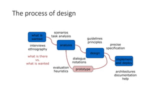
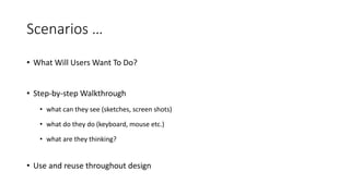
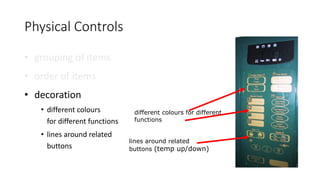
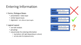
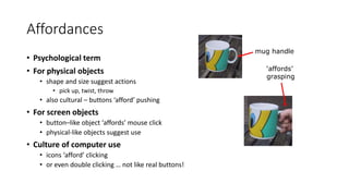
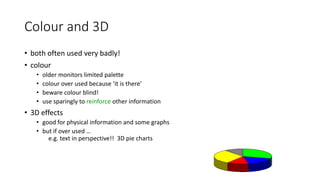
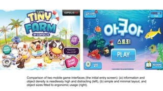
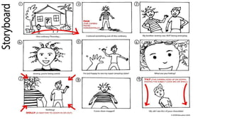
The process of design
what is
wanted
analysis
design
implement
and deploy
prototype
interviews
ethnography
what is there
vs.
what is wanted
guidelines
principles
dialogue
notations
precise
specification
architectures
documentation
help
evaluation
heuristics
scenarios
task analysis
Steps …
• requirements
• what is there and what is wanted …
• analysis
• ordering and understanding
• design
• what to do and how to decide
• iteration and prototyping
• getting it right … and finding what is really needed!
• implementation and deployment
• making it and getting it out there
User Focus
know your user
personae
cultural probes
Know Your User
• who are they?
• probably not like you!
• talk to them
• watch them
• use your imagination
Persona
• description of an ‘example’ user
• not necessarily a real person
• use as surrogate user
• what would Betty think
• details matter
• makes her ‘real’
Example Persona
Betty is 37 years old, She has been Warehouse Manager for five years and worked for Simpkins Brothers
Engineering for twelve years. She didn’t go to university, but has studied in her evenings for a business
diploma. She has two children aged 15 and 7 and does not like to work late. She did part of an introductory in-
house computer course some years ago, but it was interrupted when she was promoted and could no longer
afford to take the time. Her vision is perfect, but her right-hand movement is slightly restricted following an
industrial accident 3 years ago. She is enthusiastic about her work and is happy to delegate responsibility and
take suggestions from her staff. However, she does feel threatened by the introduction of yet another new
computer system (the third in her time at SBE).
Cultural Probes
• Direct Observation
• sometimes hard
• in the home
• psychiatric patients, …
• Probe Packs
• items to prompt responses
• e.g. glass to listen at wall, camera, postcard
• given to people to open in their own environment
they record what is meaningful to them
• Used To …
• inform interviews, prompt ideas, enculture designers
Scenarios
stories for design
use and reuse
Scenarios
• Stories for design
• communicate with others
• validate other models
• understand dynamics
• Linearity
• time is linear - our lives are linear
• but don’t show alternatives
Scenarios …
• What Will Users Want To Do?
• Step-by-step Walkthrough
• what can they see (sketches, screen shots)
• what do they do (keyboard, mouse etc.)
• what are they thinking?
• Use and reuse throughout design
Scenario – Movie Player
Brian would like to see the new film “Moments of Significance” and wants to invite Alison, but he knows she
doesn’t like “arty” films. He decides to take a look at it to see if she would like it and so connects to one of the
movie sharing networks. He uses his work machine as it has a higher bandwidth connection, but feels a bit
guilty. He knows he will be getting an illegal copy of the film, but decides it is OK as he is intending to go to the
cinema to watch it. After it downloads to his machine he takes out his new personal movie player. He presses
the ‘menu’ button and on the small LCD screen he scrolls using the arrow keys to ‘bluetooth connect’ and
presses the select button. On his computer the movie download program now has an icon showing that it has
recognised a compatible device and he drags the icon of the film over the icon for the player. On the player the
LCD screen says “downloading now”, a percent done indicator and small whirling icon. … … …
also play act …
• mock up device
• pretend you are doing it
• internet-connected swiss army knife …
use toothpick as stylus
but where is that thumb?
Explore the depths
• Explore Interaction
• what happens when
• Explore Cognition
• what are the users thinking
• Explore Architecture
• what is happening inside
Use scenarios to ..
• Communicate With Others
• designers, clients, users
• Validate Other Models
• ‘play’ it against other models
• Express Dynamics
• screenshots – appearance
• scenario – behaviour
Linearity
Scenarios – one linear path through system
Pros:
• life and time are linear
• easy to understand (stories and narrative are natural)
• concrete (errors less likely)
Cons:
• no choice, no branches, no special conditions
• miss the unintended
• So:
• use several scenarios
• use several methods
Navigation Design
Local Structure – single screen
Global Structure – whole site
start
the systems
info and help management messages
add user remove user
main
screen
remove
user
confirm
add user
Levels
• Widget choice
• Menus, buttons etc.
• Screen design
• Application navigation design
• Environment
• Other apps, O/S
Structure
• Within A Screen
• later ...
• Local
• looking from this screen out
• Global
• structure of site, movement between screens
• Wider Still
• relationship with other applications
Four Golden Rules
• Knowing where you are
• Knowing what you can do
• Knowing where you are going
• Or what will happen
• Knowing where you’ve been
• Or what you’ve done
Local Structure
Modes
• lock to prevent accidental use …
• remove lock - ‘c’ + ‘yes’ to confirm
• frequent practiced action
• if lock forgotten
• in pocket ‘yes’ gets pressed
• goes to phone book
• in phone book …
‘c’ – delete entry
‘yes’ – confirm
… oops !
Where you are – breadcrumbs
shows path through web site hierarchy
web site
top level category sub-category
this page
live links
to higher
levels
Global
between screens
within the application
Hierarchical Diagrams
the system
info and help management messages
add user remove user
Hierarchical Diagrams Ctd.
• parts of application
• screens or groups of screens
• typically functional separation
the systems
info and help management messages
add user remove user
Navigating Hierarchies
• deep is difficult!
• misuse of Miller’s 7 ± 2
• short term memory, not menu size
• optimal?
• many items on each screen
• but structured within screen
see /e3/online/menu-breadth/
Think About Dialogue
what does it mean in UI design?
Minister: do you name take this woman …
Man: I do
Minister: do you name take this man …
Woman: I do
Minister: I now pronounce you man and wife
Think About Dialogue
what does it mean in UI design?
• marriage service
• general flow, generic – blanks for names
• pattern of interaction between people
• computer dialogue
• pattern of interaction between users and system
• but details differ each time
Minister: do you name take this woman …
Network Diagrams
• show different paths through system
main
screen
remove
user
confirm
add user
Network Diagrams Ctd.
• what leads to what
• what happens when
• including branches
• more task oriented then hierarchy
main
screen
remove
user
confirm
add user
Wider Still
between applications and beyond ...
Wider Still …
• style issues:
• platform standards, consistency
• functional issues
• cut and paste
• navigation issues
• embedded applications
• links to other apps … the web
Screen Design and Layout
Basic Principles
Grouping, Structure, Order
Alignment
Use of White Space
ABCDEFGHIJKLM
NOPQRSTUVWXYZ
Dix , Alan
Finlay, Janet
Abowd, Gregory
Beale, Russell

Basic Principles
•Ask
• what is the user doing?
•Think
• what information,
comparisons, order
•Design
• form follows function
Available Tools
• Grouping of items
• Order of items
• Decoration - fonts, boxes etc.
• Alignment of items
• White space between items
Grouping and structure
logically together  physically together
Billing details:
Name
Address: …
Credit card no
Delivery details:
Name
Address: …
Delivery time
Order details:
item quantity cost/item cost
size 10 screws (boxes) 7 3.71 25.97
…… … … …
Order of groups and items
• Think! - What is natural order
• Should match screen order!
• use boxes, space etc.
• set up tabbing right!
• Instructions
• beware the cake recipe syndrome!
… mix milk and flour, add the fruit
after beating them
Decoration
• Use boxes to group logical items
• Use fonts for emphasis, headings
• But not too many!!
ABCDEFGHIJKLM
NOPQRSTUVWXYZ
Alignment - Text
• you read from left to right (English and European)
 align left hand side
Willy Wonka and the Chocolate Factory
Winston Churchill - A Biography
Wizard of Oz
Xena - Warrior Princess
Willy Wonka and the Chocolate Factory
Winston Churchill - A Biography
Wizard of Oz
Xena - Warrior Princess
fine for special effects but hard
to scan
boring but
readable!
Alignment - Text
Alignment - Names
• Usually scanning for surnames  make it easy!
Alan Dix
Janet Finlay
Gregory Abowd
Russell Beale
Alan Dix
Janet Finlay
Gregory Abowd
Russell Beale
Dix , Alan
Finlay, Janet
Abowd, Gregory
Beale, Russell
 

Alignment - Numbers
think purpose!
which is biggest?
532.56
179.3
256.317
15
73.948
1035
3.142
497.6256
Alignment - Numbers
visually:
long number = big number
align decimal points
or right align integers
627.865
1.005763
382.583
2502.56
432.935
2.0175
652.87
56.34
Multiple Columns
• scanning across gaps hard:
(often hard to avoid with large data base fields)
sherbert 75
toffee 120
chocolate 35
fruit gums 27
coconut dreams 85
Multiple Columns - 2
• use leaders
sherbert 75
toffee 120
chocolate 35
fruit gums 27
coconut dreams 85
Multiple Columns - 3
• or greying (vertical too)
sherbert 75
toffee 120
chocolate 35
fruit gums 27
coconut dreams 85
sherbert 75
toffee 120
chocolate 35
fruit gums 27
coconut dreams 85
Multiple Columns - 4
• or even (with care!) ‘bad’ alignment
White Space - The Counter
WHAT YOU SEE
White Space - The Counter
WHAT YOU SEE
THE GAPS BETWEEN
Space To Separate
Space To Structure
Space To Highlight
Physical Controls
• grouping of items
• defrost settings
• type of food
• time to cook
type of food
time to cook
defrost settings
Physical Controls
• grouping of items
• Order of Items
1) type of heating
2) temperature
3) time to cook
4) start
4
4) start
2
2) temperature
3
3) time to cook
1
1) type of heating
Physical Controls
• grouping of items
• order of items
• decoration
• different colours
for different functions
• lines around related
buttons
different colours for different
functions
lines around related
buttons (temp up/down)
Physical Controls
• grouping of items
• order of items
• decoration
• alignment
• centered text in buttons - easy to scan
centred text in buttons
Physical Controls
• grouping of items
• order of items
• decoration
• alignment
• white space
• gaps to aid grouping
gaps to aid grouping
User Action and Control
Entering information
Knowing what to do
Affordances
Entering Information
• Forms, Dialogue Boxes
• presentation + data input
• similar layout issues
• alignment - N.B. different label lengths
• Logical Layout
• use task analysis
• groupings
• natural order for entering information
• top-bottom, left-right (depending on culture)
• set tab order for keyboard entry
Name:
Address:
Alan Dix
Lancaster
Name:
Address:
Alan Dix
Lancaster
Name:
Address:
Alan Dix
Lancaster

?
Knowing What To Do
• What is Active or What is Passive?
• where do you click
• where do you type
• Consistent Style Helps
• e.g. web underlined links
• Labels and Icons
• standards for common actions
• language – bold = current state or action
Affordances
• Psychological term
• For physical objects
• shape and size suggest actions
• pick up, twist, throw
• also cultural – buttons ‘afford’ pushing
• For screen objects
• button–like object ‘affords’ mouse click
• physical-like objects suggest use
• Culture of computer use
• icons ‘afford’ clicking
• or even double clicking … not like real buttons!
mug handle
‘affords’
grasping
Affordances
Affordances
Appropriate Appearance
Presenting Information
Aesthetics and Utility
Colour and 3D
Localisation & Internationalisation
Presenting Information
• purpose matters
• sort order (which column, numeric alphabetic)
• text vs. diagram
• scatter graph vs. histogram
• use paper presentation principles!
• but add interactivity
• softens design choices
• e.g. re-ordering columns
• ‘dancing histograms’ (chap 21)
chap1
chap10
chap11
chap12
chap13
chap14
…
17
12
51
262
83
22
…
size
name size
chap10
chap5
chap1
chap14
chap20
chap8
…
12
16
17
22
27
32
…
name size
Aesthetics and Utility
• aesthetically pleasing designs
• increase user satisfaction and improve productivity
• beauty and utility may conflict
• mixed up visual styles  easy to distinguish
• clean design – little differentiation  confusing
• backgrounds behind text
… good to look at, but hard to read
• but can work together
• e.g. the design of the counter
• in consumer products – key differentiator (e.g. iMac)
Aesthetics and Utility
Colour and 3D
• both often used very badly!
• colour
• older monitors limited palette
• colour over used because ‘it is there’
• beware colour blind!
• use sparingly to reinforce other information
• 3D effects
• good for physical information and some graphs
• but if over used …
e.g. text in perspective!! 3D pie charts
bad use of colour
• over use - without very good reason (e.g. kids’ site)
• colour blindness
• poor use of contrast
• do adjust your set!
• adjust your monitor to greys only
• can you still read your screen?
Colour and 3D
Across Countries and Cultures
• localisation & internationalisation
• changing interfaces for particular cultures/languages
• globalisation
• try to choose symbols etc. that work everywhere
• simply change language?
• use ‘resource’ database instead of literal text
… but changes sizes, left-right order etc.
• deeper issues
• cultural assumptions and values
• meanings of symbols
e.g tick and cross … +ve and -ve in some cultures
… but … mean the same thing (mark this) in others


A global view of a London map, showing large-scale geographic features and neighborhoods, is useless for finding a nearby
coffee shop, but good for deciding how to go from the British Museum to Buckingham Palace.
A local view of the London neighborhood Brixton shows a much greater variety of features. Here, it’s easy to find a nearby
place to eat, but there’s no help for finding your way to Buckingham Palace.
SPECIFIC HCI GUIDELINES
Guidelines
• International Organization for Standardization (ISO) 9241 document guides the
ergonomics aspects of HCI designs, with topics covering visual display, physical input
devices, workplace/environment ergonomics, and tactile/haptic inter- actions
• Each guideline illustrates specific UI examples with exact descriptions of what it is and
what it does and why and when it should be used.
• Guidelines are divided into two categories:
(a) domain specific (i.e., specific to user, platform, etc.) and
(b) of general HCI design.
Examples of HCI Guidelines
Visual Display Layout (General HCI Design)
• One of the main focuses in many design guidelines is on the display
(page) layout.
• Concerns organizing and allotting relevant information (both the
content and UI elements) in one visible screen or scrollable page
• The display layout should be such that it is organized according to the
information content
• Importance,
• Sequence, functionality),
• Is sized manageably (Divided into proper sections),
• Is attention grabbing, and
• Is visually pleasing (e.g., aligned and with restricted use of colours).
Information Structuring and Navigation (General HCI
Design)
• Structuring the information and making it easy to move (or
navigate) among the various items becomes a very important
issue for high usability.
• Structuring information content and controlling the interface for
the purpose of HCI is closely related to the principle of
understanding the task
• Identify the sequence of subtasks and actions, and each task
will be associated with information either for making input or for
the resulting output.
• The task structure, action sequence, and associated content
organization will dictate the interaction flow and its fluidity.
Information Structuring and Navigation (General HCI
Design)
The use of a two-panel selector, a design pattern for information structuring and facilitated navigation.
Use of one-window
drilldown as a design
pattern for content
organization and fast
navigation.
Taking User Input (General HCI Design)
• Modern interfaces employ graphical user interface (GUI) elements
• (e.g., window, text box, button, menu, forms, dialog box, icon)
• Support techniques
• (e.g., autocompletion, deactivating irrelevant options, voice recognition), and
• Devices
• (e.g., mouse, touch screen) to obtain user input in different ways.
• Design constraints
• (e.g., user type, task characteristics, operating environment, etc.).
Input methods to facilitate data entry
1. Consistency of data-entry transactions:
2. Minimal input actions by user
3. Minimal memory load on users
4. Compatibility of data entry with data display
5. Clear and effective labeling of buttons and data-entry fields
6. Match and place the sequence of data-entry and selection fields in a natural
scanning and hand-movement direction
7. Do not place semantically opposing entry/selection options close together
8. Design of form and dialog boxes
Users with Disability (User Type)
• W3C has led the web accessibility initiative and published the web
content accessibility guidelines (WCAG) 2.0
• Explains how to make web content more accessible to people with
disabilities.
• Web content generally refers to the information in a web page or web
appli- cation, including text, images, forms, sounds, and such
Summary of the guidelines
• Perceivable
• Provide text alternatives for nontext content.
• Provide captions and other alternatives for
multimedia.
• Create content that can be presented in
different ways, including by assistive
technologies, without losing meaning.
• Make it easier for users to see and hear
content.
• 2. Operable
• Make all functionality available from a
keyboard.
• Give users enough time to read and use
content.
• Do not use content that causes seizures.
• Help users navigate and find content.
3. Understandable
• Make text readable and
understandable.
• Make content appear and operate in
predictable ways.
• Help users avoid and correct mistakes.
4. Robust
• A. Maximize compatibility with current
and future user tools.
Mobile Device (Platform Type)
1.Fast status information (especially with regard to network connection and
services)
2.Minimize typing and leverage on varied input hardware (e.g., buttons,
touch, voice, handwriting recognition, virtual keyboard, etc.)
3.Fierce task focus (for less confusion in a highly dense information space)
4.Large hit targets (for easy and correct selection and manipulation)
5. Efficient use of screen space (with condensed information)
• Following is a similar set of guidelines available from the Nokia
developer’s home page:
1. Enable shortcuts (e.g., hot keys) for frequently used functions
2. Keep the user informed of his or her actions
3. Follow the device’s (vendor’s) interface patterns (positioning of the buttons and
menus).
Comparison of two mobile game interfaces (the initial entry screen): (a) information and
object density is needlessly high and distracting (left), (b) simple and minimal layout, and
object sizes fitted to ergonomic usage (right).
Android design guideline
promoting the use of list
views and detailed views
(multiple panels) to efficiently
use the screen size of mobile
devices.
“Earcon” Design for Aural Interface (Modality)
• Earcons are auditory icons used in user interfaces to convey
information or provide feedback to users through sound.
• They are analogous to icons in graphical interfaces but are
designed for aural perception.
• Earcon design involves creating distinct and meaningful sound
patterns that users can recognize and interpret easily.
Earcons
They suggest three types of earcons, namely, those that are:
(a) Symbolic
• Symbolic earcons rely on social convention such as applause for approval
(b) Nomic
• nomic ones are physical such as a door slam
(c) Metaphoric
• capturing the similarities such as a falling pitch for a falling object
• Aural feedback (including earcons) involves a careful choice of sound-related
parameters such as the amplitude/ loudness, frequency/pitch, timbre, and
duration
HCI in Software process
HCI in the software process
• Software engineering and the design process for interactive systems
• Usability engineering
• Iterative design and prototyping
• Design rationale
the software lifecycle
• Software engineering is the discipline for understanding the software design
process, or life cycle
• Designing for usability occurs at all stages of the life cycle, not as a single isolated
activity
The waterfall model
Requirements
specification
Architectural
design
Detailed
design
Coding and
unit testing
Integration
and testing
Operation and
maintenance
Activities in the life cycle
Requirements specification
designer and customer try capture what the system is expected to provide can be expressed in natural
language or more precise languages, such as a task analysis would provide
Architectural design
high-level description of how the system will provide the services required factor system into major
components of the system and how they are interrelated needs to satisfy both functional and
nonfunctional requirements
Detailed design
refinement of architectural components and interrelations to identify modules to be implemented
separately the refinement is governed by the nonfunctional requirements
Verification and validation
Verification
designing the product right
Validation
designing the right product
The formality gap
validation will always rely to some extent on subjective means of proof
Management and contractual issues
design in commercial and legal contexts
Real-world
requirements
and constraints The formality gap
The life cycle for interactive systems
cannot assume a linear
sequence of activities
as in the waterfall model
lots of feedback!
Requirements
specification
Architectural
design
Detailed
design
Coding and
unit testing
Integration
and testing
Operation and
maintenance
Iterative design and prototyping
• Iterative design overcomes inherent problems of incomplete requirements
• Prototypes
• simulate or animate some features of intended system
• different types of prototypes
• throw-away
• incremental
• evolutionary
• Management issues
• time
• planning
• non-functional features
• contracts
Techniques for prototyping
Storyboards
need not be computer-based
can be animated
Limited functionality simulations
some part of system functionality provided by designers
tools like HyperCard are common for these
Wizard of Oz technique
Warning about iterative design
design inertia – early bad decisions stay bad
diagnosing real usability problems in prototypes….
…. and not just the symptoms
Design rationale
Design rationale is information that explains why a computer system is the way it is.
Benefits of design rationale
• communication throughout life cycle
• reuse of design knowledge across products
• enforces design discipline
• presents arguments for design trade-offs
• organizes potentially large design space
• capturing contextual information
Design rationale (cont’d)
Types of DR:
• Process-oriented
• preserves order of deliberation and decision-making
• Structure-oriented
• emphasizes post hoc structuring of considered design alternatives
• Two examples:
• Issue-based information system (IBIS)
• Design space analysis
Issue-based information system (IBIS)
• basis for much of design rationale research
• process-oriented
• main elements:
issues
– hierarchical structure with one ‘root’ issue
positions
– potential resolutions of an issue
arguments
– modify the relationship between positions and issues
• gIBIS is a graphical version
structure of gIBIS
Sub-issue
Issue
Sub-issue
Sub-issue
Position
Position
Argument
Argument
responds to
responds to
objects to
supports
questions
generalizes
specializes
Design space analysis
• structure-oriented
• QOC – hierarchical structure:
questions (and sub-questions)
– represent major issues of a design
options
– provide alternative solutions to the question
criteria
– the means to assess the options in order to make a choice
• DRL – similar to QOC with a larger language and more formal semantics
the QOC notation
Question
Option
Option
Option
Criterion
Criterion
Criterion
Question
… Consequent
Question
…
Psychological design rationale
• to support task-artefact cycle in which user tasks are affected by the systems they use
• aims to make explicit consequences of design for users
• designers identify tasks system will support
• scenarios are suggested to test task
• users are observed on system
• psychological claims of system made explicit
• negative aspects of design can be used to improve next iteration of design
Summary
The software engineering life cycle
• distinct activities and the consequences for interactive system design
Usability engineering
• making usability measurements explicit as requirements
Iterative design and prototyping
• limited functionality simulations and animations
Design rationale
• recording design knowledge
• process vs. structure

HCI-software engineering life cycle.pptx

  • 1.
    The process ofdesign what is wanted analysis design implement and deploy prototype interviews ethnography what is there vs. what is wanted guidelines principles dialogue notations precise specification architectures documentation help evaluation heuristics scenarios task analysis
  • 2.
    Steps … • requirements •what is there and what is wanted … • analysis • ordering and understanding • design • what to do and how to decide • iteration and prototyping • getting it right … and finding what is really needed! • implementation and deployment • making it and getting it out there
  • 3.
    User Focus know youruser personae cultural probes
  • 4.
    Know Your User •who are they? • probably not like you! • talk to them • watch them • use your imagination
  • 5.
    Persona • description ofan ‘example’ user • not necessarily a real person • use as surrogate user • what would Betty think • details matter • makes her ‘real’
  • 6.
    Example Persona Betty is37 years old, She has been Warehouse Manager for five years and worked for Simpkins Brothers Engineering for twelve years. She didn’t go to university, but has studied in her evenings for a business diploma. She has two children aged 15 and 7 and does not like to work late. She did part of an introductory in- house computer course some years ago, but it was interrupted when she was promoted and could no longer afford to take the time. Her vision is perfect, but her right-hand movement is slightly restricted following an industrial accident 3 years ago. She is enthusiastic about her work and is happy to delegate responsibility and take suggestions from her staff. However, she does feel threatened by the introduction of yet another new computer system (the third in her time at SBE).
  • 7.
    Cultural Probes • DirectObservation • sometimes hard • in the home • psychiatric patients, … • Probe Packs • items to prompt responses • e.g. glass to listen at wall, camera, postcard • given to people to open in their own environment they record what is meaningful to them • Used To … • inform interviews, prompt ideas, enculture designers
  • 8.
  • 9.
    Scenarios • Stories fordesign • communicate with others • validate other models • understand dynamics • Linearity • time is linear - our lives are linear • but don’t show alternatives
  • 10.
    Scenarios … • WhatWill Users Want To Do? • Step-by-step Walkthrough • what can they see (sketches, screen shots) • what do they do (keyboard, mouse etc.) • what are they thinking? • Use and reuse throughout design
  • 11.
    Scenario – MoviePlayer Brian would like to see the new film “Moments of Significance” and wants to invite Alison, but he knows she doesn’t like “arty” films. He decides to take a look at it to see if she would like it and so connects to one of the movie sharing networks. He uses his work machine as it has a higher bandwidth connection, but feels a bit guilty. He knows he will be getting an illegal copy of the film, but decides it is OK as he is intending to go to the cinema to watch it. After it downloads to his machine he takes out his new personal movie player. He presses the ‘menu’ button and on the small LCD screen he scrolls using the arrow keys to ‘bluetooth connect’ and presses the select button. On his computer the movie download program now has an icon showing that it has recognised a compatible device and he drags the icon of the film over the icon for the player. On the player the LCD screen says “downloading now”, a percent done indicator and small whirling icon. … … …
  • 12.
    also play act… • mock up device • pretend you are doing it • internet-connected swiss army knife … use toothpick as stylus but where is that thumb?
  • 13.
    Explore the depths •Explore Interaction • what happens when • Explore Cognition • what are the users thinking • Explore Architecture • what is happening inside
  • 14.
    Use scenarios to.. • Communicate With Others • designers, clients, users • Validate Other Models • ‘play’ it against other models • Express Dynamics • screenshots – appearance • scenario – behaviour
  • 15.
    Linearity Scenarios – onelinear path through system Pros: • life and time are linear • easy to understand (stories and narrative are natural) • concrete (errors less likely) Cons: • no choice, no branches, no special conditions • miss the unintended • So: • use several scenarios • use several methods
  • 16.
    Navigation Design Local Structure– single screen Global Structure – whole site start the systems info and help management messages add user remove user main screen remove user confirm add user
  • 17.
    Levels • Widget choice •Menus, buttons etc. • Screen design • Application navigation design • Environment • Other apps, O/S
  • 18.
    Structure • Within AScreen • later ... • Local • looking from this screen out • Global • structure of site, movement between screens • Wider Still • relationship with other applications
  • 19.
    Four Golden Rules •Knowing where you are • Knowing what you can do • Knowing where you are going • Or what will happen • Knowing where you’ve been • Or what you’ve done
  • 20.
  • 21.
    Modes • lock toprevent accidental use … • remove lock - ‘c’ + ‘yes’ to confirm • frequent practiced action • if lock forgotten • in pocket ‘yes’ gets pressed • goes to phone book • in phone book … ‘c’ – delete entry ‘yes’ – confirm … oops !
  • 22.
    Where you are– breadcrumbs shows path through web site hierarchy web site top level category sub-category this page live links to higher levels
  • 23.
  • 24.
    Hierarchical Diagrams the system infoand help management messages add user remove user
  • 25.
    Hierarchical Diagrams Ctd. •parts of application • screens or groups of screens • typically functional separation the systems info and help management messages add user remove user
  • 26.
    Navigating Hierarchies • deepis difficult! • misuse of Miller’s 7 ± 2 • short term memory, not menu size • optimal? • many items on each screen • but structured within screen see /e3/online/menu-breadth/
  • 28.
    Think About Dialogue whatdoes it mean in UI design? Minister: do you name take this woman … Man: I do Minister: do you name take this man … Woman: I do Minister: I now pronounce you man and wife
  • 29.
    Think About Dialogue whatdoes it mean in UI design? • marriage service • general flow, generic – blanks for names • pattern of interaction between people • computer dialogue • pattern of interaction between users and system • but details differ each time Minister: do you name take this woman …
  • 30.
    Network Diagrams • showdifferent paths through system main screen remove user confirm add user
  • 31.
    Network Diagrams Ctd. •what leads to what • what happens when • including branches • more task oriented then hierarchy main screen remove user confirm add user
  • 32.
  • 33.
    Wider Still … •style issues: • platform standards, consistency • functional issues • cut and paste • navigation issues • embedded applications • links to other apps … the web
  • 34.
    Screen Design andLayout Basic Principles Grouping, Structure, Order Alignment Use of White Space ABCDEFGHIJKLM NOPQRSTUVWXYZ Dix , Alan Finlay, Janet Abowd, Gregory Beale, Russell 
  • 35.
    Basic Principles •Ask • whatis the user doing? •Think • what information, comparisons, order •Design • form follows function
  • 36.
    Available Tools • Groupingof items • Order of items • Decoration - fonts, boxes etc. • Alignment of items • White space between items
  • 37.
    Grouping and structure logicallytogether  physically together Billing details: Name Address: … Credit card no Delivery details: Name Address: … Delivery time Order details: item quantity cost/item cost size 10 screws (boxes) 7 3.71 25.97 …… … … …
  • 39.
    Order of groupsand items • Think! - What is natural order • Should match screen order! • use boxes, space etc. • set up tabbing right! • Instructions • beware the cake recipe syndrome! … mix milk and flour, add the fruit after beating them
  • 41.
    Decoration • Use boxesto group logical items • Use fonts for emphasis, headings • But not too many!! ABCDEFGHIJKLM NOPQRSTUVWXYZ
  • 42.
    Alignment - Text •you read from left to right (English and European)  align left hand side Willy Wonka and the Chocolate Factory Winston Churchill - A Biography Wizard of Oz Xena - Warrior Princess Willy Wonka and the Chocolate Factory Winston Churchill - A Biography Wizard of Oz Xena - Warrior Princess fine for special effects but hard to scan boring but readable!
  • 43.
  • 44.
    Alignment - Names •Usually scanning for surnames  make it easy! Alan Dix Janet Finlay Gregory Abowd Russell Beale Alan Dix Janet Finlay Gregory Abowd Russell Beale Dix , Alan Finlay, Janet Abowd, Gregory Beale, Russell   
  • 45.
    Alignment - Numbers thinkpurpose! which is biggest? 532.56 179.3 256.317 15 73.948 1035 3.142 497.6256
  • 46.
    Alignment - Numbers visually: longnumber = big number align decimal points or right align integers 627.865 1.005763 382.583 2502.56 432.935 2.0175 652.87 56.34
  • 47.
    Multiple Columns • scanningacross gaps hard: (often hard to avoid with large data base fields) sherbert 75 toffee 120 chocolate 35 fruit gums 27 coconut dreams 85
  • 48.
    Multiple Columns -2 • use leaders sherbert 75 toffee 120 chocolate 35 fruit gums 27 coconut dreams 85
  • 49.
    Multiple Columns -3 • or greying (vertical too) sherbert 75 toffee 120 chocolate 35 fruit gums 27 coconut dreams 85
  • 50.
    sherbert 75 toffee 120 chocolate35 fruit gums 27 coconut dreams 85 Multiple Columns - 4 • or even (with care!) ‘bad’ alignment
  • 51.
    White Space -The Counter WHAT YOU SEE
  • 52.
    White Space -The Counter WHAT YOU SEE THE GAPS BETWEEN
  • 53.
  • 54.
  • 55.
  • 59.
    Physical Controls • groupingof items • defrost settings • type of food • time to cook type of food time to cook defrost settings
  • 60.
    Physical Controls • groupingof items • Order of Items 1) type of heating 2) temperature 3) time to cook 4) start 4 4) start 2 2) temperature 3 3) time to cook 1 1) type of heating
  • 61.
    Physical Controls • groupingof items • order of items • decoration • different colours for different functions • lines around related buttons different colours for different functions lines around related buttons (temp up/down)
  • 62.
    Physical Controls • groupingof items • order of items • decoration • alignment • centered text in buttons - easy to scan centred text in buttons
  • 63.
    Physical Controls • groupingof items • order of items • decoration • alignment • white space • gaps to aid grouping gaps to aid grouping
  • 64.
    User Action andControl Entering information Knowing what to do Affordances
  • 65.
    Entering Information • Forms,Dialogue Boxes • presentation + data input • similar layout issues • alignment - N.B. different label lengths • Logical Layout • use task analysis • groupings • natural order for entering information • top-bottom, left-right (depending on culture) • set tab order for keyboard entry Name: Address: Alan Dix Lancaster Name: Address: Alan Dix Lancaster Name: Address: Alan Dix Lancaster  ?
  • 66.
    Knowing What ToDo • What is Active or What is Passive? • where do you click • where do you type • Consistent Style Helps • e.g. web underlined links • Labels and Icons • standards for common actions • language – bold = current state or action
  • 67.
    Affordances • Psychological term •For physical objects • shape and size suggest actions • pick up, twist, throw • also cultural – buttons ‘afford’ pushing • For screen objects • button–like object ‘affords’ mouse click • physical-like objects suggest use • Culture of computer use • icons ‘afford’ clicking • or even double clicking … not like real buttons! mug handle ‘affords’ grasping
  • 68.
  • 69.
  • 70.
    Appropriate Appearance Presenting Information Aestheticsand Utility Colour and 3D Localisation & Internationalisation
  • 71.
    Presenting Information • purposematters • sort order (which column, numeric alphabetic) • text vs. diagram • scatter graph vs. histogram • use paper presentation principles! • but add interactivity • softens design choices • e.g. re-ordering columns • ‘dancing histograms’ (chap 21) chap1 chap10 chap11 chap12 chap13 chap14 … 17 12 51 262 83 22 … size name size chap10 chap5 chap1 chap14 chap20 chap8 … 12 16 17 22 27 32 … name size
  • 72.
    Aesthetics and Utility •aesthetically pleasing designs • increase user satisfaction and improve productivity • beauty and utility may conflict • mixed up visual styles  easy to distinguish • clean design – little differentiation  confusing • backgrounds behind text … good to look at, but hard to read • but can work together • e.g. the design of the counter • in consumer products – key differentiator (e.g. iMac)
  • 73.
  • 74.
    Colour and 3D •both often used very badly! • colour • older monitors limited palette • colour over used because ‘it is there’ • beware colour blind! • use sparingly to reinforce other information • 3D effects • good for physical information and some graphs • but if over used … e.g. text in perspective!! 3D pie charts
  • 75.
    bad use ofcolour • over use - without very good reason (e.g. kids’ site) • colour blindness • poor use of contrast • do adjust your set! • adjust your monitor to greys only • can you still read your screen?
  • 76.
  • 77.
    Across Countries andCultures • localisation & internationalisation • changing interfaces for particular cultures/languages • globalisation • try to choose symbols etc. that work everywhere • simply change language? • use ‘resource’ database instead of literal text … but changes sizes, left-right order etc. • deeper issues • cultural assumptions and values • meanings of symbols e.g tick and cross … +ve and -ve in some cultures … but … mean the same thing (mark this) in others  
  • 78.
    A global viewof a London map, showing large-scale geographic features and neighborhoods, is useless for finding a nearby coffee shop, but good for deciding how to go from the British Museum to Buckingham Palace.
  • 79.
    A local viewof the London neighborhood Brixton shows a much greater variety of features. Here, it’s easy to find a nearby place to eat, but there’s no help for finding your way to Buckingham Palace.
  • 83.
  • 84.
    Guidelines • International Organizationfor Standardization (ISO) 9241 document guides the ergonomics aspects of HCI designs, with topics covering visual display, physical input devices, workplace/environment ergonomics, and tactile/haptic inter- actions • Each guideline illustrates specific UI examples with exact descriptions of what it is and what it does and why and when it should be used. • Guidelines are divided into two categories: (a) domain specific (i.e., specific to user, platform, etc.) and (b) of general HCI design.
  • 87.
    Examples of HCIGuidelines
  • 88.
    Visual Display Layout(General HCI Design) • One of the main focuses in many design guidelines is on the display (page) layout. • Concerns organizing and allotting relevant information (both the content and UI elements) in one visible screen or scrollable page • The display layout should be such that it is organized according to the information content • Importance, • Sequence, functionality), • Is sized manageably (Divided into proper sections), • Is attention grabbing, and • Is visually pleasing (e.g., aligned and with restricted use of colours).
  • 90.
    Information Structuring andNavigation (General HCI Design) • Structuring the information and making it easy to move (or navigate) among the various items becomes a very important issue for high usability. • Structuring information content and controlling the interface for the purpose of HCI is closely related to the principle of understanding the task • Identify the sequence of subtasks and actions, and each task will be associated with information either for making input or for the resulting output. • The task structure, action sequence, and associated content organization will dictate the interaction flow and its fluidity.
  • 91.
    Information Structuring andNavigation (General HCI Design)
  • 92.
    The use ofa two-panel selector, a design pattern for information structuring and facilitated navigation.
  • 93.
    Use of one-window drilldownas a design pattern for content organization and fast navigation.
  • 94.
    Taking User Input(General HCI Design) • Modern interfaces employ graphical user interface (GUI) elements • (e.g., window, text box, button, menu, forms, dialog box, icon) • Support techniques • (e.g., autocompletion, deactivating irrelevant options, voice recognition), and • Devices • (e.g., mouse, touch screen) to obtain user input in different ways. • Design constraints • (e.g., user type, task characteristics, operating environment, etc.).
  • 95.
    Input methods tofacilitate data entry 1. Consistency of data-entry transactions: 2. Minimal input actions by user 3. Minimal memory load on users 4. Compatibility of data entry with data display 5. Clear and effective labeling of buttons and data-entry fields 6. Match and place the sequence of data-entry and selection fields in a natural scanning and hand-movement direction 7. Do not place semantically opposing entry/selection options close together 8. Design of form and dialog boxes
  • 96.
    Users with Disability(User Type) • W3C has led the web accessibility initiative and published the web content accessibility guidelines (WCAG) 2.0 • Explains how to make web content more accessible to people with disabilities. • Web content generally refers to the information in a web page or web appli- cation, including text, images, forms, sounds, and such
  • 97.
    Summary of theguidelines • Perceivable • Provide text alternatives for nontext content. • Provide captions and other alternatives for multimedia. • Create content that can be presented in different ways, including by assistive technologies, without losing meaning. • Make it easier for users to see and hear content. • 2. Operable • Make all functionality available from a keyboard. • Give users enough time to read and use content. • Do not use content that causes seizures. • Help users navigate and find content. 3. Understandable • Make text readable and understandable. • Make content appear and operate in predictable ways. • Help users avoid and correct mistakes. 4. Robust • A. Maximize compatibility with current and future user tools.
  • 104.
    Mobile Device (PlatformType) 1.Fast status information (especially with regard to network connection and services) 2.Minimize typing and leverage on varied input hardware (e.g., buttons, touch, voice, handwriting recognition, virtual keyboard, etc.) 3.Fierce task focus (for less confusion in a highly dense information space) 4.Large hit targets (for easy and correct selection and manipulation) 5. Efficient use of screen space (with condensed information) • Following is a similar set of guidelines available from the Nokia developer’s home page: 1. Enable shortcuts (e.g., hot keys) for frequently used functions 2. Keep the user informed of his or her actions 3. Follow the device’s (vendor’s) interface patterns (positioning of the buttons and menus).
  • 105.
    Comparison of twomobile game interfaces (the initial entry screen): (a) information and object density is needlessly high and distracting (left), (b) simple and minimal layout, and object sizes fitted to ergonomic usage (right).
  • 106.
    Android design guideline promotingthe use of list views and detailed views (multiple panels) to efficiently use the screen size of mobile devices.
  • 107.
    “Earcon” Design forAural Interface (Modality) • Earcons are auditory icons used in user interfaces to convey information or provide feedback to users through sound. • They are analogous to icons in graphical interfaces but are designed for aural perception. • Earcon design involves creating distinct and meaningful sound patterns that users can recognize and interpret easily.
  • 108.
    Earcons They suggest threetypes of earcons, namely, those that are: (a) Symbolic • Symbolic earcons rely on social convention such as applause for approval (b) Nomic • nomic ones are physical such as a door slam (c) Metaphoric • capturing the similarities such as a falling pitch for a falling object • Aural feedback (including earcons) involves a careful choice of sound-related parameters such as the amplitude/ loudness, frequency/pitch, timbre, and duration
  • 109.
  • 110.
    HCI in thesoftware process • Software engineering and the design process for interactive systems • Usability engineering • Iterative design and prototyping • Design rationale
  • 111.
    the software lifecycle •Software engineering is the discipline for understanding the software design process, or life cycle • Designing for usability occurs at all stages of the life cycle, not as a single isolated activity
  • 112.
    The waterfall model Requirements specification Architectural design Detailed design Codingand unit testing Integration and testing Operation and maintenance
  • 113.
    Activities in thelife cycle Requirements specification designer and customer try capture what the system is expected to provide can be expressed in natural language or more precise languages, such as a task analysis would provide Architectural design high-level description of how the system will provide the services required factor system into major components of the system and how they are interrelated needs to satisfy both functional and nonfunctional requirements Detailed design refinement of architectural components and interrelations to identify modules to be implemented separately the refinement is governed by the nonfunctional requirements
  • 114.
    Verification and validation Verification designingthe product right Validation designing the right product The formality gap validation will always rely to some extent on subjective means of proof Management and contractual issues design in commercial and legal contexts Real-world requirements and constraints The formality gap
  • 115.
    The life cyclefor interactive systems cannot assume a linear sequence of activities as in the waterfall model lots of feedback! Requirements specification Architectural design Detailed design Coding and unit testing Integration and testing Operation and maintenance
  • 116.
    Iterative design andprototyping • Iterative design overcomes inherent problems of incomplete requirements • Prototypes • simulate or animate some features of intended system • different types of prototypes • throw-away • incremental • evolutionary • Management issues • time • planning • non-functional features • contracts
  • 117.
    Techniques for prototyping Storyboards neednot be computer-based can be animated Limited functionality simulations some part of system functionality provided by designers tools like HyperCard are common for these Wizard of Oz technique Warning about iterative design design inertia – early bad decisions stay bad diagnosing real usability problems in prototypes…. …. and not just the symptoms
  • 120.
    Design rationale Design rationaleis information that explains why a computer system is the way it is. Benefits of design rationale • communication throughout life cycle • reuse of design knowledge across products • enforces design discipline • presents arguments for design trade-offs • organizes potentially large design space • capturing contextual information
  • 121.
    Design rationale (cont’d) Typesof DR: • Process-oriented • preserves order of deliberation and decision-making • Structure-oriented • emphasizes post hoc structuring of considered design alternatives • Two examples: • Issue-based information system (IBIS) • Design space analysis
  • 122.
    Issue-based information system(IBIS) • basis for much of design rationale research • process-oriented • main elements: issues – hierarchical structure with one ‘root’ issue positions – potential resolutions of an issue arguments – modify the relationship between positions and issues • gIBIS is a graphical version
  • 123.
    structure of gIBIS Sub-issue Issue Sub-issue Sub-issue Position Position Argument Argument respondsto responds to objects to supports questions generalizes specializes
  • 124.
    Design space analysis •structure-oriented • QOC – hierarchical structure: questions (and sub-questions) – represent major issues of a design options – provide alternative solutions to the question criteria – the means to assess the options in order to make a choice • DRL – similar to QOC with a larger language and more formal semantics
  • 125.
  • 126.
    Psychological design rationale •to support task-artefact cycle in which user tasks are affected by the systems they use • aims to make explicit consequences of design for users • designers identify tasks system will support • scenarios are suggested to test task • users are observed on system • psychological claims of system made explicit • negative aspects of design can be used to improve next iteration of design
  • 127.
    Summary The software engineeringlife cycle • distinct activities and the consequences for interactive system design Usability engineering • making usability measurements explicit as requirements Iterative design and prototyping • limited functionality simulations and animations Design rationale • recording design knowledge • process vs. structure