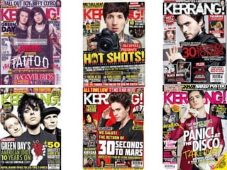
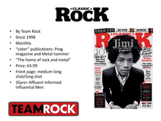
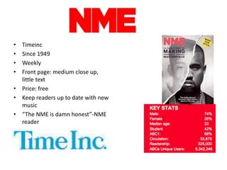
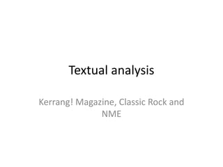
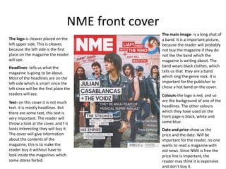
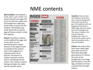
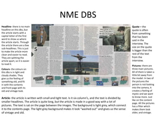
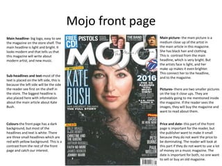
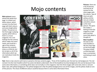
Initial Research
This is a presentation to show my
research on different magazines and
publishers.
Magazines in the UK
• Mojo Magazine
• Classic Rock
• NME
• We <3 pop
• Prog Magazine
• Metal Hammer
• Kerrang!
• Uncut
• Front cover: Medium close
up, often of a celebrity
• Weekly
• Bauer also publish Mojo
magazine and Kerrang!
• Founded 1981
• By Team Rock
• Since 1998
• Monthly
• “sister” publications: Prog
magazine and Metal hammer
• “The home of rock and metal”
• Price: £4.99
• Front page: medium long
shot/long shot
• 35yrs+ Affluent Informed
Influential Men
• Timeinc
• Since 1949
• Weekly
• Front page: medium close up,
little text
• Price: free
• Keep readers up to date with new
music
• “The NME is damn honest”-NME
reader
Textual analysis
Kerrang! Magazine, Classic Rock and
NME
Kerrang! Front cover
The main headline is in white
and makes the colourful
background not so dominated as
it would be. The white master
headline has some black pattern,
I think they used it to make it
more heavy and so the light
header would fit in with the
other colours which are dark.
The headline, which present
the band, catch the readers
attention of the band and
make them want to buy the
magazine and read the
article.
Colours – the main colours
are red, white, yellow and
black.
Text- the text on the front
page are in white or black,
but there are colourful
background behind the text.
The front page text is
important, because the
reader buys the magazine if
they see something
interesting on the front page.
Main image- the two men on
the front page is obviously
from Twenty One Pilots. They
are dressed in black, red and
white. This is to fit in on the
front page, with the other
colours. Their fan’s will buy
this magazine, when they see
them on the front cover.
Picture-including the main
image, there are some smaller
on the front cover. Probably to
give the buyer/reader a sneak
peak on what they can read
about in the magazine.
Price and date- the date mark
is important for the reader to
know that the magazine is up
to date, and that they can
read about the news that are
relevant to this time of year.
The price is also important for
the reader. They have to know
is they can afford it. This part
of the front page is very small,
because the publisher do not
want the price to be so
dominating.
Kerrang! Contents
The main headline- is in 3D
format, and stick out of the rest
of the page. It has some
cartoon-ish pattern around, to
make it look more interesting
and different.
Main picture- overs half of
the page, and a little more.
Is big part of the magazine,
because it shows us what
we can read about inside.
The contents page has a
connection with the front
page, they have still used
the same colours: red,
yellow, black and white.
Date- shows us that the
magazine is up to date.
Important for the reader,
because no one want to buy an
old magazine.Text- use headings with black
text, and yellow background.
When the reader opens the
magazine it is easy to just
look, and then know what the
magazine is about. It is
important for the reader to
know what it is about, if they
do not like the content it is no
reason to buy it.
Right under the main headline,
there is one part of text from
the editor. It makes the reader
feel like the magazine is made
for you.
Picture- they have used one big
image, and one smaller. They
have probably done this to give
the reader a little sneak peak,
but did not want to show too
much of the magazine in the
contents.
Kerrang! DBS
The first thing that
catch my eyes, are
the first headline.
They have
continued with the
yellow background,
and use capital
letters, this makes
the reader very
curious and makes
us want to read the
article.
Picture- they have
one big image,
and then three
smaller. By looking
at the pictures, it
makes the reader
feel like they have
been looking
inside the band’s
private life. It
makes the reader
feel special, and
that they have
been the only one
seeing this.
Main picture- taken
in a medium close up.
It is not a “photo-
shoot” picture, and
make the reader feel
they are in the
situation. Make the
reader feel that they
get to know them,
and see the inside
information.
Quote- something
the band said,
again, important
to give the reader
the feeling that
they are getting
the inside
information.
Text- the article text is placed between the pictures, it is placed in a good
way and it is not messy. This article seems interesting for the reader,
because it is a lot of pictures and not too mush text.
Colours- the article is surrounded by a yellow frame, continues the
pattern from the front page and make the magazine have a good flow.
NME front cover
The logo-is cleaver placed on the
left upper side. This is cleaver,
because the left side is the first
place on the magazine the reader
will see.
Headlines- tells us what the
magazine is going to be about.
Most of the headlines are on the
left side which is smart since the
left since will be the first place the
readers will see.
Text- on this cover it is not much
text. it is mostly headlines. But
there are some text, this text is
very important. The reader will
throw a look at the cover, and f it
looks interesting they will buy it.
The cover will give information
about the contents of the
magazine, this is to make the
reader buy it without have to
look inside the magazines which
some stores forbid.
The main image- is a long shot of
a band. It is a important picture,
because the reader will probably
not buy the magazine if they do
not like the band which the
magazine is writing about. The
band wears black clothes, which
tells us that they are a band
which sing the genre rock. It is
important for the publisher to
chose a hot band on the cover.
Colours-the logo is red, and so
are the background of one of the
headlines. The other colours
which they have used on the
front page is black, white and
some blue.
Date and price-show us the
price and the date. Will be
important for the reader, no one
wants to read a magazine with
old news. Since NME is free the
price line is important, the
reader may think it is expensive
and don’t buy it.
NME contents
Main headline- the headline is
small, and it is just “inside”. It is
cleaver placed in the upper left
corner to catch the readers eye.
The background is light grey,
which makes it easy to see the
headline. The headline says
inside which tells us that this
page will show us what is inside
the magazine.
Picture- the picture is placed
on the middle of the page, and
is very small. It is not
dominating which is good,
because on the page we want
to read about the contents.
Later in the magazine it is
important with a lot of
pictures. The picture is a
medium long shot, and the
artist is not looking into the
camera. This creates a mystical
feeling and makes the reader
want to read the article.
Headlines- there are four
sub-headlines. All of them
has a colourful background.
Either with red, black or
grey. The headlines with red
background link back to
NME’s logo, which has white
text and red background.
The reason, I believe, that
they put colourful
backgrounds is that it is
easier for the readers eye to
catch the headlines with a
colourful headline.
Colours- the colours they
have used is black, light
grey, white and red. It
think they chose light
grey, because it is almost
the same as the
background in the image.
Red and white is from the
logo, and black is to have
a contrast from the light
colours.
NME DBS
Quote – the
quote is often
from something
that has been
said in the
interview. The
size on the quote
is bigger than the
rest of the text
from the
interview.
Pictures- there are
three main pictures.
All of them is taken a
little bit away from
the model. In two of
the pictures the
person is not looking
into the camera, it
creates a feeling of
mystic and we want
to know more. Just
like on the content
page. All the pictures
has a filter which
makes them look
older, and vintage.
Headline- there is no main
headline on this dbs, but
the article starts with a
capital letter of the first
word to show us where
the article starts. Through
the article there are a few
sub-headlines. This is just
to make the article more
clean and easier to read.
They are splitting the
article apart, so it is easier
to read it.
Article- the article is written with small and tight text. Is it six column’s, and the text is divided by
smaller headlines. The article is quite long, but the article is made in a good way with a lot of
pictures. The text is sat on the page between the images. The background is light grey, which connect
it to the contents page. The light grey background makes it look “washed out” and gives us the sense
of vintage and old.
Colours- the colours on
this dbs is in light and
cloudy shades. They
give us the feeling of
something old, and fit
in with the contents
and front page with its
old and vintage look.
Mojo front page
Main headline- big logo, easy to see
the magazine on the store shelf. The
main headline is light and bright. It
looks modern and that tells us that
this magazine will write about
modern artist, and new music.
Main picture- the main picture is a
medium close up of the artist in
the main article in this magazine.
She has black hair and clothing.
This is contrast from the main
headline, which is very bright. But
the artists face is light, and her
make up makes it even brighter.
This connect her to the headline,
and to the magazine.
Pictures- there are two smaller pictures
on the top it close ups. They are
probably going to me mentioned inside
the magazine. If the reader sees the
images, they will buy the magazine and
want to read about them.
Price and date- this part of the front
page is important for the reader, but
the publisher want to make it small
because they do not want the price to
be dominating. The reader will look at
this part if they do not want to use a lot
of money on a music magazine. The
date is important for both, no one want
to sell or buy an old magazine.
Sub-headlines and text-most of the
text is placed on the left side, this is
because the left side will be the side
the reader see first on the shelf in
the store. The biggest headline is
also placed here with information
about the main article about Kate
Bush.
Colours-the front page has a dark
background, but most of the
headlines and text is white. There
are three small headlines which are
red with yellow background. This is a
contrast from the rest of the front
page and catch our interest.
Mojo contents
Main picture-covers
almost the whole first
page. Is in black and
white colours, which
connect it to the front
page with dark colours,
and some bright white
shades. The person on
the front page is playing
a guitar, which tells us
that it is a music
magazine. He is not
looking into the camera,
which makes him seem
mystic and could be a
sign of the contents.
Because the contents
show us a little bit, but
do not give us all of the
information which we
can read about inside the
magazine.
Text- there is two columns with text on spread on the two contents pages. Three of the headlines over the text has red background. The red
connect it to the main headline which has some red details underneath. One of the headlines has blue background, this can be because it has
some extra information, or something which does not normally is in the magazine. Over the three images with some text, there is red and
black text, with yellow background. The yellow background is like the yellow background on one of the images, and the yellow shade on one
of the pictures. The chose of different colours could be because there is some extra information there.
Main headline-
the text on the
main headline is
like the mojo logo
on the front page.
This gives shows
us that they both
have a connection
and belong to each
other.
Pictures- there are
a lot of pictures,
and they do all
connect to the
other pages with
the colours. Two of
them are with
yellow, and the
rest are in black
and white colours
as the main
picture. This gives
the reader a
feeling of that the
magazine is well
done and that
every little detail is
thought of.
Mojo DBS
Headlines-there
are no specific
headlines, but
there are a big
capital letter on
the first sentence
in the different
columns.
Quote- there is
one quote on the
middle of the first
page. The text is
red, which
connects it to the
contents pages.
The quote makes
the reader feel like
they know the
artist, because
they get to know
exactly that the
person said in the
interview.
Text- there is a lot of text in this DBS. It is sorted out in columns, and there are no headlines but just a big capital letter in
the first sentence. Around the compact text there are quotes, pictures and an extra column with some extra information
which makes the article more interesting.
Pictures-it is a lot
of pictures. Most
of them in colours,
but one in
black/white
colours. There are
two main pictures,
but the other are
connected in the
article text. I think
they connected it
in the article,
because it is a lot
of text and do not
want it to look
boring.
Colours-it is a few
different colours,
but the main
colours is red.
Probably to show
that it is connected
to the contents
page.

Initial research!

  • 1.
    Initial Research This isa presentation to show my research on different magazines and publishers.
  • 2.
    Magazines in theUK • Mojo Magazine • Classic Rock • NME • We <3 pop • Prog Magazine • Metal Hammer • Kerrang! • Uncut
  • 3.
    • Front cover:Medium close up, often of a celebrity • Weekly • Bauer also publish Mojo magazine and Kerrang! • Founded 1981
  • 5.
    • By TeamRock • Since 1998 • Monthly • “sister” publications: Prog magazine and Metal hammer • “The home of rock and metal” • Price: £4.99 • Front page: medium long shot/long shot • 35yrs+ Affluent Informed Influential Men
  • 7.
    • Timeinc • Since1949 • Weekly • Front page: medium close up, little text • Price: free • Keep readers up to date with new music • “The NME is damn honest”-NME reader
  • 9.
  • 10.
    Kerrang! Front cover Themain headline is in white and makes the colourful background not so dominated as it would be. The white master headline has some black pattern, I think they used it to make it more heavy and so the light header would fit in with the other colours which are dark. The headline, which present the band, catch the readers attention of the band and make them want to buy the magazine and read the article. Colours – the main colours are red, white, yellow and black. Text- the text on the front page are in white or black, but there are colourful background behind the text. The front page text is important, because the reader buys the magazine if they see something interesting on the front page. Main image- the two men on the front page is obviously from Twenty One Pilots. They are dressed in black, red and white. This is to fit in on the front page, with the other colours. Their fan’s will buy this magazine, when they see them on the front cover. Picture-including the main image, there are some smaller on the front cover. Probably to give the buyer/reader a sneak peak on what they can read about in the magazine. Price and date- the date mark is important for the reader to know that the magazine is up to date, and that they can read about the news that are relevant to this time of year. The price is also important for the reader. They have to know is they can afford it. This part of the front page is very small, because the publisher do not want the price to be so dominating.
  • 11.
    Kerrang! Contents The mainheadline- is in 3D format, and stick out of the rest of the page. It has some cartoon-ish pattern around, to make it look more interesting and different. Main picture- overs half of the page, and a little more. Is big part of the magazine, because it shows us what we can read about inside. The contents page has a connection with the front page, they have still used the same colours: red, yellow, black and white. Date- shows us that the magazine is up to date. Important for the reader, because no one want to buy an old magazine.Text- use headings with black text, and yellow background. When the reader opens the magazine it is easy to just look, and then know what the magazine is about. It is important for the reader to know what it is about, if they do not like the content it is no reason to buy it. Right under the main headline, there is one part of text from the editor. It makes the reader feel like the magazine is made for you. Picture- they have used one big image, and one smaller. They have probably done this to give the reader a little sneak peak, but did not want to show too much of the magazine in the contents.
  • 12.
    Kerrang! DBS The firstthing that catch my eyes, are the first headline. They have continued with the yellow background, and use capital letters, this makes the reader very curious and makes us want to read the article. Picture- they have one big image, and then three smaller. By looking at the pictures, it makes the reader feel like they have been looking inside the band’s private life. It makes the reader feel special, and that they have been the only one seeing this. Main picture- taken in a medium close up. It is not a “photo- shoot” picture, and make the reader feel they are in the situation. Make the reader feel that they get to know them, and see the inside information. Quote- something the band said, again, important to give the reader the feeling that they are getting the inside information. Text- the article text is placed between the pictures, it is placed in a good way and it is not messy. This article seems interesting for the reader, because it is a lot of pictures and not too mush text. Colours- the article is surrounded by a yellow frame, continues the pattern from the front page and make the magazine have a good flow.
  • 13.
    NME front cover Thelogo-is cleaver placed on the left upper side. This is cleaver, because the left side is the first place on the magazine the reader will see. Headlines- tells us what the magazine is going to be about. Most of the headlines are on the left side which is smart since the left since will be the first place the readers will see. Text- on this cover it is not much text. it is mostly headlines. But there are some text, this text is very important. The reader will throw a look at the cover, and f it looks interesting they will buy it. The cover will give information about the contents of the magazine, this is to make the reader buy it without have to look inside the magazines which some stores forbid. The main image- is a long shot of a band. It is a important picture, because the reader will probably not buy the magazine if they do not like the band which the magazine is writing about. The band wears black clothes, which tells us that they are a band which sing the genre rock. It is important for the publisher to chose a hot band on the cover. Colours-the logo is red, and so are the background of one of the headlines. The other colours which they have used on the front page is black, white and some blue. Date and price-show us the price and the date. Will be important for the reader, no one wants to read a magazine with old news. Since NME is free the price line is important, the reader may think it is expensive and don’t buy it.
  • 14.
    NME contents Main headline-the headline is small, and it is just “inside”. It is cleaver placed in the upper left corner to catch the readers eye. The background is light grey, which makes it easy to see the headline. The headline says inside which tells us that this page will show us what is inside the magazine. Picture- the picture is placed on the middle of the page, and is very small. It is not dominating which is good, because on the page we want to read about the contents. Later in the magazine it is important with a lot of pictures. The picture is a medium long shot, and the artist is not looking into the camera. This creates a mystical feeling and makes the reader want to read the article. Headlines- there are four sub-headlines. All of them has a colourful background. Either with red, black or grey. The headlines with red background link back to NME’s logo, which has white text and red background. The reason, I believe, that they put colourful backgrounds is that it is easier for the readers eye to catch the headlines with a colourful headline. Colours- the colours they have used is black, light grey, white and red. It think they chose light grey, because it is almost the same as the background in the image. Red and white is from the logo, and black is to have a contrast from the light colours.
  • 15.
    NME DBS Quote –the quote is often from something that has been said in the interview. The size on the quote is bigger than the rest of the text from the interview. Pictures- there are three main pictures. All of them is taken a little bit away from the model. In two of the pictures the person is not looking into the camera, it creates a feeling of mystic and we want to know more. Just like on the content page. All the pictures has a filter which makes them look older, and vintage. Headline- there is no main headline on this dbs, but the article starts with a capital letter of the first word to show us where the article starts. Through the article there are a few sub-headlines. This is just to make the article more clean and easier to read. They are splitting the article apart, so it is easier to read it. Article- the article is written with small and tight text. Is it six column’s, and the text is divided by smaller headlines. The article is quite long, but the article is made in a good way with a lot of pictures. The text is sat on the page between the images. The background is light grey, which connect it to the contents page. The light grey background makes it look “washed out” and gives us the sense of vintage and old. Colours- the colours on this dbs is in light and cloudy shades. They give us the feeling of something old, and fit in with the contents and front page with its old and vintage look.
  • 16.
    Mojo front page Mainheadline- big logo, easy to see the magazine on the store shelf. The main headline is light and bright. It looks modern and that tells us that this magazine will write about modern artist, and new music. Main picture- the main picture is a medium close up of the artist in the main article in this magazine. She has black hair and clothing. This is contrast from the main headline, which is very bright. But the artists face is light, and her make up makes it even brighter. This connect her to the headline, and to the magazine. Pictures- there are two smaller pictures on the top it close ups. They are probably going to me mentioned inside the magazine. If the reader sees the images, they will buy the magazine and want to read about them. Price and date- this part of the front page is important for the reader, but the publisher want to make it small because they do not want the price to be dominating. The reader will look at this part if they do not want to use a lot of money on a music magazine. The date is important for both, no one want to sell or buy an old magazine. Sub-headlines and text-most of the text is placed on the left side, this is because the left side will be the side the reader see first on the shelf in the store. The biggest headline is also placed here with information about the main article about Kate Bush. Colours-the front page has a dark background, but most of the headlines and text is white. There are three small headlines which are red with yellow background. This is a contrast from the rest of the front page and catch our interest.
  • 17.
    Mojo contents Main picture-covers almostthe whole first page. Is in black and white colours, which connect it to the front page with dark colours, and some bright white shades. The person on the front page is playing a guitar, which tells us that it is a music magazine. He is not looking into the camera, which makes him seem mystic and could be a sign of the contents. Because the contents show us a little bit, but do not give us all of the information which we can read about inside the magazine. Text- there is two columns with text on spread on the two contents pages. Three of the headlines over the text has red background. The red connect it to the main headline which has some red details underneath. One of the headlines has blue background, this can be because it has some extra information, or something which does not normally is in the magazine. Over the three images with some text, there is red and black text, with yellow background. The yellow background is like the yellow background on one of the images, and the yellow shade on one of the pictures. The chose of different colours could be because there is some extra information there. Main headline- the text on the main headline is like the mojo logo on the front page. This gives shows us that they both have a connection and belong to each other. Pictures- there are a lot of pictures, and they do all connect to the other pages with the colours. Two of them are with yellow, and the rest are in black and white colours as the main picture. This gives the reader a feeling of that the magazine is well done and that every little detail is thought of.
  • 18.
    Mojo DBS Headlines-there are nospecific headlines, but there are a big capital letter on the first sentence in the different columns. Quote- there is one quote on the middle of the first page. The text is red, which connects it to the contents pages. The quote makes the reader feel like they know the artist, because they get to know exactly that the person said in the interview. Text- there is a lot of text in this DBS. It is sorted out in columns, and there are no headlines but just a big capital letter in the first sentence. Around the compact text there are quotes, pictures and an extra column with some extra information which makes the article more interesting. Pictures-it is a lot of pictures. Most of them in colours, but one in black/white colours. There are two main pictures, but the other are connected in the article text. I think they connected it in the article, because it is a lot of text and do not want it to look boring. Colours-it is a few different colours, but the main colours is red. Probably to show that it is connected to the contents page.