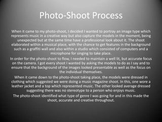
Justification Of Image Choices
Katrina Morton
Photo-Shoot Process
When it came to my photo-shoot, I decided I wanted to portray an image type which
represents music in a creative way but also capture the models in the moment, being
unexpected but at the same time have a professional look about it. The shoot
elaborated within a musical place, with the chance to get features in the background
such as a graffiti wall and also within a studio which consisted of computers and a
microphone for singing to take place.
In order for the photo-shoot to flow, I needed to maintain a well lit, but accurate focus
on the camera. I got every shoot I wanted by asking the models to do as I say and to
ensure that the background of the images looked presentable as well as the focus on
the individual themselves.
When it came down to the photo-shoot taking place, the models were dressed in
clothing which suggested we were doing a music magazine shoot. In this, one wore a
leather jacket and a top which represented music. The other looked average dressed
suggesting there was no stereotype to a person who enjoys music.
The photo-shoot identified what type of genre I was going for and in this made the
shoot, accurate and creative throughout.
Image 1
With this image, It’s a mid-shot in which we can
see the model in detail with all facial features
but also goes from waist up, also having the
capability to see what she is wearing at the
same time. I decided to shoot this image as it
represents the model as the key feature
potentially implying the magazine is going to
feature her as the main story. Not only that but I
always got the graffiti background in as its
something different suggesting that graffiti isn’t
all mess but expresses art and feelings as to why
I used this image as my main front cover
picture, attracting the audiences eye as its
bright and straight to the point.
Image 2
With this image, it is a high angle shot, it lows down
towards the feature within the shot. I choose to do
this image as it reflects the technology involved
representing all music equipment involved. The
shot is taken from a higher angle as the model is
sitting down and can portray all the work she is
actually doing. The keyboard and speakers
represent the music element which is what is the
feature within my music magazine. I used this image
within my front cover, it is conveyed as quite small
but is visible and can be acknowledged from the
reader. The main feature in this shot is the musical
equipment and that’s the highlighting reason as to
why I decided to use this image.
Image 3
With this image, it is portrayed as a mid shot,
featuring from the waist upwards but can still
see in detail, the features on the models face.
I used this shot on the content page and was
the only image used, I wanted to highlight the
importance of this shot as it reflects the area
which is going to be the main story on the
double page spread. With the recording
microphone shown in detail, it can easily be
identified as linking to music and how this will
appear throughout the magazine. I got the
model to look as if she was recording a song,
being very serious but positive at the same
time so when the readers came across it, they
can enjoy reading and looking at the image.
Image 4
This is a high angle shot, in which looks down
upon the models giving the camera the chance
to get all features involved. In this image, I blew
it up so it took up one whole side of my double
page spread to show the importance and
portrays how it relates to the interview
involving both models. I decided to shoot this
image so that we can see all the musical
equipment needed to make it stand out as a
musical magazine. Also to show the idea of hard
work often reflected in a studio, it was a shot I
decided would be the key one as we can see
two models and also the use of the musical
technology. I also wanted to get the walls of the
studio within the shot as it shows sound proof
walls which imitates hard work and dedication.
Image 5
With this low angle shot, it is one of the
images I choose not to use. For this
reason as the angle wasn’t right, it
looked too played upon and when
shooting the picture, the models were
looking too far up. In this, the models
look too staged out as if they were
placed there and told directly what to
do, where as my magazine is suppose to
look casual as if the models are getting
on with their day to day life instead of
being staged out. Although the feature
wall was very high detail with the graffiti
and old fashion car, the shot just didn’t
look right and in this was the reasoning
why I choose not to feature this image
within my magazine.
Image 6
With this image, I choose not to use in
within my magazine, with it being a long
shot with a slight high angle aspect about
it. Once again it looked to staged, the
models look to positioned and didn’t
really fit in with the specific criteria I was
essential looking for when I first started
shooting. It doesn’t look realistic as one
of the models isn't actually working on
the computer but to the side of it. If I got
it from a different angle it would of
worked more effectively but because it
doesn’t look like a real working shoot, I
choose not to use it.

Justification of image choices

  • 1.
    Justification Of ImageChoices Katrina Morton
  • 2.
    Photo-Shoot Process When itcame to my photo-shoot, I decided I wanted to portray an image type which represents music in a creative way but also capture the models in the moment, being unexpected but at the same time have a professional look about it. The shoot elaborated within a musical place, with the chance to get features in the background such as a graffiti wall and also within a studio which consisted of computers and a microphone for singing to take place. In order for the photo-shoot to flow, I needed to maintain a well lit, but accurate focus on the camera. I got every shoot I wanted by asking the models to do as I say and to ensure that the background of the images looked presentable as well as the focus on the individual themselves. When it came down to the photo-shoot taking place, the models were dressed in clothing which suggested we were doing a music magazine shoot. In this, one wore a leather jacket and a top which represented music. The other looked average dressed suggesting there was no stereotype to a person who enjoys music. The photo-shoot identified what type of genre I was going for and in this made the shoot, accurate and creative throughout.
  • 3.
    Image 1 With thisimage, It’s a mid-shot in which we can see the model in detail with all facial features but also goes from waist up, also having the capability to see what she is wearing at the same time. I decided to shoot this image as it represents the model as the key feature potentially implying the magazine is going to feature her as the main story. Not only that but I always got the graffiti background in as its something different suggesting that graffiti isn’t all mess but expresses art and feelings as to why I used this image as my main front cover picture, attracting the audiences eye as its bright and straight to the point.
  • 4.
    Image 2 With thisimage, it is a high angle shot, it lows down towards the feature within the shot. I choose to do this image as it reflects the technology involved representing all music equipment involved. The shot is taken from a higher angle as the model is sitting down and can portray all the work she is actually doing. The keyboard and speakers represent the music element which is what is the feature within my music magazine. I used this image within my front cover, it is conveyed as quite small but is visible and can be acknowledged from the reader. The main feature in this shot is the musical equipment and that’s the highlighting reason as to why I decided to use this image.
  • 5.
    Image 3 With thisimage, it is portrayed as a mid shot, featuring from the waist upwards but can still see in detail, the features on the models face. I used this shot on the content page and was the only image used, I wanted to highlight the importance of this shot as it reflects the area which is going to be the main story on the double page spread. With the recording microphone shown in detail, it can easily be identified as linking to music and how this will appear throughout the magazine. I got the model to look as if she was recording a song, being very serious but positive at the same time so when the readers came across it, they can enjoy reading and looking at the image.
  • 6.
    Image 4 This isa high angle shot, in which looks down upon the models giving the camera the chance to get all features involved. In this image, I blew it up so it took up one whole side of my double page spread to show the importance and portrays how it relates to the interview involving both models. I decided to shoot this image so that we can see all the musical equipment needed to make it stand out as a musical magazine. Also to show the idea of hard work often reflected in a studio, it was a shot I decided would be the key one as we can see two models and also the use of the musical technology. I also wanted to get the walls of the studio within the shot as it shows sound proof walls which imitates hard work and dedication.
  • 7.
    Image 5 With thislow angle shot, it is one of the images I choose not to use. For this reason as the angle wasn’t right, it looked too played upon and when shooting the picture, the models were looking too far up. In this, the models look too staged out as if they were placed there and told directly what to do, where as my magazine is suppose to look casual as if the models are getting on with their day to day life instead of being staged out. Although the feature wall was very high detail with the graffiti and old fashion car, the shot just didn’t look right and in this was the reasoning why I choose not to feature this image within my magazine.
  • 8.
    Image 6 With thisimage, I choose not to use in within my magazine, with it being a long shot with a slight high angle aspect about it. Once again it looked to staged, the models look to positioned and didn’t really fit in with the specific criteria I was essential looking for when I first started shooting. It doesn’t look realistic as one of the models isn't actually working on the computer but to the side of it. If I got it from a different angle it would of worked more effectively but because it doesn’t look like a real working shoot, I choose not to use it.