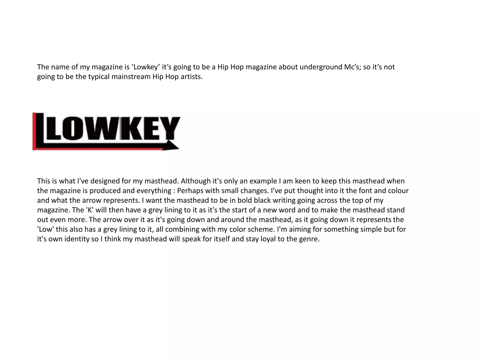
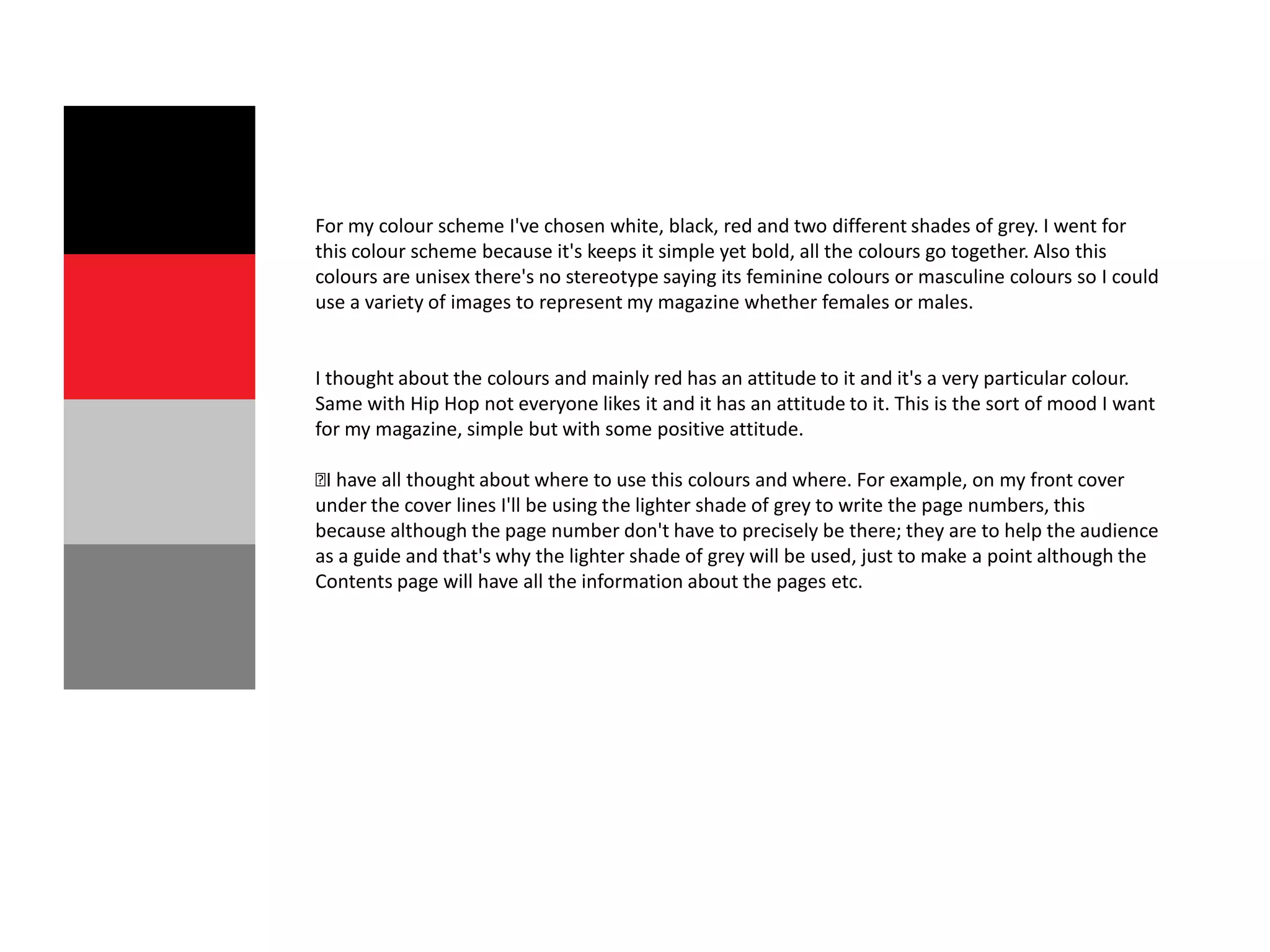
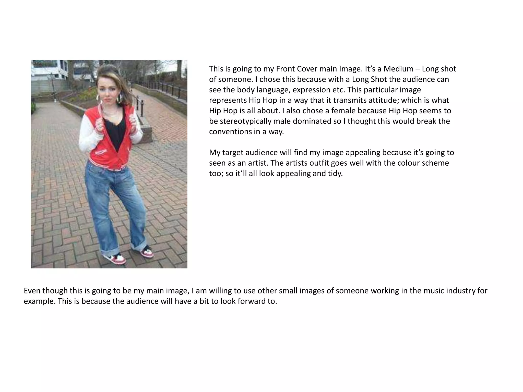
The name of my magazine is ‘Lowkey’ it’s going to be a Hip Hop magazine about underground Mc’s; so it’s not
going to be the typical mainstream Hip Hop artists.


This is what I've designed for my masthead. Although it's only an example I am keen to keep this masthead when
the magazine is produced and everything : Perhaps with small changes. I've put thought into it the font and colour
and what the arrow represents. I want the masthead to be in bold black writing going across the top of my
magazine. The 'K' will then have a grey lining to it as it's the start of a new word and to make the masthead stand
out even more. The arrow over it as it's going down and around the masthead, as it going down it represents the
'Low' this also has a grey lining to it, all combining with my color scheme. I'm aiming for something simple but for
it's own identity so I think my masthead will speak for itself and stay loyal to the genre.
For my colour scheme I've chosen white, black, red and two different shades of grey. I went for
this colour scheme because it's keeps it simple yet bold, all the colours go together. Also this
colours are unisex there's no stereotype saying its feminine colours or masculine colours so I could
use a variety of images to represent my magazine whether females or males.


I thought about the colours and mainly red has an attitude to it and it's a very particular colour.
Same with Hip Hop not everyone likes it and it has an attitude to it. This is the sort of mood I want
for my magazine, simple but with some positive attitude.

have all thought about where to use this colours and where. For example, on my front cover
 I
under the cover lines I'll be using the lighter shade of grey to write the page numbers, this
because although the page number don't have to precisely be there; they are to help the audience
as a guide and that's why the lighter shade of grey will be used, just to make a point although the
Contents page will have all the information about the pages etc.
This is going to my Front Cover main Image. It’s a Medium – Long shot
                                                   of someone. I chose this because with a Long Shot the audience can
                                                   see the body language, expression etc. This particular image
                                                   represents Hip Hop in a way that it transmits attitude; which is what
                                                   Hip Hop is all about. I also chose a female because Hip Hop seems to
                                                   be stereotypically male dominated so I thought this would break the
                                                   conventions in a way.

                                                   My target audience will find my image appealing because it’s going to
                                                   seen as an artist. The artists outfit goes well with the colour scheme
                                                   too; so it’ll all look appealing and tidy.


Even though this is going to be my main image, I am willing to use other small images of someone working in the music industry for
example. This is because the audience will have a bit to look forward to.
Statement of intent

Statement of intent

  • 2.
    The name ofmy magazine is ‘Lowkey’ it’s going to be a Hip Hop magazine about underground Mc’s; so it’s not going to be the typical mainstream Hip Hop artists. This is what I've designed for my masthead. Although it's only an example I am keen to keep this masthead when the magazine is produced and everything : Perhaps with small changes. I've put thought into it the font and colour and what the arrow represents. I want the masthead to be in bold black writing going across the top of my magazine. The 'K' will then have a grey lining to it as it's the start of a new word and to make the masthead stand out even more. The arrow over it as it's going down and around the masthead, as it going down it represents the 'Low' this also has a grey lining to it, all combining with my color scheme. I'm aiming for something simple but for it's own identity so I think my masthead will speak for itself and stay loyal to the genre.
  • 3.
    For my colourscheme I've chosen white, black, red and two different shades of grey. I went for this colour scheme because it's keeps it simple yet bold, all the colours go together. Also this colours are unisex there's no stereotype saying its feminine colours or masculine colours so I could use a variety of images to represent my magazine whether females or males. I thought about the colours and mainly red has an attitude to it and it's a very particular colour. Same with Hip Hop not everyone likes it and it has an attitude to it. This is the sort of mood I want for my magazine, simple but with some positive attitude. have all thought about where to use this colours and where. For example, on my front cover I under the cover lines I'll be using the lighter shade of grey to write the page numbers, this because although the page number don't have to precisely be there; they are to help the audience as a guide and that's why the lighter shade of grey will be used, just to make a point although the Contents page will have all the information about the pages etc.
  • 4.
    This is goingto my Front Cover main Image. It’s a Medium – Long shot of someone. I chose this because with a Long Shot the audience can see the body language, expression etc. This particular image represents Hip Hop in a way that it transmits attitude; which is what Hip Hop is all about. I also chose a female because Hip Hop seems to be stereotypically male dominated so I thought this would break the conventions in a way. My target audience will find my image appealing because it’s going to seen as an artist. The artists outfit goes well with the colour scheme too; so it’ll all look appealing and tidy. Even though this is going to be my main image, I am willing to use other small images of someone working in the music industry for example. This is because the audience will have a bit to look forward to.