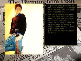
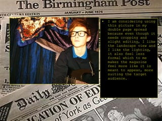
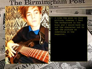
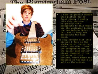
Pictures for my music magazine
This picture was taken outside. I am not going to use this picture even though I really like its scenic sky because I feel it doesn’t focus enough on the main feature which the magazine is based on. I like the setting of this picture and I also like the lining of the picture, the footprints leading to the focus and the tracks also.
This picture I am  thinking about using, inside the magazine for my double spread, because it is more of a focus on the main artist the lighting I like, and as mentioned before the lining and scenic background I feel gives it more of an urban feel.
I like this picture because it shows real individuality and I like the bright lighting which is highlighting part of the main focus. A few objectives I would say to this picture would be the shadowing. And the fact half of the main character in the picture is cropped off.
I prefer this picture to the one before, it brings more colour. The colours fit together well. The only objection again is the fact half of his knee is off the picture. Making it difficult to involve it into a double spread page or even a front cover which I will experiment with 2 pictures to decide which is best.
I am considering using this picture in my double page spread because even though it needs cropping and slight editing, I like the landscape view and I like the lighting, it also feel less formal which to me makes the magazine feel more like it is meant to appear, more suiting the target audience.
I like the pose in this picture, however I feel the background is too busy and I would have to cut the character out to use the picture as something in the magazine.
I have originally choose this picture for my front cover, I really like this picture. I originally had a background to this which was the wallpaper behind the one before. Which I felt was to busy and defocusing the main event. The only problem with this picture I feel is the shadowing on the guitar. Other than that I love the prospective making the guitar seem majorly bigger compared to the character in this picture, which bases the magazine on the music as well as the artist.

Pictures For Magazine

  • 1.
    Pictures for mymusic magazine
  • 2.
    This picture wastaken outside. I am not going to use this picture even though I really like its scenic sky because I feel it doesn’t focus enough on the main feature which the magazine is based on. I like the setting of this picture and I also like the lining of the picture, the footprints leading to the focus and the tracks also.
  • 3.
    This picture Iam thinking about using, inside the magazine for my double spread, because it is more of a focus on the main artist the lighting I like, and as mentioned before the lining and scenic background I feel gives it more of an urban feel.
  • 4.
    I like thispicture because it shows real individuality and I like the bright lighting which is highlighting part of the main focus. A few objectives I would say to this picture would be the shadowing. And the fact half of the main character in the picture is cropped off.
  • 5.
    I prefer thispicture to the one before, it brings more colour. The colours fit together well. The only objection again is the fact half of his knee is off the picture. Making it difficult to involve it into a double spread page or even a front cover which I will experiment with 2 pictures to decide which is best.
  • 6.
    I am consideringusing this picture in my double page spread because even though it needs cropping and slight editing, I like the landscape view and I like the lighting, it also feel less formal which to me makes the magazine feel more like it is meant to appear, more suiting the target audience.
  • 7.
    I like thepose in this picture, however I feel the background is too busy and I would have to cut the character out to use the picture as something in the magazine.
  • 8.
    I have originallychoose this picture for my front cover, I really like this picture. I originally had a background to this which was the wallpaper behind the one before. Which I felt was to busy and defocusing the main event. The only problem with this picture I feel is the shadowing on the guitar. Other than that I love the prospective making the guitar seem majorly bigger compared to the character in this picture, which bases the magazine on the music as well as the artist.