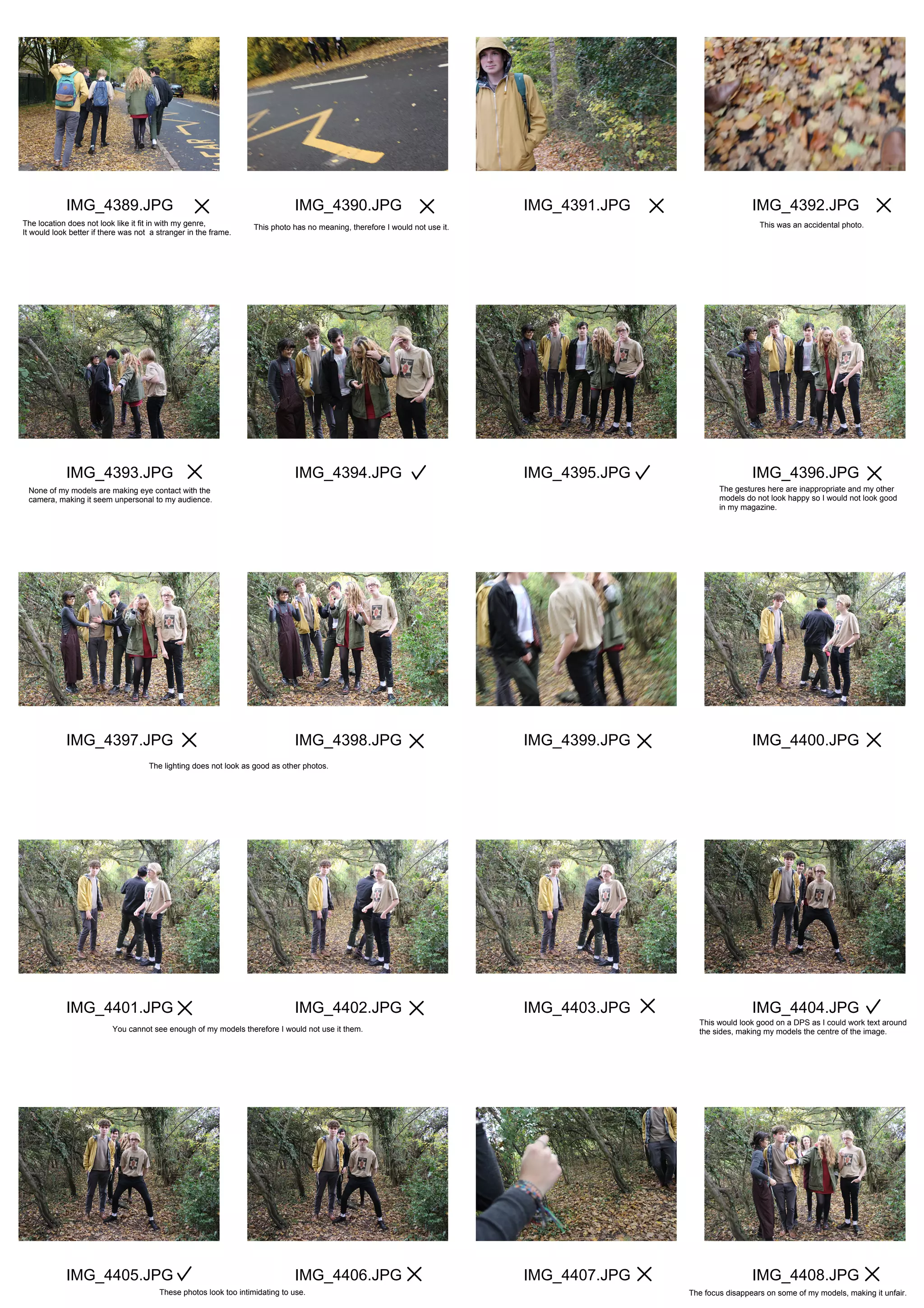
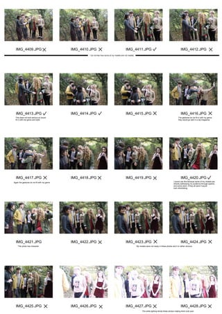
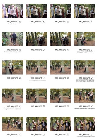
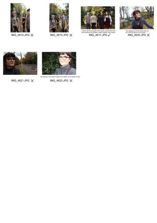
This document contains reviews and critiques from a photographer of various photos taken of a band. The photographer considers factors like lighting, composition, gestures, visibility of models, appropriateness for their genre/magazine style, and overall quality. Some photos are deemed unsuitable due to issues like blurriness, poor lighting, unnatural poses, backgrounds not fitting the genre, or not clearly showing the models. Other photos are marked as potential candidates due to natural lighting, eye contact with the camera, fitting costumes/mise-en-scene, layered compositions, and capturing a sense of fun or story. The photographer aims to select photos that portray the band in a relaxed, inviting manner fitting an indie magazine theme.
This document contains reviews and critiques of photographs being considered for use in a magazine. It discusses the composition, lighting, focus, and subject matter of various photos, assessing their suitability for uses like front covers, double page spreads, and smaller interior images. Critiques address technical photo quality issues as well as whether the visual style and subjects align with the intended genre, color scheme, and overall vision for the magazine. Photos are evaluated based on factors like whether the main subject is clearly visible and engaged with the viewer, if backgrounds or props fit the theme, and how the photos might help tell stories or capture reader interest.
This document discusses photos taken of models for an R&B/hip hop magazine spread. The author positions one model for a double page spread but decides his pose lacks masculinity. They feel the first photo of the model sitting down best presents appealing masculinity through his jawline and posture. Later photos are rejected for not representing R&B/hip hop style due to one model's fur hood and top. Another selected photo is felt to work well for the double page spread by implying something being uncovered. Most photos of some models are rejected for clothing choices not stereotypically presenting R&B genre. One group of photos is deemed suitable for a contents page due to the edgy contrasting stances of two models.
This document discusses several potential photos for the cover of a magazine. It analyzes each photo and provides critiques on the composition, angles, poses of the model, and whether they effectively portray the desired image of a "sex symbol" or "cheeky chappy" personality. While some shots have good eye contact or positioning of the model, none are quite right for the cover due to flaws like unattractive angles, poses that seem too intimidating or don't suit the genre, or backgrounds that are not professional looking.
This document discusses potential images to use for a contents page. It reviews multiple images files of people in various poses and outfits. Specific images of "Princess" and "Bolu" are called out as possible choices for the contents page due to the subjects' postures and expressions. Other images are rejected due to issues like blurred faces, off-center compositions, unwanted objects like coats, or poses and facial expressions that are not preferred. The document concludes by noting one image of "Stephen" crouching at an awkward angle is unsuitable, while another image of a posing group could work for the contents page.
The document discusses photo options for a magazine cover and evaluates each based on contrast, lighting, shadows and how well they fit the theme of the issue. The author explains that one photo stands out due to high contrast colors and bright lighting that eliminates shadows. However, it has a shadow under the man's arm and behind his head that would need to be edited out. The man's posture conveys importance which matches the cover theme. In the end, the author determines this photo could work if the shadows were removed through photo editing.
The author is choosing between three pictures for the front cover of their magazine. Picture 1 shows a model with a slight smile that looks strong yet feminine without being provocative. The only concern is if the cover lines will fit. Picture 2 also shows a strong feminine model but her straight face could come across as intimidating. Picture 3 shows a pensive focused model not looking at the camera directly, which could give a negative impression, and is also not in color.
The pictures that I might choose for my front coverElizaakua
The author considers three pictures for the front cover of their magazine. Picture 1 shows a model with a slight smile who looks strong yet feminine without being provocative. The only concern is if the cover lines will fit around the photo. Picture 2 also shows a strong feminine model but her straight face may seem intimidating. Picture 3 shows a pensive focused model not looking at the camera directly, which could give a negative impression, and it is not in color.
The document discusses and analyzes five potential photographs for a fashion spread with a grunge theme. For the first photo, the main focus is the model's tartan shirt which fits the grunge idea, and there is a narrow depth of field focused on the model. For the second photo, the clothing is the eye-catching aspect and focus, though the lighting is too dark. The third photo has a sense of action as the model walks toward the camera, but the background is in focus rather than the model. Issues with the fourth photo include the lighting being too dark and lack of direct address by the model. The fifth photo also has a sense of action but the lighting is too dark on the right side
The document appears to be notes from selecting and reviewing photographs for use in a magazine project. It describes various photographs of models and settings that were considered but ultimately not used. Reasons for not using the images included the subjects not looking at the camera, backgrounds not suiting the magazine style, and lack of clear facial features. Some images inspired mock-ups for the front cover or spreads but were not felt to match the final direction. Image 4236, 4237, 4238 provided inspiration for a contents page design.
These photos were selected for use in an indie music magazine. A photo of the artist smirking was chosen for the cover as it makes the photo more appealing. Interior photos show the model looking confident and mysterious to attract readers to learn more. A photo of the artist doing his hair in a mirror was selected as it seems casual and intriguing. A photo of an unlabeled album was chosen to pique interest in an undisclosed artist. An intimate photo of the model in a one-on-one meeting was selected for the double-page spread to give the interview a personal and authentic feel.
The document describes a selection of images for inclusion in a magazine. It discusses each set of 20 images, with the creator explaining why they chose or did not choose specific photos. For most images, the creator felt the subjects looked unhappy or the photos were unfocused mug shots. The creator selected some images that depicted the subjects looking friendly or professionally portraying hip hop artists. Overall, the creator wanted a variety of clear photos that fit the magazine's genre and allowed inclusion of different people within the space constraints.
This document outlines photography plans for a rock music magazine cover and inside pages. It describes using a female friend with a black t-shirt and aggressive facial expression for the cover. For inside pages it discusses a male friend photographed in a studio looking directly at the camera to convey attitude. It also mentions including a small poster image, a headshot of the female editor with a slight smile, and a double page spread of a female band member posed in a "rocky" style inspired by Paramore.
This photographer summarized their attempts at a photo shoot for the front cover of their indie magazine. In the first shoot, they did not find an image that had the right lighting, facial expression, or background. In the second shoot, most images were too far away, had awkward poses or gestures, or dull backgrounds and outfits that did not match the magazine's style. Ultimately, they chose one image that conveyed the right indie attitude through facial expression and hand gestures, and they were able to edit it to improve the lighting and background.
The document contains descriptions and evaluations of multiple photos taken for a student magazine project. Most of the photos were practice shots used to test lighting, locations, poses, and angles, and will not be used in the final magazine. However, a few photos are identified as suitable for uses such as front covers, double page spreads, or graphic features due to qualities like the model's pose, the inclusion of a costume, and backgrounds that allow for text overlays.
This document discusses several photographs being considered for a fashion magazine spread with the theme of summer. The first photo is not appropriate as the clothes are not the main focus. The second photo is an action shot but when enlarged, the model is out of focus. The third photo is the right distance and in focus but was taken in portrait orientation instead of landscape. The fourth photo does not represent summer as it is too dark. The fifth and chosen photo clearly conveys the summer theme with a sunny day and green surroundings, and maintains focus when enlarged for a professional look.
The document discusses planning for a double-page magazine spread. It includes topics like locations, makeup, hair, clothing, lighting and styling for photos. Several students share their ideas - one suggests using a plain background for the main photo to make it stand out, while another favors taking photos in a garden to tell a story. They also discuss styling the female model with dark eye makeup and flowing hair, and dressing models in bright, contrasting colors that fit R&B music genres.
The photographer took several shots during a photo shoot for a magazine. They tried different poses, expressions, and locations to portray different themes and styles. The photographer evaluated each shot based on the composition, how well the facial expressions were captured, and how suitable they were for the magazine. They preferred shots that showed detail in the face, had space for text, and portrayed the intended mood, such as one of the model looking thoughtfully over a bridge. An unplanned shot of the model posing with political graffiti was also favored for its realism and link to current issues.
This document discusses potential front cover photographs for an indie magazine. Three example photographs are presented that would work well, while one is presented that would not work well. The examples that would work well show a model making eye contact, have a plain background, and feature clothing fitting the target audience. The example that would not work has an unattentive model, busy background, and incorrect orientation.
Teddy Smith conducted a photo shoot for a Kpop magazine. The equipment used included a green screen, photography camera, studio lights and umbrellas, and a chair. Risks of the shoot included tripping over wires and getting burned by the hot lamps. Several test photos were taken of the model in different poses and lighting. Some photos were blurry or didn't fit the desired mysterious aesthetic. However, others showed the model's eye or with her hand covering her mouth, portraying her as shy but confident. These photos were edited and incorporated into the magazine design. Through this project, Teddy Smith learned photography skills and how to select the best images to represent their magazine concept.
This photo shoot produced several potential images for use as a magazine cover or thumbnail. The photographer was able to capture a close-up shot of a character appearing to die that will work well as a thumbnail. They also got a full-body shot of the actress in the desired pose for the magazine cover quickly and efficiently in only a few takes. While two location shots may need to be re-taken, overall the shoot was successful in obtaining the needed cover and thumbnail images.
The document discusses photos taken during a studio shoot for an indie genre project. Several photos will not be used for the cover because of issues with lighting, framing, or background colors. However, some photos could work as graphic features inside the project due to the poses and focus, while one photo in particular is highlighted as a potential choice for the cover based on its lighting, focus, and neutral pose.
The document outlines a photo shoot plan for magazine covers featuring Graham as the model. It discusses using a mixture of close up, medium, and long shots for the front cover and double page spread. Lighting will be mainly high key but some low key images will be tried. Minimal post-production effects will be used to enhance images without making the covers look cheap. Wardrobe and hairstyles for Graham are chosen to portray a casual, relaxed vibe suitable for a pop-rock music magazine. The photo shoot will take place on January 26th at the photographer's house against a plain white wall.
1) The document summarizes a fashion photoshoot contact sheet analysis where the photographer selected their best photos.
2) A variety of poses were captured including portraits, landscapes, and photos of models together. Lighting was adjusted throughout.
3) The photographer indicated successful and unsuccessful photos by using crosses and ticks. Photos were assessed based on lighting, posing, facial expressions, and outfit visibility.
4) The best photos were chosen to focus the magazine article and showcase outfits effectively. These photos will be enlarged and edited to be suitable for publication.
This document provides details for a photo shoot planning a magazine spread. It includes descriptions of 3 potential photos for the front cover, with close up and medium close up shots described. It also lists props needed for the shoot. Further photos planned include shots for the contents page and double-page spread, with descriptions of poses and shots. Props are listed for each section as well. The document concludes with contact information for the photographer and assistant.
Photograph selection for magazine cover 2ah05007283
This document discusses potential photographs for a magazine cover. It analyzes six photos and their suitability. The author ultimately selects one photo where the model stands out against a dark background, is in focus, looks directly at the camera, and stands up straight, appearing powerful. This photo is chosen for providing direct engagement with the audience.
The document discusses the process of selecting a front cover photo for a magazine. It describes choosing two attractive models wearing complementary outfits and makeup suitable for an awards event. Multiple photos were taken with different angles, lighting, and backgrounds but none achieved the desired look. The best photo captures the models looking confident but needs Photoshop edits to the lighting to match the outdoor background theme of the magazine.
The document discusses several photos of a male model promoting clothing. It notes that:
1) The plain white background allows the model to stand out and receive the audience's full attention.
2) The model's pose and positioning are meant to appear manly, which is intended to make the target audience want to look like the model or wear the clothes he is promoting.
3) Details like shadows are removed and backgrounds are kept plain white so the focus remains solely on the model, his clothes, and masculine pose.
The document discusses various photos being considered for inclusion in a music magazine. It provides reasoning for including some photos and not including others. Photos that are selected are said to suit the genre of the magazine, look good on double page spreads or contents pages, and effectively portray the model as "looking the part" or like a "thug". Photos that are not selected have issues like unwanted backgrounds, an unfavorable camera angle, or too many people making the photo unsuitable for the magazine.
This document provides explanations for the photo selections made for different elements of an R&B magazine. A photo of the model James with a mysterious, non-smiling expression was selected for the cover as it captured the key themes of R&B magazines. Photos where the subjects were looking away from the camera were rejected for the cover as it doesn't show connection with the audience. A photo of James with space to the right was used for a double page spread to allow for article text. A photo of Blaine was used for the contents page as the text could wrap around his body. Other photos were rejected for reasons such as the subject appearing to float, wearing a suit which doesn't fit the genre, or being out of
The photographer reviewed a series of photos taken for an indie magazine. While some captured the desired mood and focused on the model, most were too dark, blurry, or did not have the right lighting, angle, or focus to be suitable for the magazine. A few photos of trees were liked as fitting the genre but most were too dark. Some full body shots and images with better lighting were selected for providing variety to the magazine.
The document discusses photographs taken for a pop magazine that the author felt needed improvement. The photos were too dark, blurred, or did not match the genre of pop music. To make the photos more suitable for the pop magazine, the author re-shot them with better lighting, backgrounds, and focus to create bright, high-quality images that would appeal to readers of a pop magazine.
The document discusses the process of taking photos for a magazine photo shoot. It describes choosing indoor and outdoor locations, ensuring proper lighting, and using props like guitars. Feedback was gathered from questionnaires and friends/family on photo composition and subjects. Various shots were compared and one was chosen as the front cover based on it having a medium shot that clearly showed faces and was engaging for the target audience.
The document discusses taking photos of a boy band for a music magazine. The author will meet the band at their performance venue and take photos with a digital SLR camera to ensure professional quality. They plan to capture photos of the band performing on stage for a double page spread, as well as a group photo of the entire band to use on the front cover.
1) The document discusses photos taken by the author for their music magazine, including photos of a boy band performing on stage and together as a group for the cover.
2) Key photos selected for the front cover and article were taken with a professional SLR camera for quality and focus on the band.
3) Additional photos were considered but not selected due to issues like low lighting, blurriness, and other people obstructing the subject.
The document summarizes the selection process for photos to include in a music magazine. The author chose a photo for the front cover that shows the model smiling and making direct eye contact with the reader. For interior pages, a mid-shot photo was selected that focuses on the model's face and shows a friendly expression. Additional photos included a mirror shot that captures the model's reflection and eye contact to represent glamour, and a photo with the model and her dog to provide a realistic glimpse into the celebrity's life.
The document contains photo descriptions from a photo shoot for an alternative magazine. The photographer provides comments on 12 photos, noting details like the intended pose or shot, whether they achieved their goal, and any issues with lighting or cropping. They indicate several photos could work for the double page spread (DPS) or contents page with minor editing and select one moody close-up as their favorite for the front cover.
This document contains annotations for various photos taken for a magazine feature page. Many of the photos are commented on for having issues like poor lighting, focus, or composition that make them unsuitable despite other desirable qualities. A few photos are highlighted as very good examples that effectively capture emotion, use flattering angles, and have well-lit quality, but are still not used due to not fully representing the magazine's style or message. The main photo chosen for the feature page is praised for being edited to match the magazine's colors and stylistic vision.
I will take photos of a boy band for my music magazine. I will photograph them performing live on stage to use as a double page spread, and will try to get a group photo for the cover. The best photo for the cover captures the band looking together with a plain background. Another photo will be used inside, though it has lower lighting. A third photo will show the band performing on stage for the main article.
Melissa Cruz Santos is a medical photographer. Her photographs are used in medical textbooks and publications to show factual information about medical conditions or procedures. The photos are often not highly controlled, as she is observing real medical scenes and surgeries and cannot control the lighting or environment. Some photos may be in black and white to give an artistic style, but the goal is to represent medical realities accurately rather than be purely artistic. Post-production editing is usually minimal to maintain authenticity.
The document outlines plans for several photo shoots for a clubbing music magazine. It details 5 shoots to create images for the cover, contents page, and a double page spread. Each shoot will feature models with neon makeup and props to portray a club scene and connect visually. Close-up shots will emphasize the makeup, and backdrops/lighting will activate the neon colors. A schedule allocates days for the shoots over a week.
The document discusses the process of choosing images for the front cover of a music magazine. It begins by discussing inspiration drawn from simplicity in Vibe magazine covers and use of black and white photography. Further inspiration is drawn from images in Vibe of Jay-Z representing the urban music genre. The final inspiration comes from Chris Brown's music video pose using a peace sign. Six potential cover images are then analyzed, with the sixth image chosen for its portrait orientation, space for the masthead, and intriguing model gaze away from the camera. Alternate model gazes from Esquire magazine are shown as further examples.
The document discusses the selection and annotation of photos taken for a music magazine project. The photographer provides reasoning for including and excluding various photos of bands and musicians. Photos were chosen or rejected based on lighting, composition, posing of subjects, background settings, and how well they represented the music genres. The ideal photos captured the essence of the musicians, had striking lighting and angles, and would catch readers' attention on the magazine pages.
The photographer rejected several photos for their music magazine for reasons such as awkward poses, blurriness, bright lighting, accidentally cutting off parts of the model, and backgrounds or outfits that did not fit the R&B genre. Issues included poses that were boring or did not fit the magazine, blurry or poorly lit photos, accidentally cutting off the model's hair or hands, and backgrounds or outfits that did not match the R&B theme.
- The photo shoot took place in a school dance studio which had a green screen and appropriate lighting setup. This allowed for easy manipulation of the background images. However, some shots had increased shadows due to the lighting.
- The cover image features a model in a tight black outfit with a sparkly bra, looking directly at the camera to draw attention. Her hair is back in a ponytail to focus on her face.
- The first contents page image also features the main model looking directly at the camera with a cheeky smile and finger on her lips, suggesting she has a secret. The outfits are the same to recognize her throughout the magazine.
The document discusses several potential photographs for use in a regional film magazine. It analyzes each photo in 1-2 paragraphs. Photo 1 is deemed suitable as the main cover image due to its clear focus on the model's face and serious expression, which sticks to film magazine conventions. Photo 2 is deemed unsuitable due to the blurred male model not looking at the camera. Photo 3 shows the models interacting naturally and is selected for its realistic portrayal. Photo 4 also shows natural interaction and an unforced smile. Photo 5 is deemed unsuitable due to bottles obstructing the camera. Photo 6 is selected for its creative quirky style depicting local scenery. Photo 7 captures movement at a metro station. Photo 8 is too dark and lifeless for
The document discusses why certain photos of a model were selected or not selected for use in a fashion magazine. It provides several reasons for not using some photos, such as photos being blurry, having an unprofessional background, having an unattractive angle, or not clearly showing the model or clothing. The photos that were selected provided a clear view of the model and clothing, showed the model looking natural, and portrayed a professional quality suitable for the magazine.
This document discusses 5 potential photographs for inclusion in a fashion spread with the theme of "grunge". For each photo, the author analyzes elements like the model's pose, focus on the clothing item, depth of field, lighting, and issues like backgrounds. Natural lighting from late afternoon shoots is a common strength across the photos. Reasons for considering inclusion generally relate to the photo directing attention to the clothing as the main subject.
Physiology and chemistry of skin and pigmentation, hairs, scalp, lips and nail, Cleansing cream, Lotions, Face powders, Face packs, Lipsticks, Bath products, soaps and baby product,
Preparation and standardization of the following : Tonic, Bleaches, Dentifrices and Mouth washes & Tooth Pastes, Cosmetics for Nails.
A workshop hosted by the South African Journal of Science aimed at postgraduate students and early career researchers with little or no experience in writing and publishing journal articles.
Introduction to AI for Nonprofits with Tapp NetworkTechSoup
Dive into the world of AI! Experts Jon Hill and Tareq Monaur will guide you through AI's role in enhancing nonprofit websites and basic marketing strategies, making it easy to understand and apply.
Exploiting Artificial Intelligence for Empowering Researchers and Faculty, In...Dr. Vinod Kumar Kanvaria
Exploiting Artificial Intelligence for Empowering Researchers and Faculty,
International FDP on Fundamentals of Research in Social Sciences
at Integral University, Lucknow, 06.06.2024
By Dr. Vinod Kumar Kanvaria
Executive Directors Chat Leveraging AI for Diversity, Equity, and InclusionTechSoup
Let’s explore the intersection of technology and equity in the final session of our DEI series. Discover how AI tools, like ChatGPT, can be used to support and enhance your nonprofit's DEI initiatives. Participants will gain insights into practical AI applications and get tips for leveraging technology to advance their DEI goals.
Macroeconomics- Movie Location
This will be used as part of your Personal Professional Portfolio once graded.
Objective:
Prepare a presentation or a paper using research, basic comparative analysis, data organization and application of economic information. You will make an informed assessment of an economic climate outside of the United States to accomplish an entertainment industry objective.
The simplified electron and muon model, Oscillating Spacetime: The Foundation...RitikBhardwaj56
Discover the Simplified Electron and Muon Model: A New Wave-Based Approach to Understanding Particles delves into a groundbreaking theory that presents electrons and muons as rotating soliton waves within oscillating spacetime. Geared towards students, researchers, and science buffs, this book breaks down complex ideas into simple explanations. It covers topics such as electron waves, temporal dynamics, and the implications of this model on particle physics. With clear illustrations and easy-to-follow explanations, readers will gain a new outlook on the universe's fundamental nature.
हिंदी वर्णमाला पीपीटी, hindi alphabet PPT presentation, hindi varnamala PPT, Hindi Varnamala pdf, हिंदी स्वर, हिंदी व्यंजन, sikhiye hindi varnmala, dr. mulla adam ali, hindi language and literature, hindi alphabet with drawing, hindi alphabet pdf, hindi varnamala for childrens, hindi language, hindi varnamala practice for kids, https://www.drmullaadamali.com
it describes the bony anatomy including the femoral head , acetabulum, labrum . also discusses the capsule , ligaments . muscle that act on the hip joint and the range of motion are outlined. factors affecting hip joint stability and weight transmission through the joint are summarized.
4. IMG_4449.JPG
IMG_4453.JPG
IMG_4457.JPG
IMG_4461.JPG
IMG_4465.JPG
IMG_4450.JPG
IMG_4454.JPG
IMG_4458.JPG
IMG_4462.JPG
IMG_4466.JPG
IMG_4451.JPG
IMG_4455.JPG
IMG_4459.JPG
IMG_4463.JPG
IMG_4467.JPG
IMG_4452.JPG
IMG_4456.JPG
IMG_4460.JPG
IMG_4464.JPG
IMG_4468.JPG
In these four photos, my models are either stood too far away from eachother making the photo look spaced out when they are supposed to be a close band, or a model is only half in the picture.
I like all of the models costume, the range of colours
make it look interesting and eye catching which will
draw in my target audience.
I like the low angle and how it looks up to my
"band" it will make them seem like idols to my
target audience.
This is alike the past few photos but the shot is different,
the mid shot suggests that my "band" and audience are
equal and on the same level, and this will make
them more likely to like my magazine.
This would be a better photo is more of my models were visable.
I like how it looks like they are all stood around having fun. One of my models has his hood up, this does not fit
into my genre, it is in the style of a rap magazine.
6. IMG_4489.JPG
IMG_4493.JPG
IMG_4497.JPG
IMG_4501.JPG
IMG_4505.JPG
IMG_4490.JPG
IMG_4494.JPG
IMG_4498.JPG
IMG_4502.JPG
IMG_4506.JPG
IMG_4491.JPG
IMG_4495.JPG
IMG_4499.JPG
IMG_4503.JPG
IMG_4507.JPG
IMG_4492.JPG
IMG_4496.JPG
IMG_4500.JPG
IMG_4504.JPG
IMG_4508.JPG
I would not use this as some of my models are cut out. This is too blurry. The models are too far away from the camera, so the
photo deos not personally address my audience at all.
The quality of these photos are too poor, 3&4 are too blurry, and the lighting is too white in 1&2, so I would not put these in my magazine.
My models in these photos genuinely look happy, and the location fits in with the style I am going for.
I like the side angle, and how you can tell that my model is smoking a
cigarette, also how it focuses on the back model but is still blurred.
This would be better if it was more of an eye level shot,
the high angle makes my "band" look small so the reader
is looking down at them.
The compostion of this photo makes it interesting
so I would use this, most likely on a DPS.
These photos are alike the other one I would use but not as good, they cut out some of my models, and it is a mug of some of them.
7. IMG_4509.JPG
IMG_4513.JPG
IMG_4517.JPG
IMG_4521.JPG
IMG_4525.JPG
IMG_4510.JPG
IMG_4514.JPG
IMG_4518.JPG
IMG_4522.JPG
IMG_4526.JPG
IMG_4511.JPG
IMG_4515.JPG
IMG_4519.JPG
IMG_4523.JPG
IMG_4527.JPG
IMG_4512.JPG
IMG_4516.JPG
IMG_4520.JPG
IMG_4524.JPG
IMG_4528.JPG
The use of mise-en-scene fits into my style, creating
an appealing aesthetic for my target audience.
The natural lighting makes the photo appear too light.
the quality and gestures degrades this photo. This photo looks playful and natural so I would use it. The smoke creates a cool effect so I would use this.
This looks too forced. This photo looks awkward so I would not use it.
My theme is about peace and love and this photo
portrays that so I would put this in my magazine.
I like how one model is closer to the camera than the
other two, itgives the photo layers which will make it
stand out on a DPS.
The sky contrasts with the rest of the photo, emphasising
the two front models, I also like how you can still see the
other two models in the back.
The way that the models are stood gives the photos layers, they do not look flat, so these would be good on a DPS
8. IMG_4529.JPG
IMG_4533.JPG
IMG_4537.JPG
IMG_4541.JPG
IMG_4545.JPG
IMG_4530.JPG
IMG_4534.JPG
IMG_4538.JPG
IMG_4542.JPG
IMG_4546.JPG
IMG_4531.JPG
IMG_4535.JPG
IMG_4539.JPG
IMG_4543.JPG
IMG_4547.JPG
IMG_4532.JPG
IMG_4536.JPG
IMG_4540.JPG
IMG_4544.JPG
IMG_4548.JPG
I do not like the lighting in this photo, and if I put a
filter on it it reduces the quality.
I like the use ofthe cigarette, it will be
relateable to my target audience.
I would use this as they look like they are playfighting,
it does not look serious which is a good thing.
The quality of this photo is poor so it would worsen
next to other chosen pictures that are perfect quality.
My female models facial expression, and the use of mise-en-scene
(cigarette) and the direct address through eyeline makes the
picture look fun.
This is a mug shot so does not look good enough to
go in my magazine, plus I do not have an idea for an
individual story for this model.
I would use this because I have captured a real moment of
happiness which will make my audience feel welcome.
This is too much of a sarcastic photo.
I like the positioning of my models, and the dark lighting enhances
the quality of the photo making it look more professional.
9. IMG_4549.JPG
IMG_4553.JPG
IMG_4557.JPG
IMG_4561.JPG
IMG_4565.JPG
IMG_4550.JPG
IMG_4554.JPG
IMG_4558.JPG
IMG_4562.JPG
IMG_4566.JPG
IMG_4551.JPG
IMG_4555.JPG
IMG_4559.JPG
IMG_4563.JPG
IMG_4567.JPG
IMG_4552.JPG
IMG_4556.JPG
IMG_4560.JPG
IMG_4564.JPG
IMG_4568.JPG
The movement of the camera makes the picture look physchedelic,
I would use this if I went for my 60's themed product.
The facial expressions do not all portray a happy and
inviting feeling so I would not use this photo.
This photo looks natural and has a sense of comedy, and looks
like it has a back story so I would use it to entertain my audience.
I like the mid shot, and the mise-en-scene (earrings) they give this
photo an indie look, also how it looks like there is a deep meaning behind it.
The costume (Dr Martens) fit in with my initial ideas mood board,
also the pinafore dress, and the funky pattern dungarees.
This is angled too high. In this my models are stood too far away from eachother,
making the photo look too spaced out.
The laughter and smiles on my modelas faces makes the photo
look really inviting and natural which will draw the attention
of my audience.
I would definitely use this
becuse the lighting makes
the colours look bold.
This photo is not as god in
comparison to the others.
This photo looks really natural
and gives of happy vibes.
Eventhough I want natural looking photos like
looks like it has been staged to look silly.
This would look better if the photo was
taken landscape instead of portrait.
The costume my models are wearing fits
perfectly into the style and theme of my product.
10. IMG_4569.JPG
IMG_4573.JPG
IMG_4577.JPG
IMG_4581.JPG
IMG_4585.JPG
IMG_4570.JPG
IMG_4574.JPG
IMG_4578.JPG
IMG_4582.JPG
IMG_4586.JPG
IMG_4571.JPG
IMG_4575.JPG
IMG_4579.JPG
IMG_4583.JPG
IMG_4587.JPG
IMG_4572.JPG
IMG_4576.JPG
IMG_4580.JPG
IMG_4584.JPG
IMG_4588.JPG
One of my models is cut out from this picture so it is unfair.
I like this photo because the wind makes their hair blow making it
look relaxed and natural, which is the vibe I am trying to create.
I like this because some of my models
are directly addressing the reader and some are not.
The lighting in this photo is good, emphasising the quality of it.
Eventhough this photo is rather dark, it looks
natural and I have caught them in action.
This would be better if more than 1 person
was directly looking into the camera.
Catching them mid screen makes the photo seem more
interesting and will entice the reader to read my content.
The proxemics of me taking the picture and my models
is too cose, cutting off parts of my models.
I like the use of the high angle shot, but the wind is
disrupting the positioning of my models.
The colour contrast in the models clothing looks
aesthetically pleasing butthere is not enough to
the photo for me to use it in my final product.
I like the location, the green scenery contrasts with
the models mustard jacket making it look cool.
I would cut the models on the left out as he is only partially in it, but
the trees in the background makes the mid shot look more of a low
angle, and it looks entriguing.
11. IMG_4589.JPG
IMG_4593.JPG
IMG_4597.JPG
IMG_4601.JPG
IMG_4606.JPG
IMG_4590.JPG
IMG_4594.JPG
IMG_4598.JPG
IMG_4602.JPG
IMG_4607.JPG
IMG_4591.JPG
IMG_4595.JPG
IMG_4599.JPG
IMG_4604.JPG
IMG_4609.JPG
IMG_4592.JPG
IMG_4596.JPG
IMG_4600.JPG
IMG_4605.JPG
IMG_4610.JPG
This photo is too blurry to use, it will make the
overal quality of my magazine look poor.
I would not use this as it is too much of a boring photo This is a mug shot so I would not use it
You cannot see enough people's faces for me to
use this, my "band" would look unrecognisable.
You cannot see any of my models faces, so
it's not directly addressing the audience at all.
The low camera angle ruins this photos potential.The lighting is too dull, and the photo quality
is poor so I would not use this photo.
I would use this photo because the quality is good,
the mid shot works well and the location is one I chose
for an initial idea.
Eventhough this photo is blurrry I may still use it because it looks
aesthetically pleasing, but I do not think it will look good in comparison
to my better quality photos.
The high angle works but the shoulder of
one of my models ruins the picture.
I would not use this photo becuase of the location seen behind
the models, it looks too industrial in comparison so the other photos.
12. IMG_4614.JPG
IMG_4621.JPG
IMG_4615.JPG
IMG_4623.JPG
IMG_4617.JPG IMG_4620.JPG
I would use this because of the leaves, and the fact that I
have captured my models in action makes it look natural.
The lighting in this picture makes it too bright, so the quality is poor.
The background of this photo does not
fit in with the genre of my product