Download to read offline


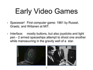
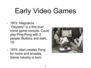
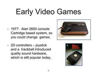
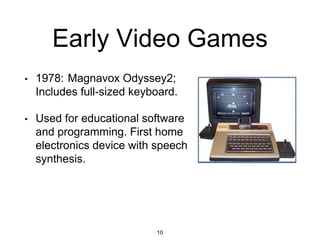
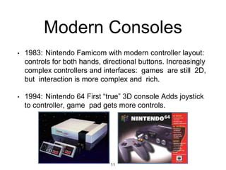

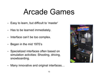
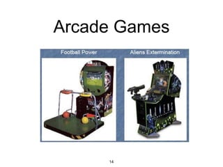


This document provides an overview of game user interfaces throughout history and discusses principles of good UI design for games. It begins with early experimental electronic games from the 1940s-1970s with simple control schemes like dials and buttons. Modern consoles starting in the 1980s introduced more complex dual-hand controllers. Case studies examine first-person shooter games and how they integrated heads-up displays. The document concludes with guidelines for game UI design including understanding the design space and game context, establishing player agency, and strengthening the player-avatar link.


![UNIT II - UID FOR MOBILE GAMES[INTRODUCTION TO MOBILE GAME DESIGN]](https://cdn.slidesharecdn.com/ss_thumbnails/unitii-uidformobilegames-250816141151-57622714-thumbnail.jpg?width=640&height=640&fit=bounds)


