Download to read offline


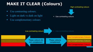


The document provides guidance on designing effective PowerPoint presentations. It discusses 5 keys to preventing audience boredom: 1) Make text big and readable from a distance, 2) Keep content simple with no more than 6 lines and 7 words per slide, 3) Use simple graphics, charts, and transitions instead of complex or distracting elements, 4) Make content clear using easily readable fonts, colors with good contrast, bullets for lists, and numbers for sequenced items, and 5) Be consistent in design across slides to avoid confusion. The overall message is to focus on simplicity, clarity and consistency in slide design.


