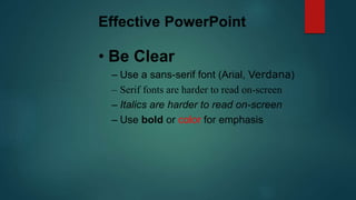
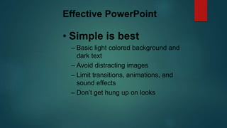
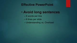
Effective PowerPoint
Message Across
Get Your
Presentation effectiveness
 To be truly effective a presentation must allow the
audience to see, hear and interact with the presenter and
the material being presented.
Effective PowerPoint
• Be Seen
– Make sure your text is big enough
– This is 28 point Arial
– Anything below 24 points is too small
Effective PowerPoint
• Be Clear
– Use a sans-serif font (Arial, Verdana)
– Serif fonts are harder to read on-screen
– Italics are harder to read on-screen
– Use bold or color for emphasis
Effective PowerPoint
• Simple is best
– Basic light colored background and
dark text
– Avoid distracting images
– Limit transitions, animations, and
sound effects
– Don’t get hung up on looks
Effective PowerPoint
• Avoid long sentences
– 6 words per line
– 6 lines per slide
– Understanding vs. Overload
Length of text
 Long and complete texts make the audience switch off.
 The audience is not supposed to read the presentation.
 Keep the text concise and to the point.
 Limit the text to three to five bullets per slide
 Use one concept per slide
Use of sentences
 Short sentences attract attention and are more memorable.
 Write in the active voice
 Assure consistency in sentence structure
 Cut dead wood from a sentence
 Do not clutter a sentence with secondary information
 Do not put more than three figures of any kind in a single sentence
Effective PowerPoint
Use images to
communicate…
Images
 When using images remember the following points:
 Make sure that the images add value to your message
 Do not use Word Art
 Avoid Clip Art
 Shrink images to keep the file size to a minimum
Layout
 Visual aids have a positive impact on the effectiveness of a presentation.
 They contribute to:
 Better understanding
 Higher retention
 More convincing speaker
Definition of objective
 Presentations are about causing an effect on your audience.
 Establish your objective before you start writing the presentation.
 You can:
 Inform
 Convince
 Call to action
Presentation structure
 A typical presentation consists of three elements:
 Introduction
 Main section
 Summary and conclusion
Effective PowerPoint
• Don’t read your screen
– Remember, PowerPoint presentations
shouldn’t be used as cue cards. Bullet
points should prompt you. Besides,
your audience will read faster than
you will talk. Plus your back will be
them. Which leads to the next point…
SLIDE 1
Life is like music; it must be composed by
ear, feeling, and instinct, not by rule.
Effective headlines
 The role of the headline is to grab the attention of the audience and to
provide the key message of the slide.
 Headlines should be short and straight to the point.
Graphic layout
 Maintain a consistent graphic layout
 Vary the graphical elements such as graphs, images, text (if appropriate)
every three to five slides to keep your audience interested
Use of colors
 Colors impact on:
 Attractiveness, readability and clarity
 Power of recollection
 Avoid more than three colors plus black and white on the same slide
 Be aware of what humans associate with different colors in different parts
of the world
Graphics
 Graphics make information easier to understand and remember.
 To create effective graphics you should do the following:
 Identify the message
 Choose the chart type most appropriate for your message
 Put key message at the center of your chart
 Sort information by relevance / importance
 Label axes
First impression
 Be aware of the power of the first impression:
 Memorize the first two minutes of your presentation
 Start strong, confident and in control
 Make and maintain eye contact
 Breathe!!!
 Reference
 Gravidez, J. G
 Rush, A. (September 24, 2007)

Thuso

  • 1.
  • 2.
    Presentation effectiveness  Tobe truly effective a presentation must allow the audience to see, hear and interact with the presenter and the material being presented.
  • 3.
    Effective PowerPoint • BeSeen – Make sure your text is big enough – This is 28 point Arial – Anything below 24 points is too small
  • 4.
    Effective PowerPoint • BeClear – Use a sans-serif font (Arial, Verdana) – Serif fonts are harder to read on-screen – Italics are harder to read on-screen – Use bold or color for emphasis
  • 5.
    Effective PowerPoint • Simpleis best – Basic light colored background and dark text – Avoid distracting images – Limit transitions, animations, and sound effects – Don’t get hung up on looks
  • 6.
    Effective PowerPoint • Avoidlong sentences – 6 words per line – 6 lines per slide – Understanding vs. Overload
  • 7.
    Length of text Long and complete texts make the audience switch off.  The audience is not supposed to read the presentation.  Keep the text concise and to the point.  Limit the text to three to five bullets per slide  Use one concept per slide
  • 8.
    Use of sentences Short sentences attract attention and are more memorable.  Write in the active voice  Assure consistency in sentence structure  Cut dead wood from a sentence  Do not clutter a sentence with secondary information  Do not put more than three figures of any kind in a single sentence
  • 9.
  • 10.
    Images  When usingimages remember the following points:  Make sure that the images add value to your message  Do not use Word Art  Avoid Clip Art  Shrink images to keep the file size to a minimum
  • 11.
    Layout  Visual aidshave a positive impact on the effectiveness of a presentation.  They contribute to:  Better understanding  Higher retention  More convincing speaker
  • 12.
    Definition of objective Presentations are about causing an effect on your audience.  Establish your objective before you start writing the presentation.  You can:  Inform  Convince  Call to action
  • 13.
    Presentation structure  Atypical presentation consists of three elements:  Introduction  Main section  Summary and conclusion
  • 14.
    Effective PowerPoint • Don’tread your screen – Remember, PowerPoint presentations shouldn’t be used as cue cards. Bullet points should prompt you. Besides, your audience will read faster than you will talk. Plus your back will be them. Which leads to the next point…
  • 15.
    SLIDE 1 Life islike music; it must be composed by ear, feeling, and instinct, not by rule.
  • 16.
    Effective headlines  Therole of the headline is to grab the attention of the audience and to provide the key message of the slide.  Headlines should be short and straight to the point.
  • 17.
    Graphic layout  Maintaina consistent graphic layout  Vary the graphical elements such as graphs, images, text (if appropriate) every three to five slides to keep your audience interested
  • 18.
    Use of colors Colors impact on:  Attractiveness, readability and clarity  Power of recollection  Avoid more than three colors plus black and white on the same slide  Be aware of what humans associate with different colors in different parts of the world
  • 19.
    Graphics  Graphics makeinformation easier to understand and remember.  To create effective graphics you should do the following:  Identify the message  Choose the chart type most appropriate for your message  Put key message at the center of your chart  Sort information by relevance / importance  Label axes
  • 20.
    First impression  Beaware of the power of the first impression:  Memorize the first two minutes of your presentation  Start strong, confident and in control  Make and maintain eye contact  Breathe!!!
  • 21.
     Reference  Gravidez,J. G  Rush, A. (September 24, 2007)