1) The document discusses how brand identity can effectively link together a musician's main products and ancillary tasks through consistent visual elements like logo, colors, fonts, and imagery.
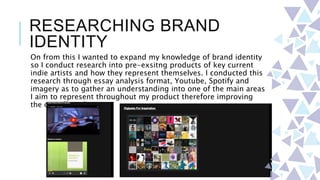
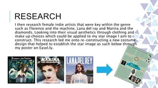
2) Research was conducted on indie artists like The Neighbourhood to understand how to represent a star image across different media.
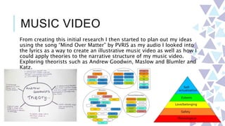
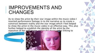
3) A music video was created for the song "Mind Over Matter" that applied theories of star image and narrative structure while incorporating the musician's visual identity.
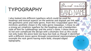
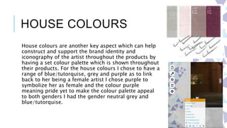
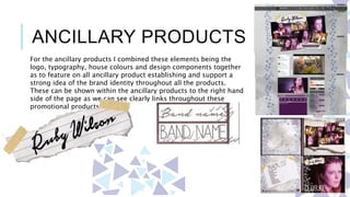
4) Ancillary products like a website, digital album, and promotional materials were designed using the established visual elements of logo, typography, geometric prints, and color palette to clearly link them to the music video and represent the musician's brand


![[Evaluation] Question 2: How effective is the combination of your main produc...](https://cdn.slidesharecdn.com/ss_thumbnails/question2-160503071203-thumbnail.jpg?width=640&height=640&fit=bounds)


