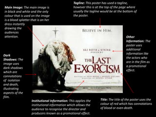
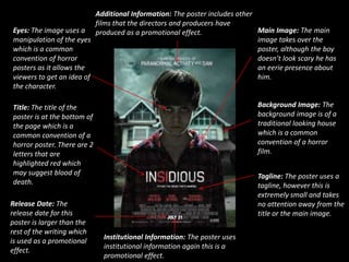
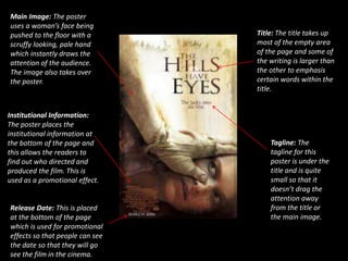
Horror Poster Analysis! 
By Laura Naylor
Main Image: The main image is 
in black and white and the only 
colour that is used on the image 
is a blood splatter that is on her 
dress instantly 
drawing the 
audiences 
attention. 
Tagline: This poster has used a tagline, 
however this is at the top of the page where 
usually the tagline would be at the bottom of 
the poster. 
Other 
Information: The 
poster uses 
additional 
information like 
the actors who 
are in the film as 
a promotional 
effect. 
Title: The title of the poster uses the 
colour of red which has connotations 
of blood or even death. 
Institutional Information: This applies the 
institutional information which allows the 
audience to recognise the director and 
producers known as a promotional effect. 
Dark 
Shadows: The 
image uses 
dark shadows 
which are 
connotations 
of isolation 
and death, 
illustrating 
aspects of the 
film.
Additional Information: The poster includes other 
films that the directors and producers have 
Eyes: The image uses a produced as a promotional effect. 
manipulation of the eyes 
which is a common 
convention of horror 
posters as it allows the 
viewers to get an idea of 
the character. 
Main Image: The main 
image takes over the 
poster, although the boy 
doesn’t look scary he has 
an eerie presence about 
him. 
Background Image: The 
background image is of a 
traditional looking house 
which is a common 
convention of a horror 
film. 
Title: The title of the 
poster is at the bottom of 
the page which is a 
common convention of a 
horror poster. There are 2 
letters that are 
highlighted red which 
may suggest blood of 
death. 
Tagline: The poster uses a 
tagline, however this is 
extremely small and takes 
no attention away from the 
title or the main image. 
Release Date: The 
release date for this 
poster is larger than the 
rest of the writing which 
is used as a promotional 
effect. 
Institutional Information: The poster uses 
institutional information again this is a 
promotional effect.
Main Image: The poster 
uses a woman’s face being 
pushed to the floor with a 
scruffy looking, pale hand 
which instantly draws the 
attention of the audience. 
The image also takes over 
the poster. 
Title: The title takes up 
most of the empty area 
of the page and some of 
the writing is larger than 
the other to emphasis 
certain words within the 
title. 
Institutional Information: 
The poster places the 
institutional information at 
the bottom of the page and 
this allows the readers to 
find out who directed and 
produced the film. This is 
used as a promotional effect. 
Tagline: The 
tagline for this 
poster is under the 
title and is quite 
small so that it 
doesn’t drag the 
attention away 
from the title or 
the main image. 
Release Date: This is placed 
at the bottom of the page 
which is used for promotional 
effects so that people can see 
the date so that they will go 
see the film in the cinema.

Horror poster analysis!

  • 1.
    Horror Poster Analysis! By Laura Naylor
  • 2.
    Main Image: Themain image is in black and white and the only colour that is used on the image is a blood splatter that is on her dress instantly drawing the audiences attention. Tagline: This poster has used a tagline, however this is at the top of the page where usually the tagline would be at the bottom of the poster. Other Information: The poster uses additional information like the actors who are in the film as a promotional effect. Title: The title of the poster uses the colour of red which has connotations of blood or even death. Institutional Information: This applies the institutional information which allows the audience to recognise the director and producers known as a promotional effect. Dark Shadows: The image uses dark shadows which are connotations of isolation and death, illustrating aspects of the film.
  • 3.
    Additional Information: Theposter includes other films that the directors and producers have Eyes: The image uses a produced as a promotional effect. manipulation of the eyes which is a common convention of horror posters as it allows the viewers to get an idea of the character. Main Image: The main image takes over the poster, although the boy doesn’t look scary he has an eerie presence about him. Background Image: The background image is of a traditional looking house which is a common convention of a horror film. Title: The title of the poster is at the bottom of the page which is a common convention of a horror poster. There are 2 letters that are highlighted red which may suggest blood of death. Tagline: The poster uses a tagline, however this is extremely small and takes no attention away from the title or the main image. Release Date: The release date for this poster is larger than the rest of the writing which is used as a promotional effect. Institutional Information: The poster uses institutional information again this is a promotional effect.
  • 4.
    Main Image: Theposter uses a woman’s face being pushed to the floor with a scruffy looking, pale hand which instantly draws the attention of the audience. The image also takes over the poster. Title: The title takes up most of the empty area of the page and some of the writing is larger than the other to emphasis certain words within the title. Institutional Information: The poster places the institutional information at the bottom of the page and this allows the readers to find out who directed and produced the film. This is used as a promotional effect. Tagline: The tagline for this poster is under the title and is quite small so that it doesn’t drag the attention away from the title or the main image. Release Date: This is placed at the bottom of the page which is used for promotional effects so that people can see the date so that they will go see the film in the cinema.