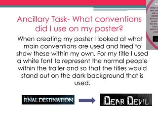
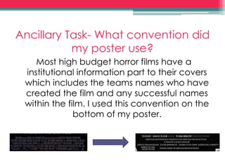
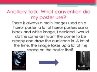
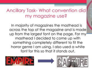
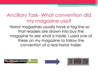
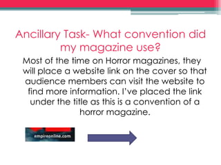
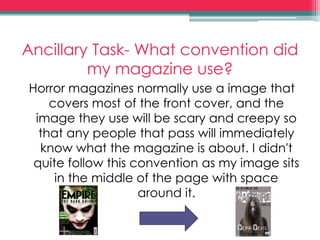
Evaluation
Question 1
Research and Analysis
When first starting the project, I decided
to go straight into it and research into
what makes a successful horror trailer. I
research into Annabelle, Insidious,
Sinister and Deliver us from Evil as these
are all extremely successful and this is
how we want our final project to turn
out.
What conventions did we use?
When creating our horror trailer we wanted to use a
diary as our main possessive object as a lot of films
use an object to base the film around, with this we
also followed the common convention of
something/someone evil living in the house with a
normal group of people. Our trailer is made up of
little scenes in a non chronological order, we
started the trailer with later parts of the film so that
the audience wonder what happens throughout
the film itself. We also used a final scare and music
which creates a tension as this is what is thought of
when thinking into a horror trailer, this is what these
type of trailers are known for.
Ancillary Task- What conventions
did I use on my poster?
When creating my poster I looked at what
main conventions are used and tried to
show these within my own. For my title I used
a white font to represent the normal people
within the trailer and so that the titles would
stand out on the dark background that is
used.
Ancillary Task- What convention did
my poster use?
Most high budget horror films have a
institutional information part to their covers
which includes the teams names who have
created the film and any successful names
within the film. I used this convention on the
bottom of my poster.
Ancillary Task- What convention did
my poster use?
There is always a main images used on a
horror poster, a lot of horror posters use a
black and white image, I decided I would
do the same as I want the poster to be
creepy and draw the audience in. A lot of
the time, the image takes up a lot of the
space on the poster itself.
Ancillary Task- What convention did
my magazine use?
In majority of magazines the masthead is
across the top of the magazine and is made
up from the largest font on the page. For my
masthead I decided to come up with
something completely different to fit the
horror genre I am using. I also used a white
font for this so that it stands out.
Ancillary Task- What convention did
my magazine use?
Horror magazines usually have a tag line so
that readers are drawn into buy the
magazine to see what is inside. I used one of
these on my magazine to follow the
convention of a real horror trailer.
Ancillary Task- What convention did
my magazine use?
Most of the time on Horror magazines, they
will place a website link on the cover so that
audience members can visit the website to
find more information. I’ve placed the link
under the title as this is a convention of a
horror magazine.
Ancillary Task- What convention did
my magazine use?
Horror magazines normally use a image that
covers most of the front cover, and the
image they use will be scary and creepy so
that any people that pass will immediately
know what the magazine is about. I didn't
quite follow this convention as my image sits
in the middle of the page with space
around it.

Evaluation question one 2

  • 1.
  • 2.
    Research and Analysis Whenfirst starting the project, I decided to go straight into it and research into what makes a successful horror trailer. I research into Annabelle, Insidious, Sinister and Deliver us from Evil as these are all extremely successful and this is how we want our final project to turn out.
  • 3.
    What conventions didwe use? When creating our horror trailer we wanted to use a diary as our main possessive object as a lot of films use an object to base the film around, with this we also followed the common convention of something/someone evil living in the house with a normal group of people. Our trailer is made up of little scenes in a non chronological order, we started the trailer with later parts of the film so that the audience wonder what happens throughout the film itself. We also used a final scare and music which creates a tension as this is what is thought of when thinking into a horror trailer, this is what these type of trailers are known for.
  • 4.
    Ancillary Task- Whatconventions did I use on my poster? When creating my poster I looked at what main conventions are used and tried to show these within my own. For my title I used a white font to represent the normal people within the trailer and so that the titles would stand out on the dark background that is used.
  • 5.
    Ancillary Task- Whatconvention did my poster use? Most high budget horror films have a institutional information part to their covers which includes the teams names who have created the film and any successful names within the film. I used this convention on the bottom of my poster.
  • 6.
    Ancillary Task- Whatconvention did my poster use? There is always a main images used on a horror poster, a lot of horror posters use a black and white image, I decided I would do the same as I want the poster to be creepy and draw the audience in. A lot of the time, the image takes up a lot of the space on the poster itself.
  • 7.
    Ancillary Task- Whatconvention did my magazine use? In majority of magazines the masthead is across the top of the magazine and is made up from the largest font on the page. For my masthead I decided to come up with something completely different to fit the horror genre I am using. I also used a white font for this so that it stands out.
  • 8.
    Ancillary Task- Whatconvention did my magazine use? Horror magazines usually have a tag line so that readers are drawn into buy the magazine to see what is inside. I used one of these on my magazine to follow the convention of a real horror trailer.
  • 9.
    Ancillary Task- Whatconvention did my magazine use? Most of the time on Horror magazines, they will place a website link on the cover so that audience members can visit the website to find more information. I’ve placed the link under the title as this is a convention of a horror magazine.
  • 10.
    Ancillary Task- Whatconvention did my magazine use? Horror magazines normally use a image that covers most of the front cover, and the image they use will be scary and creepy so that any people that pass will immediately know what the magazine is about. I didn't quite follow this convention as my image sits in the middle of the page with space around it.