Call 8617370543 Sangli Call girls with real photos and phone numbers
Poster ta sliding doors (b)
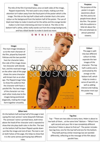
1. Image:
The main image introduces
us to the main character of
the film, played by Gwyneth
Paltrow and the two parallel
lives her character takes.
One side of the image shows
her character with blonde
hair, and the reversed image
on the other side of the page
shows the same character
with brown hair as an alter
ego. The flipped image helps
to show the audience that
the character with have a
parallel life. The two images
of the character run into
each other nicely due to the
images being positioned
diagonally, making the image
form together smoothly.
Colour:
The page is split
into two different
colours to help
separate the two
images of the
character. The top
half is white and is
contrasted by the
orange on the
bottom half, which
helps to create a
sense of warmth, as
well as adding
interest and making
the poster more eye
catching.
Purpose:
The purpose of the
poster is to gain
awareness about
the film and to let
people know about
the film. The poster
tells the audience a
little bit about the
film and attempts to
attract potential
viewers.
Tag line:
Top - “There are two sides to every story. Helen is about to
live both of them... at the same time” Bottom – “What if one
split second sent your life in two completely different
directions? Helen is about to find out”. The poster includes
two tag lines; one for the top half and one for the bottom.
They both portray similar meanings but are worded
differently; reflecting on the message of the film about
parallel lives.
Title:
The title of the film if printed twice, once on both sides of the image,
flipped respectively. The text used is very simple, making sure that
attention isn’t taken away from the focal point of the poster which is the
image. The title on the top half is black with a border that is the same
colour as the background from the bottom half of the poster. The use of
black text helps to make it stand out for the white and the orange border
makes it a bit more interesting and nicer to look at. The title on the
bottom half is white, white really stands out from the orange background,
and has a black border to make it stand out more.
Other text:
On the bottom half and top half of the page is text
saying the main actress’ name (Gwyneth Paltrow).
The actresses’ name is printed twice, both times
above the head of her character and is repeated to
show that she plays both roles in the film. The text
on the bottom half has been flipped upside down
just like the image and rest of text. The text is red
on both halves of the page, this helps to show that
it is the same actress portraying two different
roles.