Download to read offline

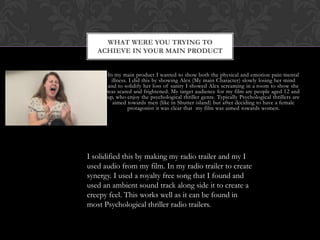
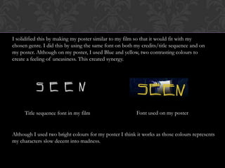
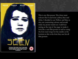
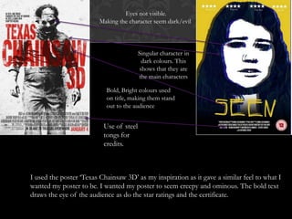

In this document, the author discusses their main product which was a film showing the physical and emotional pain of mental illness through the character Alex slowly losing her sanity. The intended audience was those aged 12 and up who enjoy psychological thrillers, which typically target male audiences. To create synergy between the film and ancillary texts, the author made a radio trailer using audio from the film set to a creepy ambient soundtrack. The film poster was also designed to fit the psychological thriller genre, using the same font as the film credits and contrasting blue and yellow colors to create an unsettling feeling and represent the character's descent into madness.