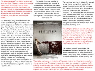
The colour scheme of this poster is mainly red,
white and black. These are typical horror colours
used in many horror films. The red colour
connotes blood, which links in with death and
disaster. The use of black represents darkness,
evil, fear, destruction, emptiness and creates a
mysterious and uneasy mood. This allows the
audience to know that this is a horror film
poster.
The main image along the bottom half of the
poster is of a female girl with her face and
identity disguised as she has her hand positioned
along the wall where she leaves the blood marks.
The use of a child is very common in horror films
as it is able to target their audience. This is
because children are often known as being
innocent and it is the best way to manipulate the
audience through this. Her white costume links
with this as it could represent innocence and
purity. The blood marks along the wall shows a
skull-like face which represents devil, this draws
the viewers attention and is the unique selling
point of the poster as it straight away tells the
audience what genre this film poster is. The
image of this face is rather disturbing and
terrifying as it looks as though the demonic and
angry eyes are staring straight at the audience,
creating a creepy and goose-thrilling
atmosphere. The image of the blooded face links
in with the slogan as it makes it more believable
and therefore helps encourages the audience to
watch the film.
The selling line ‘Once you see him, nothing can
save you’, creates a very horrific and terrifying
atmosphere. It is written in a small serif font
just under the masthead so it will be the next
thing the audience reads after the masthead.
This encourages the viewer to watch the film
as it makes them question the selling line, and
therefore leaving them eager to find out.
The credits are located at the bottom of the poster to draw as little attention away from
the main conventions. This allows the audience to know who took part in producing the film
and what companies were also involved. It is also a way to gain a wider audience and allows
the audience to recognise the company logos straight away. The use of social networking
sites can help promote the film and gain a fan base as they are globally used.
The company have not yet publicised the
release date, therefore shows that this is a
teaser poster which is an early promotion of
the film. The ‘Coming Soon’ allows the audience
to expect and be aware of this upcoming film.
The masthead is written in a black font located
across the top centre of the poster. This
follows the colour scheme and also contrasts
with the light background, which will help stand
out on the page and draws the readers
attention. The typography used look as thought
it has been smudged down, giving off a creepy
and unknown feeling. It also looks diseased and
infectious, which links in with the main plot of
the film. The way the typography has been
‘smudged’ down links with the main image of the
blooded skull dripping down.
The tagline ‘From the producer of
‘Paranormal Activity and Insidious’’ is
located on the top centre of the poster.
This targets their audience as they all have
similar target audience. They have been
successful horror movies which will make
the audience want to watch this film,
knowing that it has been produced by the
same producer.
The main colour scheme of this poster is
white, grey and black. These choice of
colours plain but adds to the atmosphere
the poster is trying to create. The use of
the light greys and white symbolises
mystery and emptiness as it surrounds the
cabin. It also gives the feeling of unknown
as it fades into the background, leaving the
audience feel uneasy.
The main image is of a cabin, which is the
main focus of the poster, located on the
centre of the page to attract the readers
attention . The image is simple and does not
give too much away leaving enigma’s. The
cabin looks as though it is floating in mid-air
which immediately creates a mysterious and
intriguing feeling. The architecture of the
cabin has been manipulated into an unusual
and unique shape which resembles a rubiks
cube, this leaves the audience wondering
what is going on and encourages them to
watch the film to find out the answer.
The selling line ‘You think you know the
story’ intrigues the audience into thinking
that there may be a twist in the plot of the
film that will change an event. This
persuades the audience into watching the
film as the audience would want to know
what the story actually is. The typography
is simple and plain which matches the main
image and is located under the cabin and
above the masthead to attract the
readers attention.
The credits are located on the bottom of the
poster which is typical for film posters. This is so
that it does not distract the audiences attention
from the main conventions. This is by legal
requirements and helps the production company
gain recognition and a wider audience. They have
included the institution ‘Lionsgate’ at the end of
the credits in a slightly bigger font size as they
are a big and popular film production company.
This allows the audience to recognise their logo
immediately and will know that they have
previously brought many horror films to the big
screen and therefore intrigues the audience to
watch the film as they will more likely believe
that this will be another success.
The masthead is below the tagline in a big black font
which stands out against the while, pale background.
This makes it eye-catching to the viewer and draws
the attention to the film name. It is also done in a way
where it does not take too much attention away from
the main image. The title of this film is pretty
explanatory itself as it already sets the location
where the audience would expect there to a story
behind the woods that they are going for. The
scratches on the typography is a typical horror
convention as it shows suspicion and creates an
uneasy atmosphere.
The tagline ‘From Producer Joss Whedon
and Drew Goddard the Writer of ‘Cloverfield’
lets the audience know what producer and
writer was involved in the film. Although Drew
Goddard is not a familiar horror director as he
mainly does television programmes and low
budget indie films such as American sci-fi
thriller film ‘Cloverfield’. This however, has
been a successful and well-known film. On the
other hand, Joss Whedon has worked over
bigger projects such as ‘The Avengers
Assemble and has won 8 awards, making him
a well-known writer. This will encourage the
audience to watch this film as they may be
part of his fan base and want to see more of
his films.
The release date is located in the bottom centre
of the credits in a bold, black font which is cliché
for most film posters. This is so that the audience
will know exactly when the film will be released.
The 13th
of a month is often associated with
horror, therefore building tension.
The tagline is located on the top of the film poster so it attracts the readers attention as the
author and director of the mentioned films has been rather successful. It is written in a white serif
font in capital letters to appeal to its target audience and to stand out against the main image.
The have used a larger font size for the names of the well-known films, ‘The Notebook’ and ‘Dear
John’, to ensure that they stand out as they are popular romance films. This is also the company’s
unique selling point as they will gain a fan base before the
actual release of the film.
The background of the main image
shows it's location at a beach, linking
with the genre of the film, romance.
This is because the beach is often
stereotypically referred to as being a
calm, relaxing and romantic place. This
links in with the two main characters
shown on the poster as they are closely
held and look as though they are about
to kiss, therefore telling the reader that
they are in love. Their body language
interprets this and the way they both
have their eyes closed highlights the
fact that they are passionate about
each other and is a typical convention
used in the romance genre. The blue
and white sky represents freedom, calm
and happiness which could be shared
between the two characters and also
sets the loving, romantic mood. Their
outfits follows the colour scheme and
the girl could represent happiness and
joy as she is wearing a blue denim top,
matching the blue sky, therefore
expresses her personality. However,
the male character could differ from
this, leaving the audience wondering
why and therefore encouraging them to
watch the film to find out the answer.
The masthead typography is in a baby blue serif
font in capitals, located across the bottom half of
the poster. This way it will ensure that it does not
distract the main image but is still eye-catching to
the viewer as it is simple but classy. They have laid
it out so that the ‘E’ in ‘Safe’ and the ‘H’ in ‘Haven’
are in line with each other, therefore it wouldn’t be
as boring and plain.
The actor’s name is placed above the masthead in
a smaller font, in white. This is so that it will be
noticeable to the reader but will not take all the
attention away from the masthead. The reason for
this convention is because they have used well-
known American actor and former fashion model,
Josh Duhamel and actress and dancer Julianne
Hough as the protagonists which will then attract
more audience to watch the film.
They have used persuasive language for the
selling line, ‘You know it when you find it’.
Located underneath the masthead in a white
font, following the colour scheme. It leaves
the audience thinking ‘what am I meant to find
for me to know?’, persuading the audience to
watch the film to find out what they mean.
The credits are at the bottom of the poster which
is typical for film posters. This is a legal requirement
for companies to gain recognition for being involved
in the production of the film. They have also included
the hash tag for the film to create a social link to
twitter as social networking has grown over the
past years. This helps gain worldwide audience and
links in with the uses and gratification theory. It is
written in the baby blue font colour to make it stand
out against the credits as they are in white.
They have included the release month on
the bottom right hand corner of the poster,
after the credits a baby blue font so it
stands out to the audience as it lets them
know roughly when the film is released.

Horror poster analysis

  • 1.
    The colour schemeof this poster is mainly red, white and black. These are typical horror colours used in many horror films. The red colour connotes blood, which links in with death and disaster. The use of black represents darkness, evil, fear, destruction, emptiness and creates a mysterious and uneasy mood. This allows the audience to know that this is a horror film poster. The main image along the bottom half of the poster is of a female girl with her face and identity disguised as she has her hand positioned along the wall where she leaves the blood marks. The use of a child is very common in horror films as it is able to target their audience. This is because children are often known as being innocent and it is the best way to manipulate the audience through this. Her white costume links with this as it could represent innocence and purity. The blood marks along the wall shows a skull-like face which represents devil, this draws the viewers attention and is the unique selling point of the poster as it straight away tells the audience what genre this film poster is. The image of this face is rather disturbing and terrifying as it looks as though the demonic and angry eyes are staring straight at the audience, creating a creepy and goose-thrilling atmosphere. The image of the blooded face links in with the slogan as it makes it more believable and therefore helps encourages the audience to watch the film. The selling line ‘Once you see him, nothing can save you’, creates a very horrific and terrifying atmosphere. It is written in a small serif font just under the masthead so it will be the next thing the audience reads after the masthead. This encourages the viewer to watch the film as it makes them question the selling line, and therefore leaving them eager to find out. The credits are located at the bottom of the poster to draw as little attention away from the main conventions. This allows the audience to know who took part in producing the film and what companies were also involved. It is also a way to gain a wider audience and allows the audience to recognise the company logos straight away. The use of social networking sites can help promote the film and gain a fan base as they are globally used. The company have not yet publicised the release date, therefore shows that this is a teaser poster which is an early promotion of the film. The ‘Coming Soon’ allows the audience to expect and be aware of this upcoming film. The masthead is written in a black font located across the top centre of the poster. This follows the colour scheme and also contrasts with the light background, which will help stand out on the page and draws the readers attention. The typography used look as thought it has been smudged down, giving off a creepy and unknown feeling. It also looks diseased and infectious, which links in with the main plot of the film. The way the typography has been ‘smudged’ down links with the main image of the blooded skull dripping down. The tagline ‘From the producer of ‘Paranormal Activity and Insidious’’ is located on the top centre of the poster. This targets their audience as they all have similar target audience. They have been successful horror movies which will make the audience want to watch this film, knowing that it has been produced by the same producer.
  • 2.
    The main colourscheme of this poster is white, grey and black. These choice of colours plain but adds to the atmosphere the poster is trying to create. The use of the light greys and white symbolises mystery and emptiness as it surrounds the cabin. It also gives the feeling of unknown as it fades into the background, leaving the audience feel uneasy. The main image is of a cabin, which is the main focus of the poster, located on the centre of the page to attract the readers attention . The image is simple and does not give too much away leaving enigma’s. The cabin looks as though it is floating in mid-air which immediately creates a mysterious and intriguing feeling. The architecture of the cabin has been manipulated into an unusual and unique shape which resembles a rubiks cube, this leaves the audience wondering what is going on and encourages them to watch the film to find out the answer. The selling line ‘You think you know the story’ intrigues the audience into thinking that there may be a twist in the plot of the film that will change an event. This persuades the audience into watching the film as the audience would want to know what the story actually is. The typography is simple and plain which matches the main image and is located under the cabin and above the masthead to attract the readers attention. The credits are located on the bottom of the poster which is typical for film posters. This is so that it does not distract the audiences attention from the main conventions. This is by legal requirements and helps the production company gain recognition and a wider audience. They have included the institution ‘Lionsgate’ at the end of the credits in a slightly bigger font size as they are a big and popular film production company. This allows the audience to recognise their logo immediately and will know that they have previously brought many horror films to the big screen and therefore intrigues the audience to watch the film as they will more likely believe that this will be another success. The masthead is below the tagline in a big black font which stands out against the while, pale background. This makes it eye-catching to the viewer and draws the attention to the film name. It is also done in a way where it does not take too much attention away from the main image. The title of this film is pretty explanatory itself as it already sets the location where the audience would expect there to a story behind the woods that they are going for. The scratches on the typography is a typical horror convention as it shows suspicion and creates an uneasy atmosphere. The tagline ‘From Producer Joss Whedon and Drew Goddard the Writer of ‘Cloverfield’ lets the audience know what producer and writer was involved in the film. Although Drew Goddard is not a familiar horror director as he mainly does television programmes and low budget indie films such as American sci-fi thriller film ‘Cloverfield’. This however, has been a successful and well-known film. On the other hand, Joss Whedon has worked over bigger projects such as ‘The Avengers Assemble and has won 8 awards, making him a well-known writer. This will encourage the audience to watch this film as they may be part of his fan base and want to see more of his films. The release date is located in the bottom centre of the credits in a bold, black font which is cliché for most film posters. This is so that the audience will know exactly when the film will be released. The 13th of a month is often associated with horror, therefore building tension.
  • 3.
    The tagline islocated on the top of the film poster so it attracts the readers attention as the author and director of the mentioned films has been rather successful. It is written in a white serif font in capital letters to appeal to its target audience and to stand out against the main image. The have used a larger font size for the names of the well-known films, ‘The Notebook’ and ‘Dear John’, to ensure that they stand out as they are popular romance films. This is also the company’s unique selling point as they will gain a fan base before the actual release of the film. The background of the main image shows it's location at a beach, linking with the genre of the film, romance. This is because the beach is often stereotypically referred to as being a calm, relaxing and romantic place. This links in with the two main characters shown on the poster as they are closely held and look as though they are about to kiss, therefore telling the reader that they are in love. Their body language interprets this and the way they both have their eyes closed highlights the fact that they are passionate about each other and is a typical convention used in the romance genre. The blue and white sky represents freedom, calm and happiness which could be shared between the two characters and also sets the loving, romantic mood. Their outfits follows the colour scheme and the girl could represent happiness and joy as she is wearing a blue denim top, matching the blue sky, therefore expresses her personality. However, the male character could differ from this, leaving the audience wondering why and therefore encouraging them to watch the film to find out the answer. The masthead typography is in a baby blue serif font in capitals, located across the bottom half of the poster. This way it will ensure that it does not distract the main image but is still eye-catching to the viewer as it is simple but classy. They have laid it out so that the ‘E’ in ‘Safe’ and the ‘H’ in ‘Haven’ are in line with each other, therefore it wouldn’t be as boring and plain. The actor’s name is placed above the masthead in a smaller font, in white. This is so that it will be noticeable to the reader but will not take all the attention away from the masthead. The reason for this convention is because they have used well- known American actor and former fashion model, Josh Duhamel and actress and dancer Julianne Hough as the protagonists which will then attract more audience to watch the film. They have used persuasive language for the selling line, ‘You know it when you find it’. Located underneath the masthead in a white font, following the colour scheme. It leaves the audience thinking ‘what am I meant to find for me to know?’, persuading the audience to watch the film to find out what they mean. The credits are at the bottom of the poster which is typical for film posters. This is a legal requirement for companies to gain recognition for being involved in the production of the film. They have also included the hash tag for the film to create a social link to twitter as social networking has grown over the past years. This helps gain worldwide audience and links in with the uses and gratification theory. It is written in the baby blue font colour to make it stand out against the credits as they are in white. They have included the release month on the bottom right hand corner of the poster, after the credits a baby blue font so it stands out to the audience as it lets them know roughly when the film is released.