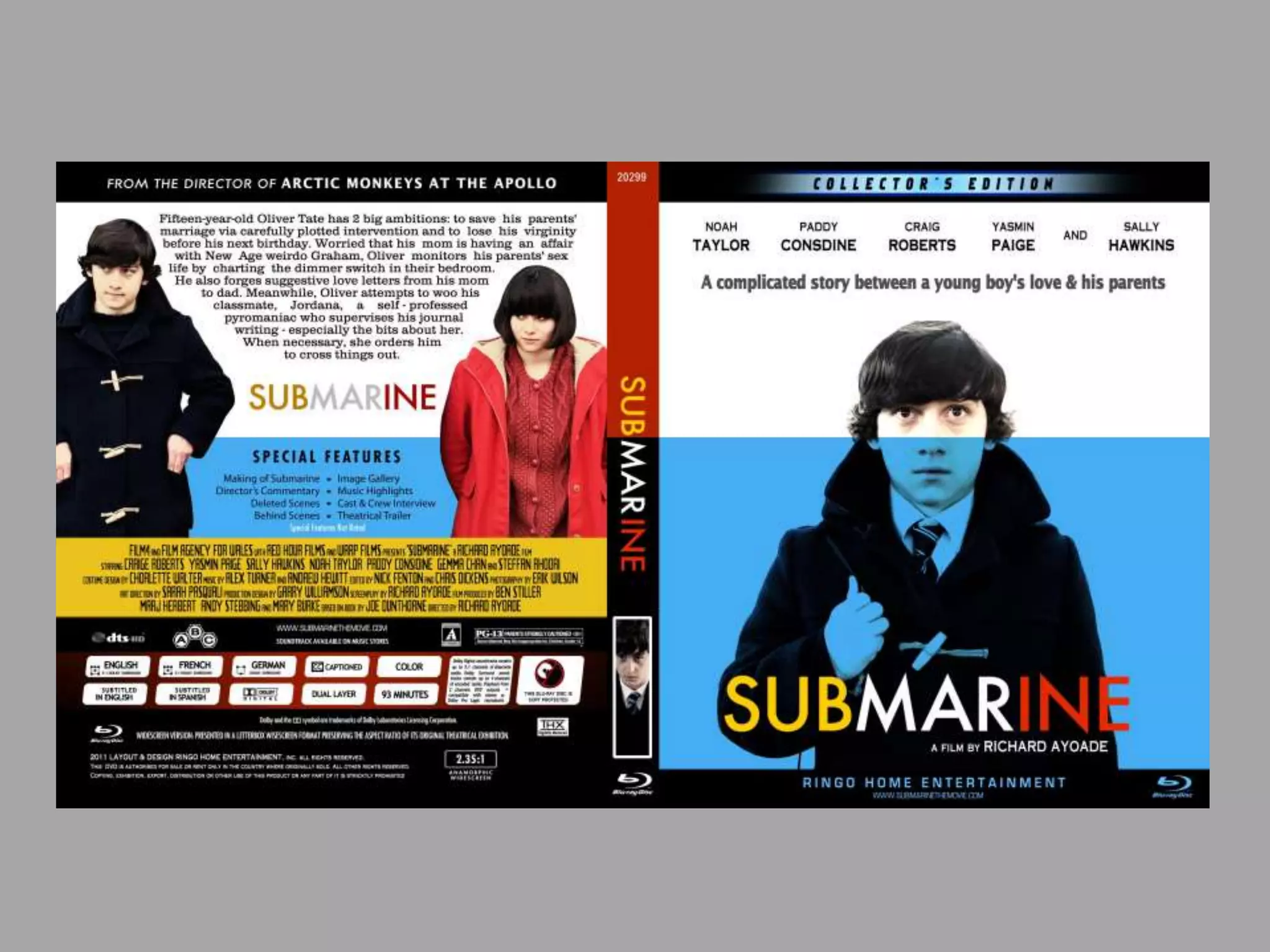
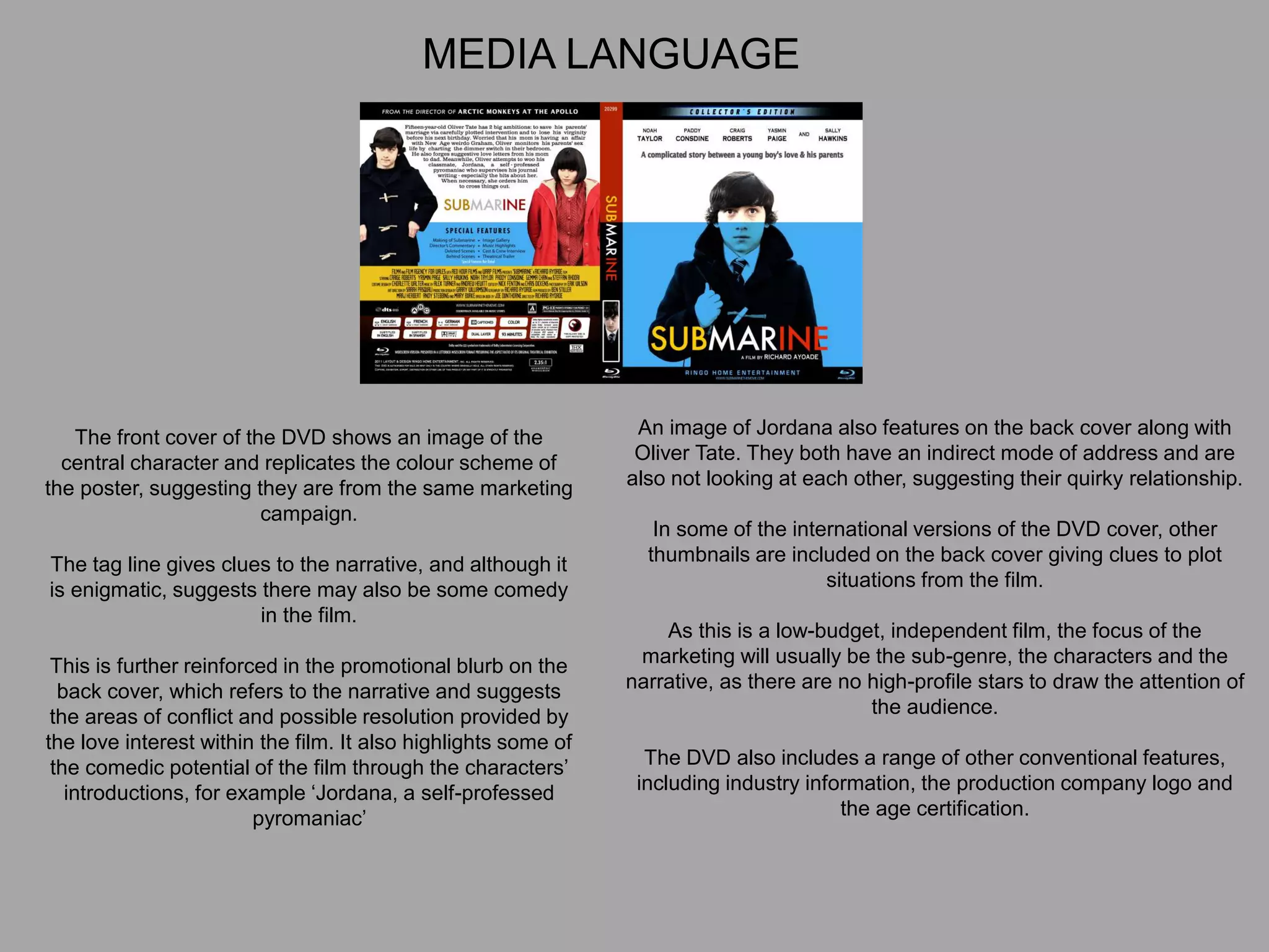
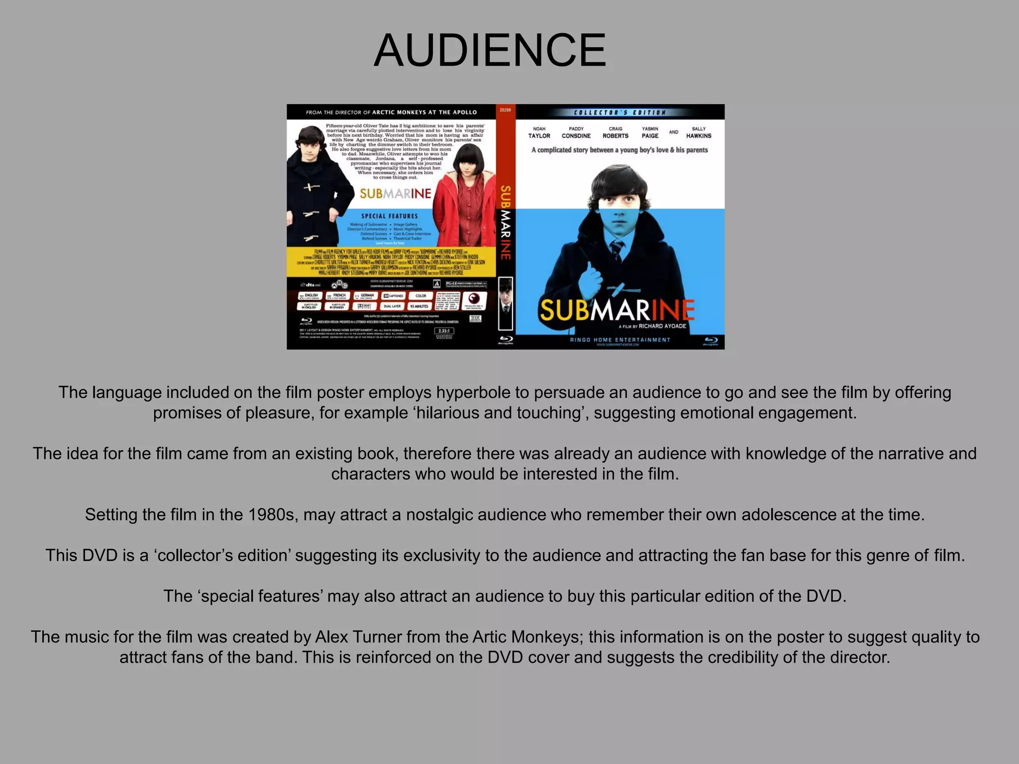
Media Semiotic Film Poster
Analysis
UK
Polish
French
Portuguese
Chinese
French
German
Chinese
Strong Fallow Area
Primary Optical Area
Weak Fallow Area
Terminal Area
His eye contact with the
audience shows direct
mode of address. The
director has used this so
the audience can see
what the main character
might be feeling when
looking at his eyes and
face.
The actor in the film Matt Damon
is mostly known for starring in
blockbuster action films, making
his target audience for his films
would be male audience who are
aged 16-35 who like action films.
This is why Ridley Scott cast him
as a main character in this film to
broaden the audience.
Formal mode of address shown on the title of the film. The font is a light
grey/silver colour. The title font is quite sophisticated and seems quite
serious. This will attract a more serious and mature audience.
His face shows no
emotion, like a blank
stare. It’s very
masculine and shows
no fear. This represents
the type of audience for
this film being a male
orientated audience.
The film tag line is ‘BRING
HIM HOME’, which gives the
idea of how far away from
home he might be, and why he
has a vague look on his face.
This represents his genre of
the film, science fiction. The
use of the tag line and space
suit, are used together so the
audience understand the plot.
The audience for this film is
predominantly male, because
Matt Damon is in action films
which are usually targeted
towards men. A female
audience is drawn to watching
this film because of his looks,
which also broadens the
audience for the film.
French
UK
Japanese
Russian
The main colour used in this poster is pink.
It stands out the most. Even the red
colours have a slight pinkness to them.
This suggests that love is a key theme
throughout the film. The sky in the poster
is pink and it is behind the main characters
head. This means that perhaps the main
character has some sort of romance in the
film. The red car has a pinkish colour to it.
The use of this red car suggests that there
is danger and action within the film. This is
reinforced by the red and blue lines next to
the car as well as the lights in the cars
behind the red one.
This tells the audience that this is a film
about criminals, as red and blue lights are
an iconic sign as well as indexical signifier
(like the lines next to the car) of the police.
This, again, informs the audience that the
film is about a crime.
Crime is reinforced by the gun being held by
Jon Hamm in the poster. This gun is an
indexical sign as it has connotations of
violence. There is also another gun in the
hand of Eiza Gonzalez as well as tattooed
onto Jamie Foxx’s hand whilst he is making
the shape of a gun with his hand.
Reinforcing the idea that violence is present
throughout the entire movie and informs the
audience of the genre of film.
There are also many other uses of semiotics within
this poster. For example each of the actors present
on the poster are an example of an iconic sign, as
they are all physical representations of the actors in
the form of the image. The signifier resembles the
signified. The names of the actors are also symbolic
of them, because the name of the actor is seen and
then associated with the actual person.
The use of their names on the poster can
encourage a larger audience to come and watch the
film as they recognise the names. Another symbolic
sign is the road sign saying ‘Atlanta’. This
accompanied with the iconic sign of the Atlanta
skyline in the background inform the audience of the
setting in which the film takes place.
The layout of the poster draws the audience’s
attention to the road and the cars. This may have
been done so that the audience know that this is a
movie about a getaway driver, and that cars and
driving are very important. It sets up a certain
expectation for the audience and tells them more
about the film.
The images of the cast tell you about the characters
as well as who is in the film. The audience sees that
the character ‘Baby’ has earphones in, which is a
key plot point within the film. Jon Hamm’s character
is holding a large gun, as is Eiza Gonzalez’s and
Jamie Foxx’s characters. This shows that they are
criminals and perhaps threats within the film. Kevin
Spacey’s character is wearing a suit, suggesting
that he is more empowered, as well as more
professional like a business man.
The text informs the audience of the films name, as
well as the director. Edgar Wright is a very well-
known director and has a very dedicated fan base,
so the inclusion of his name on the poster may be a
way of them marketing the film as it may lead to
more ticket sales. The text is also retro and almost a
cheesy generic action film text, looking like it would
be on a ‘Bad Boys 2’ poster. However, it also
reminds the audience of a road, as it is similar to
text that would be present on a road.
Media Semiotic DVD Cover
Analysis
The central image draws the eye and
demonstrates the genre conventions of a ‘coming
of age’ film with the use of a young male.
The name of the film is enigmatic; the fact that the
young boy seems to be just peering over the
surface of the water, like a submarine gives clues
to the possible narrative.
The omission of settings on the poster suggests
the narrative focus will be his story and also
suggests the low production values of the film.
The visual code of expression, coupled with the
indirect mode of address, suggests his confusion.
The code of clothing of the school uniform further
reinforces the film’s sub-genre, suggesting that
the narrative will focus on issues surrounding the
young man featured. The clothing also suggests
that this is not set in the present.
The layout and design is simple, demonstrating
the conventions of a low-budget independent film;
this is reinforced by the lack of high-profile star
billing and the fact that the quotes are in a larger
font than the actor’s name.
The front cover of the DVD shows an image of the
central character and replicates the colour scheme of
the poster, suggesting they are from the same marketing
campaign.
The tag line gives clues to the narrative, and although it
is enigmatic, suggests there may also be some comedy
in the film.
This is further reinforced in the promotional blurb on the
back cover, which refers to the narrative and suggests
the areas of conflict and possible resolution provided by
the love interest within the film. It also highlights some of
the comedic potential of the film through the characters’
introductions, for example ‘Jordana, a self-professed
pyromaniac’
An image of Jordana also features on the back cover along with
Oliver Tate. They both have an indirect mode of address and are
also not looking at each other, suggesting their quirky relationship.
In some of the international versions of the DVD cover, other
thumbnails are included on the back cover giving clues to plot
situations from the film.
As this is a low-budget, independent film, the focus of the
marketing will usually be the sub-genre, the characters and the
narrative, as there are no high-profile stars to draw the attention of
the audience.
The DVD also includes a range of other conventional features,
including industry information, the production company logo and
the age certification.
MEDIA LANGUAGE
REPRESENTION
The DVD cover and the film poster construct representations of ‘troubled’
young people as the sub-genre is ‘coming of age’.
The visual codes of clothing, gesture and expression combined with the
narrative blurb reinforce the idea that these are more realistic
representations of youth than in other more mainstream films.
There is also the social and cultural representation of 1980s Britain.
The blurb suggests that issues related to the young people of the time will be
represented in the film. This is also suggested by the film’s tag line. These
issues are transferable to young people today, the target audience of the
film.
AUDIENCE
The language included on the film poster employs hyperbole to persuade an audience to go and see the film by offering
promises of pleasure, for example ‘hilarious and touching’, suggesting emotional engagement.
The idea for the film came from an existing book, therefore there was already an audience with knowledge of the narrative and
characters who would be interested in the film.
Setting the film in the 1980s, may attract a nostalgic audience who remember their own adolescence at the time.
This DVD is a ‘collector’s edition’ suggesting its exclusivity to the audience and attracting the fan base for this genre of film.
The ‘special features’ may also attract an audience to buy this particular edition of the DVD.
The music for the film was created by Alex Turner from the Artic Monkeys; this information is on the poster to suggest quality to
attract fans of the band. This is reinforced on the DVD cover and suggests the credibility of the director.
Submarine was made by the independent film company Warp Films, known for making innovative films including This is England (2008) and Four
Lions (2010).
Warp also has an independent record label as part of its extended company and there is evidence of horizontal integration as Alex Turner wrote
the soundtrack for Submarine.
Below-the-line advertising is an advertising strategy in which a product is promoted on platforms other than radio, TV, billboards, print and film.
Funding is often a problem for independent film companies, whose aim is to foster new talent and innovate ideas. Other smaller companies joined
together to ensure the success of the film, including Film 4 Productions, Film Agency for Wales and Red Hour Films.
Submarine was directed by Richard Ayoade and produced by Red Hour Films.
Submarine has won awards worldwide, including best screenplay at the 2011 BFI Awards. Richard Ayoade was nominated for a BAFTA for
outstanding debut by a British writer.
Much of the film’s success came from below the line and word of mouth advertising, and from its success at independent film festivals.
‘Optimum Releasing’ distributed the film in the UK; they have a lot of experience in releasing smaller, independent films.
INDUSTRY
The cover incorporates industry information, including the age certification and the film logo, indicating it is from an independent
film company.
The main image establishes the central characters and their positioning on the page creates an enigma regarding their
relationship within the film. The images are original and there is evidence that instruction has been given to the models about
gesture, expression and clothing in order to establish the representation.
The promotional blurb on the back cover gives a clear synopsis of the narrative, creates enigmas and suggests a conflict and
possible equilibrium.
The name of the film and the tag line give a clear indication of the film’s sub-genre and therefore appeals to a specific audience.
The absence of star names suggests that the actors are relatively unknown; a convention of an independent film and the focus
is therefore on the narrative.
The inclusion of the film logo, Warp Film, further emphasizes that this is the product of an independent film company.
The expert criticism ‘TRULY THRILLING’ is a marketing device and will persuade an audience to go and see the film.

Media Semiotic Film Poster Analysis

  • 1.
    Media Semiotic FilmPoster Analysis
  • 2.
  • 3.
  • 4.
  • 5.
    Strong Fallow Area PrimaryOptical Area Weak Fallow Area Terminal Area His eye contact with the audience shows direct mode of address. The director has used this so the audience can see what the main character might be feeling when looking at his eyes and face. The actor in the film Matt Damon is mostly known for starring in blockbuster action films, making his target audience for his films would be male audience who are aged 16-35 who like action films. This is why Ridley Scott cast him as a main character in this film to broaden the audience. Formal mode of address shown on the title of the film. The font is a light grey/silver colour. The title font is quite sophisticated and seems quite serious. This will attract a more serious and mature audience. His face shows no emotion, like a blank stare. It’s very masculine and shows no fear. This represents the type of audience for this film being a male orientated audience. The film tag line is ‘BRING HIM HOME’, which gives the idea of how far away from home he might be, and why he has a vague look on his face. This represents his genre of the film, science fiction. The use of the tag line and space suit, are used together so the audience understand the plot. The audience for this film is predominantly male, because Matt Damon is in action films which are usually targeted towards men. A female audience is drawn to watching this film because of his looks, which also broadens the audience for the film.
  • 6.
  • 7.
    The main colourused in this poster is pink. It stands out the most. Even the red colours have a slight pinkness to them. This suggests that love is a key theme throughout the film. The sky in the poster is pink and it is behind the main characters head. This means that perhaps the main character has some sort of romance in the film. The red car has a pinkish colour to it. The use of this red car suggests that there is danger and action within the film. This is reinforced by the red and blue lines next to the car as well as the lights in the cars behind the red one. This tells the audience that this is a film about criminals, as red and blue lights are an iconic sign as well as indexical signifier (like the lines next to the car) of the police. This, again, informs the audience that the film is about a crime. Crime is reinforced by the gun being held by Jon Hamm in the poster. This gun is an indexical sign as it has connotations of violence. There is also another gun in the hand of Eiza Gonzalez as well as tattooed onto Jamie Foxx’s hand whilst he is making the shape of a gun with his hand. Reinforcing the idea that violence is present throughout the entire movie and informs the audience of the genre of film. There are also many other uses of semiotics within this poster. For example each of the actors present on the poster are an example of an iconic sign, as they are all physical representations of the actors in the form of the image. The signifier resembles the signified. The names of the actors are also symbolic of them, because the name of the actor is seen and then associated with the actual person. The use of their names on the poster can encourage a larger audience to come and watch the film as they recognise the names. Another symbolic sign is the road sign saying ‘Atlanta’. This accompanied with the iconic sign of the Atlanta skyline in the background inform the audience of the setting in which the film takes place. The layout of the poster draws the audience’s attention to the road and the cars. This may have been done so that the audience know that this is a movie about a getaway driver, and that cars and driving are very important. It sets up a certain expectation for the audience and tells them more about the film. The images of the cast tell you about the characters as well as who is in the film. The audience sees that the character ‘Baby’ has earphones in, which is a key plot point within the film. Jon Hamm’s character is holding a large gun, as is Eiza Gonzalez’s and Jamie Foxx’s characters. This shows that they are criminals and perhaps threats within the film. Kevin Spacey’s character is wearing a suit, suggesting that he is more empowered, as well as more professional like a business man. The text informs the audience of the films name, as well as the director. Edgar Wright is a very well- known director and has a very dedicated fan base, so the inclusion of his name on the poster may be a way of them marketing the film as it may lead to more ticket sales. The text is also retro and almost a cheesy generic action film text, looking like it would be on a ‘Bad Boys 2’ poster. However, it also reminds the audience of a road, as it is similar to text that would be present on a road.
  • 8.
    Media Semiotic DVDCover Analysis
  • 10.
    The central imagedraws the eye and demonstrates the genre conventions of a ‘coming of age’ film with the use of a young male. The name of the film is enigmatic; the fact that the young boy seems to be just peering over the surface of the water, like a submarine gives clues to the possible narrative. The omission of settings on the poster suggests the narrative focus will be his story and also suggests the low production values of the film. The visual code of expression, coupled with the indirect mode of address, suggests his confusion. The code of clothing of the school uniform further reinforces the film’s sub-genre, suggesting that the narrative will focus on issues surrounding the young man featured. The clothing also suggests that this is not set in the present. The layout and design is simple, demonstrating the conventions of a low-budget independent film; this is reinforced by the lack of high-profile star billing and the fact that the quotes are in a larger font than the actor’s name.
  • 11.
    The front coverof the DVD shows an image of the central character and replicates the colour scheme of the poster, suggesting they are from the same marketing campaign. The tag line gives clues to the narrative, and although it is enigmatic, suggests there may also be some comedy in the film. This is further reinforced in the promotional blurb on the back cover, which refers to the narrative and suggests the areas of conflict and possible resolution provided by the love interest within the film. It also highlights some of the comedic potential of the film through the characters’ introductions, for example ‘Jordana, a self-professed pyromaniac’ An image of Jordana also features on the back cover along with Oliver Tate. They both have an indirect mode of address and are also not looking at each other, suggesting their quirky relationship. In some of the international versions of the DVD cover, other thumbnails are included on the back cover giving clues to plot situations from the film. As this is a low-budget, independent film, the focus of the marketing will usually be the sub-genre, the characters and the narrative, as there are no high-profile stars to draw the attention of the audience. The DVD also includes a range of other conventional features, including industry information, the production company logo and the age certification. MEDIA LANGUAGE
  • 12.
    REPRESENTION The DVD coverand the film poster construct representations of ‘troubled’ young people as the sub-genre is ‘coming of age’. The visual codes of clothing, gesture and expression combined with the narrative blurb reinforce the idea that these are more realistic representations of youth than in other more mainstream films. There is also the social and cultural representation of 1980s Britain. The blurb suggests that issues related to the young people of the time will be represented in the film. This is also suggested by the film’s tag line. These issues are transferable to young people today, the target audience of the film.
  • 13.
    AUDIENCE The language includedon the film poster employs hyperbole to persuade an audience to go and see the film by offering promises of pleasure, for example ‘hilarious and touching’, suggesting emotional engagement. The idea for the film came from an existing book, therefore there was already an audience with knowledge of the narrative and characters who would be interested in the film. Setting the film in the 1980s, may attract a nostalgic audience who remember their own adolescence at the time. This DVD is a ‘collector’s edition’ suggesting its exclusivity to the audience and attracting the fan base for this genre of film. The ‘special features’ may also attract an audience to buy this particular edition of the DVD. The music for the film was created by Alex Turner from the Artic Monkeys; this information is on the poster to suggest quality to attract fans of the band. This is reinforced on the DVD cover and suggests the credibility of the director.
  • 14.
    Submarine was madeby the independent film company Warp Films, known for making innovative films including This is England (2008) and Four Lions (2010). Warp also has an independent record label as part of its extended company and there is evidence of horizontal integration as Alex Turner wrote the soundtrack for Submarine. Below-the-line advertising is an advertising strategy in which a product is promoted on platforms other than radio, TV, billboards, print and film. Funding is often a problem for independent film companies, whose aim is to foster new talent and innovate ideas. Other smaller companies joined together to ensure the success of the film, including Film 4 Productions, Film Agency for Wales and Red Hour Films. Submarine was directed by Richard Ayoade and produced by Red Hour Films. Submarine has won awards worldwide, including best screenplay at the 2011 BFI Awards. Richard Ayoade was nominated for a BAFTA for outstanding debut by a British writer. Much of the film’s success came from below the line and word of mouth advertising, and from its success at independent film festivals. ‘Optimum Releasing’ distributed the film in the UK; they have a lot of experience in releasing smaller, independent films. INDUSTRY
  • 15.
    The cover incorporatesindustry information, including the age certification and the film logo, indicating it is from an independent film company. The main image establishes the central characters and their positioning on the page creates an enigma regarding their relationship within the film. The images are original and there is evidence that instruction has been given to the models about gesture, expression and clothing in order to establish the representation. The promotional blurb on the back cover gives a clear synopsis of the narrative, creates enigmas and suggests a conflict and possible equilibrium. The name of the film and the tag line give a clear indication of the film’s sub-genre and therefore appeals to a specific audience. The absence of star names suggests that the actors are relatively unknown; a convention of an independent film and the focus is therefore on the narrative. The inclusion of the film logo, Warp Film, further emphasizes that this is the product of an independent film company. The expert criticism ‘TRULY THRILLING’ is a marketing device and will persuade an audience to go and see the film.