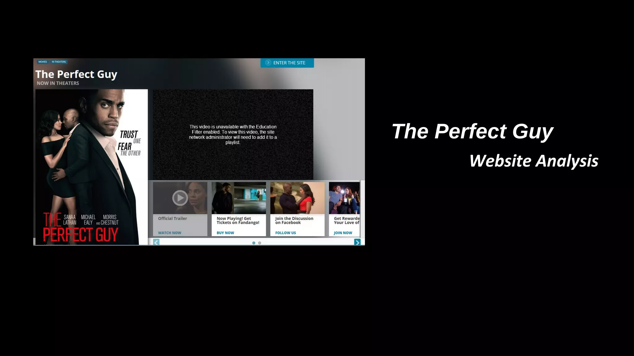
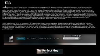
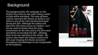
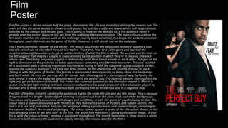
The Perfect Guy…
The Perfect Guy
Website Analysis
Title
sThe Perfect Guy doesn’t have its own website however can be found on the Song website due to them being the production company.The Perfect Guy doesn’t have its own website however can be found on the Song website due to them being the production company.
At the top of the page there are sub titles which say ‘Movie , Television ,Game and Social'. This is used to give a clear direction to otherAt the top of the page there are sub titles which say ‘Movie , Television ,Game and Social'. This is used to give a clear direction to other
products that are relate to Sony , as the audience of The Perfect Guy may be interested in Sony’s other work. This also helps to develop aproducts that are relate to Sony , as the audience of The Perfect Guy may be interested in Sony’s other work. This also helps to develop a
large audience for Sony helping with the support for future productions which is a typical convention for a production company especiallylarge audience for Sony helping with the support for future productions which is a typical convention for a production company especially
from the five Majors , six including Sony as the success of the company is rising. The sans serif font used adds a professional , modern imagefrom the five Majors , six including Sony as the success of the company is rising. The sans serif font used adds a professional , modern image
which suits the style of their 21 century films. The white colour used for the font allows the title to stand out and to be easily recognisable onwhich suits the style of their 21 century films. The white colour used for the font allows the title to stand out and to be easily recognisable on
the gradient black/grey background. The black background also helps to connote a thriller film as black is usually associated withthe gradient black/grey background. The black background also helps to connote a thriller film as black is usually associated with
thriller/horror film as it nicely compliments the films image as it helps add a sense of mystery .thriller/horror film as it nicely compliments the films image as it helps add a sense of mystery .
There are also links to social media sites on the webpage, this is used as a way for Sony to interact with their audiences for this film ,There are also links to social media sites on the webpage, this is used as a way for Sony to interact with their audiences for this film ,
keeping them updated and attract new people to go and watch the film. The links shown include links to the Facebook page , YouTube ,keeping them updated and attract new people to go and watch the film. The links shown include links to the Facebook page , YouTube ,
twitter and more .This is also a way for them to easily advertise the film spreading the film around attracting a wider audience. This alsotwitter and more .This is also a way for them to easily advertise the film spreading the film around attracting a wider audience. This also
connotes that the target audience for this film will be younger people as they're more likely to use social media and spread the film aroundconnotes that the target audience for this film will be younger people as they're more likely to use social media and spread the film around
on the internet .on the internet .
Background
The background for this webpage on the
Perfect Guy sticks to two main colours which
include white and black. This may off been
used to represent the theme of good vs evil
which is one of the main themes portrayed
during the film. Although the colours are
plain this still comes across as modern , as it
can be used to clearly show the main
conventions on the site such as the film cover
and detail surrounding the film , allowing
them to be eye catching to the viewer. The
colours also match the colours used on the
film cover keeping the theme consistent
throughout and allowing it to be recognisable
to the audience.
Film
Poster
The film poster is shown on over half the page , dominating the site and instantly catching the viewers eye. The
cover still has the same visuals as shown on the poster but just has a different layout which still helps connote
a thriller by the colours and images used. This is useful to have on the website as, if the audience haven’t
already seen the poster they can still see from the webpage the representation .The main colours used on the
film cover matches the colours used on the webpage (mainly black ad white), this keeps the website consistent
throughout , and also matches the genre of thriller ,however, it still stands out on the webpage.
The 3 main characters appear on the poster , the way in which they are positioned instantly suggest a love
triangle, which can be identified through the tagline ‘Trust One, Fear One‘ , this gives way apart of the
storyline allowing the audience to get an understanding of what the film is about. The women and the man on
the left suggest that they're a couple in love connoted by the position in which they're in ,looking into each
others eyes. Their body language suggest a relationship with their hands placed on each other .The guy on the
right is dominant on the poster as he takes up the space connoting he’s the main character. The way in which
he is positioned adds a sense of mystery to his character fitting in with the subgenre of psychological thriller ,
making the audience question if he’s the one to be feared. All the characters are smartly dressed in black
,fitting in with the genre of thriller. The female is represented stereotypically by being show in a black dress
and heels while the men are portrayed in the similar suits showing the in a stereotypical way, by having the
suits similar it makes the audience question which on is the perfect guy. The lighting is bright starting from the
right and get darker towards the left, this makes the audience question as the character played by Morris Is
shown in a bright light making him look innocent and portrayed a good compared to the character played by
Michael who is show in a darker mysterious light portraying him as mysterious and in a negative way.
The title of the film instantly catches the audiences eye as the enter the site and see this image. This is because
it is presented in a bright , bold red font allowing it to stand out from the plain black and white background..
The colour red is usually associated with danger and lust fitting in with the genre of psychological thriller. The
colour black is always associated with thrillers as they represent a sense of mystery and hidden secrets. The
text is in a san serif font which matches the webpage adding a professional and modern image, connoting to
the viewers that he’s the trusted perfect guy. The actors names appear in order of the characters shown on the
front allowing views to see who stars in the film. The white font maintains a classy professional image , it also
fits in with the colour scheme , keeping it consistent throughout. The month September is show also in a white
however is bold allowing the audience to clearly identify the release date for the film a
Trailer
This is probably the most important part on the webpage as the trailer
can attract an audience and gives them an understanding of what the
film is about. This takes up a third of the page ,placed next to the film
cover keeping the webpage consistent on all the things associated with
the film. The trailer dominates the page because as soon as the viewer
goes on the page , the video instantly begins to play instantly attracting
their attention , making them more interested and want to watch the
trailer. As this is the trailer it is more noticeable than the videos shown
below connoting its importance and how its aim is to catch the views
attention. This also has a link to YouTube allowing the users to watch
other videos associates with the film , attracting their interests and get
an inside view on who appears in the film and the behind the scenes
footage.
Smaller video’s
These also have links to YouTube involving the viewers once again. Theses are
placed below the main trailer connoting they’re less important on the site ,
however , this will still capture the viewers attention as they can automatically
go through each video .The titles of these videos include “watch , buy , follow or
join” which help include the viewers and almost commanding them to do this ,
adding to the popularity of the site and helping towards the advertisement of
the film.
Information
Below the trailer and film cover at the
bottom of the page there is information
regarding the film. As shown on the
image to the left the website provides
details about the film including : who’s
starring , the director , who’s it written by
,producer and executive producer. Theses
are used to attract the viewer as they can
see if there favourite actor/ess or direct is
involved in the film making them want to
watch it. The font sticks to the serif style
keeping the website consistent. The black
coloured writing allows it to stand out
from the white once again sticking to the
2 main colour schemes.
PIES
This webpage can link to PIES which Blumber and Katz suggest they meet the viewers needs.
Personal identity –This is because they're in control of the site and have the power to discover
information regarding the film which might reflect on them. The issue shown in the trailer might
off happened to a viewer such as ending a relationship or finding someone who they thought was
‘perfect’ then discovering they're not.
Informed- The webpage informs them about this new upcoming film attracting their attention.
The trailer allows them to be given hints to what the film involves. The poster indicates what the
characters look like and who they're played by.
Entertain – The trailer is the main entertainer on the page as it instantly attracts the viewers
attention and allows them to be given an insight into what the film is about. This could be used to
make them feel grateful that this hasn’t happened to them , so by watching the trailer it might
attract them to watch it as they want to find out the end result.
Social Interaction- The webpage instantly allows the audience to interact with the film. They are
given options to watch the trailer or other video surrounding the film , they can see the the film
cover and details abut the film or actor/ess below. This form of media mainly would attract a
young audience mainly teenagers aged 15 and over, so by having a clear layout and links to social
media t allows the film to be advertised which they can share with their friends.
Maslow's Hierarchy of
needs
The theory plays a significant role in advertising products and services.
Adverts and products play on audience’s need in order to consumer and/
or sell products.
This webpage meets the needs of its audience referring to Marlow as it
meets their cognitive needs and Love / belonging .The way it meets their
cognitive needs is by allowing them to explore the webpage which helps
them to understand the film in more detail which they gain by watching
the trailer or from the information provided below.
It also allows them to feel loved and belonged as this is a new upcoming
film so by watching the trailer it allows them to be able to discuss with
other what they think of the film and maybe attract them to go and
watch it.

Ppppppppppefrect

  • 1.
    The Perfect Guy… ThePerfect Guy Website Analysis
  • 2.
    Title sThe Perfect Guydoesn’t have its own website however can be found on the Song website due to them being the production company.The Perfect Guy doesn’t have its own website however can be found on the Song website due to them being the production company. At the top of the page there are sub titles which say ‘Movie , Television ,Game and Social'. This is used to give a clear direction to otherAt the top of the page there are sub titles which say ‘Movie , Television ,Game and Social'. This is used to give a clear direction to other products that are relate to Sony , as the audience of The Perfect Guy may be interested in Sony’s other work. This also helps to develop aproducts that are relate to Sony , as the audience of The Perfect Guy may be interested in Sony’s other work. This also helps to develop a large audience for Sony helping with the support for future productions which is a typical convention for a production company especiallylarge audience for Sony helping with the support for future productions which is a typical convention for a production company especially from the five Majors , six including Sony as the success of the company is rising. The sans serif font used adds a professional , modern imagefrom the five Majors , six including Sony as the success of the company is rising. The sans serif font used adds a professional , modern image which suits the style of their 21 century films. The white colour used for the font allows the title to stand out and to be easily recognisable onwhich suits the style of their 21 century films. The white colour used for the font allows the title to stand out and to be easily recognisable on the gradient black/grey background. The black background also helps to connote a thriller film as black is usually associated withthe gradient black/grey background. The black background also helps to connote a thriller film as black is usually associated with thriller/horror film as it nicely compliments the films image as it helps add a sense of mystery .thriller/horror film as it nicely compliments the films image as it helps add a sense of mystery . There are also links to social media sites on the webpage, this is used as a way for Sony to interact with their audiences for this film ,There are also links to social media sites on the webpage, this is used as a way for Sony to interact with their audiences for this film , keeping them updated and attract new people to go and watch the film. The links shown include links to the Facebook page , YouTube ,keeping them updated and attract new people to go and watch the film. The links shown include links to the Facebook page , YouTube , twitter and more .This is also a way for them to easily advertise the film spreading the film around attracting a wider audience. This alsotwitter and more .This is also a way for them to easily advertise the film spreading the film around attracting a wider audience. This also connotes that the target audience for this film will be younger people as they're more likely to use social media and spread the film aroundconnotes that the target audience for this film will be younger people as they're more likely to use social media and spread the film around on the internet .on the internet .
  • 3.
    Background The background forthis webpage on the Perfect Guy sticks to two main colours which include white and black. This may off been used to represent the theme of good vs evil which is one of the main themes portrayed during the film. Although the colours are plain this still comes across as modern , as it can be used to clearly show the main conventions on the site such as the film cover and detail surrounding the film , allowing them to be eye catching to the viewer. The colours also match the colours used on the film cover keeping the theme consistent throughout and allowing it to be recognisable to the audience.
  • 4.
    Film Poster The film posteris shown on over half the page , dominating the site and instantly catching the viewers eye. The cover still has the same visuals as shown on the poster but just has a different layout which still helps connote a thriller by the colours and images used. This is useful to have on the website as, if the audience haven’t already seen the poster they can still see from the webpage the representation .The main colours used on the film cover matches the colours used on the webpage (mainly black ad white), this keeps the website consistent throughout , and also matches the genre of thriller ,however, it still stands out on the webpage. The 3 main characters appear on the poster , the way in which they are positioned instantly suggest a love triangle, which can be identified through the tagline ‘Trust One, Fear One‘ , this gives way apart of the storyline allowing the audience to get an understanding of what the film is about. The women and the man on the left suggest that they're a couple in love connoted by the position in which they're in ,looking into each others eyes. Their body language suggest a relationship with their hands placed on each other .The guy on the right is dominant on the poster as he takes up the space connoting he’s the main character. The way in which he is positioned adds a sense of mystery to his character fitting in with the subgenre of psychological thriller , making the audience question if he’s the one to be feared. All the characters are smartly dressed in black ,fitting in with the genre of thriller. The female is represented stereotypically by being show in a black dress and heels while the men are portrayed in the similar suits showing the in a stereotypical way, by having the suits similar it makes the audience question which on is the perfect guy. The lighting is bright starting from the right and get darker towards the left, this makes the audience question as the character played by Morris Is shown in a bright light making him look innocent and portrayed a good compared to the character played by Michael who is show in a darker mysterious light portraying him as mysterious and in a negative way. The title of the film instantly catches the audiences eye as the enter the site and see this image. This is because it is presented in a bright , bold red font allowing it to stand out from the plain black and white background.. The colour red is usually associated with danger and lust fitting in with the genre of psychological thriller. The colour black is always associated with thrillers as they represent a sense of mystery and hidden secrets. The text is in a san serif font which matches the webpage adding a professional and modern image, connoting to the viewers that he’s the trusted perfect guy. The actors names appear in order of the characters shown on the front allowing views to see who stars in the film. The white font maintains a classy professional image , it also fits in with the colour scheme , keeping it consistent throughout. The month September is show also in a white however is bold allowing the audience to clearly identify the release date for the film a
  • 5.
    Trailer This is probablythe most important part on the webpage as the trailer can attract an audience and gives them an understanding of what the film is about. This takes up a third of the page ,placed next to the film cover keeping the webpage consistent on all the things associated with the film. The trailer dominates the page because as soon as the viewer goes on the page , the video instantly begins to play instantly attracting their attention , making them more interested and want to watch the trailer. As this is the trailer it is more noticeable than the videos shown below connoting its importance and how its aim is to catch the views attention. This also has a link to YouTube allowing the users to watch other videos associates with the film , attracting their interests and get an inside view on who appears in the film and the behind the scenes footage.
  • 6.
    Smaller video’s These alsohave links to YouTube involving the viewers once again. Theses are placed below the main trailer connoting they’re less important on the site , however , this will still capture the viewers attention as they can automatically go through each video .The titles of these videos include “watch , buy , follow or join” which help include the viewers and almost commanding them to do this , adding to the popularity of the site and helping towards the advertisement of the film.
  • 7.
    Information Below the trailerand film cover at the bottom of the page there is information regarding the film. As shown on the image to the left the website provides details about the film including : who’s starring , the director , who’s it written by ,producer and executive producer. Theses are used to attract the viewer as they can see if there favourite actor/ess or direct is involved in the film making them want to watch it. The font sticks to the serif style keeping the website consistent. The black coloured writing allows it to stand out from the white once again sticking to the 2 main colour schemes.
  • 8.
    PIES This webpage canlink to PIES which Blumber and Katz suggest they meet the viewers needs. Personal identity –This is because they're in control of the site and have the power to discover information regarding the film which might reflect on them. The issue shown in the trailer might off happened to a viewer such as ending a relationship or finding someone who they thought was ‘perfect’ then discovering they're not. Informed- The webpage informs them about this new upcoming film attracting their attention. The trailer allows them to be given hints to what the film involves. The poster indicates what the characters look like and who they're played by. Entertain – The trailer is the main entertainer on the page as it instantly attracts the viewers attention and allows them to be given an insight into what the film is about. This could be used to make them feel grateful that this hasn’t happened to them , so by watching the trailer it might attract them to watch it as they want to find out the end result. Social Interaction- The webpage instantly allows the audience to interact with the film. They are given options to watch the trailer or other video surrounding the film , they can see the the film cover and details abut the film or actor/ess below. This form of media mainly would attract a young audience mainly teenagers aged 15 and over, so by having a clear layout and links to social media t allows the film to be advertised which they can share with their friends.
  • 9.
    Maslow's Hierarchy of needs Thetheory plays a significant role in advertising products and services. Adverts and products play on audience’s need in order to consumer and/ or sell products. This webpage meets the needs of its audience referring to Marlow as it meets their cognitive needs and Love / belonging .The way it meets their cognitive needs is by allowing them to explore the webpage which helps them to understand the film in more detail which they gain by watching the trailer or from the information provided below. It also allows them to feel loved and belonged as this is a new upcoming film so by watching the trailer it allows them to be able to discuss with other what they think of the film and maybe attract them to go and watch it.
  • 10.
    Maslow's Hierarchy of needs Thetheory plays a significant role in advertising products and services. Adverts and products play on audience’s need in order to consumer and/ or sell products. This webpage meets the needs of its audience referring to Marlow as it meets their cognitive needs and Love / belonging .The way it meets their cognitive needs is by allowing them to explore the webpage which helps them to understand the film in more detail which they gain by watching the trailer or from the information provided below. It also allows them to feel loved and belonged as this is a new upcoming film so by watching the trailer it allows them to be able to discuss with other what they think of the film and maybe attract them to go and watch it.