Analysing film
posters
Faiza Wasim
Main image
Title of film
Tagline
Production
company
Actors starring
Website Date of release
Features of a film poster
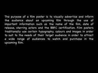
The purpose of a film poster is to visually advertise and inform
the audience about an upcoming film through the use of
important information such as the name of the film, date of
release, starring actors and the BBFC certification. Film posters
traditionally use certain typography, colours and images in order
to suit to the needs of their target audience in order to attract
a wide range of audiences to watch and purchase in the
upcoming film.
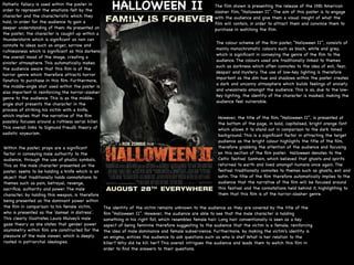
The film shown is presenting the release of the 1981 American
slasher film, “Halloween II”. The aim of this poster is to engage
with the audience and give them a visual insight of what the
film will contain, in order to attract them and convince them to
purchase in watching the film. 

The colour scheme of the film poster, “Halloween II”, consists of
mainly monochromatic colours such as black, white and grey,
which is significant in conveying the genre of the film to the
audience. The colours used are traditionally linked to themes
such as darkness which often connotes to the idea of evil, fear,
despair and mystery. The use of low-key lighting is therefore
important as the dim hue and shadows within the poster creates
a dark and uncanny atmosphere which builds feelings of anxiety
and uneasiness amongst the audience. This is as, due to the low-
key lighting, the identity of the character is masked, making the
audience feel vulnerable. 

However, the title of the film, “Halloween II”, is presented at
the bottom of the page, in bold, capitalised, bright orange font
which allows it to stand out in comparison to the dark toned
background. This is a significant factor in attracting the target
audience as the bright colour highlights the title of the film,
therefore grabbing the attention of the audience and focusing
on this section of the film poster. Halloween denotes to the
Celtic festival Samhain, which believed that ghosts and spirits
returned to earth and lived amongst humans once again. The
festival traditionally connotes to themes such as ghosts, evil and
satin. The title of the film therefore automatically implies to the
audience that the narrative of the film will be focused around
this festival and the connotations held behind it, highlighting to
them that this film is of the horror-slasher genre.

Pathetic fallacy is used within the poster in
order to represent the emotions felt by the
character and the characteristic which they
hold, in order for the audience to gain a
deeper understanding of them. As presented on
the poster, the character is caught up within a
thunderstorm which is significant as rain can
connote to ideas such as anger, sorrow and
ruthlessness which is significant as this darkens
the overall mood of the image, creating a
sinister atmosphere. This automatically makes
the audience aware that this film is of the
horror genre which therefore attracts horror
fanatics to purchase in this film. Furthermore,
the middle-angle shot used within the poster is
also important in reinforcing the horror-slasher
genre to the audience. This is as the middle-
angle shot presents the character in the
process of striking his victim with a knife,
which implies that the narrative of the film
possibly focuses around a ruthless serial killer.
This overall links to Sigmund Freud’s theory of
sadistic voyeurism.

Within the poster, props are a significant
factor in conveying male authority to the
audience, through the use of phallic symbols.
This as the male character presented on the
poster, seems to be holding a knife which is an
object that traditionally holds connotations to
themes such as pain, betrayal, revenge,
sacrifice, authority and power. The male
character, by holding this weapon, is therefore
being presented as the dominant power within
the film in comparison to his female victim,
who is presented as the ‘damsel in distress’.
This clearly illustrates Laura Mulvey’s male
gaze theory as she states that gender power
asymmetry within film are constructed for the
pleasure of the male viewer, which is deeply
rooted in patriarchal ideologies. 

The identity of the victim remains unknown to the audience as they are covered by the title of the
film “Halloween II”. However, the audience are able to see that the male character is holding
something in his right fist, which resembles female hair. Long hair conventionally is seen as a key
aspect of being feminine therefore suggesting to the audience that the victim is a female, reinforcing
the idea of male dominance and female subservience. Furthermore, by making the victim's identity is
an enigma, entices the audience to ask questions such as who is she? What is her relation to the
killer? Why did he kill her? This overall intrigues the audience and leads them to watch this film in
order to find the answers to their questions.
HALLOWEEN II
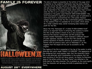
The date of release is presented at the bottom of the page which
is essential as the audience traditionally read top-down, meaning
that this will be the final section of the poster which the audience
will look at. This, therefore, will ensure that the date of release
will be imprinted in the audience’s mind, which allows them to know
when the film is out in cinema so they can watch it. The date
presented on the poster reads “AUGUST 28TH EVERYWHERE”. The
word “everywhere” is significant as no specific year of publication is
mentioned which is unconventional for a film poster. However
instead, this suggests that the film is distributed globally, indicating
to the audience that it is available for all to watch, which allows
for a wider audience base, overall increasing sales revenue and
profit for the film.
Above the title, “Halloween II”, it states “A ROB ZOMBIE FILM”
which is an important factor in attracting the audience to watch
this film as Rob Zombie is known to be a very successful
American film director, screenwriter and film producer. Rob
Zombie created “Halloween I” which received a sufficient amount
of public appraisal, resulting it to win four film awards. This
positive reputation of director attracts an audience who are
familiar with his previous work, such as “Halloween I”, as this
suggests that the sequel will be just as successful as the
original. 

The tagline of the film is presented at the top of the poster in white
distorted font which reads “FAMILY IS FOREVER”. The appearance of
the disfigured font could possibly imply that the character’s family
life is also distorted, which foreshadows to the audience that the
main narrative of the film will focus around his family. Furthermore,
some of the letters within the word “family” are reflected in the
knife held by the male character. This is symbolic as this could signify
that the character will be using this knife to potentially kill his
family.
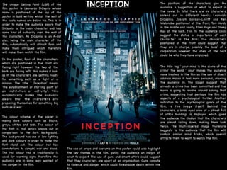
INCEPTION The positions of the characters give the
audience a suggestion of what to expect in
the movie. In total there are six characters,
spread out in different levels; Leonardo
DiCaprio, Joseph Gordon-Levitt and Ken
Watanabe positioned at the front, Tom Hardy
in the middle and finally, Ellen Page and Dileep
Rao at the back. This to the audience could
suggest the status or importance of each
character in the film; the characters
positioned at the front could suggest that
they are in charge, possibly the boss' of a
cooperation however the ones at the back
could be who they have employed. 

The Unique Selling Point (USP) of the
film poster is Leonardo DiCaprio whose
name is positioned at the top of the
poster in bold writing whilst the rest of
the casts names are below his. This is in
order to make the audience aware that
DiCaprio is the main character and has
some kind of authority over the rest of
the characters. As DiCaprio is an A-list
star, being the main character of the
film, automatically will attract fans and
make them intrigued which therefore
will make them watch the film.
In the poster, four of the characters
which are positioned in the front are
facing right however the two at the
back are facing left; this makes it look
as if the characters are getting ready
for something such as a fight or a
mission. The title ' Inception' means
'the establishment or starting point of
an institution or activity'. This
automatically makes the audience
aware that the characters are
preparing themselves for something big
such as a war.

The colour scheme of the poster is
mainly dark colours such as blacks,
greys, whites and reds. The colour of
the font is red, which stands out in
comparison to the dark background.
The background has use of low lighting
and dark colours in order to make the
font stand out. The colour red has
connotations to danger, war and blood.
The red colour red is traditionally is
used for warning signs therefore the
audience are in some way warned of
the danger in the film. 

The use of props and costume on the poster could also highlight
the key themes in the film, giving the audience an insight of
what to expect. The use of guns and smart attire could suggest
that they characters are apart of an organisation. Guns connote
to violence and danger which could foreshadow death within the
film. 

The title tag ' your mind is the scene of the
crime' the word ' your' makes the audience
more involved in the film as the use of direct
address makes it feel more personal, drawing
the audience in. The slogan suggest that
already a crime has been committed and the
movie is going to revolve around solving that
crime, suggesting that perhaps the film has
aspects of a psychological thriller. Another
indication to the psychological genre of the
film, is the image itself. Behind the
characters, a birds eyed view of a street full
of office buildings is displayed which gives
the audience the illusion that the characters
are almost falling down, making them look
twice. The multi-layered image therefore
suggests to the audience that the film will
contain similar mind tricks, which overall
attracts them to want to watch the film.
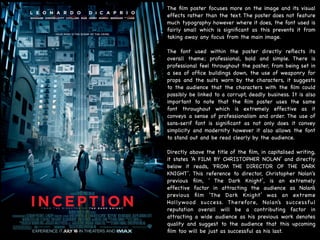
The film poster focuses more on the image and its visual
effects rather than the text. The poster does not feature
much typography however where it does, the font used is
fairly small which is significant as this prevents it from
taking away any focus from the main image. 

The font used within the poster directly reflects its
overall theme; professional, bold and simple. There is
professional feel throughout the poster, from being set in
a sea of office buildings down, the use of weaponry for
props and the suits worn by the characters, it suggests
to the audience that the characters with the film could
possibly be linked to a corrupt, deadly business. It is also
important to note that the film poster uses the same
font throughout which is extremely effective as it
conveys a sense of professionalism and order. The use of
sans-serif font is significant as not only does it convey
simplicity and modernity however it also allows the font
to stand out and be read clearly by the audience.

Directly above the title of the film, in capitalised writing,
it states ‘A FILM BY CHRISTOPHER NOLAN’ and directly
below it reads, 'FROM THE DIRECTOR OF THE DARK
KNIGHT’. This reference to director, Christopher Nolan's
previous film, ' The Dark Knight’, is an extremely
effective factor in attracting the audience as Nolan’s
previous film ‘The Dark Knight’ was an extreme
Hollywood success. Therefore, Nolan’s successful
reputation overall will be a contributing factor in
attracting a wide audience as his previous work denotes
quality and suggest to the audience that this upcoming
film too will be just as successful as his last.
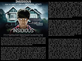
INSIDIOUS The colour scheme of the film poster, “Insidious”, consists of cold
tones such as blue, grey and white which is significant in conveying
an unsettling atmosphere amongst the audience. This is as the
colours used traditionally linked to themes such as darkness, evil,
coldness, mystery which are all themes closely linked to the horror
genre. The use of nature and dark, misty clouds within the
background are also reinforces the sinister atmosphere to the
audience. Flowers and plants traditionally represent growth and
beauty however the plants featured within the background are
rotten and dead. Traditionally, decayed flowers often signify death,
vengeance or something broken which is significant as this could be
reflective of the themes featured within the film.

Within the background of the image a hand of what appears like a
demon is shown in the back, reaching its hand out in the direction of
the boy. This overall could possibly foreshadow that within the film,
the young boy will been possessed by an evil spirit, hence his
scribble eyes. This idea is reinforced by the tagline displayed directly
below the title which reads “IT’S NOT THE HOUSE THAT’S
HAUNTED’. This overall puts a plot twist on the narrative of the film
and probes many questions amongst the audience overall creating a
sense of mystery. This therefore attracts the audience to watch the
film in order to gain the answers required for their questions.
Furthermore, the use of a child antagonist is extremely effective in
building up fear and creating an anxious feeling amongst the
audience as there's nothing we consider more innocent than the
child. Therefore when the innocence is lost and a child become the
primal force of evil, it adds a factor of shock amongst the audience.

Children are often linked to themes such as innocence and purity
however this traditional notion is subverted within the poster
presented on the left. The main image featured on the poster is a
medium angle shot of a young expressionless boy, dressed in a red
shirt with both his eyes scribbled out. The use of character’s clothing
not only gives the audience an indication that he is the main
antagonist within the film, however it also conveys binary opposition.
This is as, flannel shirts are often clothing which are seen to be
worn by children therefore connoting a sense of innocence however,
the colour red on the other hand is a direct representation of evil.
This use of binary opposition therefore represents the conflict
between the child’s innocent and his corruption of evil.
The background presents an establishing shot of a white coloured house which could suggest
to the audience that the house is of significance throughout the film. The white coloured
house and the silhouette of the demon within it conveys the binary opposition of good and
evil. This is as the colour white links to themes such as goodness and purity however a demon
holds paranormal connotations which are closely linked to evil. This could therefore possibly
imply to the audience that the house is where the demon inhabits. 

On the right hand side of the poster, there are five star ratings of the film and an audience’s
positive review of the film. Specific words from the sentence however are highlighted such as
‘SO SCARY’ and ‘SHEER TERROR’ in order to catch the attention of horror fanatics who are
interested in being frightened. Similarly, at the top centre of the film poster, in large
capitalised writing it states ‘ FROM THE MAKERS OF SAW AND PARANORMAL ACTIVITY’.
This is an effective technique in selling the film to the audience as people trust the work of
directors and producers whose previous films have been a success. Both films, ‘Saw’ and
‘Paranormal Activity’ have been horror success’ therefore by highlighting that the film is
produced by the same creators, makes the audience assume that this film also will follow in
the same footsteps and be a success.

Poster Analysis- Faiza Wasim

  • 1.
  • 2.
    Main image Title offilm Tagline Production company Actors starring Website Date of release Features of a film poster
  • 3.
    The purpose ofa film poster is to visually advertise and inform the audience about an upcoming film through the use of important information such as the name of the film, date of release, starring actors and the BBFC certification. Film posters traditionally use certain typography, colours and images in order to suit to the needs of their target audience in order to attract a wide range of audiences to watch and purchase in the upcoming film.
  • 4.
    The film shownis presenting the release of the 1981 American slasher film, “Halloween II”. The aim of this poster is to engage with the audience and give them a visual insight of what the film will contain, in order to attract them and convince them to purchase in watching the film. The colour scheme of the film poster, “Halloween II”, consists of mainly monochromatic colours such as black, white and grey, which is significant in conveying the genre of the film to the audience. The colours used are traditionally linked to themes such as darkness which often connotes to the idea of evil, fear, despair and mystery. The use of low-key lighting is therefore important as the dim hue and shadows within the poster creates a dark and uncanny atmosphere which builds feelings of anxiety and uneasiness amongst the audience. This is as, due to the low- key lighting, the identity of the character is masked, making the audience feel vulnerable. However, the title of the film, “Halloween II”, is presented at the bottom of the page, in bold, capitalised, bright orange font which allows it to stand out in comparison to the dark toned background. This is a significant factor in attracting the target audience as the bright colour highlights the title of the film, therefore grabbing the attention of the audience and focusing on this section of the film poster. Halloween denotes to the Celtic festival Samhain, which believed that ghosts and spirits returned to earth and lived amongst humans once again. The festival traditionally connotes to themes such as ghosts, evil and satin. The title of the film therefore automatically implies to the audience that the narrative of the film will be focused around this festival and the connotations held behind it, highlighting to them that this film is of the horror-slasher genre. Pathetic fallacy is used within the poster in order to represent the emotions felt by the character and the characteristic which they hold, in order for the audience to gain a deeper understanding of them. As presented on the poster, the character is caught up within a thunderstorm which is significant as rain can connote to ideas such as anger, sorrow and ruthlessness which is significant as this darkens the overall mood of the image, creating a sinister atmosphere. This automatically makes the audience aware that this film is of the horror genre which therefore attracts horror fanatics to purchase in this film. Furthermore, the middle-angle shot used within the poster is also important in reinforcing the horror-slasher genre to the audience. This is as the middle- angle shot presents the character in the process of striking his victim with a knife, which implies that the narrative of the film possibly focuses around a ruthless serial killer. This overall links to Sigmund Freud’s theory of sadistic voyeurism. Within the poster, props are a significant factor in conveying male authority to the audience, through the use of phallic symbols. This as the male character presented on the poster, seems to be holding a knife which is an object that traditionally holds connotations to themes such as pain, betrayal, revenge, sacrifice, authority and power. The male character, by holding this weapon, is therefore being presented as the dominant power within the film in comparison to his female victim, who is presented as the ‘damsel in distress’. This clearly illustrates Laura Mulvey’s male gaze theory as she states that gender power asymmetry within film are constructed for the pleasure of the male viewer, which is deeply rooted in patriarchal ideologies. The identity of the victim remains unknown to the audience as they are covered by the title of the film “Halloween II”. However, the audience are able to see that the male character is holding something in his right fist, which resembles female hair. Long hair conventionally is seen as a key aspect of being feminine therefore suggesting to the audience that the victim is a female, reinforcing the idea of male dominance and female subservience. Furthermore, by making the victim's identity is an enigma, entices the audience to ask questions such as who is she? What is her relation to the killer? Why did he kill her? This overall intrigues the audience and leads them to watch this film in order to find the answers to their questions. HALLOWEEN II
  • 5.
    The date ofrelease is presented at the bottom of the page which is essential as the audience traditionally read top-down, meaning that this will be the final section of the poster which the audience will look at. This, therefore, will ensure that the date of release will be imprinted in the audience’s mind, which allows them to know when the film is out in cinema so they can watch it. The date presented on the poster reads “AUGUST 28TH EVERYWHERE”. The word “everywhere” is significant as no specific year of publication is mentioned which is unconventional for a film poster. However instead, this suggests that the film is distributed globally, indicating to the audience that it is available for all to watch, which allows for a wider audience base, overall increasing sales revenue and profit for the film. Above the title, “Halloween II”, it states “A ROB ZOMBIE FILM” which is an important factor in attracting the audience to watch this film as Rob Zombie is known to be a very successful American film director, screenwriter and film producer. Rob Zombie created “Halloween I” which received a sufficient amount of public appraisal, resulting it to win four film awards. This positive reputation of director attracts an audience who are familiar with his previous work, such as “Halloween I”, as this suggests that the sequel will be just as successful as the original. The tagline of the film is presented at the top of the poster in white distorted font which reads “FAMILY IS FOREVER”. The appearance of the disfigured font could possibly imply that the character’s family life is also distorted, which foreshadows to the audience that the main narrative of the film will focus around his family. Furthermore, some of the letters within the word “family” are reflected in the knife held by the male character. This is symbolic as this could signify that the character will be using this knife to potentially kill his family.
  • 6.
    INCEPTION The positionsof the characters give the audience a suggestion of what to expect in the movie. In total there are six characters, spread out in different levels; Leonardo DiCaprio, Joseph Gordon-Levitt and Ken Watanabe positioned at the front, Tom Hardy in the middle and finally, Ellen Page and Dileep Rao at the back. This to the audience could suggest the status or importance of each character in the film; the characters positioned at the front could suggest that they are in charge, possibly the boss' of a cooperation however the ones at the back could be who they have employed. The Unique Selling Point (USP) of the film poster is Leonardo DiCaprio whose name is positioned at the top of the poster in bold writing whilst the rest of the casts names are below his. This is in order to make the audience aware that DiCaprio is the main character and has some kind of authority over the rest of the characters. As DiCaprio is an A-list star, being the main character of the film, automatically will attract fans and make them intrigued which therefore will make them watch the film. In the poster, four of the characters which are positioned in the front are facing right however the two at the back are facing left; this makes it look as if the characters are getting ready for something such as a fight or a mission. The title ' Inception' means 'the establishment or starting point of an institution or activity'. This automatically makes the audience aware that the characters are preparing themselves for something big such as a war. The colour scheme of the poster is mainly dark colours such as blacks, greys, whites and reds. The colour of the font is red, which stands out in comparison to the dark background. The background has use of low lighting and dark colours in order to make the font stand out. The colour red has connotations to danger, war and blood. The red colour red is traditionally is used for warning signs therefore the audience are in some way warned of the danger in the film. The use of props and costume on the poster could also highlight the key themes in the film, giving the audience an insight of what to expect. The use of guns and smart attire could suggest that they characters are apart of an organisation. Guns connote to violence and danger which could foreshadow death within the film. The title tag ' your mind is the scene of the crime' the word ' your' makes the audience more involved in the film as the use of direct address makes it feel more personal, drawing the audience in. The slogan suggest that already a crime has been committed and the movie is going to revolve around solving that crime, suggesting that perhaps the film has aspects of a psychological thriller. Another indication to the psychological genre of the film, is the image itself. Behind the characters, a birds eyed view of a street full of office buildings is displayed which gives the audience the illusion that the characters are almost falling down, making them look twice. The multi-layered image therefore suggests to the audience that the film will contain similar mind tricks, which overall attracts them to want to watch the film.
  • 7.
    The film posterfocuses more on the image and its visual effects rather than the text. The poster does not feature much typography however where it does, the font used is fairly small which is significant as this prevents it from taking away any focus from the main image. The font used within the poster directly reflects its overall theme; professional, bold and simple. There is professional feel throughout the poster, from being set in a sea of office buildings down, the use of weaponry for props and the suits worn by the characters, it suggests to the audience that the characters with the film could possibly be linked to a corrupt, deadly business. It is also important to note that the film poster uses the same font throughout which is extremely effective as it conveys a sense of professionalism and order. The use of sans-serif font is significant as not only does it convey simplicity and modernity however it also allows the font to stand out and be read clearly by the audience. Directly above the title of the film, in capitalised writing, it states ‘A FILM BY CHRISTOPHER NOLAN’ and directly below it reads, 'FROM THE DIRECTOR OF THE DARK KNIGHT’. This reference to director, Christopher Nolan's previous film, ' The Dark Knight’, is an extremely effective factor in attracting the audience as Nolan’s previous film ‘The Dark Knight’ was an extreme Hollywood success. Therefore, Nolan’s successful reputation overall will be a contributing factor in attracting a wide audience as his previous work denotes quality and suggest to the audience that this upcoming film too will be just as successful as his last.
  • 8.
    INSIDIOUS The colourscheme of the film poster, “Insidious”, consists of cold tones such as blue, grey and white which is significant in conveying an unsettling atmosphere amongst the audience. This is as the colours used traditionally linked to themes such as darkness, evil, coldness, mystery which are all themes closely linked to the horror genre. The use of nature and dark, misty clouds within the background are also reinforces the sinister atmosphere to the audience. Flowers and plants traditionally represent growth and beauty however the plants featured within the background are rotten and dead. Traditionally, decayed flowers often signify death, vengeance or something broken which is significant as this could be reflective of the themes featured within the film. Within the background of the image a hand of what appears like a demon is shown in the back, reaching its hand out in the direction of the boy. This overall could possibly foreshadow that within the film, the young boy will been possessed by an evil spirit, hence his scribble eyes. This idea is reinforced by the tagline displayed directly below the title which reads “IT’S NOT THE HOUSE THAT’S HAUNTED’. This overall puts a plot twist on the narrative of the film and probes many questions amongst the audience overall creating a sense of mystery. This therefore attracts the audience to watch the film in order to gain the answers required for their questions. Furthermore, the use of a child antagonist is extremely effective in building up fear and creating an anxious feeling amongst the audience as there's nothing we consider more innocent than the child. Therefore when the innocence is lost and a child become the primal force of evil, it adds a factor of shock amongst the audience. Children are often linked to themes such as innocence and purity however this traditional notion is subverted within the poster presented on the left. The main image featured on the poster is a medium angle shot of a young expressionless boy, dressed in a red shirt with both his eyes scribbled out. The use of character’s clothing not only gives the audience an indication that he is the main antagonist within the film, however it also conveys binary opposition. This is as, flannel shirts are often clothing which are seen to be worn by children therefore connoting a sense of innocence however, the colour red on the other hand is a direct representation of evil. This use of binary opposition therefore represents the conflict between the child’s innocent and his corruption of evil. The background presents an establishing shot of a white coloured house which could suggest to the audience that the house is of significance throughout the film. The white coloured house and the silhouette of the demon within it conveys the binary opposition of good and evil. This is as the colour white links to themes such as goodness and purity however a demon holds paranormal connotations which are closely linked to evil. This could therefore possibly imply to the audience that the house is where the demon inhabits. On the right hand side of the poster, there are five star ratings of the film and an audience’s positive review of the film. Specific words from the sentence however are highlighted such as ‘SO SCARY’ and ‘SHEER TERROR’ in order to catch the attention of horror fanatics who are interested in being frightened. Similarly, at the top centre of the film poster, in large capitalised writing it states ‘ FROM THE MAKERS OF SAW AND PARANORMAL ACTIVITY’. This is an effective technique in selling the film to the audience as people trust the work of directors and producers whose previous films have been a success. Both films, ‘Saw’ and ‘Paranormal Activity’ have been horror success’ therefore by highlighting that the film is produced by the same creators, makes the audience assume that this film also will follow in the same footsteps and be a success.