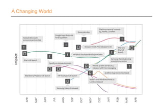
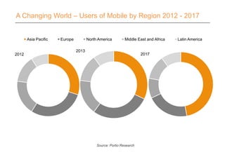
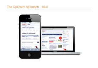
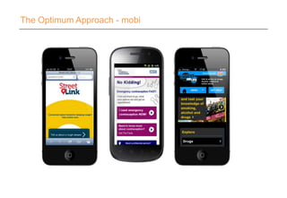
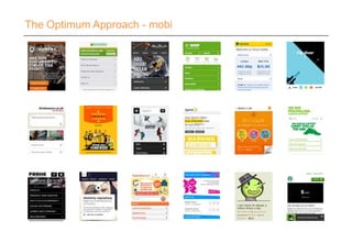
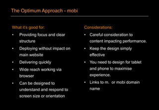
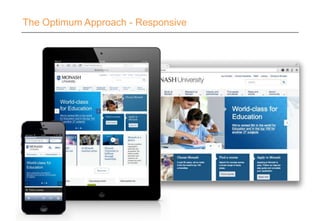
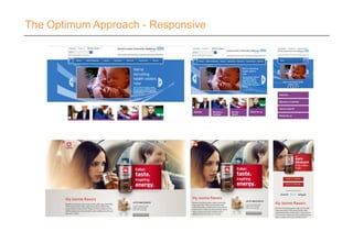
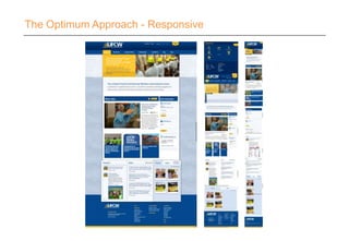
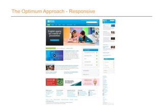
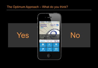
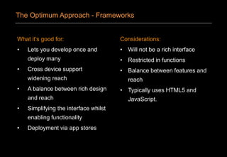
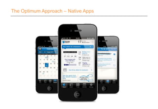
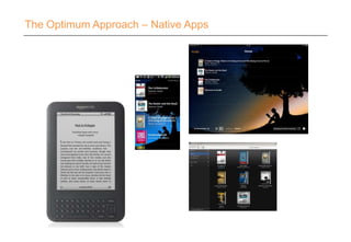
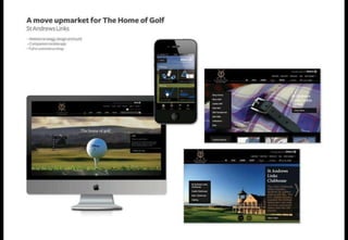
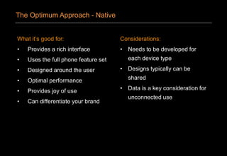
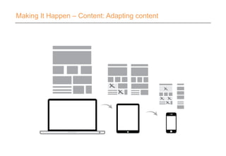
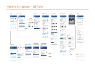
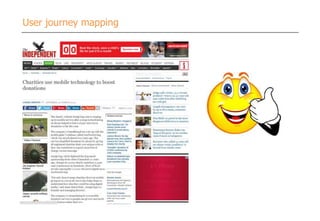
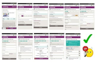
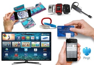
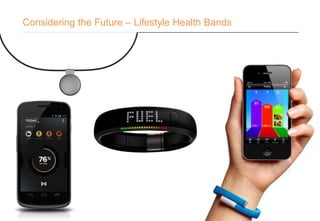
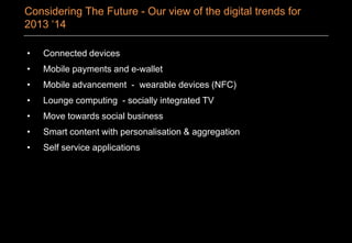
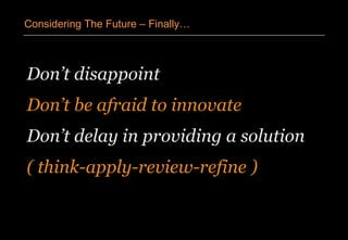
13th Aug, 2013
Putting Mobile First
@precedent##PrecSem
John Campbell
Head of Mobile
Mark Baillie
Creative Director
Mobile whitepaper series
1. Optimising Mobile
2. Targeting Mobile
3
1. A Changing World
2. What Are My Options?
3. Design Considerations
4. The Optimum Approach
5. Making It Happen
6. Considering The Future
Putting Mobile First
A Changing World
A Changing World – Google I/O
A Changing World - Stats…
2013
Asia Pacific Europe North America Middle East and Africa Latin America
A Changing World – Users of Mobile by Region 2012 - 2017
2012
Source: Portio Research
2017
Australia Brazil China India Italy Russia South
Korea
Turkey UK US
0%
10%
20%
30%
40%
50%
60%
70%
80%
90%
100%
SMS Web Browsing Email Social Networking Apps Streaming Music Instant Messaging Video/Mobile TV
A Changing World – Activities performed by Smartphone
Users at Least Once a Month
Source: Nielsen, (February 2013) via: mobiThinking
A Changing World – The Surge Towards Tablet
GlobalUnitsShipped(MMs)
Global PC (Desktop / Notebook) and Tablet Shipments by Quarter (Q1: 1995 - Q1: 2013)
Source: Katy Huberty, Ehud Gelblum, Morgan Stanley Research. Gartner. Data as of 4/13. Note: Notebook PCs include Net books
A Changing World – What Do Your Customers Use?
Smart TV
Blackberry Windows
iOS
Android
A Changing World – Tablets
A Changing World – Mobile Operating System by Region
EuropeAustralia
June 2012 to May 2013
Asia
iOS Android SymbianOS Other
Source: Stat Counter – Global Stat Counter - http://gs.statcounter.com/
1. A Changing World
2. What Are My Options?
3. Design Considerations
4. The Optimum Approach
5. Making It Happen
6. Considering The Future
Putting Mobile First
Take the time to
understand your user’s
behaviour and context.
What Are My Options?
1. Typically has short bursts of activity
2. Often is time restricted
3. Is goal driven
4. Loves using his phone - joy of use
5. Tells others of a good experience
6. Needs a simple uncomplicated experience
What Are My Options? – Remember a Mobile User…
Take the opportunity
to innovate in design
and function.
What Are My Options?
What Are My Options? – Mathew Algie - Ethical Coffee
Campaign
What Are My Options?
Mobi
Responsive
Hybrid Apps
Native Framework Web App
Feed Aggregators
What Are My Options? – Roll It - App or Web?
1. A Changing World
2. What Are My Options?
3. Design Considerations
4. The Optimum Approach
5. Making It Happen
6. Considering The Future
Putting Mobile First
‘
’
Design Considerations
Effective mobile designs not only
account for these one thumb/one eyeball
experiences but aim to optimize for them
as well.
Luke Wroblewski – Mobile First
Design Considerations – Common Language
Design Considerations – Hit Areas
Recognition
Putting a picture to either a person
or a place:
‘Meet Bob the new council
member for your area’
Or
‘Drop by the new office on
Flinders Lane’
Description
Where a specific item is better
described visually:
‘We will be rolling out new
wheely bins to replace our old
ones, they will look like this:’
Or
‘Our new Series 125fx is the
fastest widget on the market and
comes in blue!’
Design Considerations - Images
Design Considerations – Responsive layouts
Design Considerations - Reach
Right hand
Easy
Average
Hard
Left hand
Easy
Average
Hard
1. A Changing World
2. What Are My Options?
3. Design Considerations
4. The Optimum Approach
5. Making It Happen
6. Considering The Future
Putting Mobile First
The Optimum Approach - mobi
What it’s good for:
• Providing focus and clear
structure
• Deploying without impact on
main website
• Delivering quickly
• Wide reach working via
browser
• Can be designed to
understand and respond to
screen size or orientation
Considerations:
• Careful consideration to
content impacting performance.
• Keep the design simply
effective
• You need to design for tablet
and phone to maximise
experience.
• Links to m. or mobi domain
name
The Optimum Approach - mobi
The Optimum Approach - Responsive
What it’s good for:
• Reflows the same content
from the website
• Content is presented on all
devices and screen sizes.
• Architecture of the site
remaining the same
• Single update of content
Considerations:
• Cannot apply a different tone of
voice for mobile usage.
• Experience not built around the
user or context
• Requires to think in % and not
fixed width
• Supported screen size has to
be chosen
The Optimum Approach - Responsive
‘
’
The Optimum Approach - Responsive
It's cheap but degrading to reuse content
and design across diverging media
forms like print vs. online or desktop vs.
mobile. Superior UX requires tight
platform integration.
Jakob Neilsen – 21st May 2012
The Optimum Approach - Responsive
The Optimum Approach – Hybrid Apps
Are apps going out
of fashion?
The Optimum Approach – What do you think?
Yes No
The Optimum Approach – What do you think?
The Optimum Approach - Frameworks
What it’s good for:
• Lets you develop once and
deploy many
• Cross device support
widening reach
• A balance between rich design
and reach
• Simplifying the interface whilst
enabling functionality
• Deployment via app stores
Considerations:
• Will not be a rich interface
• Restricted in functions
• Balance between features and
reach
• Typically uses HTML5 and
JavaScript.
The Optimum Approach - Frameworks
The Optimum Approach – Native Apps
The Optimum Approach – iButterfly
Leeds College of Music
What it’s good for:
• Provides a rich interface
• Uses the full phone feature set
• Designed around the user
• Optimal performance
• Provides joy of use
• Can differentiate your brand
Considerations:
• Needs to be developed for
each device type
• Designs typically can be
shared
• Data is a key consideration for
unconnected use
The Optimum Approach - Native
The Optimum Approach
The Optimum Approach - Feeds
1. A Changing World
2. What Are My Options?
3. Design Considerations
4. The Optimum Approach
5. Making It Happen
6. Considering The Future
Putting Mobile First
From the ground up:
• Custom approaches
• Considered context
• Specific content
From pre-existing:
• Desktop applied to mobile
• Stress / break points
• Reworked content
Making It Happen - Content
Making It Happen – Content: Mobile First
Making It Happen – Content: Adapting content
Don’t just follow the web
Move from a 4 to 6 step process
Making It Happen – UI Flow
User journey mapping
NARRATING THE STORIES IS CRUCIAL
TO GATHERING SUPPORT FOR BIGGER CHANGE
Creating engaging online experiences for ACI ‘s customers, James Downes, UX Director, Precedent 2012
Digital glass
What happens the morning after?
So many ways to enjoy
Advice from the communityThe barman’s guide in your pocket
Virtual cheers
Digital tasting
Giraffes on the loose
Match my mood to a drink
Cross link blogs
Get better advocates
Cooking with whisky What would Dr Bill say?
The Sixteen…
A moment of calm
Whisky doesn’t equal drunk
Augmented drink finder
Wearable tech
Tweet my glass!
How do I get started?
Acoustic zoning
Will it blend?
The Labrador effect
A slice of class
Mapping the way forward
‘
’
Making It Happen - Images
What about performance?
Won’t a lot of images slow down the
mobile experience?
Making It Happen – Images
‘
’
Making It Happen – Data Integration
Users are sympathetic to poor network
coverage and adjust their expectations
when WIFI isn’t available.
‘
’
Making It Happen – Data Integration
Users are NOT sympathetic to poor
network coverage and adjust their
expectations when WIFI isn’t available.
1. Ensure your existing web API
does not bundle unnecessary
data with requests for data
2. Expand your API to deal with
short, quick requests and
hook it into your CMS solution
as soon as possible
3. FEO is vital. Use mobile
optimisation and analytics
tools to see where your
delivery speeds can be
improved
4. Track user interaction in your
app using an analytics tool
Making It Happen – Data Integration – 4 Key points
Making It Happen – Data Integration
‘
’
Making It Happen – Resource and Process
The more channels I run, the more
resource I’ll need, right?
Making It Happen – Resource and Process
1. A Changing World
2. What Are My Options?
3. Design Considerations
4. The Optimum Approach
5. Making It Happen
6. Considering The Future
Putting Mobile First
Considering the Future – Lifestyle Health Bands
Considering The Future
Considering The Future – Remember it’s a Phone!
‘
’
Considering The Future
If you want the Internet to be
everywhere it has to be visible nowhere.
It has to be
unseen, unnoticed, undiscussed.
David St. Charles - Integrated Systems Inc. (Wired 1996)
SpaceBook is a speech-driven, hands-
free, eyes-free device for pedestrian navigation
and exploration.
Considering The Future - PrecedentLabs
Considering The Future – PrecEvents – Out of the Box!
Considering The Future – New mobile platforms in 2013
• Connected devices
• Mobile payments and e-wallet
• Mobile advancement - wearable devices (NFC)
• Lounge computing - socially integrated TV
• Move towards social business
• Smart content with personalisation & aggregation
• Self service applications
Considering The Future - Our view of the digital trends for
2013 ‘14
Don’t disappoint
Don’t be afraid to innovate
Don’t delay in providing a solution
( think-apply-review-refine )
Considering The Future – Finally…
Think big.
Start small.
Act Quickly.
Smart thinking wins…
Considering The Future – Finally…
120 experts
Strategy & research
Branding & communications
User-centred design
Development & hosting
Digital marketing
Years24 Experience
Quality
Stability
Loyalty
Results
LONDON
EDINBURGH
CARDIFF
PERTH
MELBOURNE
HONG KONG
Who we work with
Find our Precedent group
on LinkedIn for a chance to
find out more about our
seminars, network, share
ideas and quiz the Precedent
team on seminar issues and
more!
and follow us on
twitter.com/Precedentcomms
for Precedent news, seminar
info and general observations.

Mobile First London 13 August

  • 2.
    13th Aug, 2013 PuttingMobile First @precedent##PrecSem John Campbell Head of Mobile Mark Baillie Creative Director
  • 3.
    Mobile whitepaper series 1.Optimising Mobile 2. Targeting Mobile 3
  • 4.
    1. A ChangingWorld 2. What Are My Options? 3. Design Considerations 4. The Optimum Approach 5. Making It Happen 6. Considering The Future Putting Mobile First
  • 5.
  • 6.
    A Changing World– Google I/O
  • 7.
    A Changing World- Stats…
  • 8.
    2013 Asia Pacific EuropeNorth America Middle East and Africa Latin America A Changing World – Users of Mobile by Region 2012 - 2017 2012 Source: Portio Research 2017
  • 9.
    Australia Brazil ChinaIndia Italy Russia South Korea Turkey UK US 0% 10% 20% 30% 40% 50% 60% 70% 80% 90% 100% SMS Web Browsing Email Social Networking Apps Streaming Music Instant Messaging Video/Mobile TV A Changing World – Activities performed by Smartphone Users at Least Once a Month Source: Nielsen, (February 2013) via: mobiThinking
  • 10.
    A Changing World– The Surge Towards Tablet GlobalUnitsShipped(MMs) Global PC (Desktop / Notebook) and Tablet Shipments by Quarter (Q1: 1995 - Q1: 2013) Source: Katy Huberty, Ehud Gelblum, Morgan Stanley Research. Gartner. Data as of 4/13. Note: Notebook PCs include Net books
  • 11.
    A Changing World– What Do Your Customers Use? Smart TV Blackberry Windows iOS Android
  • 12.
    A Changing World– Tablets
  • 13.
    A Changing World– Tablets
  • 14.
    A Changing World– Tablets
  • 15.
    A Changing World– Mobile Operating System by Region EuropeAustralia June 2012 to May 2013 Asia iOS Android SymbianOS Other Source: Stat Counter – Global Stat Counter - http://gs.statcounter.com/
  • 16.
    1. A ChangingWorld 2. What Are My Options? 3. Design Considerations 4. The Optimum Approach 5. Making It Happen 6. Considering The Future Putting Mobile First
  • 17.
    Take the timeto understand your user’s behaviour and context. What Are My Options?
  • 19.
    1. Typically hasshort bursts of activity 2. Often is time restricted 3. Is goal driven 4. Loves using his phone - joy of use 5. Tells others of a good experience 6. Needs a simple uncomplicated experience What Are My Options? – Remember a Mobile User…
  • 20.
    Take the opportunity toinnovate in design and function. What Are My Options?
  • 22.
    What Are MyOptions? – Mathew Algie - Ethical Coffee Campaign
  • 23.
    What Are MyOptions? Mobi Responsive Hybrid Apps Native Framework Web App Feed Aggregators
  • 24.
    What Are MyOptions? – Roll It - App or Web?
  • 25.
    1. A ChangingWorld 2. What Are My Options? 3. Design Considerations 4. The Optimum Approach 5. Making It Happen 6. Considering The Future Putting Mobile First
  • 26.
    ‘ ’ Design Considerations Effective mobiledesigns not only account for these one thumb/one eyeball experiences but aim to optimize for them as well. Luke Wroblewski – Mobile First
  • 27.
  • 28.
  • 29.
    Recognition Putting a pictureto either a person or a place: ‘Meet Bob the new council member for your area’ Or ‘Drop by the new office on Flinders Lane’ Description Where a specific item is better described visually: ‘We will be rolling out new wheely bins to replace our old ones, they will look like this:’ Or ‘Our new Series 125fx is the fastest widget on the market and comes in blue!’ Design Considerations - Images
  • 30.
    Design Considerations –Responsive layouts
  • 31.
    Design Considerations -Reach Right hand Easy Average Hard Left hand Easy Average Hard
  • 32.
    1. A ChangingWorld 2. What Are My Options? 3. Design Considerations 4. The Optimum Approach 5. Making It Happen 6. Considering The Future Putting Mobile First
  • 33.
  • 34.
  • 35.
  • 36.
    What it’s goodfor: • Providing focus and clear structure • Deploying without impact on main website • Delivering quickly • Wide reach working via browser • Can be designed to understand and respond to screen size or orientation Considerations: • Careful consideration to content impacting performance. • Keep the design simply effective • You need to design for tablet and phone to maximise experience. • Links to m. or mobi domain name The Optimum Approach - mobi
  • 37.
  • 38.
  • 39.
  • 40.
  • 41.
    What it’s goodfor: • Reflows the same content from the website • Content is presented on all devices and screen sizes. • Architecture of the site remaining the same • Single update of content Considerations: • Cannot apply a different tone of voice for mobile usage. • Experience not built around the user or context • Requires to think in % and not fixed width • Supported screen size has to be chosen The Optimum Approach - Responsive
  • 42.
    ‘ ’ The Optimum Approach- Responsive It's cheap but degrading to reuse content and design across diverging media forms like print vs. online or desktop vs. mobile. Superior UX requires tight platform integration. Jakob Neilsen – 21st May 2012
  • 43.
  • 44.
    The Optimum Approach– Hybrid Apps
  • 45.
    Are apps goingout of fashion? The Optimum Approach – What do you think?
  • 46.
    Yes No The OptimumApproach – What do you think?
  • 47.
  • 48.
    What it’s goodfor: • Lets you develop once and deploy many • Cross device support widening reach • A balance between rich design and reach • Simplifying the interface whilst enabling functionality • Deployment via app stores Considerations: • Will not be a rich interface • Restricted in functions • Balance between features and reach • Typically uses HTML5 and JavaScript. The Optimum Approach - Frameworks
  • 49.
    The Optimum Approach– Native Apps
  • 50.
    The Optimum Approach– Native Apps
  • 51.
    The Optimum Approach– Native Apps
  • 52.
    The Optimum Approach– Native Apps
  • 53.
    The Optimum Approach– iButterfly
  • 54.
  • 55.
    What it’s goodfor: • Provides a rich interface • Uses the full phone feature set • Designed around the user • Optimal performance • Provides joy of use • Can differentiate your brand Considerations: • Needs to be developed for each device type • Designs typically can be shared • Data is a key consideration for unconnected use The Optimum Approach - Native
  • 56.
  • 57.
  • 58.
    1. A ChangingWorld 2. What Are My Options? 3. Design Considerations 4. The Optimum Approach 5. Making It Happen 6. Considering The Future Putting Mobile First
  • 59.
    From the groundup: • Custom approaches • Considered context • Specific content From pre-existing: • Desktop applied to mobile • Stress / break points • Reworked content Making It Happen - Content
  • 60.
    Making It Happen– Content: Mobile First
  • 61.
    Making It Happen– Content: Adapting content
  • 62.
    Don’t just followthe web Move from a 4 to 6 step process
  • 63.
    Making It Happen– UI Flow
  • 64.
  • 66.
    NARRATING THE STORIESIS CRUCIAL TO GATHERING SUPPORT FOR BIGGER CHANGE Creating engaging online experiences for ACI ‘s customers, James Downes, UX Director, Precedent 2012
  • 68.
    Digital glass What happensthe morning after? So many ways to enjoy Advice from the communityThe barman’s guide in your pocket Virtual cheers Digital tasting Giraffes on the loose Match my mood to a drink Cross link blogs Get better advocates Cooking with whisky What would Dr Bill say? The Sixteen… A moment of calm Whisky doesn’t equal drunk Augmented drink finder Wearable tech Tweet my glass! How do I get started? Acoustic zoning Will it blend? The Labrador effect A slice of class
  • 70.
  • 71.
    ‘ ’ Making It Happen- Images What about performance? Won’t a lot of images slow down the mobile experience?
  • 72.
    Making It Happen– Images
  • 73.
    ‘ ’ Making It Happen– Data Integration Users are sympathetic to poor network coverage and adjust their expectations when WIFI isn’t available.
  • 74.
    ‘ ’ Making It Happen– Data Integration Users are NOT sympathetic to poor network coverage and adjust their expectations when WIFI isn’t available.
  • 75.
    1. Ensure yourexisting web API does not bundle unnecessary data with requests for data 2. Expand your API to deal with short, quick requests and hook it into your CMS solution as soon as possible 3. FEO is vital. Use mobile optimisation and analytics tools to see where your delivery speeds can be improved 4. Track user interaction in your app using an analytics tool Making It Happen – Data Integration – 4 Key points
  • 76.
    Making It Happen– Data Integration
  • 77.
    ‘ ’ Making It Happen– Resource and Process The more channels I run, the more resource I’ll need, right?
  • 78.
    Making It Happen– Resource and Process
  • 79.
    Making It Happen– Resource and Process
  • 80.
    1. A ChangingWorld 2. What Are My Options? 3. Design Considerations 4. The Optimum Approach 5. Making It Happen 6. Considering The Future Putting Mobile First
  • 82.
    Considering the Future– Lifestyle Health Bands
  • 83.
  • 84.
    Considering The Future– Remember it’s a Phone!
  • 85.
    ‘ ’ Considering The Future Ifyou want the Internet to be everywhere it has to be visible nowhere. It has to be unseen, unnoticed, undiscussed. David St. Charles - Integrated Systems Inc. (Wired 1996)
  • 86.
    SpaceBook is aspeech-driven, hands- free, eyes-free device for pedestrian navigation and exploration. Considering The Future - PrecedentLabs
  • 87.
    Considering The Future– PrecEvents – Out of the Box!
  • 88.
    Considering The Future– New mobile platforms in 2013
  • 89.
    Considering The Future– New mobile platforms in 2013
  • 90.
    • Connected devices •Mobile payments and e-wallet • Mobile advancement - wearable devices (NFC) • Lounge computing - socially integrated TV • Move towards social business • Smart content with personalisation & aggregation • Self service applications Considering The Future - Our view of the digital trends for 2013 ‘14
  • 91.
    Don’t disappoint Don’t beafraid to innovate Don’t delay in providing a solution ( think-apply-review-refine ) Considering The Future – Finally…
  • 92.
    Think big. Start small. ActQuickly. Smart thinking wins… Considering The Future – Finally…
  • 96.
    120 experts Strategy &research Branding & communications User-centred design Development & hosting Digital marketing
  • 97.
  • 98.
  • 99.
  • 101.
    Find our Precedentgroup on LinkedIn for a chance to find out more about our seminars, network, share ideas and quiz the Precedent team on seminar issues and more! and follow us on twitter.com/Precedentcomms for Precedent news, seminar info and general observations.

Editor's Notes

  • #2 Mary Meeker - “Queen of the Net” (Partner at VC Kleiner Perkins Caufield & Byers)Just presented her new 'Internet Trends' at the Wall Street Journal D11 Conference last week.Technology cycles have tended to last ten years1960s - Mainframe Computing 1970s - Mini Computing1980s - Personal Computing1990s - Desktop Internet Computing2000s - Mobile Internet Computing2014+ - Wearable/Everywhere Computing
  • #3 What’s changed… chat through the key events in the past yearPick a trend … Siri & free messaging 9challenge to BBerry
  • #4 Google Glass. Seems daft now but…
  • #5 So now you are all inspired lets see if we can bring things back down to earth.
  • #6 Mobile OS by region statsProfile your audience – look at key parameters, for example operating systemsConsider global regions differently (iOSin Australia compared with Asia)
  • #7 Mobile OS by region statsProfile your audience – look at key parameters, for example operating systemsConsider global regions differently (iOSin Australia compared with Asia)
  • #8 Diagram: Mary Meeker at the Wall Street Journal D11 Conference May 29 2013The uptake of tablets has been rocket like surpassing desktop and notebook PC’s less than 3 years after they were first introducedPredicted sales of tablets will surge from 72.7 million in 2011 to 383.3 million in 2017
  • #13 Mobile OS by region statsProfile your audience – look at key parameters, for example operating systemsConsider global regions differently (iOSin Australia compared with Asia)
  • #14 Average person looks at their phone 150 times a day most of these are very brief interactionsDesign needs to accommodate for these very brief interactions
  • #15 Use existing visual shortcuts for essential operations. These are already emerging as standards so don’t reinvent the wheel.Hamburger icon = menuCircular arrow = refreshMagnifying glass = searchCog = settingsThumb = like
  • #16 People interact with touch-based user interfaces with their fingers. So user interface controls have to be big enough to capture fingertip actions without frustrating users with erroneous actions and tiny targets. Apple - 44pxWindows – 9mmNokia – between 7 and 8mmThe average finger pad is 10-14mm with the fingertip being 8-10mmWhat does this mean? Don’t make tiny links and tiny spaces…
  • #17 Two types of essential photographic imageRecognitionDescriptionAll other images can be rationalised for a better mobile experience.
  • #18 Placing navigation elements off screen and moving them on screen as needed allows for the greatest flexibility in navigationOther elements can move about but it is worth remembering some of the core online principlesThe user will still click on a logo to go homeUsers will skim read so key points should be highlighted somehow
  • #19 Screen design needs to take into consideration the device it will inhabit.These diagrams illustrate the average user reachThings that you don’t want a user to hit by mistake need to sit up in the orange areaWith the longest reach area running top to bottom we can expect most scrolling will occur in these areas (and therefore the thumb will hover there)
  • #20 Mobile browser basedStandard mobiWeb app mobiUsually have their own IACost effectiveLightweightWide reach
  • #22 The spectrum of mobi
  • #23 One website, that flows across multiple devicesBrowser basedSame content delivered to all usersMonashTacticalDigital business transformation
  • #24 CLCHIlly coffee
  • #25 The United Food and Commercial Workers International UnionReflow crazySame content all reflowed
  • #26 Responsive design is not always the optimal solutionBritish CouncilRemoving and adapting content to reduce the number of scrolls for the user
  • #28 My issue with responsive design is when it becomes lowest common denominator design, 'working' on all screens but not excelling on any. – Roan Lavery (Free Agent)
  • #29 Responsive frameworks such as The Golden Grid system
  • #30 One website, that flows across multiple devicesBrowser basedSame content delivered to all users
  • #32 Examples of some framework providers
  • #33 Mobile browser basedStandard mobiWeb app mobi
  • #34 Clear by RealmacSoftware
  • #35 Paper by 53
  • #36 Whisper sync – Apple changing the in app purchase policy (amazon mobi to the rescue)
  • #37 Use on the go
  • #38 Use on the go
  • #39 Use on the go
  • #40 There are two approachesEither is fine
  • #41 2. Is probably the most comfortable fit given you already have Corporate website; Microsite ; Campaign site is fine
  • #42 TescoBank UI flow
  • #67 You can gain competitive advantage through this understanding in any sector
  • #68 Some earlier ideas around effortless innovation with digital
  • #69 Just some pointers drawn out from our ideas of how to innovate and make a splash
  • #70 Glenmorangie digital touch points – focus on social alignment and opportunities
  • #71 You will likely have at least some imagery in a mobile solution and you want them to look their best. These will range from your logo and iconography to richer elements like image galleries and product shots. The basic answer is ‘Yes’ it will slow down the experience so really think about using the ‘right’ images in the ‘right’ place.
  • #72 Scrum for mobile solutions
  • #73 Not true!
  • #74 Not true!
  • #76 Digital bloat
  • #77 Digital bloatAvoid digital bloat by monitoring the effectiveness of your channels and adjust your resourcing accordingly
  • #78 Scrum for mobile solutions
  • #79 BlipparJawbonePebbleSmart TVVuzixPingit from BarclaysbankSquare (Credit card reader)
  • #80 Misfit ShineCrowdfunded through KickstarterRaised $846,675 (USD)Retails at $99 (USD) Due to ship July 2013iOS only at launchNike Fuel BandPart of the successful Nike+ rangeRetails at $149 (USD)iOS onlyJawbone UpRetails at $149.95 (AUD)iOS and Android
  • #81 Combank?
  • #82 Chinese taxi appsSay your current location and where you are going and a voice message is sent to all nearby available taxisView the taxi's location in realtime and then push to talk directly to the driver to co-ordinate pickup
  • #83 Digital bloat
  • #84 Ubantu for phonesFirefox OSTizen
  • #85 Ubantu for phonesFirefox OSTizen