The document provides annotations for three graphic layouts for movie posters promoting a romantic drama film about characters Terry and May.
Poster one depicts Terry and May standing closely together, with their heads on each other's shoulders and paint strokes covering their eyes in dull grey and blue tones. Poster two shows an intimate close-up of Terry and May almost kissing in red and brown tones. Poster three features only the characters' hugging red and brown jackets against a black backdrop, symbolizing the relationship between the contrasting characters.
All three posters emphasize mystery and gloom through subdued color palettes and blocking that hints at intimacy between the characters without revealing details of the plot. Text is kept minimal and ghostly
Describing the style and layout in detail (moodboard and sketches).pdfClaraHennig
discussing layout conventions in detail. Explain how my posters will be presented. Made
reference to fonts, colours, imagery, type of camera shots, picture placement etc. linking to conventions of drama/ romance posters
Instructions for Submissions thorugh G- Classroom.pptxJheel Barad
This presentation provides a briefing on how to upload submissions and documents in Google Classroom. It was prepared as part of an orientation for new Sainik School in-service teacher trainees. As a training officer, my goal is to ensure that you are comfortable and proficient with this essential tool for managing assignments and fostering student engagement.
How to Make a Field invisible in Odoo 17Celine George
It is possible to hide or invisible some fields in odoo. Commonly using “invisible” attribute in the field definition to invisible the fields. This slide will show how to make a field invisible in odoo 17.
Welcome to TechSoup New Member Orientation and Q&A (May 2024).pdfTechSoup
In this webinar you will learn how your organization can access TechSoup's wide variety of product discount and donation programs. From hardware to software, we'll give you a tour of the tools available to help your nonprofit with productivity, collaboration, financial management, donor tracking, security, and more.
Students, digital devices and success - Andreas Schleicher - 27 May 2024..pptxEduSkills OECD
Andreas Schleicher presents at the OECD webinar ‘Digital devices in schools: detrimental distraction or secret to success?’ on 27 May 2024. The presentation was based on findings from PISA 2022 results and the webinar helped launch the PISA in Focus ‘Managing screen time: How to protect and equip students against distraction’ https://www.oecd-ilibrary.org/education/managing-screen-time_7c225af4-en and the OECD Education Policy Perspective ‘Students, digital devices and success’ can be found here - https://oe.cd/il/5yV
How to Create Map Views in the Odoo 17 ERPCeline George
The map views are useful for providing a geographical representation of data. They allow users to visualize and analyze the data in a more intuitive manner.
The Art Pastor's Guide to Sabbath | Steve ThomasonSteve Thomason
What is the purpose of the Sabbath Law in the Torah. It is interesting to compare how the context of the law shifts from Exodus to Deuteronomy. Who gets to rest, and why?
GIÁO ÁN DẠY THÊM (KẾ HOẠCH BÀI BUỔI 2) - TIẾNG ANH 8 GLOBAL SUCCESS (2 CỘT) N...
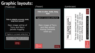
Graphic Layouts & Annotated sketched layouts
1. Graphic layouts:
Main image will be of
Terry and May's
jackets hugging
Tagline in a scrawly white font
Date in a slightly thicker and small
font
Channel
four logo
Main image of Terry
and May almost
kissing (extreme
close up)
Tagline in a scrawly white font
Channel
four logo
Age
certificate
(15)
Title in slim, bold, long
font
Title in slightly scrawly, bold,
long font (small)
(Landscape)
The
two
stood
heads
on
each
others'
shoulders
with
paint
strokes
over
their
eyes-
red
and
brown
reflecting
their
colours
Title
in
slightly
scrawly,
bold,
long
font
Tagline
in
a
scrawly
white
font
Age
certificate
(15)
Channel
four
logo
(Teaser)
(Theatrical)
2. Poster one (annotation) • My idea for poster one (landscape) is to have the composition of characters May and
Terry stood together (centrally)- with Terry’s head perched on May’s shoulder and
May’s head settled on Terry’s shoulder. May’s eyes will be closed as Terry looks
forward ‘at the audience’ set to a blank background and with paint strokes smeared
over the two’s eyes. I believe the blocking of the two characters comes off as
intimate enough to fit the romance genre conventions of a poster whilst the solid
backdrop and lack of colour fits the drama genre's conventions
• The saturation of colour will be dull and grey to emphasis a ghostly, dreary theme
establishing the films sorrowful tone- I might incorporate blue highlights to
exaggerate this gloomy vibe. The background will not have a setting or location but
instead a solid white backdrop that will not only fit the conventions of a drama poster
but create a hallow atmosphere that isolates the two characters- informing
the audience this is solely a tale on them and their relationship.
• Performance wise May will have her head resting on Terry's shoulder (vice versa) as
May’s eyes are peacefully closed- like she's asleep- and Terry’s are wide open
ominously staring in our (the spectators) direction. There will be little to no emotion
shown on either face, leaving their relationship/ feelings for one another a mystery
and instead will be straight faced to further create an unsettling narrative for the
film- somethings not right here. Having Terry’s eyes open and not mays alludes to
her knowing something we don’t- nor May- and encourages audiences to want to
watch to find out.
• There won't be that much Mise En Scene apart from the costumes that will be black
turtlenecks that will give off the effect that the two are one in the same as the colour
blurs the line between the two’s separate figures and gives off the effect they are
literally attached to one another- I took influence here from the concept of posters
like Persona (1966) that tackle themes of two being the same.
• Text should be bold but thin- shifted for a ghostly effect at the bottom of the poster,
alongside the billing block, age rating and client's logo. I want the text to be a bright
white so its noticeable but not to thick to take away the attention from the title- as I
believe that the films title is what audiences need to take away in order to ensure
that they’ll go and see it. Moreover I had both ‘actors’ names at the top as a call
back to romantic comedies' posters, warping the text a little to add a twist on the
3. Poster two (annotation)
• the theatrical release - I wanted to go back to the composition used by posters
such as Talk to her (2002) and Persona (1966) used that is of the two
characters blocking to appear like one of the same. The pair would be framed
in a extreme close up, In a near kiss but never touching- representing not only
the pairs past feelings for one another but the themes of wistfulness, the
longing of the past. Moreover I wanted to incorporate the two’s signature
colours to add cohesiveness to the poster’s campaign whilst reflecting the
intimate theme of the film.
• Performance wise, there will be a slight reluctance from both models when
posing ( having them never really kiss) leaning back their heads a smidge and
express an almost sorrowful frown or scowl to reflect the pairs ill feelings
towards each other yet conveying their love through the blocking and how
close they are. Again, Incorporating this theme of letting go with the pairs
hesitance to let one another leave.
• The colours- though I considered black and white (as that’s the colour pallet-
lack of- of the film) I eventually landed on red and brown to correlate to
their personalities and more so add cohesiveness to all three posters. The red
and brown pallet will not be too bold but dark, as it adds to the mysterious
quality of the identity of both characters. I overall want the poster feel gloomy
to embody the glum mood of the film.
• Text- the title will be in the same font as the previous- shifted for a
ghostly effect, in the centre of the poster, with the scrawny tagline running
along under it , the *coming soon* / date will be at the bottom alongside the
age rating, the clients logo and the billing block
4. Poster three (annotation)
• For poster three- the teaser I wanted to look more into the symbolism with the
pair’s coats- I wanted to utilize another convention of drama posters with
iconography- the red and brown coats embolic of May and Terry- without giving
anything away and building up excitement and mystery around the film for
audiences
• Once again I wanted to avoid a chaotic, busy background, rather, I wanted to use a
solid black backdrop- allowing absolute focus on the foreground, both the brown and
red jackets should be bursting with colours/ highlights and shadows to really make
them pop.
• The coats themselves will be hugging, but their owners won't be visible- much like
the Lobster (2011) poster- this is symbolic of the blending of beliefs- the red leather
jacket of Terry: unapologetic, dangerous, lustful, passionate (a rebel) -that I took
inspiration from Rebel without a cause (1955) to reflect Terrys altruistic outlook on
the future. and the brown suede of may: old fashioned, sentimental, conserved ( a
conformist) they don’t belong together- the colours even being almost nothing
alike- yet red (with some mixing) can make brown- I want that to say something
about terry and mays relationship- they're not meant to be but one tailors to the
other. The coats more so symbolizes the much-needed warmth the pair need; the
sheltering they need from the cold world they live in.
• Performance wise, the models (though they will be edited out) should be tense and
almost gripping onto one another rather than gently holding- reflecting mays fear of
letting go. This will create some texture and tones in the jackets, like creases and
stretches from how tightly the opposing jacket is clinging on.
• Text- the title will be in the same font as the previous two- shifted for a ghostly
effect, at the top of the poster, underneath will be the films tagline to give
something that audiences can remember the *coming soon* / date will be at the
bottom alongside the age rating and the client's logo