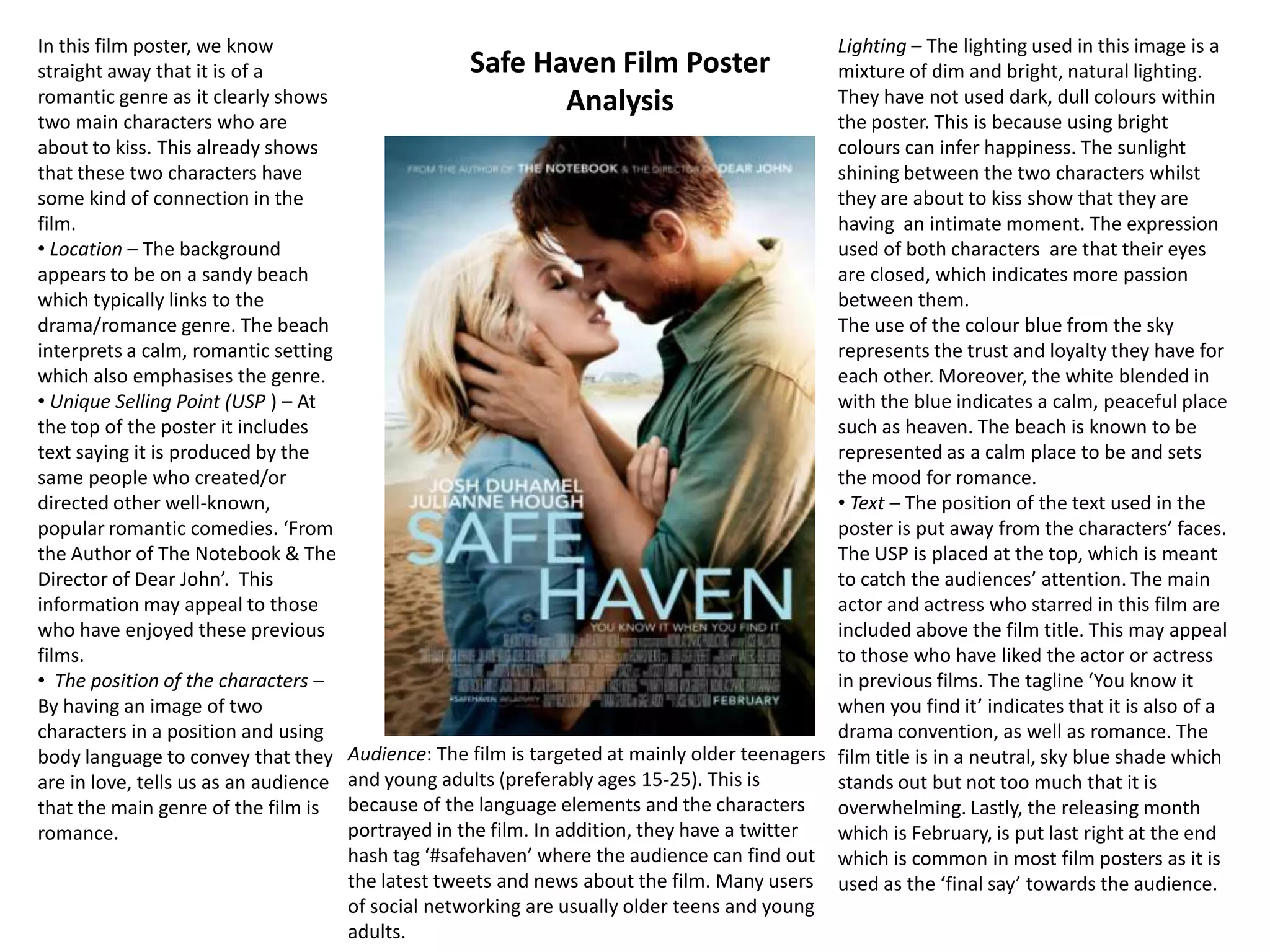
The document analyzes three different film posters:
1) Forgetting Sarah Marshall film poster - Targets older teenagers and young adults. Depicts a romantic comedy with elements of a love triangle.
2) Hard Candy film poster - Indicates it is a thriller aimed at older teenagers and young adults. Features a young girl in danger to depict the thriller elements.
3) Red Riding Hood film poster - Suggests it is a dark fantasy/horror film targeting Twilight fans ages 15-25. Draws upon the Little Red Riding Hood fairy tale with danger symbolized by the color red.
This is my film poster analysis where I have been able to look at the conventions of drama / Teen drama film posters so I can use them in my product later on in production.
Macroeconomics- Movie Location
This will be used as part of your Personal Professional Portfolio once graded.
Objective:
Prepare a presentation or a paper using research, basic comparative analysis, data organization and application of economic information. You will make an informed assessment of an economic climate outside of the United States to accomplish an entertainment industry objective.
The Roman Empire A Historical Colossus.pdfkaushalkr1407
The Roman Empire, a vast and enduring power, stands as one of history's most remarkable civilizations, leaving an indelible imprint on the world. It emerged from the Roman Republic, transitioning into an imperial powerhouse under the leadership of Augustus Caesar in 27 BCE. This transformation marked the beginning of an era defined by unprecedented territorial expansion, architectural marvels, and profound cultural influence.
The empire's roots lie in the city of Rome, founded, according to legend, by Romulus in 753 BCE. Over centuries, Rome evolved from a small settlement to a formidable republic, characterized by a complex political system with elected officials and checks on power. However, internal strife, class conflicts, and military ambitions paved the way for the end of the Republic. Julius Caesar’s dictatorship and subsequent assassination in 44 BCE created a power vacuum, leading to a civil war. Octavian, later Augustus, emerged victorious, heralding the Roman Empire’s birth.
Under Augustus, the empire experienced the Pax Romana, a 200-year period of relative peace and stability. Augustus reformed the military, established efficient administrative systems, and initiated grand construction projects. The empire's borders expanded, encompassing territories from Britain to Egypt and from Spain to the Euphrates. Roman legions, renowned for their discipline and engineering prowess, secured and maintained these vast territories, building roads, fortifications, and cities that facilitated control and integration.
The Roman Empire’s society was hierarchical, with a rigid class system. At the top were the patricians, wealthy elites who held significant political power. Below them were the plebeians, free citizens with limited political influence, and the vast numbers of slaves who formed the backbone of the economy. The family unit was central, governed by the paterfamilias, the male head who held absolute authority.
Culturally, the Romans were eclectic, absorbing and adapting elements from the civilizations they encountered, particularly the Greeks. Roman art, literature, and philosophy reflected this synthesis, creating a rich cultural tapestry. Latin, the Roman language, became the lingua franca of the Western world, influencing numerous modern languages.
Roman architecture and engineering achievements were monumental. They perfected the arch, vault, and dome, constructing enduring structures like the Colosseum, Pantheon, and aqueducts. These engineering marvels not only showcased Roman ingenuity but also served practical purposes, from public entertainment to water supply.
Introduction to AI for Nonprofits with Tapp NetworkTechSoup
Dive into the world of AI! Experts Jon Hill and Tareq Monaur will guide you through AI's role in enhancing nonprofit websites and basic marketing strategies, making it easy to understand and apply.
Embracing GenAI - A Strategic ImperativePeter Windle
Artificial Intelligence (AI) technologies such as Generative AI, Image Generators and Large Language Models have had a dramatic impact on teaching, learning and assessment over the past 18 months. The most immediate threat AI posed was to Academic Integrity with Higher Education Institutes (HEIs) focusing their efforts on combating the use of GenAI in assessment. Guidelines were developed for staff and students, policies put in place too. Innovative educators have forged paths in the use of Generative AI for teaching, learning and assessments leading to pockets of transformation springing up across HEIs, often with little or no top-down guidance, support or direction.
This Gasta posits a strategic approach to integrating AI into HEIs to prepare staff, students and the curriculum for an evolving world and workplace. We will highlight the advantages of working with these technologies beyond the realm of teaching, learning and assessment by considering prompt engineering skills, industry impact, curriculum changes, and the need for staff upskilling. In contrast, not engaging strategically with Generative AI poses risks, including falling behind peers, missed opportunities and failing to ensure our graduates remain employable. The rapid evolution of AI technologies necessitates a proactive and strategic approach if we are to remain relevant.
Palestine last event orientationfvgnh .pptxRaedMohamed3
An EFL lesson about the current events in Palestine. It is intended to be for intermediate students who wish to increase their listening skills through a short lesson in power point.
2024.06.01 Introducing a competency framework for languag learning materials ...Sandy Millin
http://sandymillin.wordpress.com/iateflwebinar2024
Published classroom materials form the basis of syllabuses, drive teacher professional development, and have a potentially huge influence on learners, teachers and education systems. All teachers also create their own materials, whether a few sentences on a blackboard, a highly-structured fully-realised online course, or anything in between. Despite this, the knowledge and skills needed to create effective language learning materials are rarely part of teacher training, and are mostly learnt by trial and error.
Knowledge and skills frameworks, generally called competency frameworks, for ELT teachers, trainers and managers have existed for a few years now. However, until I created one for my MA dissertation, there wasn’t one drawing together what we need to know and do to be able to effectively produce language learning materials.
This webinar will introduce you to my framework, highlighting the key competencies I identified from my research. It will also show how anybody involved in language teaching (any language, not just English!), teacher training, managing schools or developing language learning materials can benefit from using the framework.
Instructions for Submissions thorugh G- Classroom.pptxJheel Barad
This presentation provides a briefing on how to upload submissions and documents in Google Classroom. It was prepared as part of an orientation for new Sainik School in-service teacher trainees. As a training officer, my goal is to ensure that you are comfortable and proficient with this essential tool for managing assignments and fostering student engagement.
Operation “Blue Star” is the only event in the history of Independent India where the state went into war with its own people. Even after about 40 years it is not clear if it was culmination of states anger over people of the region, a political game of power or start of dictatorial chapter in the democratic setup.
The people of Punjab felt alienated from main stream due to denial of their just demands during a long democratic struggle since independence. As it happen all over the word, it led to militant struggle with great loss of lives of military, police and civilian personnel. Killing of Indira Gandhi and massacre of innocent Sikhs in Delhi and other India cities was also associated with this movement.
2. • Expression – The man wearing all black
(Russell Brand) is looking at the camera,
whereas the female character is looking at
him and the other man (Jason Segel) is
looking at her. This conveys the idea of a
‘love triangle’. RB’s character is shown
looking straight at the camera which shows
he is quite arrogant and self centred. It
appears as if he thinks more of himself
than the girl he is holding.
• Text – The poster includes directing
information ‘From the guys who brought
you Knocked Up & The 40 Year Old Virgin’.
This may be useful for the audience as it is
mainly targeting at those who have
enjoyed those previous films directed by
the same people. Also, as it is in a red font
against natural colours such as blue and
white, it stands out in order for the viewers
to see. This is the Unique Selling Point
(USP) of the film.
The releasing information is presented at
the bottom of the poster ‘In Cinemas April
23’ which allow the audience to know
when it is going to be released.
The tagline of the film is ‘A comedy about
getting dumped and taking it like a man’.
This reinforces that it is has aspects of both
comedy and romance.
In addition, the font colour used is mainly
light blue which may suggest a lighthearted
film.
• Audience – I would say this film is mainly
aimed at older teenagers and young adults
(ages 15-25) as the text such as the tagline
has the same language elements to it.
Forgetting Sarah Marshall Film
Poster Analysis (Class Example
Analysis)
Also, the film’s website is presented at the
bottom of the poster. This shows that the
audience is mainly those who use social
networking which are mainly older teens and
young adults. The characters played in the film
are also young adults.
The picture depicts a romantic comedy
film. For example:
• The heart shaped cloud – Suggests
possible elements of romance,
although the arrow through it may
show signs of heartbreak in the film.
• Location – The poster is set on a sandy
beach which may indicate that the
characters are on holiday, preferably
somewhere such as Hawaii. We think
this because of the props/images used
such as the flower garland, Hawaiian
styled flower print shirt and the clear,
blue sky.
• The position of the characters – The
couple who are shown closer to the
camera are more of importance.
Whereas, the man in the background
looks out of place and not as important.
The connotation to this is that we can
sense his loneliness and how
disappointed he feels. This is used to
show he may have lost his girlfriend to
the other man.
• Costumes – The man wearing all black
clothing (metal belt, leather trousers)
seems out of place which may suggest
he is a rebellious character. However,
the man in the background and the
woman are dressed suited for a holiday.
The woman is wearing a green dress
and sunglasses. The colour green can
sometimes signify jealousy.
3. • Text - The poster includes the film
title in a grey, dull colour which
contrasts with the plain white
background (making it stand out).
There is also a film review ‘Absolutely
Terrifying! Once it lands its hooks in
you, there’s no tearing away’ which is
very effective as it gives the viewers an
inside perspective of another viewers’
thoughts on the film. There is limited
text included in this film poster which
suits the film as it does not want to
give too much away and creates more
tension and a more mysterious feel to
the film.
I have noticed that most films of a
horror/thriller/supernatural genre
mainly use square, typewriter font.
Whereas films that contain
comedy/romance use a more soft,
rounded font. This applies to the film
poster shown on the right.
Hard Candy Film Poster
Analysis
•Audience – At the bottom of the film poster it has the film’s website. This may indicate that
the film is mainly aimed for those who use social networking, this mainly applies to older
teenagers and young adults (ages 15-25). The thriller convention tells us straight away that the
film is not suitable for young ages.
From looking at this film poster, I can
identify many elements which convey that it
is a thriller film.
• Deadly Trap – The sharp edged ring
around the young girl is shown as a trap.
This means that she is literally trapped and
cannot escape, indicating that this is of a
thriller/horror convention. The connotation
to this is that it is symbolising the mouth of
a dangerous animal who is ready to harm
her.
• Costumes – The first thing I noticed was
the vibrant colour red. Red is a strong
colour which usually conveys danger and
violence. The red hoodie is suppose to give
us an idea that the movie is a modern
adaption of the fairytale ‘Little Red Riding
Hood’. In the film, the young girl (red riding
hood) defeats the paedophile (wolf).
• The position of the character – The young
girl is positioned in the centre of the poster
which tells us that she is of importance. We
would think that she is vulnerable and
dependent because of her age. She is the
main protagonist of the film.
• Background – It is unknown where the
location of the film is set. This gives us a
mysterious feel to the film. The poster is
clean and simple, yet powerful and
memorable. The contrast between the cold
light background and her clothing makes
the silhouette stand out, putting the young
girl in the centre of attention. Also, as the
character is not facing the camera, we
cannot see her facial features which gives a
strange feel to the film.
4. In this film poster, we know
straight away that it is of a
romantic genre as it clearly shows
two main characters who are
about to kiss. This already shows
that these two characters have
some kind of connection in the
film.
• Location – The background
appears to be on a sandy beach
which typically links to the
drama/romance genre. The beach
interprets a calm, romantic setting
which also emphasises the genre.
• Unique Selling Point (USP ) – At
the top of the poster it includes
text saying it is produced by the
same people who created/or
directed other well-known,
popular romantic comedies. ‘From
the Author of The Notebook & The
Director of Dear John’. This
information may appeal to those
who have enjoyed these previous
films.
• The position of the characters –
By having an image of two
characters in a position and using
body language to convey that they
are in love, tells us as an audience
that the main genre of the film is
romance.
Lighting – The lighting used in this image is a
mixture of dim and bright, natural lighting.
They have not used dark, dull colours within
the poster. This is because using bright
colours can infer happiness. The sunlight
shining between the two characters whilst
they are about to kiss show that they are
having an intimate moment. The expression
used of both characters are that their eyes
are closed, which indicates more passion
between them.
The use of the colour blue from the sky
represents the trust and loyalty they have for
each other. Moreover, the white blended in
with the blue indicates a calm, peaceful place
such as heaven. The beach is known to be
represented as a calm place to be and sets
the mood for romance.
• Text – The position of the text used in the
poster is put away from the characters’ faces.
The USP is placed at the top, which is meant
to catch the audiences’ attention. The main
actor and actress who starred in this film are
included above the film title. This may appeal
to those who have liked the actor or actress
in previous films. The tagline ‘You know it
when you find it’ indicates that it is also of a
drama convention, as well as romance. The
Audience: The film is targeted at mainly older teenagers film title is in a neutral, sky blue shade which
and young adults (preferably ages 15-25). This is
stands out but not too much that it is
because of the language elements and the characters
overwhelming. Lastly, the releasing month
portrayed in the film. In addition, they have a twitter
which is February, is put last right at the end
hash tag ‘#safehaven’ where the audience can find out which is common in most film posters as it is
the latest tweets and news about the film. Many users used as the ‘final say’ towards the audience.
of social networking are usually older teens and young
adults.
Safe Haven Film Poster
Analysis
5. By looking at this poster, I can
immediately identify that the film is
of a fantasy/thriller/horror
convention.
• Costume – The first thing I noticed
was the colour red. The colour red is
usually used to symbolise danger or
love. In this case, it is used to
symbolise danger. The young woman
is positioned in the centre of the
image shown wearing a red
cloak/hood. This tells us that the film
may be loosely based on the folk tale
‘Little Red Riding Hood’.
• Location – The background of the
image is shown to be in the woods or
forest. This is a typical location for a
dark fantasy genre. The fact that it is
shot in dull darkness and with many
trees surrounding the silhouette, this
makes the character appear smaller
and having no means of
authority/power.
• Unique Selling Point (USP) – The
unique selling point to this film is
shown at the top of the poster. ‘From
the director of Twilight’. This means
that they are aiming this film at
mainly twilight fans.
• The position of the character – The
young woman is positioned in the
centre of the poster (exactly like
‘Hard Candy’), perhaps tells us that
she is the main character as she is of
importance.
Red Riding Hood Film Poster
Analysis
Text – The first thing that caught my eye was
the tagline ‘Believe the legend. Beware the
wolf.’ This is very effective as it tells the
audience that it is based on the fairy tale of
‘Little Red Riding Hood’. Giving us as an
audience a quick idea of what the film is
about. Also, I have noticed that film taglines
are usually in bold capitals which really helps
to grab the attention of the viewers.
The poster includes directing information
‘From the director of Twilight’, this information
given tells us that the target audience is mainly
twilight fans.
The film title is in a vibrant shade of red which
is a similar colour to the main character’s
costume. The use of a bright text for the film
title makes it stand out compared to the rest
of the poster. The font looks as if it has blood
marks on, which indicates that the film has
some aspects of violence or death.
At the bottom of the poster, it has a line
stating ‘Who’s afraid?’ in capital letters. This is
used to build tension and excitement for the
viewers.
The releasing information is shown right at the
end ‘March 2011’ which is useful for those
who are interested in seeing this film in
cinemas.
Audience – I would say this film is aimed at mainly twilight fans because of the USP. However, because of
the dark fantasy/thriller/horror convention being portrayed, I would say this is mainly suited at
teenagers and young adults (ages 15-25). The poster also includes the film’s website which means the
target audience is mainly those who use social networking (teens and young adults). I believe this film
would not be suited for children.