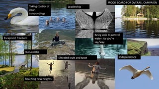
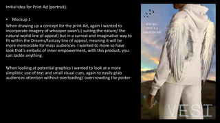
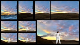
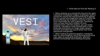
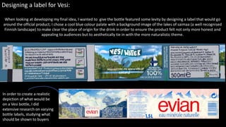
The document provides mood boards and details for developing marketing materials for the water brand Vesi. It includes:
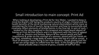
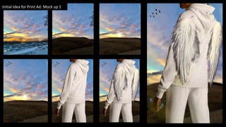
1) A mood board and details for a print ad campaign focusing on themes of dreams, nature, and empowerment featuring an image of a woman on a cliff overlooking water with wings growing from her back.
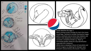
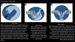
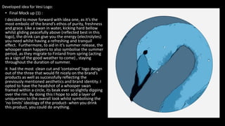
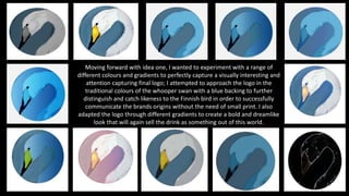
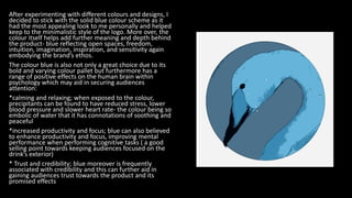
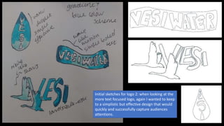
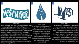
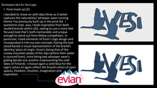
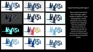
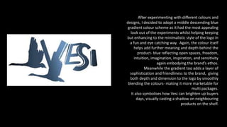
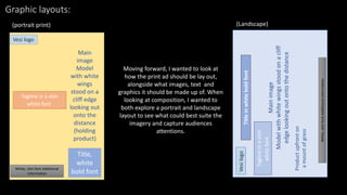
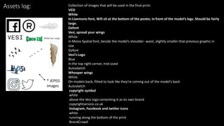
2) Concepts and mockups for two logo designs - one featuring a whooper swan silhouette and the other combining the brand name with whooper swan images. Extensive color experiments are discussed.
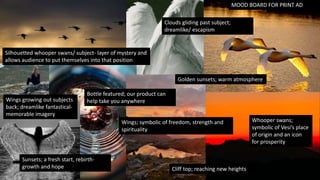
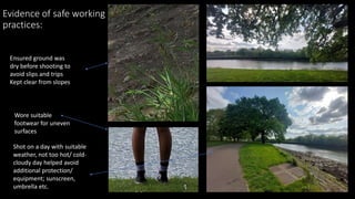
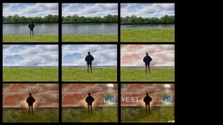
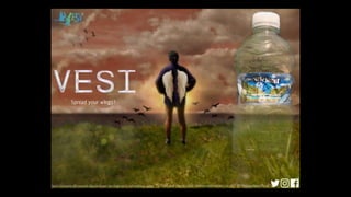
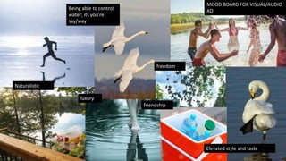
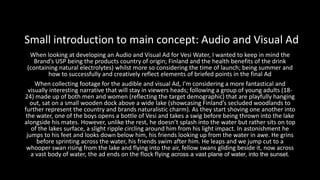
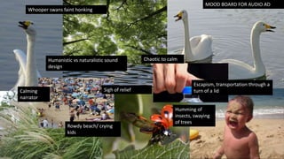
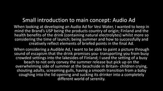
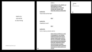
3) Details and assets for a visual and audio ad, including a mood board focusing on themes of freedom, luxury, and friendship. The ad would feature young adults by a lake to
Unit 20 how technical and aesthetic choices meet briefClaraHennig
The advertisement uses sounds of a busy beach to establish a feeling of sensory overload before introducing Vesi water. A narrator describes wanting to escape the summer chaos, transitioning to the calming sounds of nature after someone drinks Vesi. It concludes by urging listeners to "do summer your way" with Vesi. The ad grabs attention through an upbeat track and relatable beach noises before contrasting it with the serenity of Vesi. It promotes Vesi as allowing an escape from sensory overload and control over one's summer experience.
The audio ad opens with a hip hop instrumental and busy beach sounds to convey the overwhelming experience of summer at the beach. It then transitions smoothly to the sound of a bottle opening. A young woman's voice describes feeling tired and overwhelmed before drinking Vesi water. After drinking, her voice takes on a refreshed and energetic tone as she describes feeling ready to enjoy the rest of her day. Birds chirping and waves crashing are then heard, representing the natural elements of Vesi water. The ad closes with a call to "spread your wings" and find refreshment with Vesi.
This document proposes advertising campaigns for Vesi water. It outlines using the characters and color scheme from the video game Valorant to target teenagers and young adults. A 30-second audio-visual ad would feature the Valorant character Neon introducing Vesi water to a black girl and Asian boy to regain energy while gaming. Sounds of drinking and surging energy would emphasize Vesi's effects. Print ads would showcase Neon running with Vesi in the foreground to associate it with energy and fitness. The campaigns aim to appear inclusive and appeal to both genders through representation and messaging around regaining stamina.
1. The document provides initial logo ideas for an advertising unit called VESI LOGO, including concepts like northern lights, sharks, and water lilies that represent Finland and water.
2. It discusses mood boards and color schemes, settling on blue and yellow which represent water and positivity. Font styles are also considered.
3. Rough sketches are provided of two final logo concepts - one featuring a water lily and northern lights, and the other a flexing shark. The water lily design is chosen as the final logo to represent Finland and magic-like energy effects, with the slogan "water purity."
UNIT 20 how adverts comply with codes and conventions ClaraHennig
The document provides an evaluation of a print ad for the brand Vesi. Key points:
- The model, a young woman, reflects the target demographic and promotes inclusion.
- The setting and clothing were chosen to represent the brand's colors and target age range.
- The product is prominently featured to make a lasting impression on viewers.
- Graphics were included to allow viewers to easily find the brand on social media.
- The overall design aims to appeal to a younger demographic as specified in the brief.
This document provides details on the design and creation process of a print advertisement for Vesi water. Key elements included drawing the mascot Neon and adding lighting effects to emphasize her abilities to help people reach their goals. A solid blue background was used along with light blue and yellow colors representing confidence and summer. Fonts resembling beach signs were selected to convey warmth. Information on Vesi's health benefits and a social media plug were added to compel purchase and provide more information. The finished ad features these elements arranged to draw attention to the water bottle as the main product being advertised.
The document describes the logo design process for a water brand called Vesi. The logo is inspired by the northern lights in Finland where the water originates. It features a water droplet with a gradient of green and purple, the colors of the northern lights. The logo is kept simple to be memorable and recognizable. Inspiration was drawn from the Evian logo that references its source and from logo ideas generated online. The final logo uses a curly font and water droplet with northern lights colors to connect the brand to its Finnish water source.
This document outlines several initial ideas for developing an energy drink brand and advertising campaigns. Idea 1 focuses on appealing to teenagers with occult and werewolf themes. Idea 2 markets the drink as a powerful recovery beverage with industrial design elements. Idea 3 takes a more relaxed approach aimed at older consumers. Idea 4 centers around motorsports. Idea 5 targets professional athletes. Several font, color scheme, packaging and advertisement concepts are then presented and refined.
This document outlines proposals for an advertising campaign for the water brand Vesi. It proposes print, audio/visual, and audio advertisements. The print ad would feature a young woman on a cliff overlooking a lake, with wings and Vesi water in the foreground. The audio/visual ad would show a group having fun by a lake and one person gaining abilities after drinking Vesi. The audio ad aims to transport listeners from a busy beach to a natural setting using sounds. Overall, the campaign aims to portray Vesi as a natural, refreshing product that provides benefits and allows consumers to break free.
A modern alchemist in Seoul named Ae Extracts creates small packages of aromas that bring a sense of peace. She sees her work in the laboratory as a form of modern alchemy. Her company launches a 2014 spring aroma collection with a logo and branding that references the four elements of Western and Eastern alchemy. The collection is promoted through various channels in Seoul.
This proposal outlines an advertising campaign for Vesi Water that aims to promote its probable health benefits and capture audiences' attention. The campaign will include a logo, print ad, audio/visual ad, and audio ad. The key message is that Vesi's water helps maintain a happy and healthy lifestyle. The ads will feature visual and audible references to Vesi's Finnish origins and maintain a "sunny" motif to promote the product's summer launch. Actors and models will reflect the target audience of teenagers and young adults.
The document summarizes the logos and reasoning behind the designs of several well-known brands, including Snapchat, Pepsi, Nike, and McDonald's. Some key points made include that Snapchat's ghost logo symbolizes the temporary nature of messages, Pepsi's colors represent the American flag to show support for the military, Nike's swoosh represents speed and movement inspired by the Greek goddess of victory, and McDonald's golden arches were originally part of the restaurant architecture before being incorporated into their well-known logo. The document suggests exploring deeper meanings and symbolism when designing a new logo.
The document evaluates whether the final design pieces created to promote the environmental organization Surfers Against Sewage are fit for their intended purpose. It determines that the purpose of raising awareness of the organization's issues was achieved through the production of a range of fresh, eye-catching designs aimed at a young audience. An initial logo design with an eye in a jar was deemed too complex and not professional enough, so a simplified design with the eye and waves was created instead. Research into the client's existing products helped ensure the new designs would be suitable and approved.
The document discusses the creation of a brand for an artist through various media products and texts. It aims to create consistency across platforms by using similar colors, fonts, images and artistic techniques to portray a mysterious atmosphere. While some elements were successful at linking the products, the author realizes the front album cover contrasts too much with the chosen color scheme. In the future, more planning and experimentation with software could help achieve complete consistency and a stronger brand identity across all of the artist's products.
Olivia plans to create a makeup brand for her FMP. She will design products, a website, social media presence, and advert. Last year she created a perfume brand video advert but wants to expand the scope. She provides mood boards and is inspired by brands like Glossier, Rhode Skin, and Charlotte Tilbury. Olivia will research techniques, conduct surveys, and analyze existing brands. Her goals are to create a cohesive aesthetic and market the brand effectively across multiple platforms.
This document outlines an advertising campaign proposal for a water brand called Vesi. It proposes a TV advert, radio advert, and poster. The TV advert would show diverse models engaging in physical activity and then refreshed after drinking Vesi. The radio advert would use humor and reference the water's sourcing from Finnish lakes. The poster would feature a blurred field with models and highlight Vesi's benefits after exercise. Consistent fonts and colors would be used across ads to create brand recognition. The campaign aims to target teenagers and young adults interested in health and exercise.
The document discusses potential advertisements for the Vesi Water brand. It proposes three different types of ads: a print ad, a visual and audio ad, and an audio ad.
The proposed print ad features a woman standing on a cliff overlooking water as the sun sets, with whooper swans flying in the distance. A bottle of Vesi water is shown in the foreground.
The visual and audio ad follows a group of young adults hanging out on a dock above a lake in Finland. After one drinks Vesi, he is able to walk on water, astonishing his friends. It ends with whooper swans flying over a vast body of water at sunset.
The audio ad aims to transport the listener
6th Jeddah Marketing Club, (Packaging) by Dr. Sameh GaberMahmoud Bahgat
#Mahmoud_Bahgat
#Marketing_Club
Join us by WhatsApp to me 00966568654916
*اشترك في صفحة ال Marketing Club* عالفيسبوك
https://www.facebook.com/MarketingTipsPAGE/
*اشترك في جروب ال Marketing Club* عالفيسبوك
https://www.facebook.com/groups/837318003074869/
*Marketing Club Middle East*
25 Meetings in 6 Cities in 1 year & 2 months
Since October 2015
*We have 6 groups whatsapp*
*for almost 600 marketers*
From all middle east
*since 5 years*
& now 10 more groups
For Marketing Club Lovers as future Marketers
أهم حاجة الشروط
*Only marketers*
From all Industries
No students
*No sales*
*No hotels Reps*
*No restaurants Reps*
*No Travel Agents*
*No Advertising Agencies*
*Many have asked to Attend the Club*
((We Wish All can Attend,But Cant..))
*Criteria of Marketing Club Members*
•••••••••••••••••••••••••••••••••••••
For Better Harmony & Mind set.
*Must be only Marketer*
*Also Previous Marketing experience*
●Business Managers
●Country Manager,GM
●Directors, CEO
Are most welcomed to add Value to us.
■■■■■■■■■■■■■■■■
《 *Unmatched Criteria*》
Not Med Rep,
Not Key Account,
Not Product Specialist,
Not Sales Supervisor,
Not Sales Manager,
●●●●●●●●●●●●●●●●●●
But till you become a marketer
you can join other What'sApp group
*Marketing Lover Future Club Group*
■■■■■■■■■■■■■■■■
《 *Unmatched Criteria*》
For Conflict of Intrest
*Also Can't attend*
If Working in
*Marketing Services Provider*
=not *Hotel* Marketers
=not *Restaurant* Marketers
=not *Advertising* Marketer
=not *Event Manager*
=not *Market Researcher*.
■■■■■■■■■■■■■■■■
■■■■■■■■■■■■■■■■
*this Club for Only Marketers*
Very Soon we will have
*Business Leaders Club*
For Sales Managers & Directors
Will be Not for Markters
●●●●●●●●●●●●●●●●●●●●
■ *Only Marketers* ■
*& EPS Marketing Diploma*
●●●●●●●●●●●●●●●●●●●●
Confirm coming by Pvt WhatsApp
*To know the new Location*
*#Mahmoud_Bahgat*
00966568654916
*#Marketing_Club*
http://goo.gl/forms/RfskGzDslP
*اشترك بصفحة جمعية الصيادلة المصريين* عالفيسبوك
https://lnkd.in/fucnv_5
■ *Bahgat Facbook Page*
https://lnkd.in/fVAdubA
■ *Bahgat Linkedin*
https://lnkd.in/fvDQXuG
■ *Bahgat Twitter*
https://lnkd.in/fmNC72T
■ *Bahgat YouTube Channel*
https://www.Youtube.com /mahmoud bahgat
■ *Bahgat Instagram*
https://lnkd.in/fmWPXrY
■ *Bahgat SnapChat*
https://lnkd.in/f6GR-mR
*#Mahmoud_Bahgat*
*#Legendary_ADLAND*
www.TheLegendary.info
Our group consisted of myself and Mary-ann. We named our advertising company Bright Advertising to convey that our ads brighten screens. We created a logo with one bulb lit to represent being better than competitors. We researched other companies and decided to advertise water. We named our water Hydro2O to reference hydration and the chemical formula for water. Mary-ann's simple water bottle design with a detailed logo was most suitable. We created ads including banners for buses, tubes and websites with our slogan and bottle to effectively advertise. We aimed to sell bottles cheaply at 50p each to attract customers while still earning a profit. Overall, working as a small group took more time but we were happy with the successful outcome of
This document describes several design projects completed by the creator. It discusses identities and packaging designed for companies like Pipe Wrap, DistIT, Deltaco, and Café Arrivo. Details provided include the design concepts and goals for each project, such as emulating a product's texture for Pipe Wrap and implementing a logo's colors and shapes for DistIT. Other projects discussed are invitations for HMAS Diamantina and a magazine identity for Flux.
This advertisement is aimed at teenagers, children, and adults who want to feel young. It uses the color red prominently throughout as red is attention-grabbing. The bright, colorful images of toys also attract children. The advertisement suggests that drinking Coca-Cola will make one's life more fun and childlike. It uses the well-known Coca-Cola logo and suggests the product will help the viewer feel relaxed.
This portfolio document summarizes Kaylan Whitaker's work in branding, icon design, catalogs, menus, playing cards, posters, logos, and album artwork. It includes projects for Starfish Project, Gung Ho restaurant, Eluvia band, and various silkscreen prints. The artist statement at the end discusses being both influenced by the world and influencing culture through accessible yet impactful design work.
The document discusses ideas for advertising a perfume product, including potential product names, brand names, slogans, fonts, and logos. It considers how each idea might appeal to the target feminine audience and relate to themes of beauty, fashion, and feeling attractive. Several product name ideas play on seasonal themes while brand name ideas suggest feelings of confidence, beauty, and self-expression. Slogan concepts emphasize feeling beautiful and free when using the product. Font and logo selections are evaluated on how feminine, elegant, and unique they appear.
Iona developed an initial idea for a Brazilian-themed bottled water brand that she felt was original and justified, but recognized it may limit the customer demographic. The group ultimately chose to market a different brand called Kaela Vatn. Iona took on responsibilities including the slogan, print ad, and presentation. She created a print ad using Iceland's national colors to portray the water as crisp and refreshing, but recognized the logo could be better integrated. The group's campaign presented a minimalistic, sophisticated style to accurately convey the brand.
Terry and May had a one-night stand after meeting at a club but then lost touch. A week later, May unexpectedly runs into Terry at a funeral reception she is attending. Terry confronts May about why she has not contacted her but May refuses to answer. Their argument escalates until May walks away. Terry follows her outside and continues to demand answers, without success. It is then revealed that the funeral was for Terry, who had died. The story explores May dealing with her feelings for Terry after her death.
May is the film's protagonist who is initially reserved and guilt-ridden due to her strict upbringing. She suppresses her personality and sexuality to please her parents. Throughout the film, she learns to accept herself as she takes risks and explores life with Terry's influence. By the end, May realizes she can grow independently and moves on from Terry's ghost. Terry also grew up in a toxic environment but was more self-assured in her identity. When May leaves her, Terry falls apart but later learns to be alone. Paul is May's nice guy love interest, but she ultimately rejects him. He learns self-respect. May's father represents the generation stuck in the past and provides a burden for May to
The document summarizes annotations for the script of a film:
- The opening scene uses the song "Let's Stay Together" to set the tone and introduce the relationship between the main characters.
- A black screen cut will capture the audience's attention as they are brought straight to the main character at a small, sparsely attended funeral reception that establishes her small social circle.
- Details are given on the mise-en-scene, costume, setting, and other guests to help visualize and build the world of the story. The opening scene also introduces an early plot point that will be explored further in the film.
The document discusses several theories of mass media influence and how they could apply to an advertising campaign for a water brand called Vesi. It discusses the hypodermic needle theory, two step flow theory, and uses and gratifications theory. It explains how the advertising campaign could utilize each theory through message simplicity, targeting opinion leaders, and appealing to the desires of the target demographic. The document also addresses legal and ethical issues to consider, such as avoiding unrealistic representations, ensuring diversity and inclusion, and following regulations from organizations like the ASA and OFCOM.
The document provides a schedule and details for a summer campaign production for Vesi Water. It includes activities such as researching other campaigns, creating proposals, mood boards, and producing print, audio, and visual ads. Location shoots were conducted at Riverside Park and included talent, props, costumes, and safety precautions. Assets like images, audio files and graphics were planned, obtained and logged for use in creating the final advertisements.
Evian is a premium French mineral water brand that produces roughly 2 billion plastic bottles per year and generates over $1 billion in annual revenue, targeting health-conscious young adults. Lucozade is a UK-originated brand of energy and sports drinks that produces 1 billion bottles annually and generates $445 million in revenue, targeting a younger male demographic. Both brands have undertaken large advertising campaigns, such as Evian's "Roller Babies" and Lucozade's "Energy Beats Everything", to promote their products and increase sales.
Evian's "Live Young" campaign featured babies mimicking adult activities like swimming and rollerblading to market their water as unlocking youth. Ads like "Roller Babies" were hugely successful online. Despite sales drops during recessions, the campaign remained effective by capturing audiences' attention through humor. Lucozade's "Energy Beats Everything" campaign's first ad, depicting David drinking Lucozade before fighting Goliath, offended religious viewers. Collaboration with Tomb Raider helped attract new demographics but representation issues remained. Evian's baby-focused humor proved consistently popular and profitable compared to Lucozade's more controversial religious mockery.
The document evaluates the writer's script for Film4 based on their brief. The script tells an original story of two queer women, Terry and May, learning to love themselves after Terry's death. It draws from romantic tragedies but provides a new perspective on queer relationships. The opening scene effectively sets up the characters and central conflict. Overall, the script meets Film4's requirements of representing diversity and pushing boundaries while staying within their 15 rating and avoiding harmful stereotypes. Minor revisions were made to better show characters' internal conflicts through expression rather than telling. The writer believes the script successfully explores its themes around self-discovery and meets Film4's standards.
Terry and May are a couple who have a fight after meeting at a club. A week later, May attends a funeral reception and is confronted by Terry, who is upset that May has been ignoring her. However, it is revealed that the funeral is for Terry. The story then follows May as she falls in love with Terry's ghost and comes to terms with her sexuality and self-acceptance with Terry's support. The film uses flashbacks to show both May and Terry's childhoods and the influences that led them to who they are, with the goal of having diverse representation and tackling LGBTQ themes respectfully.
The script is for a 6-10 minute scene from a romantic drama film called "Terry and May". It follows the newly deceased Terry's ghost confronting her ex-girlfriend May at Terry's funeral. Through flashbacks, it's revealed they had a tumultuous relationship and May blames herself for Terry's death. The scene and film aim to subvert romantic comedy tropes by having the main characters be a same-sex couple who don't end up together. It explores themes of internalized homophobia, toxic family dynamics, and learning to accept oneself. The black-and-white film noir-inspired style is meant to feel dreary and soulful to match the somber queer love story and
May is distraught at a social club after ending things with Terry. When Terry shows up looking for answers, May ignores her. Paul comforts May as she breaks down. May explains to Terry outside that Terry is dead, having died suddenly weeks ago. May brings Terry to a cemetery where Terry's grave is being dug. Terry realizes she is a ghost, as people have been ignoring her. Though startled by the revelation, Terry maintains her upbeat attitude. May invites Terry to join her at a cafe, seeking an escape and a proper conversation with Terry.
This document provides information on script formatting and layout conventions for different media, including television, film, video games, radio, and news. It discusses the typical format for a television script, including use of sluglines, dialogue, parentheticals, and a three-act structure divided into teaser, acts one through three, and sometimes acts four and five. For television, elaborate code is used to convey information clearly within a restricted time frame. Radio script conventions include guidelines for dialogue pacing, scene numbering, and use of triple-spaced cues and paragraphs. Writing for radio news also prioritizes and summarizes information for listeners who cannot re-read or re-watch a segment.
UNIT 22 LO1 worksheet- Clara Hennig .docxClaraHennig
The document provides information on scripts for different media types, including a film script for Parasite, a TV news script for a BBC piece on outdoor learning, a radio drama script called Tony Teardrop, and a video game script for Tomb Raider. For each script example, the summary discusses the format, conventions, narrative structure, target audience, and whether it is fiction or non-fiction.
- The document provides an evaluation of print campaign materials created for the fictional film "Terry and May" produced by British film studio Film4 Productions.
- The creator designed three posters - a theatrical poster, teaser poster, and landscape poster - to promote the romantic drama film within the brief and conventions provided by Film4.
- The posters feature the main characters in intimate poses to convey the romance genre while also creating a sense of mystery and intrigue through ambiguous imagery and a dark, unsettling tone in line with drama conventions.
- The evaluation argues the posters met Film4's requirements to attract diverse audiences through representation and an R rating while staying appropriate for public display.
The document outlines the poster design for a film called "Terry and May". It describes three poster formats: a teaser poster showing the characters' jackets embracing with a black backdrop to create mystery; a landscape poster with the characters' faces painted and logos in the corner; and a theatrical poster with an extreme close-up of the characters almost kissing. The posters aim to intrigue audiences about the romantic drama plot following a troubled new couple, using vague imagery and mystery to hook viewers.
Evaluating Posters (Blown Up Image Of Billing Block).pdfClaraHennig
This document provides technical details and analysis for three movie poster designs for a fictional independent film. Each poster aims to convey mystery and intrigue through its imagery and composition while drawing from conventions of drama and romance genres. Technical specifications are given for the photography used, including lighting, equipment, and framing choices. For each poster, the document explains how its visual elements and style fit the brief of promoting an independent drama and subvert typical poster tropes to pique audience interest ahead of the film's release.
The document describes the progress made on three movie posters. For the theatrical poster, extra details were added to the background and models' faces. Graphics and logos were also added. For the teaser poster, the models were removed from their costumes and recolored in a new environment with added shadows and highlights. The same graphics and logos were used. For the landscape poster, most colors were desaturated except for the brown jacket, which was made darker. The model's hair was painted black and brightness/shadows were adjusted before adding graphics, logos, and saving the file.
Annotating Photos, Evidence Of Safe Working Practices & Assets Logs.pdfClaraHennig
The document provides details on annotating pictures for a film project, including costumes, body language, camera shots, lighting, composition, and facial expressions. For the first picture, the models wear costumes representing the characters' personalities - May's worn jacket shows her reluctance to let go of the past while Terry's moved on. Their body language has May's head on Terry's shoulder, but Terry's head held above, suggesting unreturned feelings. For the second picture, an extreme close-up aims to confront viewers while keeping the characters a mystery. Composition and lighting continue themes of intimacy and mystery.
The photographer chose one image from the contact sheet to use for a movie poster because it featured the main character's jacket in focus, conveying the film's tragic tone. Another image was rejected because the composition seemed forced. The selected image used darker lighting to give an intimate yet dreary atmosphere, and the subjects' straight faces conveyed the serious mood of the film. A different photo was rejected for lacking intimacy between the characters. The final landscape poster image chosen showed one character still wearing a jacket while the other was not, implying they had moved on, capturing the film's narrative.
Walmart Business+ and Spark Good for Nonprofits.pdfTechSoup
"Learn about all the ways Walmart supports nonprofit organizations.
You will hear from Liz Willett, the Head of Nonprofits, and hear about what Walmart is doing to help nonprofits, including Walmart Business and Spark Good. Walmart Business+ is a new offer for nonprofits that offers discounts and also streamlines nonprofits order and expense tracking, saving time and money.
The webinar may also give some examples on how nonprofits can best leverage Walmart Business+.
The event will cover the following::
Walmart Business + (https://business.walmart.com/plus) is a new shopping experience for nonprofits, schools, and local business customers that connects an exclusive online shopping experience to stores. Benefits include free delivery and shipping, a 'Spend Analytics” feature, special discounts, deals and tax-exempt shopping.
Special TechSoup offer for a free 180 days membership, and up to $150 in discounts on eligible orders.
Spark Good (walmart.com/sparkgood) is a charitable platform that enables nonprofits to receive donations directly from customers and associates.
Answers about how you can do more with Walmart!"
How to Manage Your Lost Opportunities in Odoo 17 CRMCeline George
Odoo 17 CRM allows us to track why we lose sales opportunities with "Lost Reasons." This helps analyze our sales process and identify areas for improvement. Here's how to configure lost reasons in Odoo 17 CRM
This slide is special for master students (MIBS & MIFB) in UUM. Also useful for readers who are interested in the topic of contemporary Islamic banking.
This presentation was provided by Steph Pollock of The American Psychological Association’s Journals Program, and Damita Snow, of The American Society of Civil Engineers (ASCE), for the initial session of NISO's 2024 Training Series "DEIA in the Scholarly Landscape." Session One: 'Setting Expectations: a DEIA Primer,' was held June 6, 2024.
How to Add Chatter in the odoo 17 ERP ModuleCeline George
In Odoo, the chatter is like a chat tool that helps you work together on records. You can leave notes and track things, making it easier to talk with your team and partners. Inside chatter, all communication history, activity, and changes will be displayed.
LAND USE LAND COVER AND NDVI OF MIRZAPUR DISTRICT, UPRAHUL
This Dissertation explores the particular circumstances of Mirzapur, a region located in the
core of India. Mirzapur, with its varied terrains and abundant biodiversity, offers an optimal
environment for investigating the changes in vegetation cover dynamics. Our study utilizes
advanced technologies such as GIS (Geographic Information Systems) and Remote sensing to
analyze the transformations that have taken place over the course of a decade.
The complex relationship between human activities and the environment has been the focus
of extensive research and worry. As the global community grapples with swift urbanization,
population expansion, and economic progress, the effects on natural ecosystems are becoming
more evident. A crucial element of this impact is the alteration of vegetation cover, which plays a
significant role in maintaining the ecological equilibrium of our planet.Land serves as the foundation for all human activities and provides the necessary materials for
these activities. As the most crucial natural resource, its utilization by humans results in different
'Land uses,' which are determined by both human activities and the physical characteristics of the
land.
The utilization of land is impacted by human needs and environmental factors. In countries
like India, rapid population growth and the emphasis on extensive resource exploitation can lead
to significant land degradation, adversely affecting the region's land cover.
Therefore, human intervention has significantly influenced land use patterns over many
centuries, evolving its structure over time and space. In the present era, these changes have
accelerated due to factors such as agriculture and urbanization. Information regarding land use and
cover is essential for various planning and management tasks related to the Earth's surface,
providing crucial environmental data for scientific, resource management, policy purposes, and
diverse human activities.
Accurate understanding of land use and cover is imperative for the development planning
of any area. Consequently, a wide range of professionals, including earth system scientists, land
and water managers, and urban planners, are interested in obtaining data on land use and cover
changes, conversion trends, and other related patterns. The spatial dimensions of land use and
cover support policymakers and scientists in making well-informed decisions, as alterations in
these patterns indicate shifts in economic and social conditions. Monitoring such changes with the
help of Advanced technologies like Remote Sensing and Geographic Information Systems is
crucial for coordinated efforts across different administrative levels. Advanced technologies like
Remote Sensing and Geographic Information Systems
9
Changes in vegetation cover refer to variations in the distribution, composition, and overall
structure of plant communities across different temporal and spatial scales. These changes can
occur natural.
Executive Directors Chat Leveraging AI for Diversity, Equity, and InclusionTechSoup
Let’s explore the intersection of technology and equity in the final session of our DEI series. Discover how AI tools, like ChatGPT, can be used to support and enhance your nonprofit's DEI initiatives. Participants will gain insights into practical AI applications and get tips for leveraging technology to advance their DEI goals.
it describes the bony anatomy including the femoral head , acetabulum, labrum . also discusses the capsule , ligaments . muscle that act on the hip joint and the range of motion are outlined. factors affecting hip joint stability and weight transmission through the joint are summarized.
Exploiting Artificial Intelligence for Empowering Researchers and Faculty, In...Dr. Vinod Kumar Kanvaria
Exploiting Artificial Intelligence for Empowering Researchers and Faculty,
International FDP on Fundamentals of Research in Social Sciences
at Integral University, Lucknow, 06.06.2024
By Dr. Vinod Kumar Kanvaria
2. MOOD BOARD FOR OVERALL CAMPAIGN
Being able to control
water; its you're
say/way
Escapism/ freedom
Reaching new heights
Elevated style and taste Independence
Taking control of
your
surroundings
Leadership
Naturalistic
4. MOOD BOARD FOR PRINT AD
Golden sunsets; warm atmosphere
Silhouetted whooper swans/ subject- layer of mystery and
allows audience to put themselves into that position
Cliff top; reaching new heights
Clouds gliding past subject;
dreamlike/ escapism
Bottle featured; our product can
help take you anywhere
Wings growing out subjects
back; dreamlike fantastical-
memorable imagery
Wings; symbolic of freedom, strength and
spirituality
Sunsets; a fresh start, rebirth-
growth and hope
Whooper swans;
symbolic of Vesi’s place
of origin and an icon
for prosperity
5. Small introduction to main concept: Print Ad
When looking at developing a Print Ad for Vesi Water, I wanted to keep in
mind the Brand’s USP being the products country of origin; Finland and the
health benefits of the drink (containing natural electrolytes) whilst more so
considering the time of launch; being summer and how to successfully and
creatively reflect elements of briefed points in the final Ad. In vein of such, I
landed on the idea (explored in the proposal and mood board above) of
having an Print Ad that reflects and is in alignment with the lines of appeal
such as; Dreams and fantasy, Nature & the natural world and Self-
importance & pride via the concept of a women, posed with her hands on
her hips, onlooking a large body of water from the top of a cliff at sunset, a
flock of whooper swans flying in the near distance, clouds gliding past her
as we see wings begin to unfold from her back. In the foreground we see
stood proudly atop a mound of grass, a bottle of half full Vesi.
6. Initial sketches for logo 1:
When coming up with concepts for Vesi’s first (more
visual) logo, I wanted to consider framing the images
within a confined circle to mimic that simplistic and
modern look adopted by universally known and
successful competitor brands e.g. ‘Pepsi’ (a
minimalistic graphic allows for easy identification
especially from a distance)
Whilst more so keeping in theme of naturalistic and
Finnish imagery via adopting the whooper swan
(Finland's national bird) as the brand’s “mascot”.
7. Developing on initial ideas
IDEA THREE:
When looking at idea three, similarly to Idea
Two, I wanted to look at expanding upon the
boundaries of the logo to again symbolise
ideas of ‘breaking through barriers’ and
personal growth. However again, I’m not so
confident in its design as this looks at the
swan from the back (no clear distinction for
it being whooper- representing Finland) and
comes off as over the top.
IDEA ONE:
When looking at idea one, I wanted to keep to a
more simplistic yet appealing look by zooming in
on the head of the whooper swan; its curved
neck complimenting its circular frame and the
neck swerves inwards encapsulating a both
smooth and aesthetically pleasing appearance. I
wanted to include a small water droplet sitting on
the edge of whopper’s beak breaching the circle
to communicate the water’s effective and strong
effects
IDEA TWO:
When looking at idea two, I
wanted to look at the swan
breaching the confinement
of its logo, symbolic of its
‘disregard the norm’ and
rebellious nature that I hope
to reflect themes of freedom
and escape.
1 2 3
8. • Final Mock up (1) :
I decided to move forward with idea one, as it’s the
most embolic of the brand’s ethos of purity, freshness
and grace. Like a swan in water, kicking hard bellow
whilst gliding peacefully above (reflected best in this
logo), the drink can give you the energy (electrolytes)
you need whilst having a refreshing and tranquil
effect. Furthermore, to aid in it’s summer release, the
whooper swan happens to also symbolise the summer
period, as they migrate to Finland from spring (acting
as a sign of the good weather to come) , staying
throughout the duration of summer.
it had the most clean cut and ‘contained’ logo design
out of the three that would fit nicely on the brand’s
products as well as successfully reflecting the
previously mentioned aesthetics and brand identity. I
opted to have the headshot of a whooper swan
framed within a circle, its beak ever so slightly dipping
over the rim. By doing this I hope to add a layer of
uniqueness to the overall look whilst symbolising the
‘no limits’ ideology of the product- when you drink
this product, you could do anything.
Developed idea for Vesi Logo:
9. Moving forward with idea one, I wanted to experiment with a range of
different colours and gradients to perfectly capture a visually interesting and
attention capturing final logo; I attempted to approach the logo in the
traditional colours of the whooper swan with a blue backing to further
distinguish and catch likeness to the Finnish bird in order to successfully
communicate the brands origins without the need of small print. I also
adapted the logo through different gradients to create a bold and dreamlike
look that will again sell the drink as something out of this world.
10. After experimenting with different colours and designs, I
decided to stick with the solid blue colour scheme as it
had the most appealing look to me personally and helped
keep to the minimalistic style of the logo. More over, the
colour itself helps add further meaning and depth behind
the product- blue reflecting open spaces, freedom,
intuition, imagination, inspiration, and sensitivity again
embodying the brand’s ethos.
The colour blue is also not only a great choice due to its
bold and varying colour pallet but furthermore has a
range of positive effects on the human brain within
psychology which may aid in securing audiences
attention:
*calming and relaxing; when exposed to the colour,
precipitants can be found to have reduced stress, lower
blood pressure and slower heart rate- the colour being so
embolic of water that it has connotations of soothing and
peaceful
*increased productivity and focus; blue can also believed
to enhance productivity and focus, improving mental
performance when performing cognitive tasks ( a good
selling point towards keeping audiences focused on the
drink’s exterior)
* Trust and credibility; blue moreover is frequently
associated with credibility and this can further aid in
gaining audiences trust towards the product and its
promised effects
11. Initial sketches for logo 2: when looking at the
more text focused logo, again I wanted to keep
to a simplistic but effective design that would
quickly and successfully capture audiences
attentions.
12. IDEA TWO:
When looking at idea two, once
again I wanted to keep to a
more simplistic, appealing look
by using a playful use of text
and design; this time I went
down a more visual
representation via a water
droplet (though hindsight I feel
this is a little too visual in
presentation)
IDEA ONE:
When looking at idea one, I wanted to keep to again
a more simplistic yet appealing look by using a
playful whilst professional use of typography and
design to sell the product as a trustful but enjoyable
product; I tried to emulate this via a slight wavy
outlined box to the text (the use of curves within
the box I hope to reflect the brand as a water based
product) the use of capitalized letters I hope helps
make the brand feel bold and noticeable to
audiences (in the future I may look at returning to
the idea via a gradient).
IDEA THREE:
When looking at idea three , I wanted to
incorporate more naturalistic imagery
through the reoccurrence of the whooper
swan. I went down a simplistic route once
again, by portraying the birds through
silhouettes to ensure the text goes easy on
the eyes. I wanted to further embed
creative and artistic elements to showcase
the brands modern playfulness through the
breaking up and colliding text.
1 2 3
13. • Final mock up (2):
I decided to move on with idea three as it better
captures the naturalistic/ whooper swan running
theme I've previously built up in the print Ad . i
wanted to note ,also, I took inspiration from both
studied brands within LO1, opting to use a more text
focused look that’s both memorable and unique
enough to stand out from fellow competitors. In
particular, I took elements of Evian's logo design and
incorporated it into my own concept; having the text
stood beside a visual representation of the brand’s
identity/ place of origin- Evian's being that of the
snowy mountain peaks of the alps (where their water
is sourced from), mine being two whooper swan’s
gliding beside one another (representing the cold
lakes of Finland). I choose again a solid blue for the
logo’s colour to again reflect the brand’s ethos of open
spaces, freedom, intuition, imagination and
inspiration.
Developed idea for Vesi Logo:
14. When experimenting for
Vesi’s text logo, again I
looked at different styles
and gradients; mainly
sticking to a blue colour
pallet to be in keeping
with the established
theme but more so
playing around with so
variety of colours and
textures to sell the brand
as a friendly and youthful
entity.
Experimenting with logo 2
15. After experimenting with different colours and
designs, I decided to adopt a middle descending blue
gradient colour scheme as it had the most appealing
look out of the experiments whilst helping keeping
but enhancing to the minimalistic style of the logo in
a fun and eye catching way. Again, the colour itself
helps add further meaning and depth behind the
product- blue reflecting open spaces, freedom,
intuition, imagination, inspiration, and sensitivity
again embodying the brand’s ethos.
Meanwhile the gradient too adds a layer of
sophistication and friendliness to the brand, giving
both depth and dimension to the logo by smoothly
blending the colours- making it more marketable for
multi packages.
It also symbolises how Vesi can brighten up buyers
days, visually casting a shadow on neighbouring
products on the shelf.
16. Graphic layouts:
Main
image
Model
with white
wings
stood on a
cliff edge
looking out
onto the
distance
(holding
product)
Tagline in a slim
white font
White, slim font Additional
information
Vesi logo
(Landscape)
Title
in
white
bold
font
(portrait print)
Title,
white
bold font
Vesi
logo
Main
image
Model
with
white
wings
stood
on
a
cliff
edge
looking
out
onto
the
distance
White,
slim
font
Additional
information
Tagline
in
a
slim
white
font
Product
upfront
on
a
mount
of
grass
Moving forward, I wanted to look at
how the print ad should be lay out,
alongside what images, text and
graphics it should be made up of. When
looking at composition, I wanted to
both explore a portrait and landscape
layout to see what could best suite the
imagery and capture audiences
attentions.
17. Initial sketches:
When sketching out initial ideas and concepts towards
the Print Ad, again, wanted to consider how to brand
Vesi in a way that not only hits the brief but more so
reaches the target demographic for the product. With
this mind, I looked to develop a more dreamlike and
unusual conceptual design to intrigue younger minds
(wings sprouting out someone's back, whilst the stand
in clouds on the edge of a cliff overlooking a sunset- I
hope will suite as a visually interesting Print) more so to
ensure that members of the target demographic are
hooked, I wanted to utilize a model that reflects the
average consumer to build a bridge for the younger
demographic to relate and resonate with whose
represented.
19. Initial idea for Print Ad (portrait):
• Mockup 1
When drawing up a concept for the print Ad, again I wanted to
incorporate imagery of whooper swan’s ( suiting the nature/ the
natural world line of appeal) but in a surreal and imaginative way to
fit within the Dreams/fantasy line of appeal, meaning it will be
more memorable for mass audiences. I wanted to more so have
look that’s embolic of inner empowerment, with this product, you
can tackle anything.
When looking at potential graphics I wanted to look at a more
simplistic use of text and small visual cues, again to easily grab
audiences attention without overloading/ overcrowding the poster
20.
21. • Initial idea for Print Ad: Mockup 2
• When drawing up a concept for the print Ad, again
I wanted to incorporate imagery of whooper swan’s (
suiting the nature/ the natural world line of appeal)
but in a surreal and imaginative way to fit within the
Dreams/fantasy line of appeal, meaning it will be
more memorable for mass audiences. I wanted to
more so have look that’s embolic of inner
empowerment, with this product, you can tackle
anything. I decided to move forward with a more
landscape orientation as it helps widen viewers
horizons and makes the overall poster feel more
spectacular and grander.
• When looking at potential graphics I wanted to
look at a more simplistic use of text and small visual
cues, again to easily grab audiences' attention
without overloading/ overcrowding the poster
22. Designing a label for Vesi:
When looking at developing my final idea, I wanted to give the bottle featured some levity by designing a label that would go
around the official product; I chose a cool blue colour palate with a background image of the lakes of saimaa (a well recognised
Finnish landscape) to make clear the place of origin for the drink in order to ensure the product felt not only more honest and
appealing to audiences but to aesthetically tie in with the more naturalistic theme.
In order to create a realistic
depiction of what would be
on a Vesi bottle, I did
extensive research on varying
bottle labels, studying what
should be shown to buyers
23. Evidence of safe working
practices:
Ensured ground was
dry before shooting to
avoid slips and trips
Kept clear from slopes
Wore suitable
footwear for uneven
surfaces
Shot on a day with suitable
weather, not too hot/ cold-
cloudy day helped avoid
additional protection/
equipment; sunscreen,
umbrella etc.
25. Contact sheet: I deicide to avoid using this photo
as even though it is keeping with
the bright summer reflection, the
blockings a little off
I chose this picture to use for my landscape as
this was the most polished out of the set taken,
there's enough room above and bellow to edit
and contort the picture to my desired effect and
model gives of the perfect pose of confident and
aspiration as she looks out to the water Infront.
Again I didn’t go for this photo as it looked a little
awkward- from a up angle position it makes the bottle
look off and I don’t think i could sell it standing up in
editing.
26. Assets log: Collection of images that will be used in the final print:
VESI
White
In Livemono font, Will sit at the bottom of the poster, in front of the model’s legs. Should be fairly
large.
Dafont
Vesi, spread your wings
White
In Mono Spatial font, beside the model’s shoulder- waist, slightly smaller that previous graphic in
size
Dafont
Vesi’s Logo
Blue
In the top right corner, mid-sized
Autosketch
Whooper wings
White
On models back, fitted to look like they’re coming out of the model’s back
Autosketch
copyright symbol
white
above the Vesi logo cementing it as its own brand
copyrightservice.co.uk
Instagram, Facebook and twitter icons
white
running along the bottom of the print
BrandCrowd
* JEPEG
images *
30. MOOD BOARD FOR VISUAL/AUDIO
AD
freedom
luxury
friendship
Elevated style and taste
Being able to control
water; its you're
say/way
Naturalistic
31. When looking at developing an Audio and Visual Ad for Vesi Water, I wanted to keep in mind the
Brand’s USP being the products country of origin; Finland and the health benefits of the drink
(containing natural electrolytes) whilst more so considering the time of launch; being summer and
how to successfully and creatively reflect elements of briefed points in the final Ad
When collecting footage for the audible and visual Ad, I’m considering a more fantastical and
visually interesting narrative that will stay in viewers heads; following a group of young adults (18-
24) made up of both men and women (reflecting the target demographic) that are playfully hanging
out, sat on a small wooden dock above a wide lake (showcasing Finland’s secluded woodlands to
further represent the country and brands naturalistic charm). As they start shoving one another into
the water, one of the boys opens a bottle of Vesi and takes a swig before being thrown into the lake
alongside his mates. However, unlike the rest, he doesn’t splash into the water but rather sits on top
of the lakes surface, a slight ripple circling around him from his light impact. In astonishment he
jumps to his feet and looks down below him, his friends looking up from the water in awe. He grins
before sprinting across the water, his friends swim after him. He leaps and we jump cut to a
whooper swan rising from the lake and flying into the air, fellow swans gliding beside it, now across
a vast body of water, the ad ends on the flock flying across a vast plane of water, into the sunset.
Small introduction to main concept: Audio and Visual Ad
32.
33. General
movement
Camera movement
I wanted to keep the ad for the most part pretty simple
narrative wise, having the last two shots be ambiguous though
in keeping with the dreamlike appeal that will keep audiences
engaged and overall paint that advert in a memorable light.
With these initial concept sketches, I just tried to get an overall
sense of how I would frame the camera and the actors within
each shot and how the ‘story’ would progress under a 30
second timeframe.
(First draft) Shot number
(Camera pan)
Initial sketches for
storyboard
35. MOOD BOARD FOR AUDIO AD
Escapism, transportation through a
turn of a lid
Humanistic vs naturalistic sound
design
Chaotic to calm
Whooper swans faint honking
Rowdy beach/ crying
kids
Humming of
insects, swaying
of trees
Sigh of relief
Calming
narrator
36. When looking at developing an Audio Ad for Vesi Water, I wanted to keep in
mind the Brand’s USP being the products country of origin; Finland and the
health benefits of the drink (containing natural electrolytes) whilst more so
considering the time of launch; being summer and how to successfully and
creatively reflect elements of briefed points in the final Ad.
When considering a Audible Ad, I want to be able to paint a picture through
sound of escapism that the drink promises you- transporting you from busy
crowded settings into the lakesides of Finland; I used the setting of a busy
beach to not only convey the summer release but pick up on the
overwhelming side of summer at the beachside in Britain- children crying,
shouting adults, screaming gulls, having a smooth transition from a baby
coughing into the lid opening and sucking its drinker into a completely
different world of serenity.
Small introduction to main concept: Audio Ad