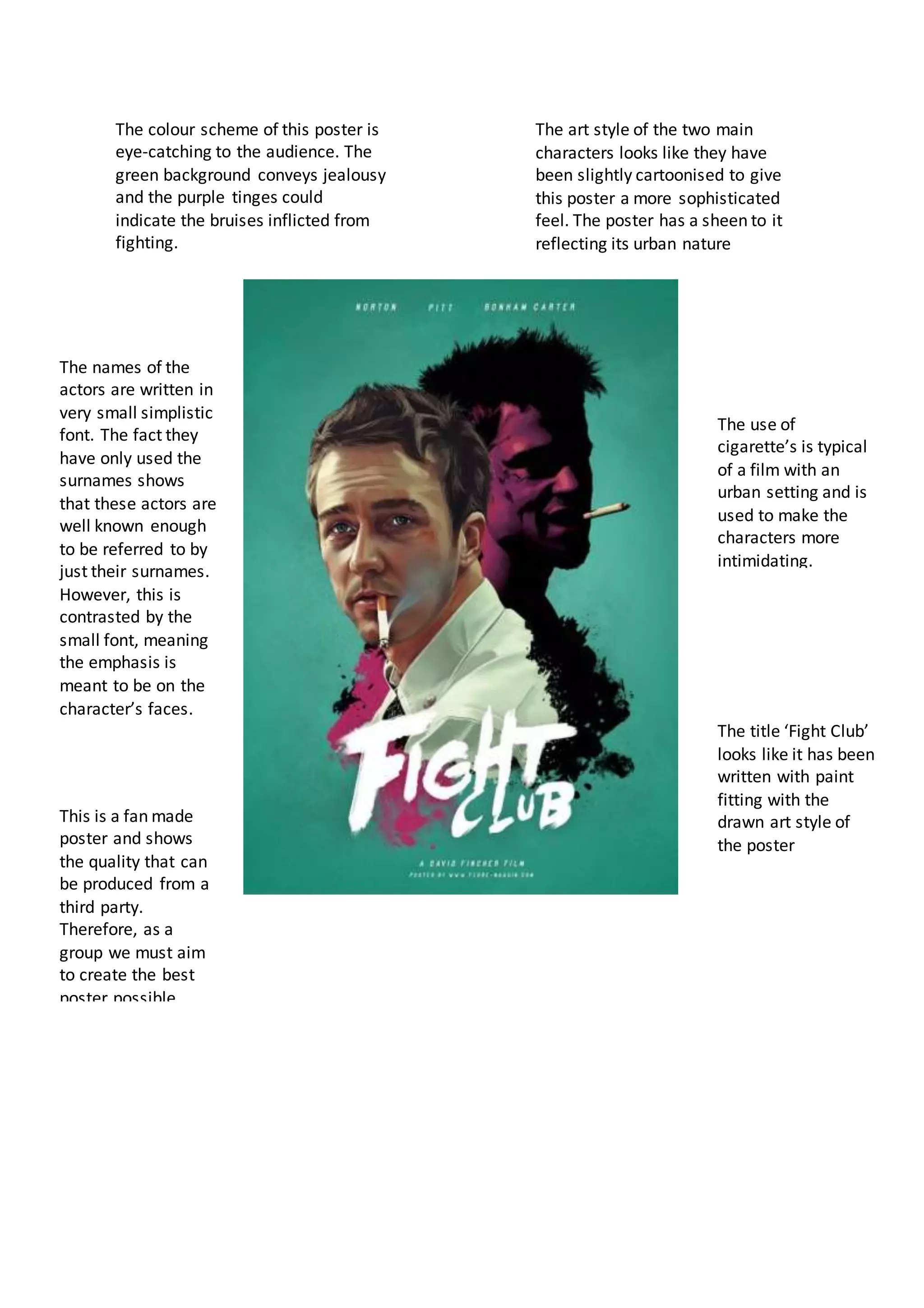
The colour scheme of this poster is
eye-catching to the audience. The
green background conveys jealousy
and the purple tinges could
indicate the bruises inflicted from
fighting.
The art style of the two main
characters looks like they have
been slightly cartoonised to give
this poster a more sophisticated
feel. The poster has a sheen to it
reflecting its urban nature
The names of the
actors are written in
very small simplistic
font. The fact they
have only used the
surnames shows
that these actors are
well known enough
to be referred to by
just their surnames.
However, this is
contrasted by the
small font, meaning
the emphasis is
meant to be on the
character’s faces.
The use of
cigarette’s is typical
of a film with an
urban setting and is
used to make the
characters more
intimidating.
The title ‘Fight Club’
looks like it has been
written with paint
fitting with the
drawn art style of
the poster
This is a fan made
poster and shows
the quality that can
be produced from a
third party.
Therefore, as a
group we must aim
to create the best
poster possible
The tagline that this film is part of a
trilogy is used to attract the attention
of those who may have been fans of
the books. (Cross media convergence)
The poster chooses to use
the faces of the two main
characters in the film.
Rooney Mara as Lisbeth is
viewed from a side angle
almost like she does not
want to be seen looking at
Daniel Craig.
The black and white filter
on this poster gives it a
traditional feel. This could
match the genre of noir
that we are trying to
emulate ourselves.
The text is very simplistic
and has not been
coloured to try and attract
attention. The font
matches a fantasy or
crime genre showing the
importance of knowing
your genre.
The text is very simplistic
and has not been
coloured to try and attract
attention. The font
matches a fantasy or
crime genre showing the
importance of knowing
your genre.
This poster is very simple and with the plain
background that sometimes less is more.
Therefore, we could do something similar as a
group using Mark and Rosette to symbolise
their relationship. Although the black and
white may not work as we are making a neo-
noir and not classic noir potentially confusing
the genre.

Film Poster Analysis

  • 1.
    The colour schemeof this poster is eye-catching to the audience. The green background conveys jealousy and the purple tinges could indicate the bruises inflicted from fighting. The art style of the two main characters looks like they have been slightly cartoonised to give this poster a more sophisticated feel. The poster has a sheen to it reflecting its urban nature The names of the actors are written in very small simplistic font. The fact they have only used the surnames shows that these actors are well known enough to be referred to by just their surnames. However, this is contrasted by the small font, meaning the emphasis is meant to be on the character’s faces. The use of cigarette’s is typical of a film with an urban setting and is used to make the characters more intimidating. The title ‘Fight Club’ looks like it has been written with paint fitting with the drawn art style of the poster This is a fan made poster and shows the quality that can be produced from a third party. Therefore, as a group we must aim to create the best poster possible
  • 2.
    The tagline thatthis film is part of a trilogy is used to attract the attention of those who may have been fans of the books. (Cross media convergence) The poster chooses to use the faces of the two main characters in the film. Rooney Mara as Lisbeth is viewed from a side angle almost like she does not want to be seen looking at Daniel Craig. The black and white filter on this poster gives it a traditional feel. This could match the genre of noir that we are trying to emulate ourselves. The text is very simplistic and has not been coloured to try and attract attention. The font matches a fantasy or crime genre showing the importance of knowing your genre. The text is very simplistic and has not been coloured to try and attract attention. The font matches a fantasy or crime genre showing the importance of knowing your genre. This poster is very simple and with the plain background that sometimes less is more. Therefore, we could do something similar as a group using Mark and Rosette to symbolise their relationship. Although the black and white may not work as we are making a neo- noir and not classic noir potentially confusing the genre.