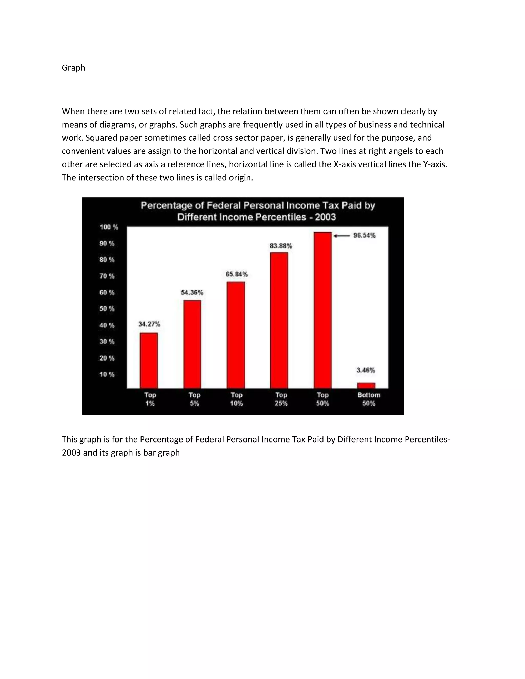
This document discusses how graphs can be used to clearly show the relationship between two sets of related facts. It notes that graphs are commonly used in business and technical work, with squared paper often being used to plot the graphs. The graph described in this document plots the percentage of federal personal income tax paid by different income percentiles for the year 2003, using a bar graph to visualize the data.