
Recommended
More Related Content
What's hot
What's hot (20)
Similar to Magazine ad analysis
Similar to Magazine ad analysis (20)
More from Emma Kelly
Recently uploaded
Recently uploaded (20)
Magazine ad analysis
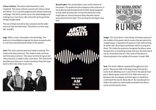
- 1. Colour scheme- The whole advertisementisvery simplistic.The colourscheme consistsof 2colours;black and white.Thisisusedthroughouttheirwholemarketing campaign.The white standsouton the blackbackground makingitour mainfocus.We notice the writingandthe designstraightaway. The use of blackand white alsocompliestoothe older sense of style the bandhave.Theydressina retro way- 50’s and60’s. Logo- What ismost noticeable isthe bandlogo.The audience immediatelyrecognise the bandsoanyone who isa fanwill automaticallybe drawntothisposter. Font- The fontsusedare boldand modernlooking.This meansthat theystandout.The modernstyle contrasts withthe colourscheme.The colourscheme bringsanold vibe acrossbut a modernvibe isalsoseen.Thislinkstothe bandbecause theyare a modernbandbut theylike togo back to theirold,indie musicroots. Record Label- The recordlabel isseenatthe bottomof the poster.Thispublicisesthe companytothe audience.If the audience hadalreadyheardof otherbandsassigned to that label,buttheydon’tknowthisbandthenthey mighttake an interestbecause theylikeotherbands associatedwiththe label.Thiscanhelpthe bandgainnew fans. Image- The illustrationisinteresting.Ithasbeenplacedin the middle of the posterwhichmeansthatwe notice this straightaway.It separatesthe posterinhalf,withwriting at eitherside.Byusingasoundwave,whichisunique to them.Thishelpsthe audience recognise the albumcover because thisissomethingunique andnew.Nootherband has an illustrationlike this. The name of the albumis cleverlyplacedinthe middle of the wave.Itreads‘AM’. Text- The lettersAMare repeatedthroughoutonthis poster.Obviously‘AM’isthe beginningof the band’s name Arctic Monkeyssoit isseenfirstinthe optical focal point.Meaningwe notice thisfirst.AMisthenseenin betweenthe soundwave andthenagaininaboldfont underneaththe words‘Newalbum’.Byrepeatingthisit makesthe audience subliminallyremember the album name and the band’sname.
- 2. Font- The fontisdigital lookingandlookslike ithasbeen typedupon a computer,thislinksinwiththe image because the image looks like ithasbeentechnologically influenced. The underscoresaddtothe computereffect. The font lookslike Ihasbeentypeduponan older computer.Suggestingthatthe bandare goingback to theiroldstyle of music- Alternative rock. Image- The image showsaneagle mergedwitha human.It has a mug shotfeel aboutit,lookinglikeit was made fora wantedposter. Thiscreatesa dangerous,rebelliousvibe. The image alsohas shallowdepthwhichmakesthe face the mainfocusof the poster. The face consistsof 4 differentfacesforeachbandmember. Showingthat each bandmembercontributedtothe makingof the album.The leadsingeristhe one we notice the most as hisface isplacedinthe primaryoptical area. Directaddressisused whichintimidatesthe audience, makingthemfeel liketheyhave tobuythe album.The fact the eagle’seyesare usingdirectaddresstooonly emphasisesthisidea. Colour scheme- The colourmainlyusedis sepiagreen whichlinkswiththe nature element.The colourgreen representsnature whichisacommontheme inthis poster.Ananimal fromthe wildisshownandthe language usedalso representsnature.Withwordssuch as “crawl” whichisone of theirsongs. SepiaGreenalso has a nostalgicfeel;manyolderpictureswouldbe takenwiththiscolourtint.Thislinkstothe ideaof themgoingback to the roots of theirmusic. As well asthat,the coloursblackand greenare dark colourswhichlink tothe ideaof the night. “Onlybythe night”The brightcoloursof blue andred contrastwith the dark colourmakingthemstandout incomparison to the rest of the image.Thisshowsthe twodifferent sidesof the band.Theirtraditional side wherethey stickto theirgenre andthentheirquirkierside where theybegintodeviate fromthe traditional songs. Iconography- Aneagle isseenwithinthe mainimage. Thisshowsthat the band are American.The Eagle is commonlylinkedwithAmericaasit isplacedonthe presidential seal.The eagle alsohasconnotations attachedto it,representingmysteryandpower. Thiscouldsuggestthat the bandthemselvesare mysteriousandare ina positionof power.The mysteriousfactorcouldshowthatthe musicmay be differentthantheirearliermusic.Theyare mysterious; the onlywayto findout whatthe newmusicis like isto buythe album. Headline- The titlesare writtenincapital letterswhich suggeststhattheyare importantthisiswhythe artists name and the albumname are capitalised.Sowe immediatelynotice themandknowwhatthe posteris for. The statementbelowthe albumtitle promotesthe songsincluded.These are theirmostpopularsongs whichthe publicwill recognise.Thiswill persuade the audience tobuythe albumbecause theyalreadylike the popularsongsso theywill wanttohear the restof the albumto see if theyare justas good. Technical codes- A nightvisionaffectis applied.This suggeststhatthe audience are inthe dark about this newalbum,theydon’tknowwhatto expect.
- 3. Main image- The mainimage consistsof a mosaic pattern. The objectsput togethercreate asunsetscene where the treesandthe moonare visible. The mosaicpatternis unusual andstandsout incomparisonto otheralbum advertisements. Itshowsthatthe band are creative. Colour scheme- The colourscheme mainlyusesthe colourspurple andwhite whichthenfadesintobrown, yellowandorange.The tophalf useslightercolourswhich connote feelingsof serenity,immortalityandhappiness whereasthe bottomhalf usescolourswhichall create a fieryeffect.The colourshave connotationsof warmth, energy,dangeranddestruction. Boththe tophalf and the bottomare completelydifferent. The tophalf could representheavenandthe bottomhalf couldrepresent hell. Fonts (typography) - The font usedforthe band’sname is totallydifferentfromthe otherfontsusedforthe headlines.Itblendsinwiththe mosaictheme.Theirname isthe biggestfontwhichmakessure thatthe audience knowthisadvertisementisabouttheirband.The headlinesare all inthe colourwhite whichstandsouton the darker colouredbackgrounds.The onlyheadline notin white isthe albumname whichsuggeststhatthisiswhat theywantyou to focuson.It standsout because everythingelse isinwhite anditisinblack. Record Label- At the bottomof the advertisementthe record label logoisseen.The bandare signedto‘Vertigo Records’whichsignon bands of the genres- Progressive rock, popsoul and hard rock.The Killersare withinthe alternative rockgenre.Withhavingthislogo,people who have not heardof the bandbefore buthave heardof the label will knowwhattype of musictheyare likelytoplay. So if theyare intothe rock genre theymightgive the killersalisten.The recordlabel attractsa wideraudience. Songs- By mentioningahitsong‘Single Human’thiswill draw the fansin to buyingthe whole album.Presumably the song mentionedwillbe recognisabletomanyfans.If theylike thatsongthentheywill wanttobuy the whole albumbecause itis likelythattheywill like the restof the songson the albumas well. Itisnot justfanswhowill have heardof the song,thismeansthat theywill gainfans by mentioningawell-knownsong. Website- Theirwebsiteisincludedrightatthe bottomof the advertisement.Byincludingthisitmakessure that people canlookthemuponline.Ontheirwebsite they couldanswerfurtherquestionaswell aspromote other stuff suchas merchandise,whichwill helpthemgaina biggerprofit. Layout- The band’sname isplacedat the mainfocal point.Thismeansthatthisis the firstthingwe see. Thisis useful because withouttheirname itwouldbe hard to figure outwhothe advertisementwasfor. The rest of the informationisplacedatthe bottomof the advertisementwhichshowsthatitisnotas importantas the band’sname and the albumname. Overall,the writingisplacedinthe centre of the page whichgivesita professionalandasymmetrical look.