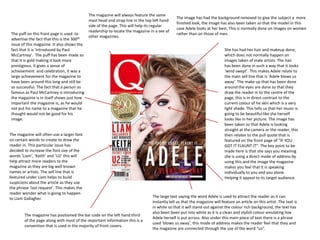
The magazine will always feature the same
                                                                                             The image has had the background removed to give the subject a more
                                            mast head and strap line in the top left hand
                                                                                             finished look, the image has also been taken so that the model in this
                                            side of the page. This will help its regular
                                                                                             case Adele looks at her best. This is normally done on images on women
                                            readership to locate the magazine in a see of
The puff on this front page is used to                                                       rather than on those of men.
                                            other magazines.
advertise the fact that this is the 300th
issue of this magazine. It also shows the
fact that it is ‘introduced by Paul                                                                                       She has had her hair and makeup done,
McCartney’. The puff has been made so                                                                                     which does not normally happen on
that it is gold making it look more                                                                                       images taken of male artists. The hair
prestigious. It gives a sense of                                                                                          has been done in such a way that it looks
achievement and celebration, it was a                                                                                     ‘wind swept’. This makes Adele relate to
large achievement for the magazine to                                                                                     the main sell line that is ‘Adele blows us
have been around this long and still be                                                                                   away’. The make up that has been done
so successful. The fact that a person as                                                                                  around the eyes are done so that they
famous as Paul McCartney is introducing                                                                                   draw the reader in to the centre of the
the magazine is in itself shows just how                                                                                  page, this is in direct contrast to the
important the magazine is, as he would                                                                                    current colour of he skin which is a very
not put his name to a magazine that he                                                                                    light shade. This tells us that her music is
thought would not be good for his                                                                                         going to be beautiful like she herself
image.                                                                                                                    looks like in her picture. The image has
                                                                                                                          been taken so that Adele is looking
                                                                                                                          straight at the camera or the reader, this
The magazine will often use a larger font                                                                                 then relates to the pull quote that is
on certain words to create to draw the                                                                                    featured on the front page of “IF YOU
reader in. This particular issue has                                                                                      GOT IT FLAUNT IT”. The key point to be
decided to increase the font size of the                                                                                  made here is that she says you meaning
words ‘Liam‘, ‘Keith’ and ‘U2’ this will                                                                                  she is using a direct mode of address by
help attract more readers to the                                                                                          using this and the image the magazine
magazine as they are big well known                                                                                       makes you feel that it is speaking
names or artists. The sell line that is                                                                                   individually to you and you alone.
featured under Liam helps to build                                                                                        Helping it appeal to its target audience.
suspicions about the article as they use
the phrase ‘last request’. This makes the
reader wonder what is going to happen
to Liam Gallagher.                                                             The large text saying the word Adele is used to attract the reader as it can
                                                                               instantly tell us that the magazine will feature an article on this artist. The text is
                                                                               in white so that it will stand out against the colour rich background, the text has
                                                                               also been been put into white as it is a clean and stylish colour emulating hoe
        The magazine has positioned the bar code on the left hand third
                                                                               Adele herself is put across. Also under this main piece of text there is a phrase
        of the page along with most of the important information this is a
                                                                               used ‘blows us away’, this mode of address makes the reader feel that they and
        convention that is used in the majority of front covers.
                                                                               the magazine are connected through the use of the word “us”.
The layout of the magazine is very conventional and does
                                                      not challenge any convention. They have made shore that               The puff on this front page is used to
The magazine will always feature the same
                                                      the left hand side is the most important part of the page             advertise the fact that you may be able
masthead saying NME at the top left hand
                                                      and that the masthead is at the top of the page.                      to win a signed limited edition stone
corner of the page to maintain the brand
                                                                                                                            roses artwork. It also shows that
identity, the magazines strap line new
                                                                                                                            information about the prize can be
musical express talks about how the music
                                                                                                                            found on page 12.The puff is in white so
that featured will be new. The font is done in
                                                                                                                            that it will stand out from the colour rich
a range of colours to allow it to stand out
                                                                                                                            scenery in the background. This puff has
from almost any background. The text is
                                                                                                                            used a large bright red font at the top
normally shown in red as this is a strong
                                                                                                                            saying the word ‘win’ to draw in the
masculine colour, which appeals to the male
                                                                                                                            reader.
readership. Having such a striking piece of
text on every issue allows the readership to
find the issue very easily even in a sea of
other magazines. The masthead is not allows
sat on top of the main image but is always
visible.                                                                                                                  This image has been taken in a more natural
 The magazine will always feature the same                                                                                location to allow the reader to connect with
 large piece of text stating what the main sell                                                                           the person more. Although it has been taken
 line is. This text has been put in a golden                                                                              in such a location the image has been
 colour to stand out from the predominantly                                                                               blurred out to create more of a focus on the
 dark background, another possible reason                                                                                 main model. Having the model have there
 that the magazine would use the gold colour                                                                              image taken in a more laid back location is a
 as he is a very important person in the indie                                                                            trademark of the indie genre, It is not very
 music world. In this particular feature the                                                                              often that on the front of a indie magazine
 magazine has a sell line above the main text                                                                             that you will find a heavily photo shopped
 with the word exclusive, this is a technique                                                                             photo. This allows the reader to immediately
 to try and attract the reader to this magazine                                                                           identify that this is a indie magazine.
 rather than another magazine. The way that
 the reader is addressed on this front cover is
 friendly and direct to the reader to try and
 make them feel connected to the magazine.

                                                                                 On the front of this magazine they have listed the names of all of the artist that will
       NME has also added a pull quote from Pearl Jam. The pull                  feature in the magazine, this is a convention that is used on all of there front
       quote says “I couldn’t give a shit what Kurt thought”. This               covers and other magazines front covers to try and draw in more readers as they
       would help pull in readers as they would be interested in the             may be interested in at least one of the artists. Underneath the list of names it
       gossip. Also featured is a sell line saying “what does this mean          says ‘and the most overrated bands ever’ helping this magazine appeal to more
       for the strokes?” this would help to draw in readers interested           people.
       in this band and the possibility of a new solo artist

Front cover s

  • 1.
    The magazine willalways feature the same The image has had the background removed to give the subject a more mast head and strap line in the top left hand finished look, the image has also been taken so that the model in this side of the page. This will help its regular case Adele looks at her best. This is normally done on images on women readership to locate the magazine in a see of The puff on this front page is used to rather than on those of men. other magazines. advertise the fact that this is the 300th issue of this magazine. It also shows the fact that it is ‘introduced by Paul She has had her hair and makeup done, McCartney’. The puff has been made so which does not normally happen on that it is gold making it look more images taken of male artists. The hair prestigious. It gives a sense of has been done in such a way that it looks achievement and celebration, it was a ‘wind swept’. This makes Adele relate to large achievement for the magazine to the main sell line that is ‘Adele blows us have been around this long and still be away’. The make up that has been done so successful. The fact that a person as around the eyes are done so that they famous as Paul McCartney is introducing draw the reader in to the centre of the the magazine is in itself shows just how page, this is in direct contrast to the important the magazine is, as he would current colour of he skin which is a very not put his name to a magazine that he light shade. This tells us that her music is thought would not be good for his going to be beautiful like she herself image. looks like in her picture. The image has been taken so that Adele is looking straight at the camera or the reader, this The magazine will often use a larger font then relates to the pull quote that is on certain words to create to draw the featured on the front page of “IF YOU reader in. This particular issue has GOT IT FLAUNT IT”. The key point to be decided to increase the font size of the made here is that she says you meaning words ‘Liam‘, ‘Keith’ and ‘U2’ this will she is using a direct mode of address by help attract more readers to the using this and the image the magazine magazine as they are big well known makes you feel that it is speaking names or artists. The sell line that is individually to you and you alone. featured under Liam helps to build Helping it appeal to its target audience. suspicions about the article as they use the phrase ‘last request’. This makes the reader wonder what is going to happen to Liam Gallagher. The large text saying the word Adele is used to attract the reader as it can instantly tell us that the magazine will feature an article on this artist. The text is in white so that it will stand out against the colour rich background, the text has also been been put into white as it is a clean and stylish colour emulating hoe The magazine has positioned the bar code on the left hand third Adele herself is put across. Also under this main piece of text there is a phrase of the page along with most of the important information this is a used ‘blows us away’, this mode of address makes the reader feel that they and convention that is used in the majority of front covers. the magazine are connected through the use of the word “us”.
  • 2.
    The layout ofthe magazine is very conventional and does not challenge any convention. They have made shore that The puff on this front page is used to The magazine will always feature the same the left hand side is the most important part of the page advertise the fact that you may be able masthead saying NME at the top left hand and that the masthead is at the top of the page. to win a signed limited edition stone corner of the page to maintain the brand roses artwork. It also shows that identity, the magazines strap line new information about the prize can be musical express talks about how the music found on page 12.The puff is in white so that featured will be new. The font is done in that it will stand out from the colour rich a range of colours to allow it to stand out scenery in the background. This puff has from almost any background. The text is used a large bright red font at the top normally shown in red as this is a strong saying the word ‘win’ to draw in the masculine colour, which appeals to the male reader. readership. Having such a striking piece of text on every issue allows the readership to find the issue very easily even in a sea of other magazines. The masthead is not allows sat on top of the main image but is always visible. This image has been taken in a more natural The magazine will always feature the same location to allow the reader to connect with large piece of text stating what the main sell the person more. Although it has been taken line is. This text has been put in a golden in such a location the image has been colour to stand out from the predominantly blurred out to create more of a focus on the dark background, another possible reason main model. Having the model have there that the magazine would use the gold colour image taken in a more laid back location is a as he is a very important person in the indie trademark of the indie genre, It is not very music world. In this particular feature the often that on the front of a indie magazine magazine has a sell line above the main text that you will find a heavily photo shopped with the word exclusive, this is a technique photo. This allows the reader to immediately to try and attract the reader to this magazine identify that this is a indie magazine. rather than another magazine. The way that the reader is addressed on this front cover is friendly and direct to the reader to try and make them feel connected to the magazine. On the front of this magazine they have listed the names of all of the artist that will NME has also added a pull quote from Pearl Jam. The pull feature in the magazine, this is a convention that is used on all of there front quote says “I couldn’t give a shit what Kurt thought”. This covers and other magazines front covers to try and draw in more readers as they would help pull in readers as they would be interested in the may be interested in at least one of the artists. Underneath the list of names it gossip. Also featured is a sell line saying “what does this mean says ‘and the most overrated bands ever’ helping this magazine appeal to more for the strokes?” this would help to draw in readers interested people. in this band and the possibility of a new solo artist